Translate

Showing posts with label Trends of 2016. Show all posts

Wednesday, October 5, 2016

Hottest Graphic Design Trends for 2016

Hottest Graphic Design Trends for 2016

By 
Hottest Graphic Design Trends for 2016
Now that we're officially four months into 2016 (Hi there, April!), we wanted to share these exciting new trends with you. We are confident that each of the following design styles and elements will take over the marketplace in what's left of this year — and even going into 2017! You're welcome to bookmark this piece and refer to it again and again.
Have you used any of these so far? Share your thoughts in the comments area below.

1. Cursor trails

Who can resist leaving a shiny trail behind the pointer? Add some magic to your next design and experiment with sparkles, circles and even cloned versions of the cursor itself.
April-Fools_10-Design-Trends_1-Cursor-Trails

2. Heavy drop shadows

We were actually a bit hesitant to include this one because it's still so new. If you're feeling adventurous today, go ahead and try adding heavy drop shadows to your shapes, buttons and even text.
April-Fools_10-Design-Trends_2-Drop-Shadows

3. Glossy buttons

Need we say more? Add a layer of sophistication and hyper-realism with 3D glossy buttons.
April-Fools_10-Design-Trends_3-Glossy-Buttons

4. Mega Glitter GIFs

We could basically stop at glitter, since it happens to be everywhere around the web these days. However, it is specifically large glitter GIFs that seem to be having a moment.
April-Fools_10-Design-Trends_4-Glitter-Gifs

5. Under construction signs

An absolute must if your website or one of its sections is still not quite there yet. Under construction signs are a thoughtful UI element that warns visitors that you're not ready for them, but soon will!
April-Fools_10-Design-Trends_5-Under-Construction

6. Page hit counters

Where would we be without these? We've even added one at the bottom of this article.
April-Fools_10-Design-Trends_6-Page-Hit-Counters

7. Word clouds

These are an engaging, non-traditional way to display text. Add word clouds to your next print or web design project and watch user delight soar.
April-Fools_10-Design-Trends_7-Word-Clouds

8. Put a cat on it

It's cats. And the web. And oh-so-fresh. Just add the cats and everything will be fine.
April-Fools_10-Design-Trends_8-Put-A-Cat

9. Torn paper

Achieve that vintage, organic feel by adding torn edges to your shapes and page sections. Emulating old paper is a bold move in an industry dominated by symmetry and geometry.
April-Fools_10-Design-Trends_9-Torn-Paper

10. Bevel effects

Ready to test your Photoshop skills? You're a few layer styles away from one of the most popular looks in web design these days. Experiment with different beveling shapes and intensities: you'll be surprised at how proper bevel effects can fix almost any design mistake.
April-Fools_10-Design-Trends_10-Bevel-Effects

Wednesday, August 17, 2016

10 Beautiful Typography Trends to Try in 2016

10 Beautiful Typography Trends to Try in 2016


By on Aug 3, 2016 in Inspiration
10 Beautiful Typography Trends to Try in 2016
Wowsers, here we are and 2016 is just over halfway done already. Whatever your design goals for the year are or were, we hope you’re well on the way to achieving them. If you’re a typography-loving designer, this article might help you out. We’ve collected 10 type and lettering trends for you to try over the coming months. Take a look, and let us know how you go in the comments below.

Watercolor

First and foremost, 2016 has been the year of beautiful watercolor type. You’ve seen it everywhere from Instagram posts to t-shirt slogans to wedding invitations. The theme here is laidback and luscious, with bits of color or just black and white.
Sea-Salt (below) is a great choice to get started with this on-trend type look:

Big and bold

There was a day on the web when all typography had to be tiny. Not anymore. These days full-screen images and big, bold type are much more common. And when done well they can look splendid. Start with an uncompromising, proud typeface like Hudson (below):

Hand-drawn

Authenticity is a big must for most brands these days. And one way to offer up a bit of that authentic vibe is to employ some hand-crafted type. The heartfelt nature of handmade lettering connects with most customers, so it’s worth a shot. Typefaces like Reusk, in the bundle below, are an excellent starting point:

Fluorishes

Sometimes it’s nice to be clean and minimal. In other occasions, it’s fun to go all out and craft some type with lots of embellishments and detail. When that ornate, swirl-filled style is what you’re going for, try Anthem, below:

Thin and Minimalist

On the opposite end of the spectrum, sometimes the job calls for a no-nonsense, straight up and down typeface that’s legible and likeable. Naive Line Sans (below) is a hand-drawn font that lets you get a good handle on this popular style:

80s

The 80s is one of those decades that seemingly never goes out of fashion. Its cool, carefree vibe is one that’s worth emulating type-wise, and a good place to start is Imogen Agnes (below):

All Caps

Strong, geometric, and essential is how the creator of Lorano (below) describes his typeface. And who could argue? All-caps typefaces in gigantic point sizes look beautiful when splashed across a full-screen responsive site.

Geometric

There’s something subtle and simplistic about a modernist, geometric font. The sharp, defined lines and consistent angles make for an intriguing headline display choice. Try out Suburbia (below):

Grunge

There’s always a place for clean and clear, but sometimes you’ve just got to dirty things up and go grungey. This look goes well with textures, rough edges, and distorted lettering. You can try creating it all by yourself from scratch, or you can save yourself some time with something like the Whiskey Font collection (below):

Script

Lastly, this wouldn’t be a list about 2016 type trends without including one script typeface on the list. Watercolor and flourishy fonts (above) sometimes go with a hand-drawn letterform style, but there’s no shortage of beautiful typefaces here at Creative Market to satiate your script needs. Crystal Sky (below) is light, airy and positive, and the perfect typeface to get your designs looking terrific:

It doesn’t stop there, though. Once you’ve tried a few of these trends out, you can take it to the next level by combining your lettering with some other design elements. We recommend utilising some of these typefaces with other techniques, like those laid out in our ‘20 Photoshop Text Effects That’ll Blow Your Mind’. Or you can get a bit of color inspiration by reading ‘How To Choose The Best Colors For Your Brand’.
Source: creativemarket blog

Thursday, February 25, 2016

10 Brilliant Graphic Design Trends of 2016


10 Brilliant Graphic Design Trends of 2016

10 Brilliant Graphic Design Trends of 2016

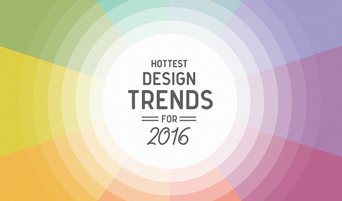
Trends come and go, they emerge, some stay for years, others are more of a flash in the pan. They don’t start one year and end the next, instead they shift until they fade out. It’s a process that often begins on the catwalk, and gradually moves to other areas such as graphic design, packaging, illustration, and home decor. A trend might be just entering one market, while it’s in full bloom on another market and fading in a third. It’s common to see trends that go in opposite directions, such as a futuristic, high-tech trend and a trend like the hipster beard, that’s more nostalgic, looking to the past for inspiration. Trend spotting is a lot of fun, and a great way to infuse your work with fresh ideas.

1. Flat 2.0.

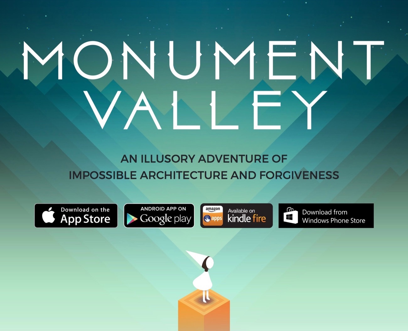
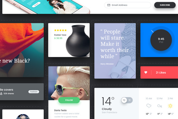
The flat design trend is characterised by a clean, colorful look, big typography, white space, and subtle gradients. It’s influenced by minimalism, Bauhaus and the Swiss Style. Flat design was introduced in 2006 with Microsoft’s Zune mp3 player, refreshed by Apple’s iOS 7 in 2013, and further refined by Google’s Material design in 2014. A beautiful example can be found in the award-winning indie game Monument Valley.
This trend has the staying power of a visual language that creates high usability and fast loading times. It’s also easy to mix flat design with more intricate or hand drawn artwork and photography, which makes the trend versatile and flexible. It started as a completely flat style, and has been updated adding depth, light and shadow, as well as motion.
In 2016 we’ll continue to see the popularity of the style grow, and spread from UI design, to areas such as surface pattern design and illustration.

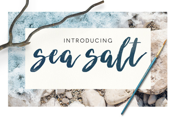
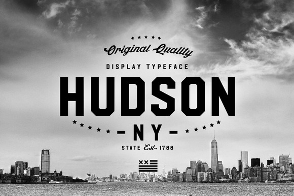
2. Bold, Playful Typography

The Flat Design trend together with tools like the Glyphs app that make the production of fonts more easy and inexpensive, pave the way for dramatic and creative typography. Bold statements, playful sans-serif typefaces, and letter stacking. Possibly also the Serif will make a return performance, encouraged by the higher resolution screens. We’ll continue to see new crops of handwritten fonts in 2016. Huge, interesting drop caps like SNASKs hand-crafted, 3D letters.
The Washington Post
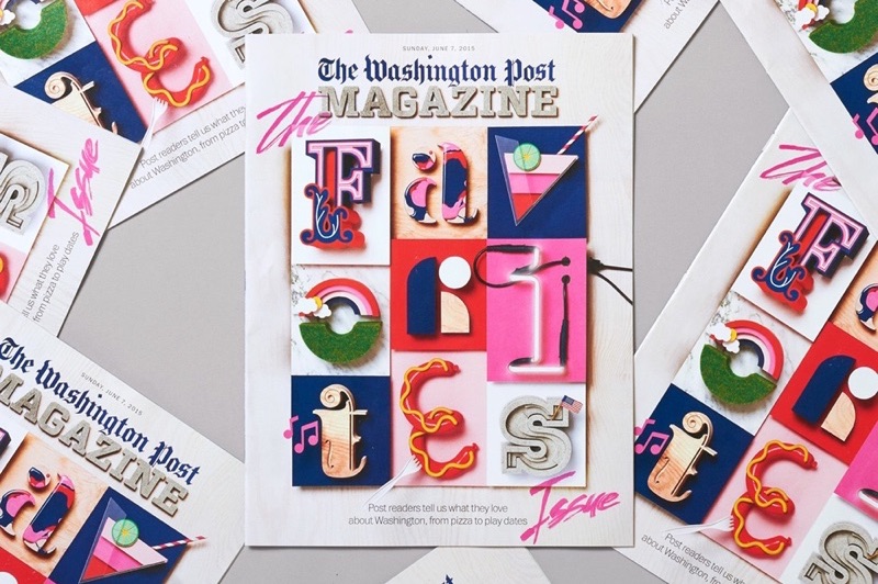
SNASK typography for The Washington Post
Glyphs
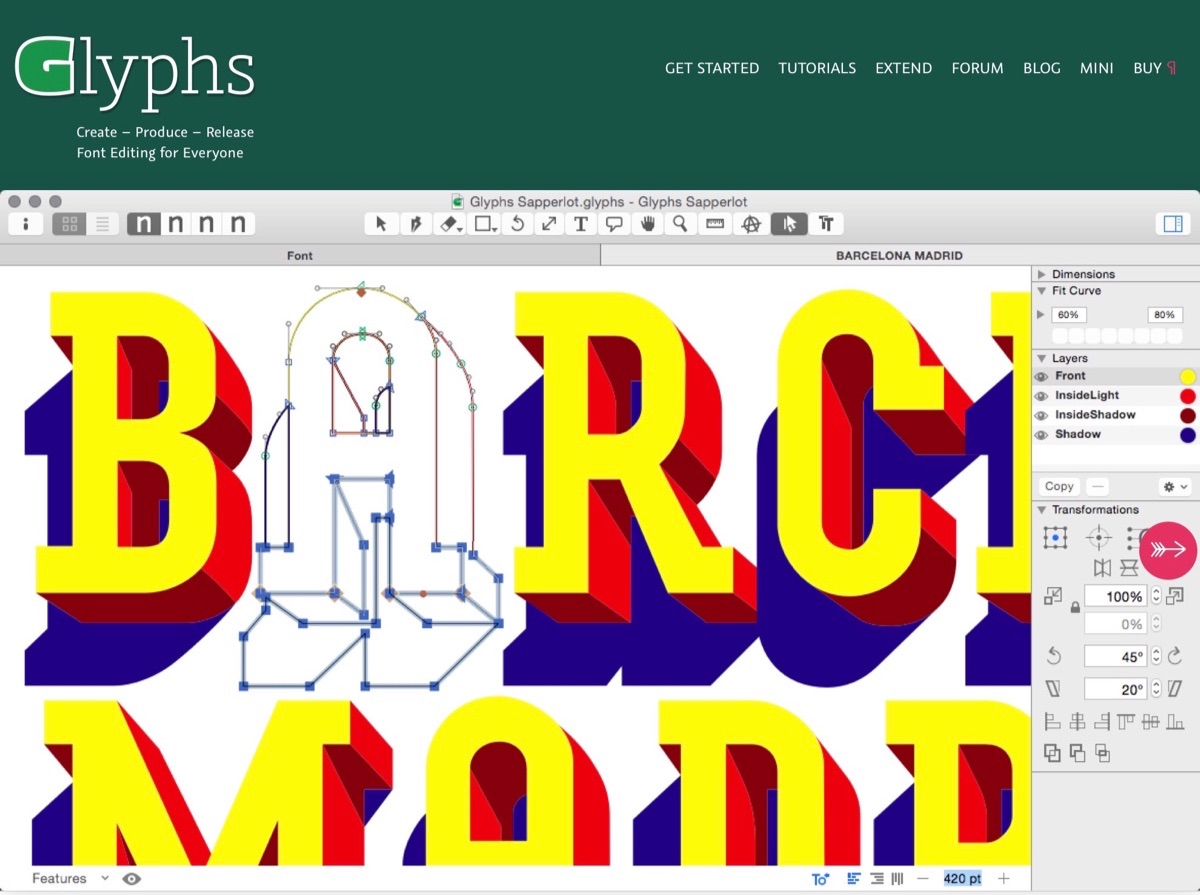
https://www.glyphsapp.com

3. Whimsical Illustrations

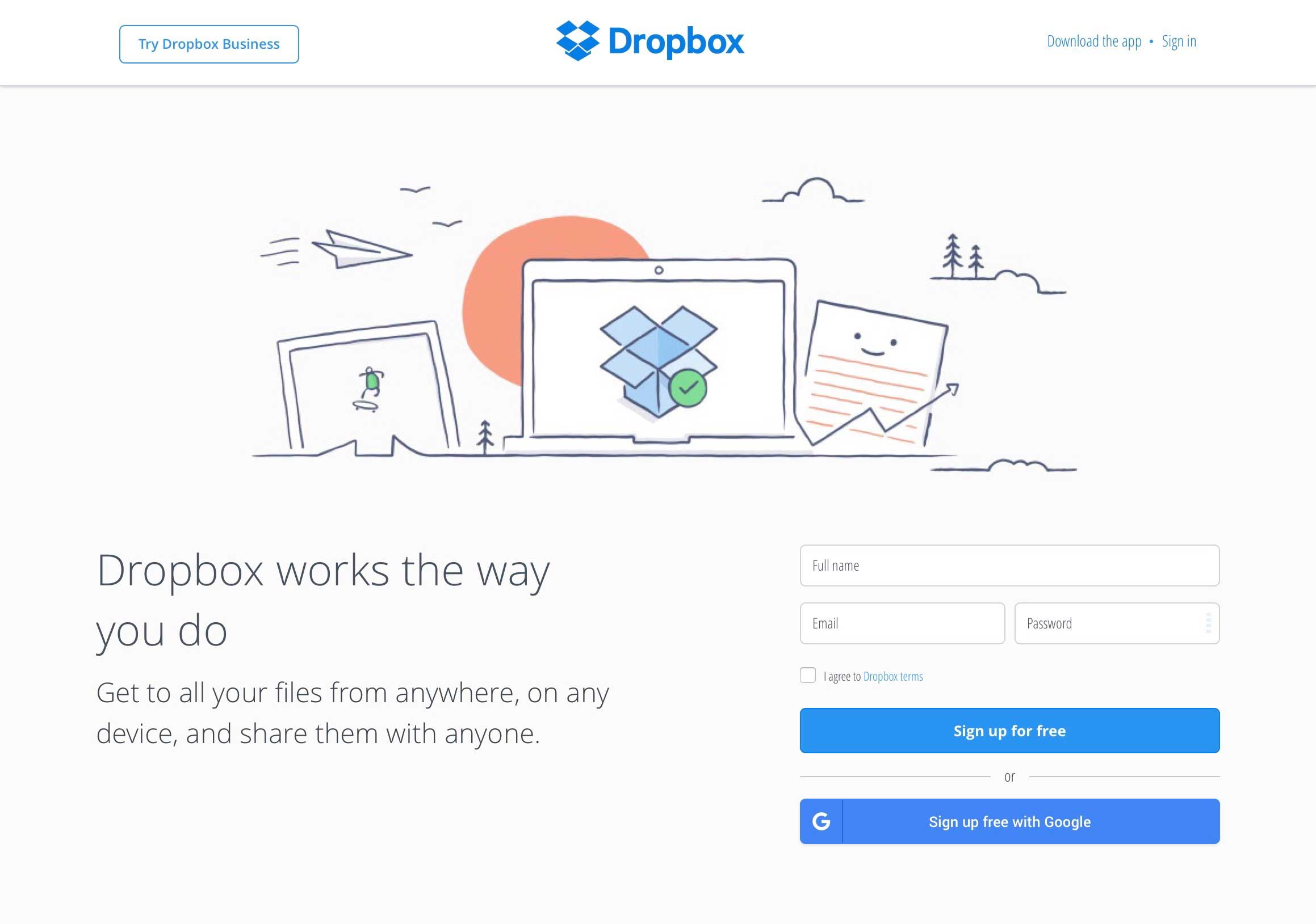
Whimsical, hand drawn illustrations aren’t just for kids anymore. An example can be seen in Dropbox’s friendly doodles that inject a playful human element. Illustrators continue to explore sketchy lines and brushstrokes, mixing their tools and techniques, digital and analog, and this leads to a broader range of illustration styles and use, including isometric projections and illustrated hero images.
Dropbox

4. The New Retro

Retro styles are inspired by the 80s and 90s, The Memphis Group, and arcade video games. Think about bold colors, pixel art, playful geometric designs and patterns. Take a look at Tim Colmant's work for examples.
Tim Colmant
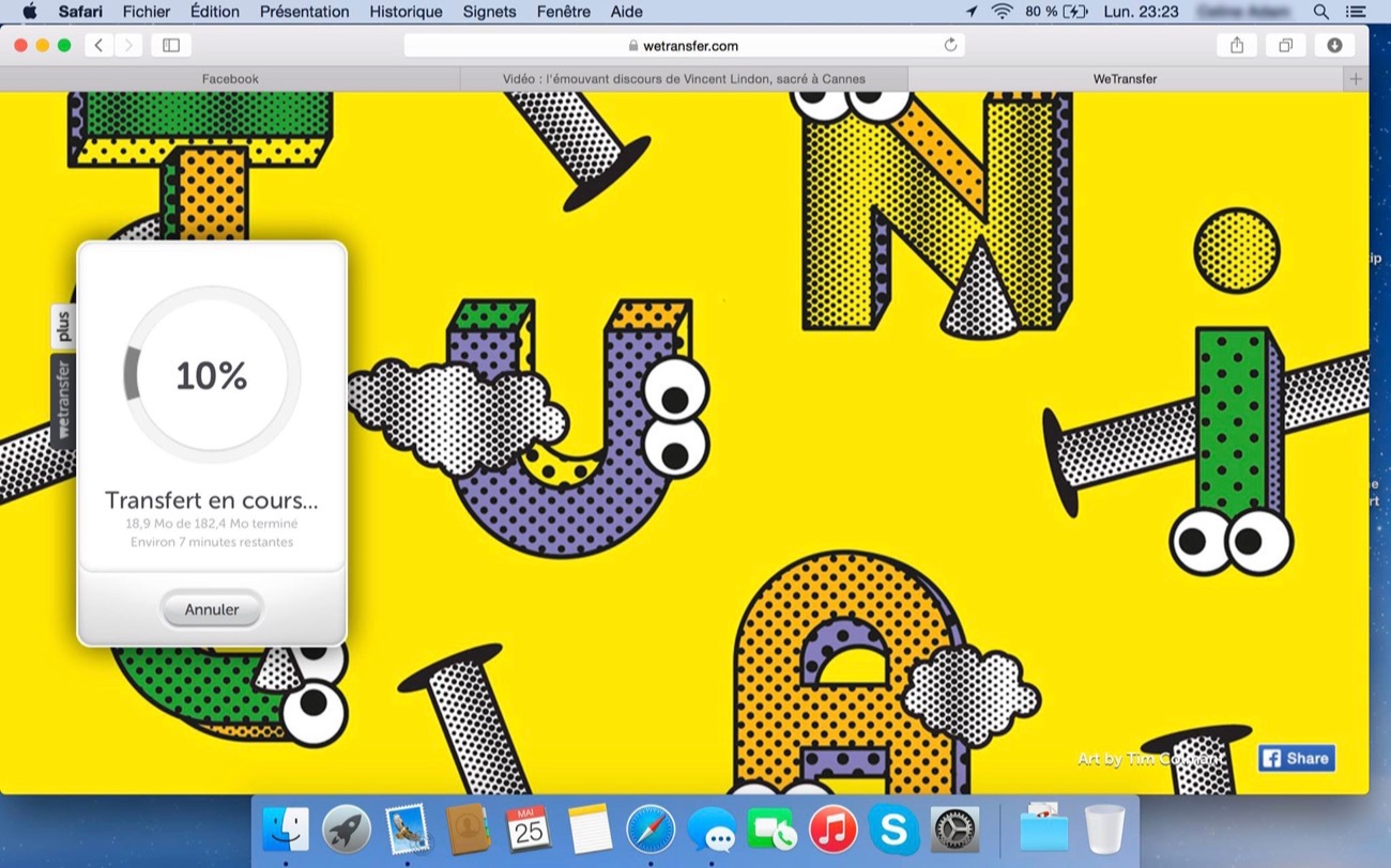
http://timcolmant.com

5. Motion

Photos and illustrations come to life with 2D animation and cinemagraphs. With just a flicker of movement, enough to catch our attention without distracting from the content, this is a hybrid of motion and still. For amazing cinemagraph examples, check out this article we shared featuring artist Said Dagdeviren.
cinemagraph-02

6. Minimalist Logotypes

Minimalism, flat design, negative space, subtle gradients, kinetic logos and crisp mono line styles are the logo trends for 2016.
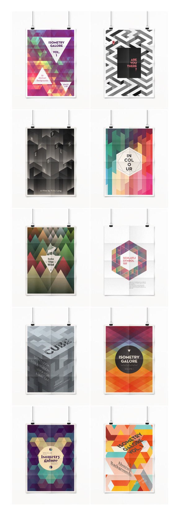
7. Geometric Shapes

The geo trend continues in 2016. Low-poly effects and sacred geometry shift into layered geometries and blend with the 80's influences of the Memphis Group’s design. Expected to be strong in packaging design. We recently explored the idea of how geometric shapes might be the new trend in web design for 2016. Read all about it here.

Isometry Galore 1


8. Print-inspired

The print-inspired trend is likely to continue this year. Inspired by pre-digital printing processes, it displays slabs of colour, rich textures, and mis-print effects. In 2016, we’ll see this style evolve to take its cue from the Risograph with it’s bright, neon colors and fun, unpredictable overprint effects.
Paperpusher-Calendar
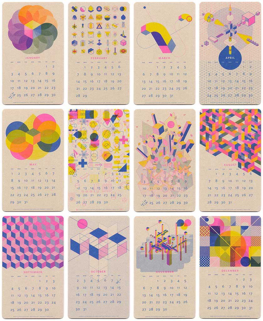
PaperPusher's 2016 Isometric Risograph Calendar by JP King

9. Abstract Swiss

In contrast to the more excessive, 80's inspired styles, a rebellious, minimalist trend is evolving. Unlike the popular card layout trend, this trend aims to break the rules. Deconstruct and distorting layouts in a seemingly random way. read more ...

10. Movies and Cartoons

The superhero film has been trending in Hollywood since 2001. Other trends in film and TV include Game of Thrones, sci-fi such as Her, Under The Skin and Ex Machina, and the spy genre with tv-series such as Homeland and London Spy. The Outer Space trend is trending just now in the children’s market. Will film and TV influence graphic design further in 2016? We shall see.
source : creative market blog