Hottest Graphic Design Trends for 2016
Now that we're officially four months into 2016 (Hi there, April!), we wanted to share these exciting new trends with you. We are confident that each of the following design styles and elements will take over the marketplace in what's left of this year — and even going into 2017! You're welcome to bookmark this piece and refer to it again and again.
Have you used any of these so far? Share your thoughts in the comments area below.
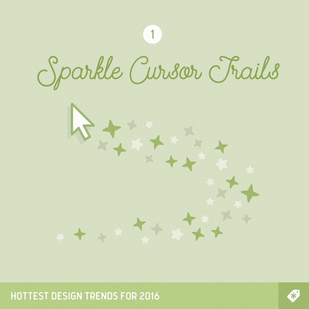
1. Cursor trails
Who can resist leaving a shiny trail behind the pointer? Add some magic to your next design and experiment with sparkles, circles and even cloned versions of the cursor itself.
2. Heavy drop shadows
We were actually a bit hesitant to include this one because it's still so new. If you're feeling adventurous today, go ahead and try adding heavy drop shadows to your shapes, buttons and even text.

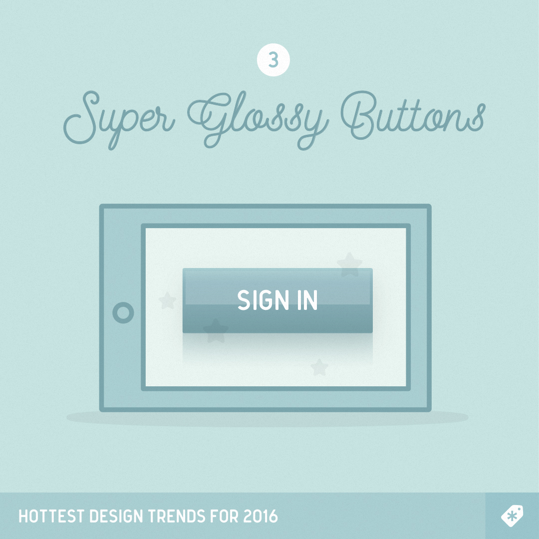
3. Glossy buttons
Need we say more? Add a layer of sophistication and hyper-realism with 3D glossy buttons.
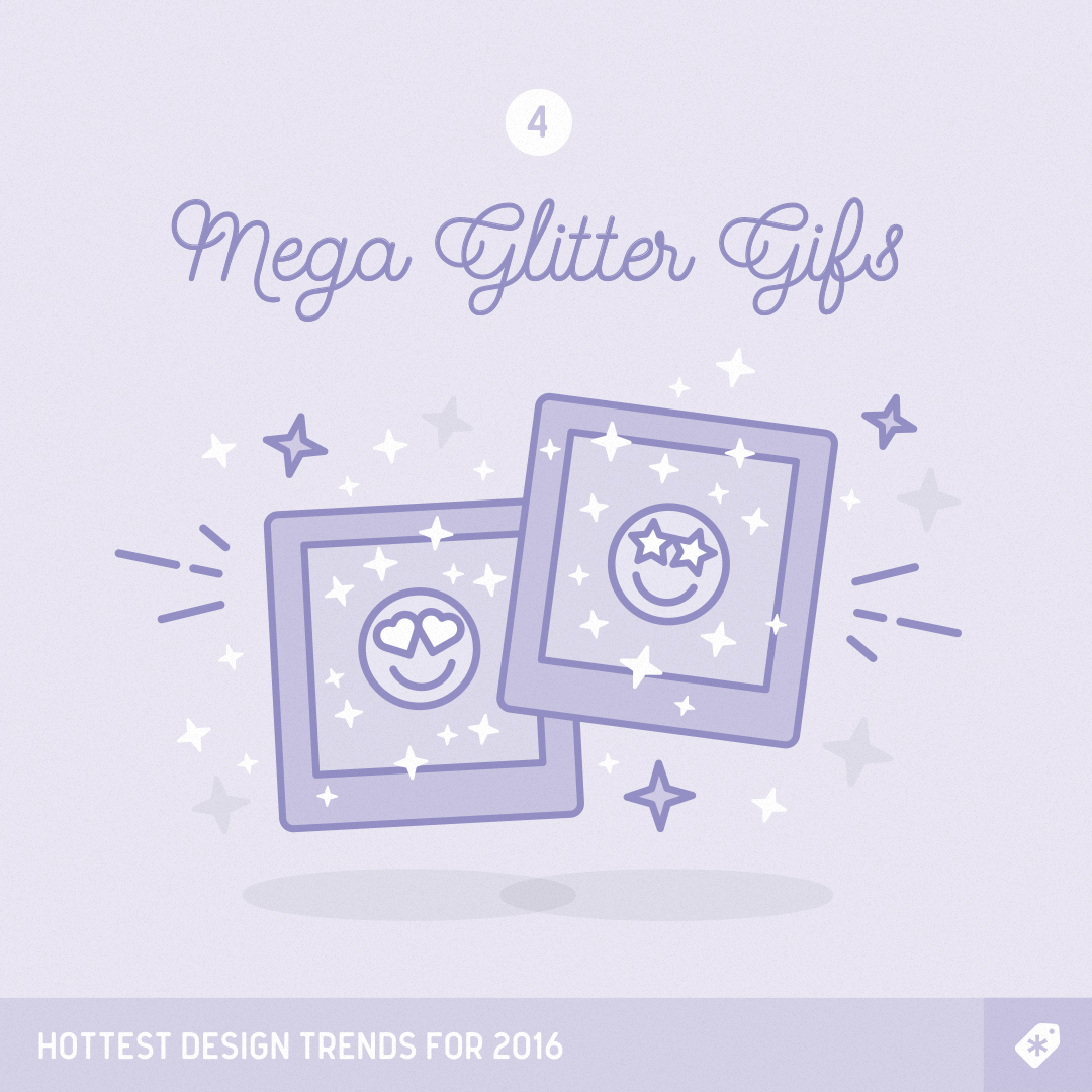
4. Mega Glitter GIFs
We could basically stop at glitter, since it happens to be everywhere around the web these days. However, it is specifically large glitter GIFs that seem to be having a moment.
5. Under construction signs
An absolute must if your website or one of its sections is still not quite there yet. Under construction signs are a thoughtful UI element that warns visitors that you're not ready for them, but soon will!

6. Page hit counters
Where would we be without these? We've even added one at the bottom of this article.
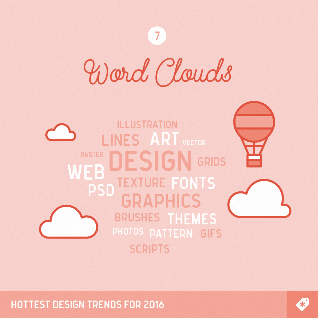
7. Word clouds
These are an engaging, non-traditional way to display text. Add word clouds to your next print or web design project and watch user delight soar.
8. Put a cat on it
It's cats. And the web. And oh-so-fresh. Just add the cats and everything will be fine.
9. Torn paper
Achieve that vintage, organic feel by adding torn edges to your shapes and page sections. Emulating old paper is a bold move in an industry dominated by symmetry and geometry.
10. Bevel effects
Ready to test your Photoshop skills? You're a few layer styles away from one of the most popular looks in web design these days. Experiment with different beveling shapes and intensities: you'll be surprised at how proper bevel effects can fix almost any design mistake.


No comments:
Post a Comment