
The Best Sports Fonts for Athletic, Gym & College Designs
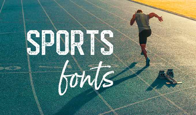
Have you ever found yourself looking for that perfect font for just the right occasion? Like you, I've looked through my files a million times trying to dig out the best option, only to wonder if I need to dig around online. The other day, I was looking for a font that had the feel of the "College" sweatshirt that John Belushi wore in Animal House. I found a few in my collection, but ultimately I ended up buying something new because it fit the theme best. College, gym, and athletic-themed design projects can benefit from a font inspired by sports, movement, and dynamism. Throughout this article, I'll describe some of the best examples available in the marketplace.
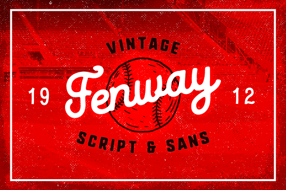
Fenway Script & Sans + Bonus
I'm going to start with Fenway for a few reasons. First and foremost, I'm from Framingham, Massachusetts, and that means I am a huge Red Sox fan. I live in the Phoenix area now, so getting out to see Fenway in person is kind of a big deal, and I did it for the first time since 2008 this past May. I love Fenway — which is part of the reason I own this font. But it's also because I like the casual and old-school script effect of it all. The way it looks just as at home in a ballpark as it would on the inside of a gym. It's versatile but works nicely for its intended usage.
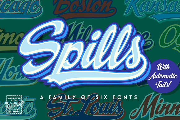
Spills
I'm a big fan of Comicraft — so much so that I talk about them here all the time. Spills is another font that I have in my personal collection. It's great because it comes with a ton of different options, plus tails. There are easy instructions on how to get it to work, and then you add your layers on top to give yourself a variety of different looks. I've used it in different sports-related designs (since it very clearly has a baseball-related feel), and I find myself returning to it for all sorts of crazy ideas.
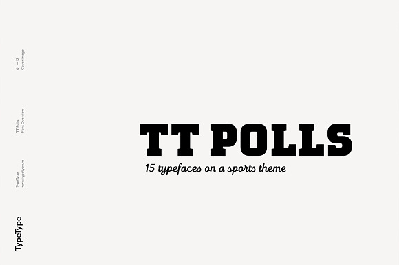
TT Polls
I love me a font with options, and that's TT Polls. They say it's "optimized for work with numbers," but it can do fractions, ligatures, and stylistic alternates. So what makes it sporty? The bold, hard angles of the letters and the clean serifs, both traits that remind us of that old college shirt. There's even a script version included too, just in case you want to get fancy.
Sports Font Bundle BTL.1
Sometimes your best option is a bundle, and that's my angle here. BoxTube Labs gives you a quintet of excellent sports-themed fonts, all of which fit into the same general area. Fanatix is nice and angular, just like you'd see on a football jersey, but Dahmer Slab takes the idea and narrows it up a bit, like what you might see at a gym. Throw in Areno for something more modern and Godou Grande for extra flair, and you've got a winning combo.

Varsity Scratch - Sports Jersey Font
You've got the traditional look of a college or athletic font, with just a touch more curves and stylistic options than usual. Then there's a stroke floating around it just to hammer the point home. Oh, and to top it all off, the whole thing looks like it's been washed and dried to the point that it's perfectly worn. This one's a winner.

Maritime Champion Stencil
When I first came across this one, I was a little bit on the fence. Is this sporty enough that I'd find it out on the street? Well, lots of fonts in this category do have that stenciled look, and this fits the bill, but the bottom of the letters are flourished out like a whale tail. It's a college-style font, but it's a bit less mainstream. Use it if you're looking for a style that hints at sports in a less literal sense.

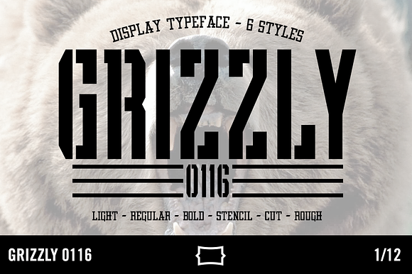
Grizzly 0116 Display Typeface
Going back to the stenciled look, Grizzly 0116 is all about athletics. It comes in a variety of different line weights, and a bunch of styles — including a version without the stencil effect. I love the rugged aesthetic of the whole family.
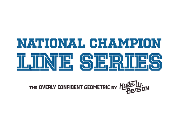
National Champion - Line Series
National Champion - Line Series is a pretty sweet product. It's got that geometric slab look that fits with this post's theme, but it also has a few different options and weights. It means that you can create a design that's got the simple line through it, or one that's made up entirely of lines. That gives you the look of an athletic font, but in the more extreme variations, the feel of one. Love it.
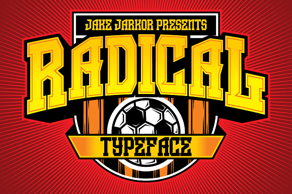
JKR - Radical
Let's try something just a little bit different. Radical, like many of the other fonts on this list, has a heavy focus on being a geometric slab. But this one works in a few different angles that aren't found in the rest. The Q, for example, has this great take on the letter itself that you don't see very often. The J is angled at the base just so, and that also makes it stand out. There's also a version with an extra stroke that puts the varsity stamp on the whole thing.
Redzone - The UFL Project
To end this list, let's go with one I dig: Redzone. First off, it looks perfect as-is, and would fit in perfectly at any sporting event. But it's the little flourishes and tweaks on a traditional geometric slab what I enjoy most. The tiny serifs on some of the letters, the shape of the G, the asterisk: they all just come together. This font's creator is also behind the UFL Project, an amazing branding experiment.
