
How to Use Psychology to Choose Fonts
Colors are well-established in the psychology of design and branding. Ninety percent of product decisions are based on color, and although some color associations are culture-based, research shows that the appropriate use of color can be used to enhance a brand's image. In contrast, studies related to the psychology of typographic design have been much less publicized.
Yet, beyond expressing meaning through the text it displays, scientific research has demonstrated a significant relationship between font choice and its effect on viewers and readers. The selection of a typeface has powerful implications for both design and branding, affecting the inferences and meaning others will draw from it. Font choice also influences the overall impression of a type-inclusive design based on legibility as well as look and feel.
These four psychological factors of typographic design — inferences, meaning, legibility, and look and feel — play a major role in whether or not a design or marketing piece will have the desired effect.
Inferences
Viewers and readers make many inferences about a design simply from the style of the text, often without realizing how it affects their perception. For example, the application of bold styling to text or a typeface that is bolder than average almost universally indicates weight and importance. This gives more prominence to the text in this font than to other text in the same design. Another example of inferences that are made based on typographic design include italics, which can signify a more subtle emphasis or, in some cases, indicate sarcasm. Spend a few seconds noticing the impact that bolding and italicizing certain words had in the last few sentences.
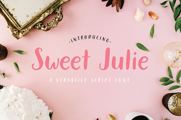
Other types of typographic symbolism are also universal, and should be used carefully in design. Script fonts are used to imply elegance or sophistication, which is why luxury brands and many wedding invitations often use them.

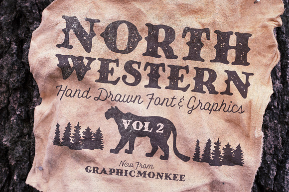
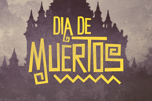
Other typefaces are designed to convey a particular theme, some with more subtlety than others. In the example below, the North Western Font is reminiscent of the outdoors.
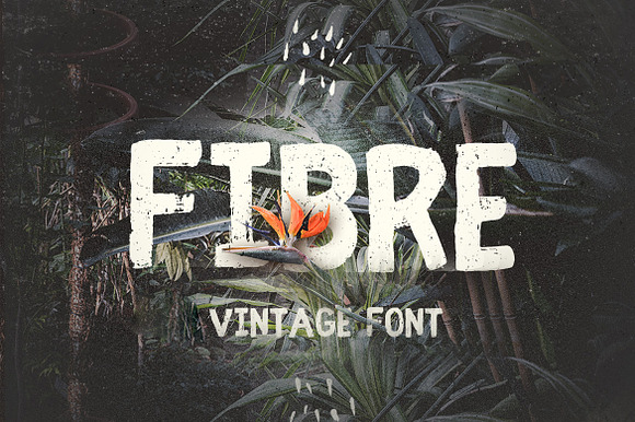
Distressed, retro and handwritten font groups are all designed to convey a specific concept to the reader, often before the content of the text is even absorbed.
By using fonts in certain styles, designers and branding experts automatically lead viewers to make specific inferences about the purpose of the design and how they are supposed to feel about it. This makes it critical to carefully consider typeface style and its implications, even within the same font family.
Visual and Verbal Meaning
Font choice can also serve as a memory aid for viewers, especially when the chosen typeface's visual style closely matches the verbal meaning of the text. This includes some of the thematic font styles mentioned above, as well as more basic aspects of typography, such as weight and height. According to the Gestalt Theory of Intensity, the word "tall" in an elongated typeface gives an even clearer picture of height than the same word in a typeface with a more average height. This can be seen in a 1986 study showing that a font choice benefited from being similarly featured to the product that it is promoting.
While at times the connections between visual and verbal meaning are natural, some elements of congruence in typeface psychology are less obvious. In a 2015 study, participants demonstrated this interesting psychological aspect of typographic design by pairing particular typefaces with basic taste words — sweet, sour, salty and bitter — based on the typeface roundness or angularity (RA).
Participants associated the rounder typefaces with sweet, and the angular typefaces with more negative taste words, such as bitter, salty and sour.
The study further indicated a close relationship between roundness, fluency, and liking. In other words, study participants found rounder font styles both easier to read and preferable to more angular ones.
Legibility
The legibility of typographic design is important for more reasons than the ability to read the text. Results from studies in this area of type psychology are almost counter-intuitive: most would assume that a more legible font would facilitate easier recall of text. However, typefaces that are difficult to read increase the time spent reading the text they display, causing readers to slow down and read more carefully. This, in turn, improves memory of the text and its meaning. Of course, there is a point where the level of illegibility far outweighs the benefits of a disfluency that benefits memory.
Look and Feel
This same effect of disrupting fluency — slowing down the readers' usual speed — is also evident when the typefaces in a design are unique or new to the viewer. The novelty of a typeface naturally causes viewers to take special notice, therefore creating better recall. Even though congruency between a typeface style and what it describes can cement a design's meaning, dissonance between visual and verbal meaning can result in a longer time needed for the reader to process a design.
However, attempts to create a memory-boosting contradiction through typographic design can go too far. While novelty and complexity can encourage focus and result in better recall and even appreciation for an ad, combinations that are overly inconsistent cause viewers to lose motivation in understanding the text and design. Discord between fonts or even elements in a design and the meaning, when not used carefully and intentionally, can result in an extremely negative perception of a design.
Conclusion
When it comes to sending a message through design, typeface decisions are just as important, if not more so, than colors. Psychological studies related to typography make it clear that designers must consider the inferences, visual meaning, legibility, and look and feel of selected fonts in order to make their designs as effective as they can be.