Eric Vadeboncoeur is the founder of both PresentationDeck.com and eVadeboncoeur Design. He creates effective, visually striking presentations for business. Eric makes PowerPoint sit up and bark. Eric holds a bachelor’s degree in graphic design, has been in the industry for over 12 years, and lives in Montreal, Canada.
_____
Meetings are not at the top of anybody’s “Fun Things To Do” list. We all get that. But, we also get that it’s up to us to change that. It’s our job, yours and mine.
The average worker spends 31 hours a month in meetings and presentations. And it gets even worse for executives: they can easily spend 40% of their week in meetings! According to research by Atlassian (the team behind Hipchat):
At presentations, on average, attendees…
- Daydreamed (91%)
- Made up an excuse to skip it (96%)
- Felt overwhelmed (45%)
- Did other work (73%)
- Complained it was wasting their time (47%)
Some (39%) even admit they slept during a presentation! (source) Half of attendees consider the time wasted.
How to avoid becoming a statistic
There’s no law that says meetings must be boring. I checked.That said, there’s a lot you can do to make meetings less boring. You can make them different. You can make them interesting. You can grab and hold the audience’s attention.
Skillful use of tools and techniques make your visuals pop. They can help the presenter get the message across and assist your audience in enjoying the message. It’s what we all need to be doing, and we need to start right now. There's no doubt that presentations are a visual medium, and it all starts with design. That's why I decided to share what’s trending in the world of presentations: to give you insights and tips that can improve your designs dramatically.
Minimalist design
Less is more. You’ve heard that often enough, right? That may not be a new idea, but it’s making a huge comeback. Maybe the economic climate is making people yearn for zen-like simplicity. Perhaps it’s just a shift in general tastes. Whatever is behind it, Minimalist Design is hot for 2016. Designers are removing distractions, focusing on key elements, and switching to outline icons. Fonts are going on diets and slimming down.
Just look at the bestsellers right here on Creative Market. People prefer clean and crisp over cluttered and noisy. The public now recognizes white space is a design element in its own right.
Now, designers have always known that. White space is not empty space: It has as much purpose as an image or the text. For the sake of minimalism, limit yourself to a single message per slide. A busy slide forces the audience to ignore the speaker. In effect, many of them shut down for the time it takes to read the slide.
Simple, but not simplistic, is the way to go.


Flat Design
Flat design is light and friendly. It too, has been around for a while but shows no sign of slowing down. Combined with an overall minimalist approach it can still pack a wallop.
It's important to note that flat does not mean boring. This trend avoids unexpected gradients and textures. It also gives us a viable alternative to tired, over-used stock photography. Flat Design’s intention is to present information quickly, painlessly, and seamlessly. Isn’t that exactly what we need for a presentation?
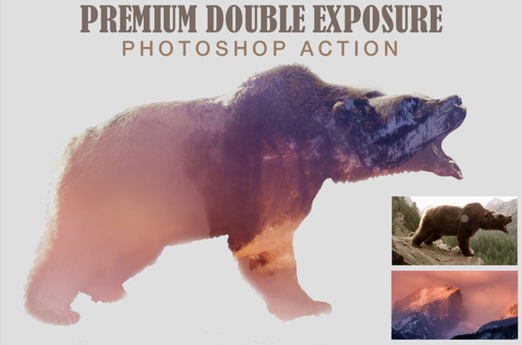
Double Exposures Still Rock & Now They’re Easier
Combine two or more images into one and you create a new image. Double exposure is a nice side-step to stock-photo-fatigue syndrome. Fortunately, it’s now easier than ever to pull off. There are “double exposure” apps and Photoshop™ actions. You can buy them right here on Creative Market.
Forget reveal-all layer masks. Just let the apps and actions do their stuff. Easy as pie and just as delicious. Choose pictures that hit on an emotional level. You want to surprise viewers, delight, and enthrall them. It’s too easy to get carried away with this stuff. Don’t, remember minimalism and take it easy.

You want to leave them wanting more. You want them to feel each image viscerally, down deep in their guts. Be careful not to dilute that. Think of these effects like Jalapeno peppers. A little bit gives a nice kick of heat. Overdo it, and you trash the dish.
Bright gradients
People are used to soft pastel gradients. They are ethereal wisps. They are subtle. They whisper. They seduce.
Bright gradients are different: they are in-your-face, bold, and strong!
They shock! They scream! They’re an F-bomb in the Sunday sermon. They have all the subtlety of a slap upside the head. But sometimes, that’s exactly what we need to pay attention.
Some may question their appropriateness. No one doubts bright gradients command attention, or that their shock value can wake up your audience. You can shake them up, but you can’t always be shouting. Used with care, they provide tension that builds the drama. Check out Uigradients.com. There are plenty of examples there, as well as a handy tool to build them.
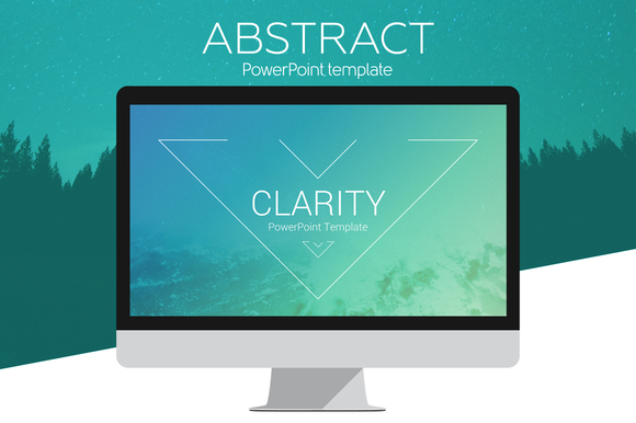
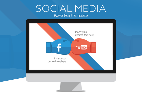
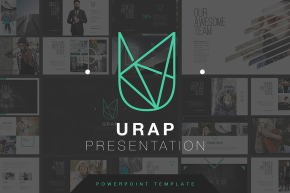
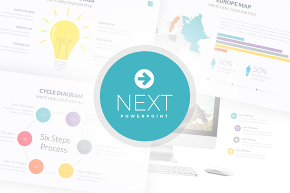
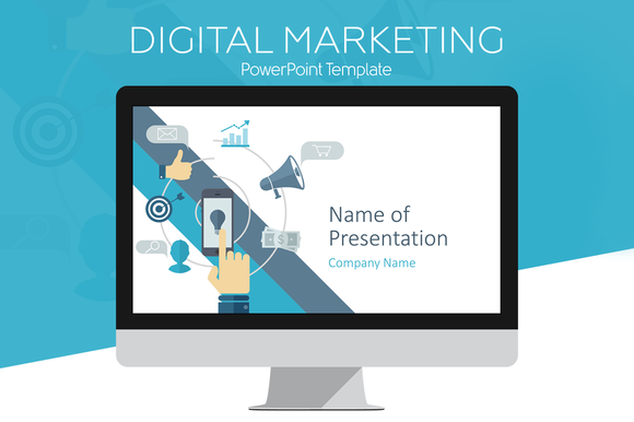
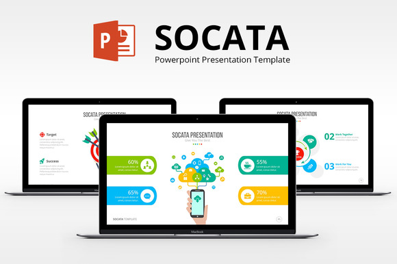
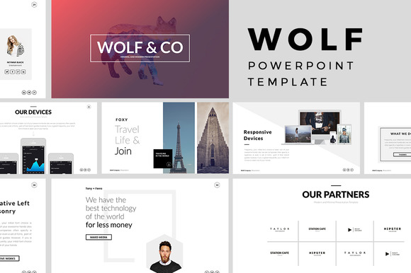
Templates
PowerPoint has a user base of over one billion people! However, many users think pasting a Word document in it is enough. O*M*G, NO! This isn’t only about PowerPoint. What about web sites? What about content marketing? What about blogs? White papers? Case studies?
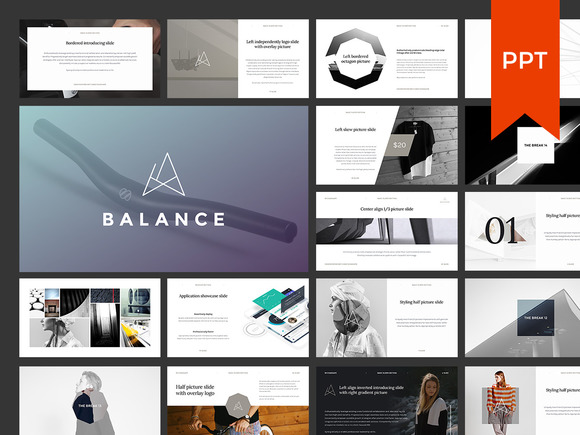

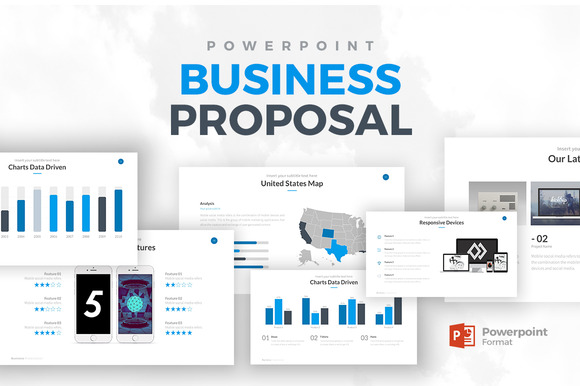
As people need to do more with less, design pros will fill the gap. And they'll do so with beautifully designed templates. Power presenters will use them as a shortcut to building one-off designs. In 2016, more and more people will have access to professional design skills. The best part? They will have it at an itsy-bitsy fraction of a one-off price. Look for templates to hit hard this year. They might be the single, most popular trend of 2016.