
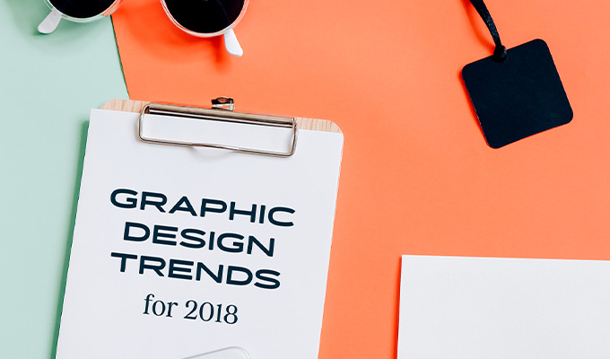
As design professionals, it's important to dedicate some time every year to sit down and analyze the trends that are starting to impact our industry. Reviewing the aesthetic styles, content formats, and tools that have become prominent during the second half of the year can help us make solid predictions about what will trend in the upcoming year. To make that process much easier, I've summarized 10 of the most outstanding graphic design trends we can expect to see more of in 2018.
1. Moody Tones
The 80/90s are clearly back, and the wild popularity of series like Stranger Things is solid proof. Along with that era comes a renewed interest in colors that weren't perceived as bright. For various reasons, the colors captured by devices back then were somewhat worn out and not as saturated. This phenomenon has inspired many designers' preference for moody color palettes to be used with all kinds of materials: screen, paper, fabric, among many others.
Perhaps the easiest way to identify this trend is to see moody filters applied to regular photos:

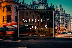

In color theory, we use the term value to express that relative brightness or darkness. Moodier tones have a lower value, making them appear darker. Similarly, there's another trait called Chroma that measures the quality of a color's intensity or purity. Since moody colors are distant from their pure, saturated bases (think primary red or blue), they are said to have a low Chroma.
2. Ultra Violet and Galactic Effects
Pantone just named Ultra Violet its Color of the Year for 2018. This deep, blue-based purple reflects the larger trend of drawing inspiration from space. Therefore, Ultra Violet doesn't just point to literal motifs like stars and planets, but also deeper emotions like our sense of discovery. Expect space-related aesthetics to impact the graphic, web, interior, and fashion design industries in particular.

3. Mid-Century Modern Motifs & Illustrations
It's not just the 80s that are making a comeback. Mid-century, a term used to describe the period roughly between 1933 and 1965, is certainly becoming a source of inspiration for web and print designers. While interior and fashion design have incorporated mid-century modern elements in waves during the last few decades, now we're observing a more digital adoption and interpretation of those elements. Just take a look at some of the illustration styles and color palettes in use all over the web:
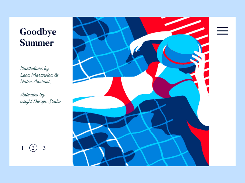
Website Slider Interaction by iesight Design Studio
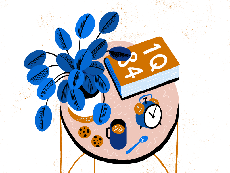
Murakami and Cookies by Alexander Mostov
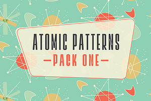
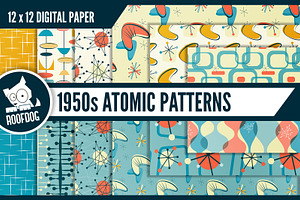
Here are some graphics packs and tools that can help you achieve the mid-century look much faster:


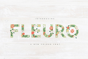
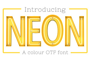
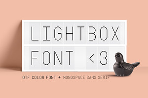
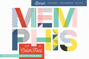
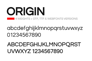
4. Color Fonts
If you haven't become familiar with the concept of color fonts, you might be missing out on a key design tool. We've discussed why Color Fonts are the next big thing in typography, and even how to create your own font, but it is truly in 2018 when this format will become incredibly popular. Why? Because the software enabling color font use has only just been released (I'm talking about Photoshop CC 2017/2018 or Illustrator CC 2018). Expect to see many more color fonts in development and use during 2018! In the meantime, here are some of our favorites from the marketplace:
5. Cinemagraphs
You may have noticed those subtle, almost imperceptible animations flooding the web — and social media networks in particular. Cinemagraphs, which we've covered on the blog before, are essentially very short videos with an almost static image where the first and last frames are the same, creating an endless motion. Here's a great collection of cinemagraphs to look at if you want to get familiar with their possibilities:


Powered by Creative Market
6. Scalable Vector Graphics (SVGs)
As designers, we encounter dozens of artwork file types during our lifetime. If you've designed for the web, in particular, you may have come across fixed-size file types like JPG, PNG, and GIF. As users shift to browsing (and doing pretty much everything else!) from their phones, we've faced the challenge of presenting information in a responsive manner. Ideally, we'd like to display brand messages in the friendliest possible format to appeal to those mobile users. When your images are inflexible, moving and zooming in on elements on the page to make it mobile-friendly can certainly be a challenge. That's when SVGs, or Scalable Vector Graphics, come into the scene.
The Caviar set, for example, includes SVG files that make all icons scalable
While they've been around for a while, SVGs are gaining ground and will continue to do so in 2018. The first public draft of SVG was published in 1999 by the W3C, the World Wide Web Consortium. At their core, SVGs are text files with XML that tells browsers what they should render. Currently all modern browsers support SVG, and that makes it incredibly attractive for web designers in 2018.
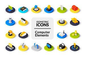
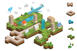
7. Isometric Design for Icons and Graphics
Coming from a few years of flat design, it seems like the web design industry as a whole is making a conscious effort to distance itself from plain visuals and minimal interaction. Isometric graphics, whether static or animated, have become a way to add dimension without incurring in excessive load times. Isometric art is a way of projecting flat objects with layers in order to depict a 3D object on a plane.
Check out some examples of unique isometric icons that have caught our eye this year:
8. Bold Modern Serifs
My personal favorite, this trend is reminiscent of the golden era of print advertising. If you've ever seen those full-page ads Ogilvy used to place in newspapers, the bold modern serif trend will strike a nostalgic chord.
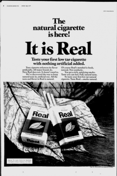
Truth be told, perhaps no other font category can convey the classic, everlasting presence that a transitional or modern bold serif can. We simply associate these font families with the evolution of the printing press, the birth of so many influential print publications, and a time when copywriting was incipient — and perhaps all the more inventive.
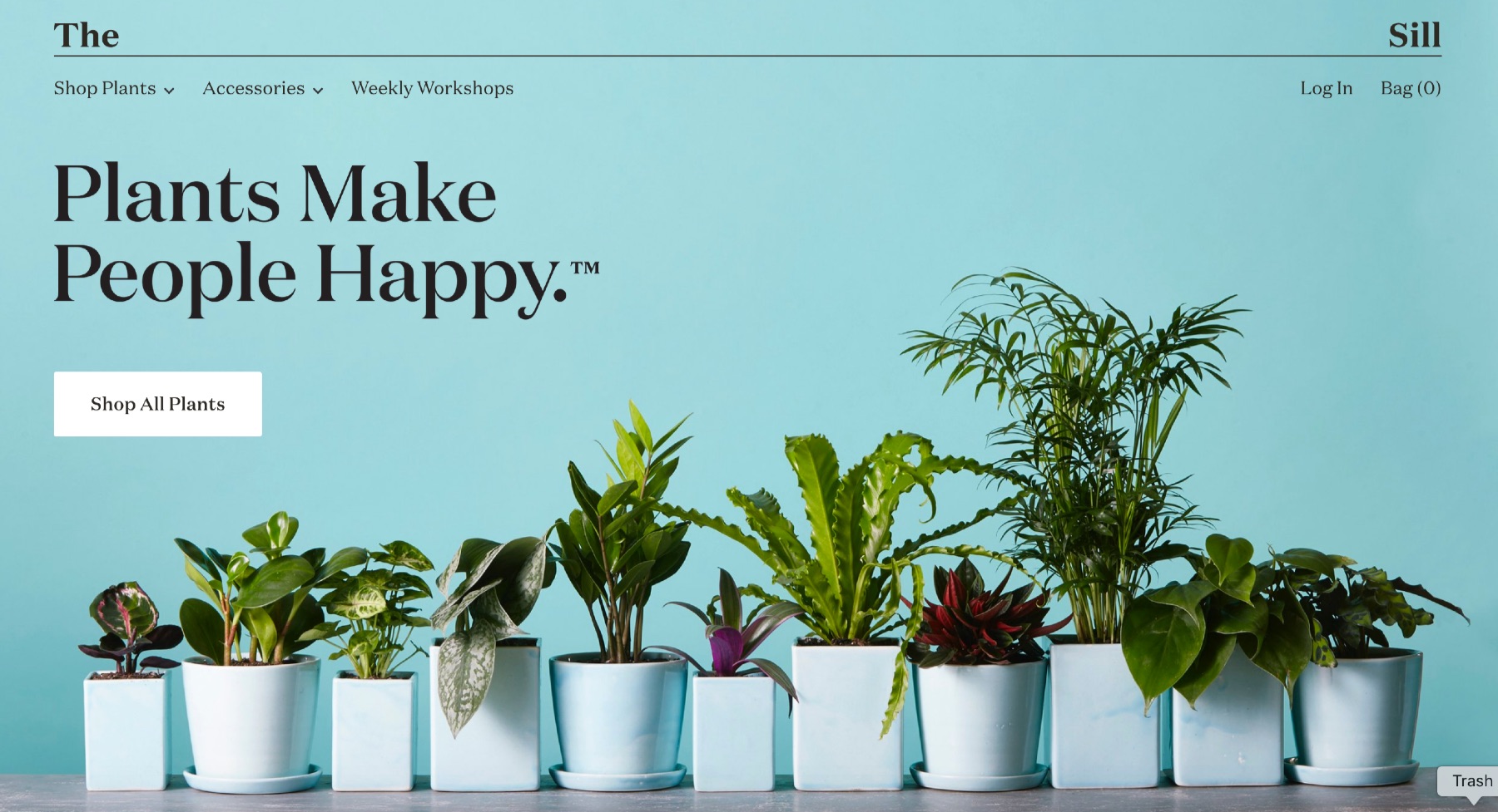
A modern serif font in use on The Sill's website
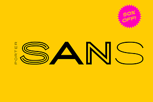
9. Wide Sans Serifs
Another typography trend to watch out for. There's a recent revival of extended sans serif typefaces with wide letters, drawing inspiration from Italian design in the early 1920s or Swiss grotesque styles around the 1950s. Here are some examples of fonts drawing such inspiration from the marketplace:

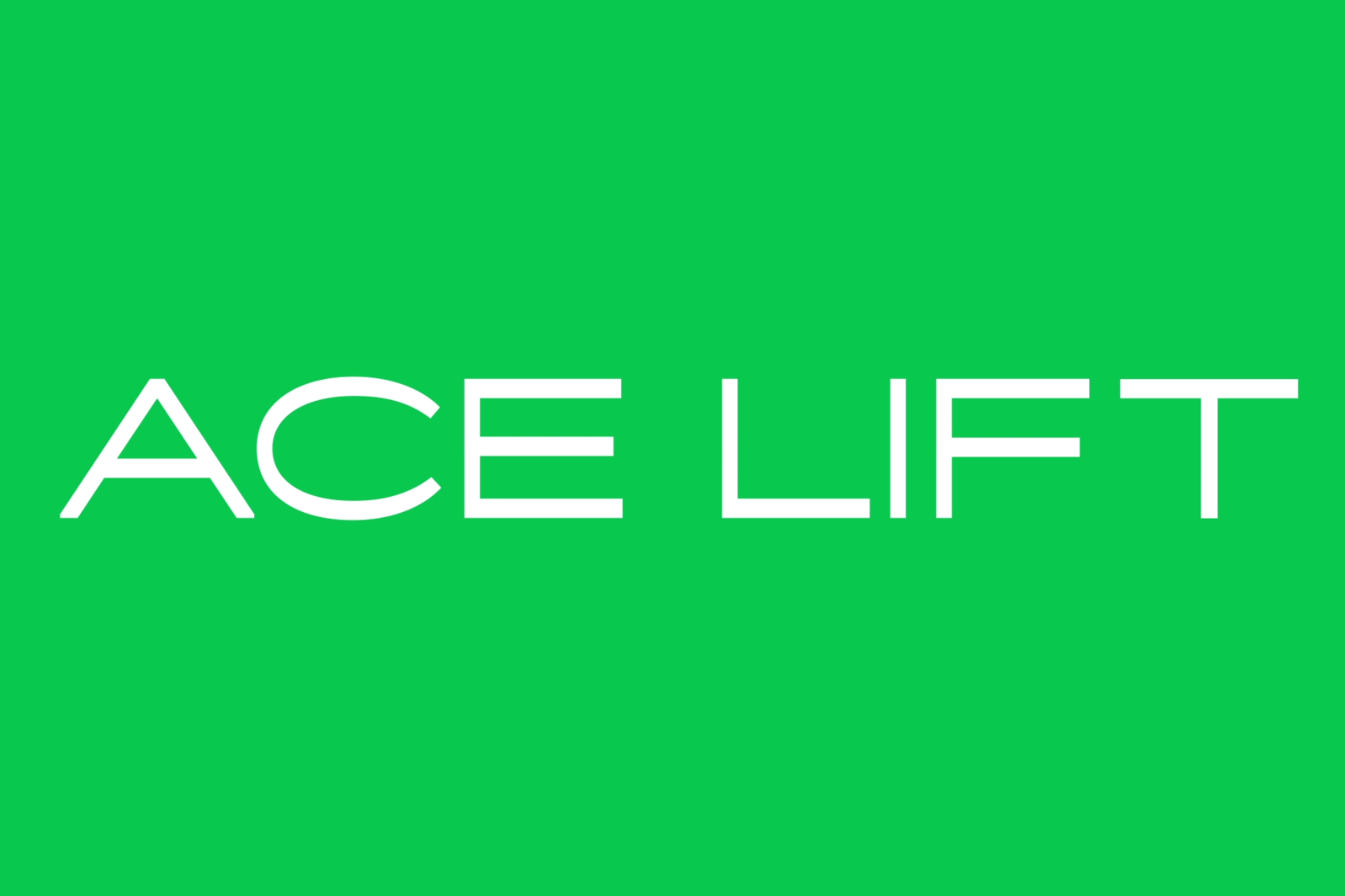
Ace Typeface, developed by b.a.-b.a. in France.
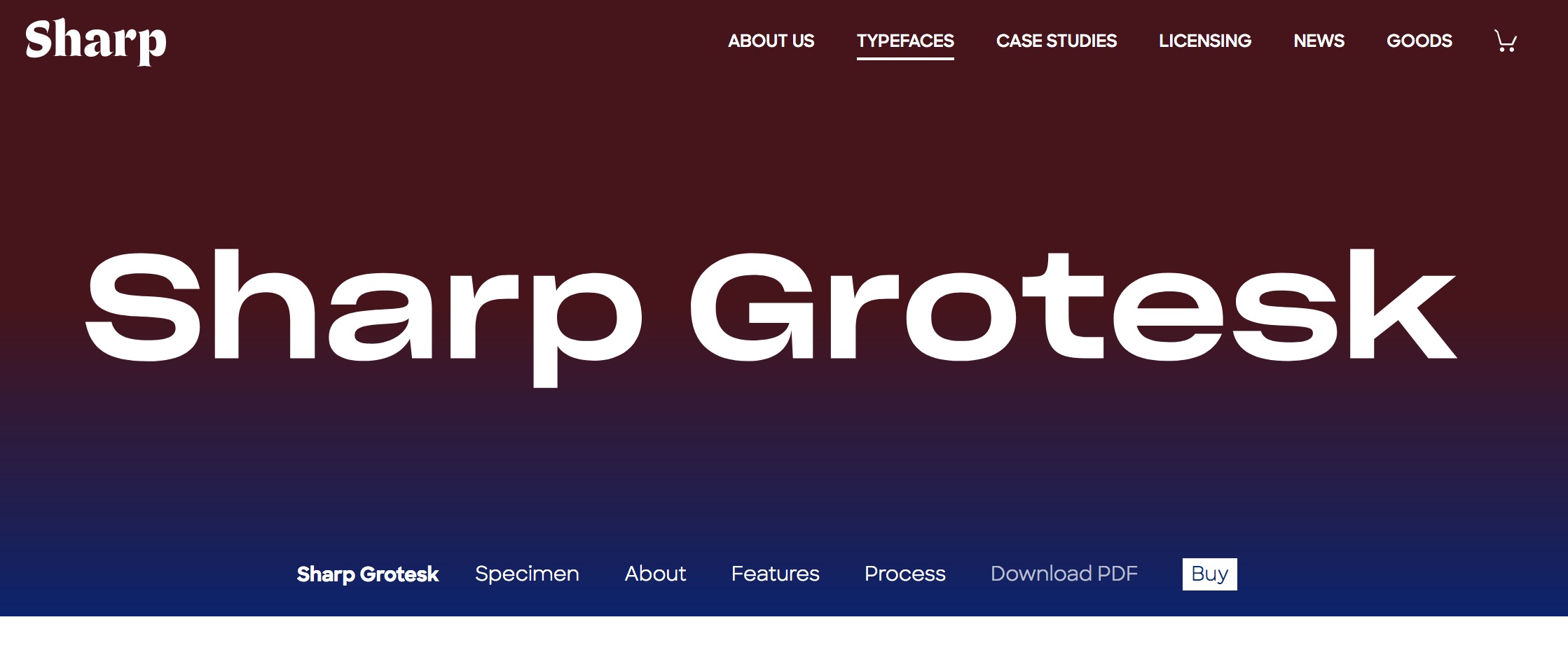
Sharp Grotesk, used in the most recent Dropbox rebrand.
10. Asymmetry, Memphis, and the Organic Grid
This is another one that feels more like a counter-trend. A movement in reaction to decades of constraint to a symmetric grid. Put simply, designers from various disciplines (web, print, identity, interiors, fashion, among others) are rejecting the idea that a layout needs to be contained by a rigid set of guidelines. This trend is evident in websites where the elements escape the page, content modules feature randomly placed containers, and asymmetrical shapes are scattered throughout. Look out for more and more of this rebellious style, which is also inspired by the Memphis design movement of the 80s.
Campaign Monitor experimenting with the grid.