Design Trend Report: Hollywood Regency

Hollywood Regency—otherwise known as Hollywood Glam or Regency Moderne—is a design trend based on the opulent glitz and glamour of Hollywood’s classic golden age of film, roughly from the 1910s to the 1960s. Inspired by the lavish estates of movie stars from that bygone era, Hollywood Regency also overlaps with other design trends that evoked a timeless American style back then, such as Art Deco and Midcentury Modern Design.
What makes this style stand out, besides its retro throwback to Hollywood’s heyday, is its emphasis on bold colors that also contrast nicely with each other. The end result is a take on aesthetics that’s vibrant and high-class, but also comfortable. Not limited to its Southern California roots any longer, Hollywood Regency has turned into an exciting niche of design that challenges both creatives and their audiences and clients.
Here’s your close-up of this design trend.
The History of Hollywood Regency
Simply put, were it not for the birth of the movie industry, this style wouldn’t be around today. However, because of the world’s fascination with American movie-based pop culture, it started to flourish almost as soon as the first silent movies began production and were released to the public.
Of course, the actual movie business had little to do with the growth of this style; it was more the sheer wealth that the movie industry (and the American moviegoing public!) created for its early actors and actresses that allowed them to show off their material riches in their homes and estates. Therefore, it can be said that Hollywood Regency’s roots actually lie in interior and architectural design and specifically with a few designers.
If the name Dorothy Draper sounds familiar at all, that’s because she had a profound impact on early 20th century interior design, and, as you’ll soon find out, Hollywood Regency.
Born into a wealthy family in New York in 1889, Draper was educated at a private school, took annual trips to Europe with her folks, and was generally exposed to the sort of culture and historical styles that would come in handy in her adult life as an interior designer.
After years of decorating her and her husband’s various homes, by 1925, she opened Architectural Clearing House, an interior-design business. Arguably the very first interior-design business in the U.S., it got a name change in 1929, after numerous apartment lobby redesigns that were well-received, when Draper renamed it Dorothy Draper & Company. It was in this decade that she likely coined the phrase “Hollywood Regency.”
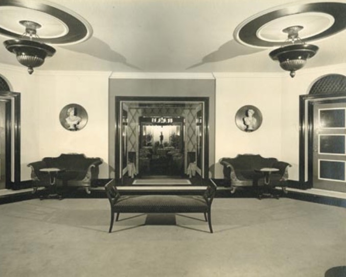 Image Source: Dorothy Draper & Company
In the early 1930s, Draper started her foray into hotel interior design. This was a notable turning point in her career since it marked a step up into the big leagues of interior design and confirmed that more important clients were willing to trust her with their properties. It was also a watershed moment for Hollywood Regency because her work in this scope began to demonstrate more and more the telltale signs of what would become this unique style.
Her various projects included designing interiors for:
- Manhattan’s Carlyle Hotel
- San Francisco’s Fairmont Hotel
- Chicago’s Drake Hotel
- New York’s Sherry-Netherland Hotel
- Rio de Janeiro’s Palacio Quitandinha Hotel
- New York’s Hampshire House Hotel
- West Virginia’s The Greenbrier Hotel
Amid all this hotel design, Draper was also hired to revitalize New York’s Sutton Place, then a series of former tenement residences that weren’t selling as quickly as developers wanted them to. Her work on Sutton Place is especially important because it gives us glimpses into her earliest, public forays into this design trend. When she redid Sutton Place, she had all its buildings painted black with some white trim, and the doors were painted in a lively color; this use of stark contrast would come to be a defining feature of the new style that she was developing and that Hollywood would embrace.
As the 1930s drew to a close, Draper’s unique designs continued to make waves and set themselves apart from the rest of the styles out there. For example, when she devised a decorative plan for the Hampshire House Hotel, she decided to do a complete, top-to-bottom redesign that included:
- Neo-Baroque plaster décor
- Art Deco-inspired mantelpiece surround (thick glass)
- Black-and-white checkerboard floors in the lobby
- Victorian-inspired wing chairs
Noteworthy here is the inclusion of touches that were inspired by the Baroque and Art Deco design movements, as these touches continued to blaze a trail of distinctness for the-then burgeoning Hollywood Regency style, but her vision didn’t stop there. Additional touches included sliding glass doors in bathrooms instead of shower curtains (to show opulence), multi-arm chandeliers, and even floral swags, which contributed yet more flair. With its inclusion of these floral swags, this design trend mirrors Art Nouveau’s use of flowers and plants, though to a much lesser degree.
By revisiting her most memorable interior designs, we can see how this design trend’s penchant for the upscale evolved. From first only designing for her husband’s homes, then graduating to apartment buildings, and then finally owning the industry of hotel design, Draper’s design environments slowly began to get more lavish throughout the years. This explained why she had to respond with such ornate décor to do justice to the sensibilities and expectations of the people who kept hiring her.
For all of her design projects, perhaps it was for The Greenbrier Hotel that she’s most remembered today. A luxurious resort that has seen more than half of all U.S. presidents stay there, The Greenbrier can be considered Draper’s signature work.
After World War II ended, she was hired to give the resort a complete facelift. During the war, the resort had to be used as a military hospital—a perfect example of the massive American mobilization that helped to win the conflict.
By now in her 50s, Draper was firmly established as America’s most well-known interior designer. Nothing was off-limits to her: She redid the interiors as well as smaller details like the staff uniforms, the menus, and even matchbox covers. Overall, the infused bold colors, classical and historical touches (drawn from all her trips abroad as a young girl with her family), and some modern touches, for a true sense of balance.
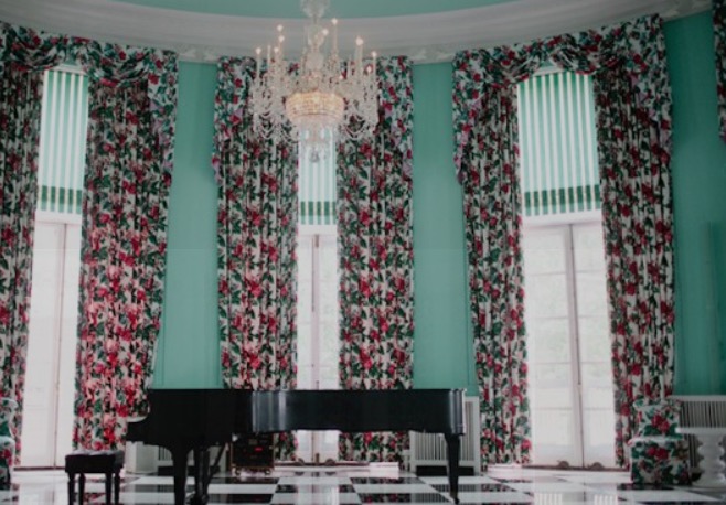
Image Source: Dorothy Draper & Company
She remained the head designer of the Greenbrier until the 1960s.
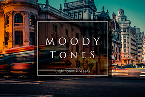
For an in-depth look at this design trend, have a peek at some of our digital assets that epitomize this lavish style:


While this “Draperization” was happening in the interior-design landscape in America in the first half of the 20th century, which would set the tone for the lavish interiors of the homes and estates decorated in Hollywood Regency, something architectural was happening simultaneously.
Hollywood needed visionary architects to build them their million-dollar homes in the first place, and a couple of notable names pioneered this style as far as the exteriors of homes.
First among them was John Elgin Woolf, a Southerner who moved to California in 1936 with the hopes of making it big as an actor. When that didn’t pan out for him, he instead smoothly transitioned to building homes for Hollywood’s rich and famous of the industry’s Golden Age, his degree in architecture proving quite handy.
Eventually recognized as the architect to the stars, Woolf’s early connections through George Cukor, Gone With the Wind’s director, were vital to him landing opportunities to design homes for movie stars. Woolf’s approach to design was revolutionary for its time, combining:
- Modernism
- Greek revival architecture
- 19th century French architecture
The end result was what we now know as Hollywood Regency.
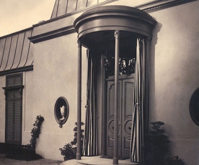 Image Source: James Colin Campbell
Operating mainly in the Beverly Hills and Bel-Air neighborhoods of Los Angeles, Woolf designed residences for a who’s who of actors and actresses:
- Errol Flynn
- Spencer Tracy
- Cary Grant
- Barbara Stanwyck
- Katharine Hepburn
- Ricardo Montalban
The other architect who helped to popularize Hollywood Regency was Paul Revere Williams, whose list of works is long and renowned. Williams, an African-American, overcame racial discrimination (he had to learn to create upside-down drawings because he had to sit across the desk from white clients and then show his illustrations right-side-up) via hard work and determination and went on to become a designer for the homes of Hollywood A-listers like:
- Frank Sinatra
- Tyrone Power
- Lucille Ball
- Lon Chaney Sr.
Besides private homes, he also designed or contributed to the designs of various buildings all over L.A., such as:
- The Shrine Auditorium
- The Los Angeles County Courthouse
- The Beverly Hills Hotel
His understanding and mastery of design styles like Mediterranean, Regency, French Country, French Chateau, and Tudor-revival made him an in-demand designer.
mage Source: Paul R. Williams Project
In summary, the combined style sensibilities of interior designers like Draper and the architectural wizardry of creatives like Woolf and Williams made for a powerful one-two punch that established the Hollywood Regency movement in wealthy people’s homes and buildings throughout the first half of the 20thcentury.
The Characteristics of Hollywood Regency
As you gathered from the storied history of this movement, it emphasized style touches that were ritzy, but stopped short of going into full-blown excess by virtue of its strong, underlying design principles that made the most of contrast and color best practices.
Here are some of the telltale characteristics of this design movement:
- Glass accents
- Metallic accents
- Bold colors (like pinks, yellows, turquoises)
- Neutral colors (blacks and whites)
- Contrast (both in colors and patterns)
- The promotion of opulence and glamour, yet in a tasteful, not gaudy, way
- Mirrored, chrome and lacquered finishes
- Modernity
- Occasional asymmetry and imbalance
- Textures and patterns (such as checkerboard patterns)
- Floral designs
- Animal prints
- Zigzag and criss-cross designs
- Sunbursts, especially for mirrors (also popular in Art Deco designs)
- French mansard roofs (architecture)
- Oval windows (architecture)
- Doric columns (architecture)
The beauty of Hollywood Regency is its confidence in taking from other design trends to create its unique style. For example, its flashes of decorative splendor have a lot in common with the Late Baroque or Rococo style, which is almost theatrical in appearance due to its grandiosity. Its use of metals and glasses in its décor overlap with Art Deco and even Futurism, in that you have the presence of a semblance of technology in Hollywood Regency designs. Finally, its floral influences are similar to trends like Scandinavian Design, which borrowed more heavily from nature.
Of course, the grandness and luxury of a classic Hollywood movie set is essentially what this design trend goes for, too, both in interiors and exteriors.
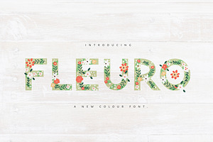
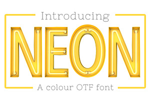
Hollywood Regency in Graphic Design
While this style isn’t traditionally associated with graphic design, creatives from all over the world have taken its characteristics and applied them to visual communication, whether in advertising or digital assets. Here are just some examples:
Gold White Mod Geometry
Capturing the essence of this movement, this digital asset is a collection of 10 patterns that epitomize the glitz and glamour of design in Hollywood. Not only are its golden colors reminiscent of Oscar gold and the opulence of movie-star estates, but the intricate and interesting textures evoke what you might’ve seen as accent pieces in the homes of Spencer Tracy or Cary Grant.

Great for all sorts of design projects, this set features editable files that you can customize to your liking, with creativity being the only deciding factor. Use this set of pattern for projects like:
- Scrapbook paper
- Web design
- Blog layouts
- Gift wrap
Hollywood Walk of Fame Star
The most iconic symbol of the entire movie industry, a star on the Walk of Fame pretty much means immortalization in pop culture. What it means in design is a feast for the eyes.
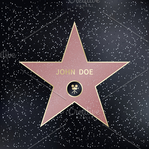
This digital asset mimics the captivating patterning of real-life Walk of Fame stars, which are inlaid into a terrazzo background and made of terrazzo themselves. The speckled texture in the black, charcoal background lend a timeless feel to this graphic, while the pink color of the star and its yellow outline perfectly align with some of the more popular color schemes of this Hollywood Regency.
This vector illustration is ideal for a whole host of projects, from web design to print materials.
Hollywood Glam Bridal Shower Invite
There’s nothing like a touch of gold to communicate the luxury of an invitation. In the case of this InDesign CC file, its elegant typography, lines and textures hit on many of the ritzy design sensibilities of Regency Moderne. Featuring both script fonts and sans serifs for effortless readability, this bridal shower invitation uses the contrast so famous in this style to present an invitation that no guest can refuse.
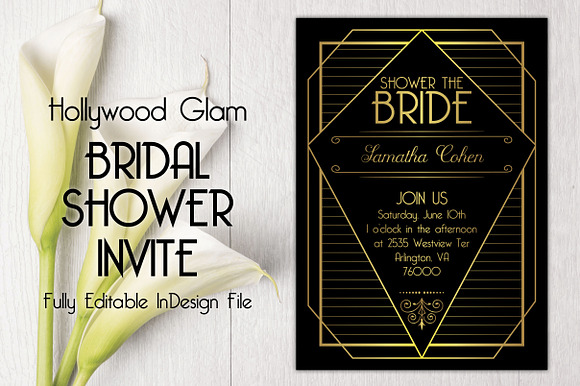
This editable asset allows designers to personalize it to their specifications.
Hollywood Regency in Web Design
Due to the longevity of this style, it’s made its way into web design, with various, stellar examples all over the web.
Instagram’s visual-centric platform is the perfect pedestal for this design movement, as users have gotten in the habit of sharing their most glamorous Hollywood Regency pieces. Just do a quick search on the platform for this design style, and you’ll see more than 100,000 results. Not bad for an aesthetic that started out in the movie-star estates of Southern California around 100 years ago.
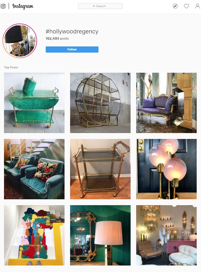 Image Source: Instagram
From eye-catching turquoises and metallic- and glass-infused pieces to ornate sofas and the warmest hues of pink you’ve ever seen, this design movement has won a sizable fan base on Instagram.
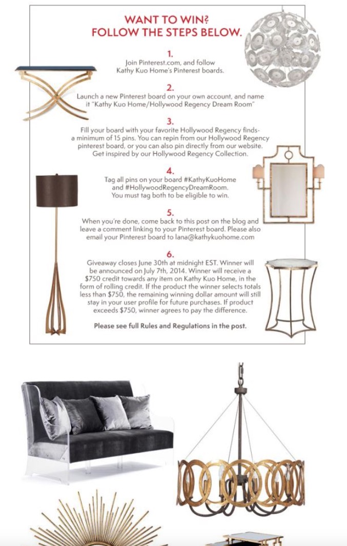
Kathy Kuo Home Pinterest Contest
Boutique furniture and home décor store Kathy Kuo Home features a contest based on this style on its Pinterest contest page. There, the instructions on how to enter and win are adorned by beautiful examples of furnishings and accents that exude the rich ornaments of Hollywood Glam.
 mage Source: Kathy Kuo Home
You’ve got your classic sunburst mirrors, metal- and glass-trimmed furniture, plush sofas, and unforgettable chandeliers.
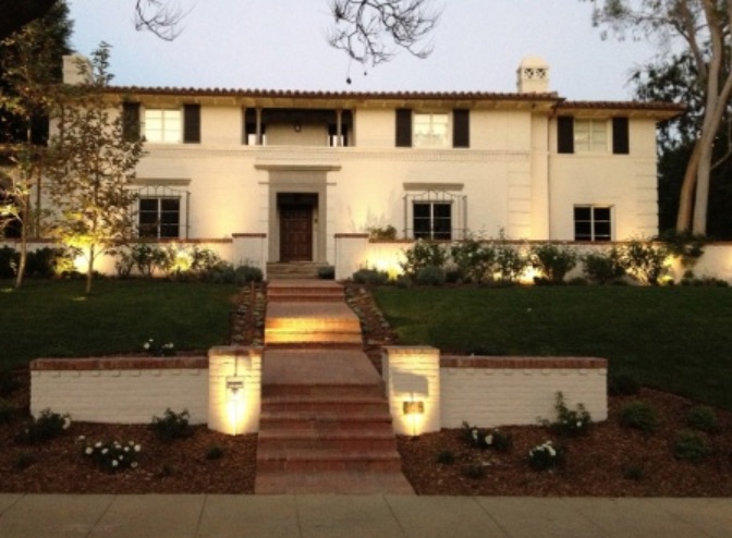
Hollywood Regency in Interior Design and Architecture
This is really THE category for this movement, as it originally sprung out of the silver screen’s influences and its actors’ and actresses’ mansions in the early days of the burgeoning movie industry. Here are some memorable examples.
The Greenbrier Hotel
Dorothy Draper’s signature project, the Greenbrier just oozes luxury, both inside and out. A study in the trappings of power and opulence, it sits in West Virginia and used to be the destination of many U.S. presidents.
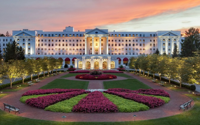
Image Source: USA Today
The hotel immediately takes visitors’ collective breath away with its majestic façade: a historical-looking building adorned with regal ornamentation, held together by immaculate columns, and finally complemented by pink-and-green landscaping that evokes the classic colors of this design trend.
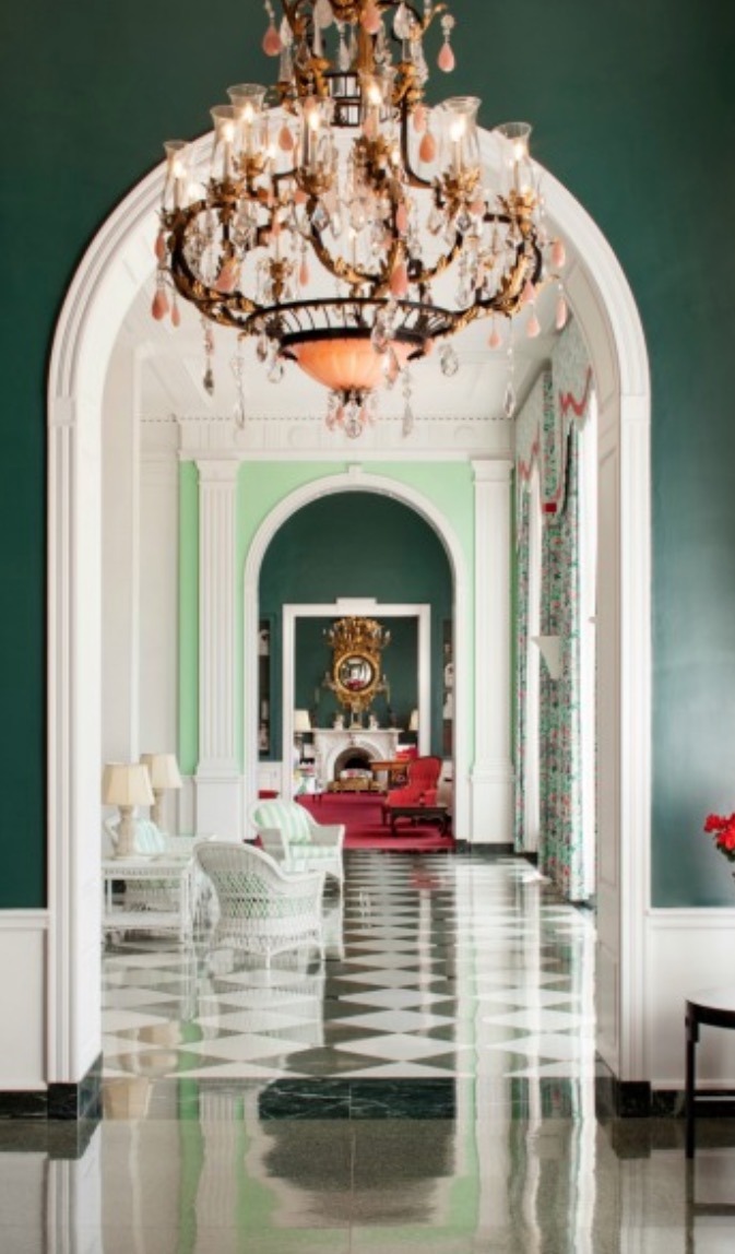 Image Source: Home Journal
On the inside, the hotel boasts more luxurious design touches, such as chandeliers, winding staircases, murals, bold and explosive colors, and checkerboard floor patterns.
Paul Lynde Residence
Formerly owned by Errol Flynn, Paul Lynde, and musician Moby, this home was designed by John Elgin Woolf. Its oval windows, light-and-dark color scheme, intricate gate patterns, and historical and ornate touches symbolize everything about Hollywood Glam that makes this such an enduring style.
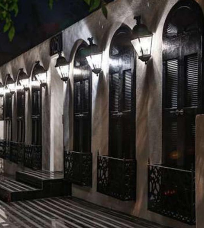 Image Source: John Elgin Woolf
Located in the hills just above Sunset Boulevard, this home comes with a trapezoid-shaped pool as well as a cabana.
Saks Fifth Avenue, Beverly Hills
Designed in party by Paul Revere Williams, Saks Fifth Avenue in Beverly Hills was the company’s first foray into Southern California. On the outside, it features heavy Art Deco influences and a broad, expansive feel that mimics a sprawling mansion.
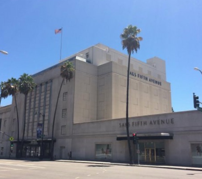 Image Source: Los Angeles Conservancy
On the inside, Williams designed it to be more intimate for customers of the brand, with each area having a nearly enclosed look and feel to prevent the chance of distraction as much as possible for store visitors.
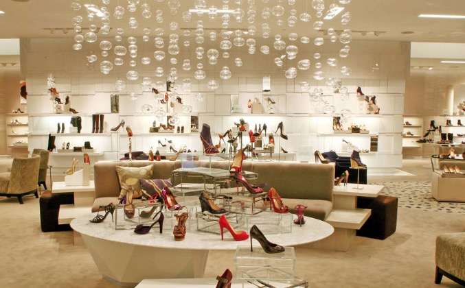 Image Source: Time Out
Each room enjoyed a luxurious atmosphere via being bathed in soft lighting, with a mix of hidden floor lights and indirect lamps illuminating the high-fashion products.
A Timeless Classic
Pop culture is always going to be fascinated with the movie-star lifestyle, which is why Hollywood Regency endures to this day, whether that’s in graphic design, interiors or how buildings are designed. While this style is glamorous and on the high-end of things, it is nonetheless accessible based on its strong use of simple design principles.
Its combination of loud, vibrant colors and eye-catching textures mean that its distinct design philosophy can be captured by anyone.