
No designer is an island. Regardless of how much you like or dislike to follow trends, the world of graphic design is continuously influenced by advertising, marketing, architecture, popular culture, and technology patterns. Because our role is to communicate brand messages in all kinds of industries, their evolving ideas about aesthetics and visual appeal end up infusing our work. No designer wants their work to be perceived as derivative, but staying on top of the key themes driving our industry is the only way to be truly intentional about where and how much our compositions depart from certain patterns.
Whether we intend to defy the norm or follow the market's leanings, it's in our best interest to monitor the changes, advances, and paradigm shifts around us. Throughout this article, I'll introduce some of the most compelling graphic design trends we expect to see more of in 2020, the ideas behind them, and some inspiring examples.
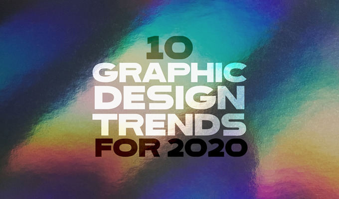
1. Brutalist Defiance
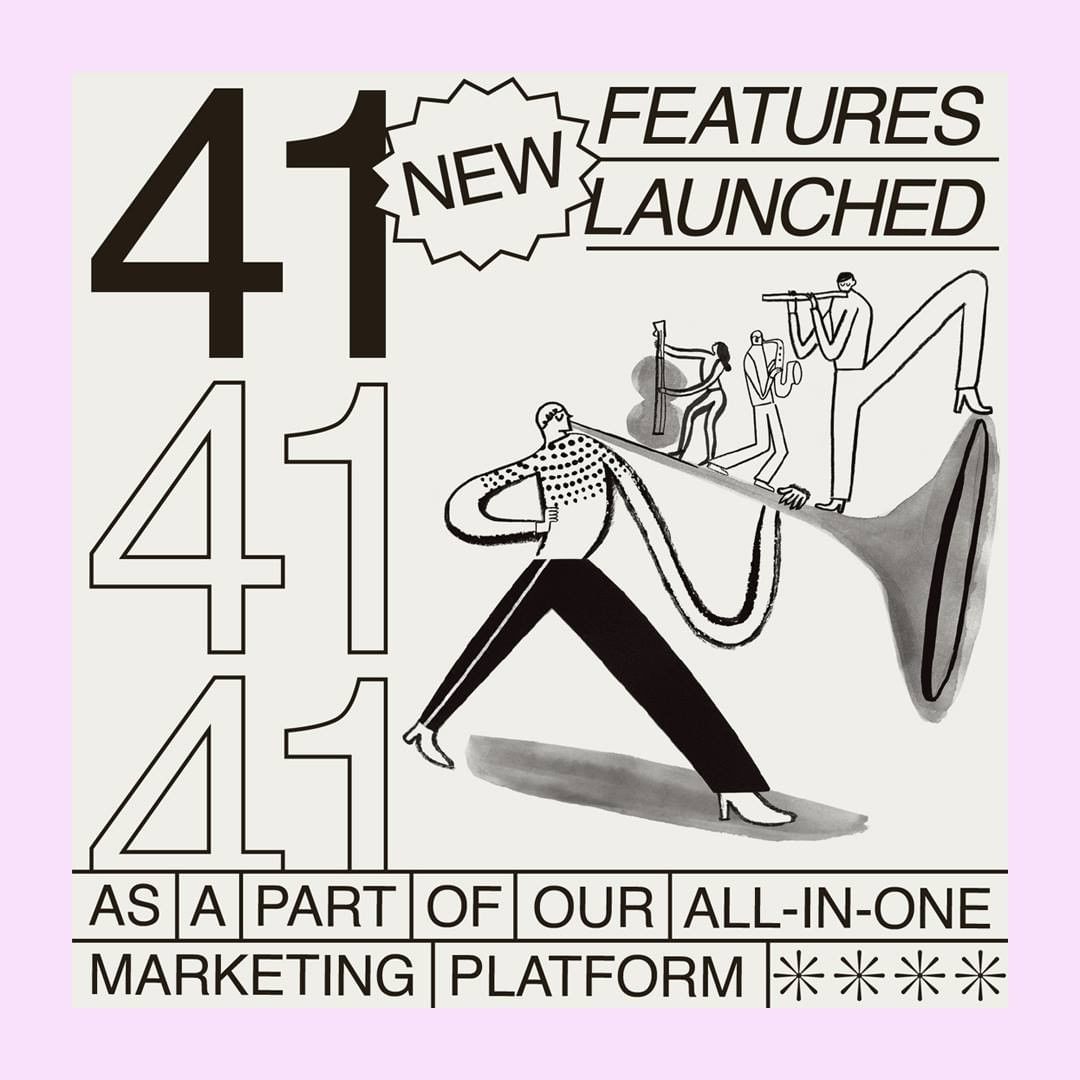
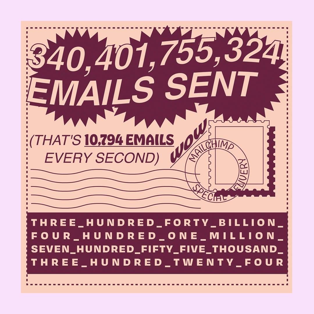
Classic design training involves learning about grid systems, well-spaced layouts, and type hierarchy. Over time, we assimilate the should bes of graphic composition and eventually internalize them to a point where they become part of our process. However, there's a sense of artistic freedom that comes from breaking the rules, and that's exactly what 2019 was all about. Defying the grid, placing text in unstructured ways, experimenting with spacing, applying high contrast color palettes, and embracing chaos are all signs of a movement towards the unexpected. Mailchimp's Year in Review for 2019 is this modern version of Brutalism in full display:
Brutalism originally emerged in the world of architecture, but has made its way into the field of graphic design via the same aesthetic principles originally applied to buildings: rawness, simplicity, and boldness. The Nielsen Norman Group highlighted its appearance in late 2017 and the style has since attracted many more designers. If you'd like to learn more, we published an in-depth trend report about Brutalism here. For some good examples of the trend, check out Brutalist Websites.
2. Environmental Awareness
Many in the creative industry coincide in describing 2019 as a year of rebellion. Consumers around the world questioned the impact of certain materials and processes on the environment, urging brands to redesign their products. To help market these new eco-conscious options, designers explored sustainable packaging and cause branding like never before. Plastic is being rejected in favor of biodegradable materials like paper, which opens endless opportunities for typographers, pattern designers, and illustrators.
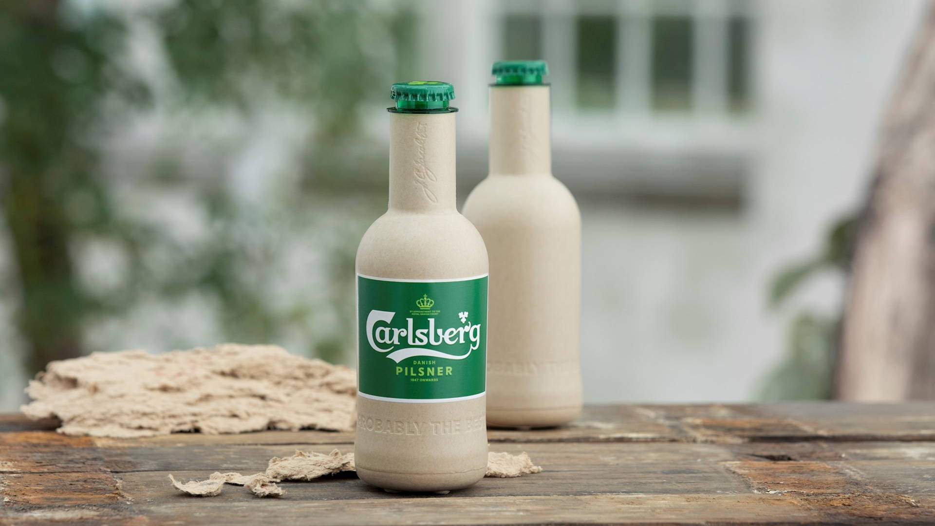
Carlsberg is currently working to make a 100% bio-based, polymer-free bottle for its beer.
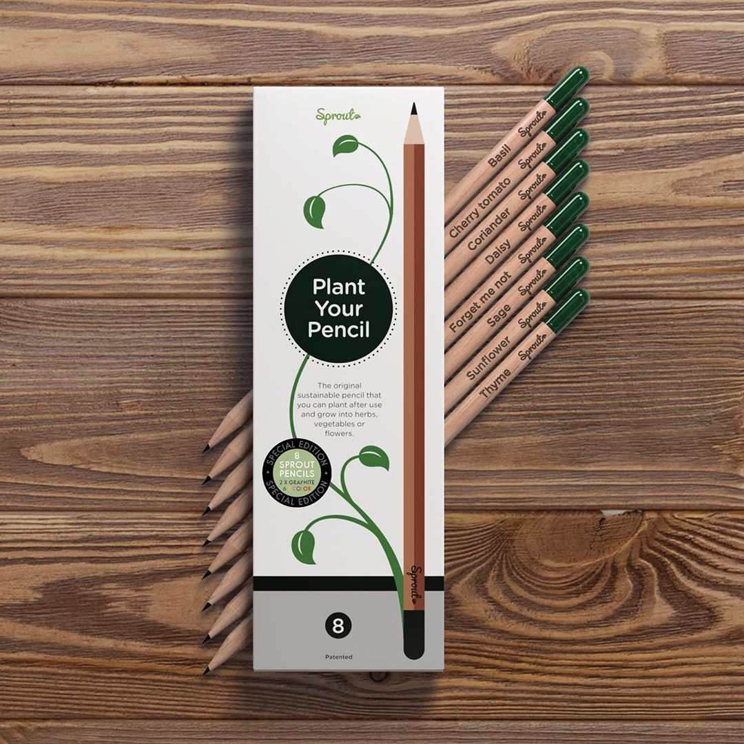
Brands like Sprout are going one step further, creating functional bio-packaging that you can actually "plant"
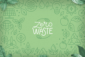
In response to this elevated environmental awareness, the market has also developed certifications to signal brands' commitment. These badges, symbols, and related packaging elements wimll become even more important in 2020. We've seen many ready-to-use templates on Creative Market designed exclusively for that purpose:
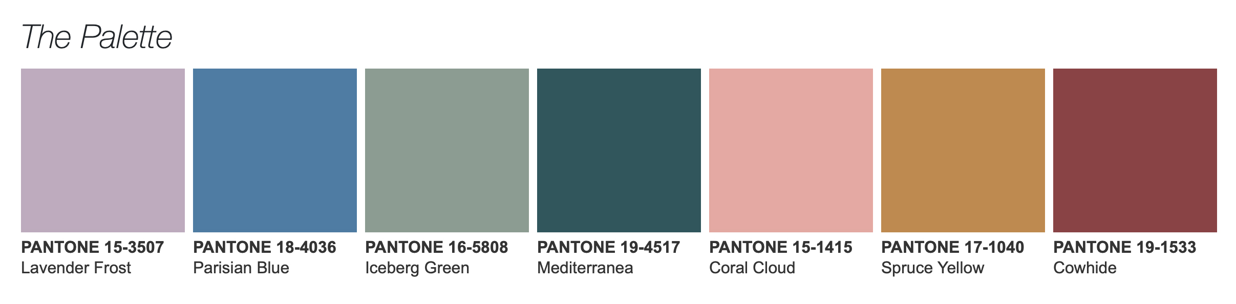
Pantone recognized this renewed sense of awareness in the fashion industry with a palette called "Eclectic Folk". The earthy hues are inspired by natural dyes and are meant to remind us about the origins of the fabrics, materials, and labor involved in the items we buy.
3. Cultivating Wellness
Wellness, mental health, self-care: 2020 is all about seeking a slower, more balanced life. The implications for designers are widespread. Everything from colors to textures to layouts will reflect the ideal of inner peace. Themes like tea, yoga, apothecaries, and essential oils will continue to inspire print and web design in response to this global trend. The balance we aspire to within ourselves will also reflect in the compositions we create, resulting in a preference for minimalism and lighter typefaces.
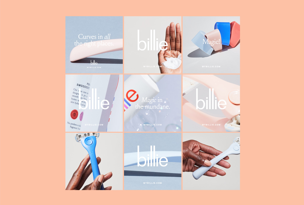
Designer Noemie Le Coz's work for Billie
A 2019 study on wellness branding showed that American and Finnish consumers use self-care practices as a way to express who they are, what they value, and ultimately "brand" themselves a certain way. As this behavior becomes more generalized, we should expect to see more products and services that offer this type of life balance. Because consumers want to communicate their identity through these items, graphic designers will be challenged with innovative ways to brand, package, and communicate the wellness promise.
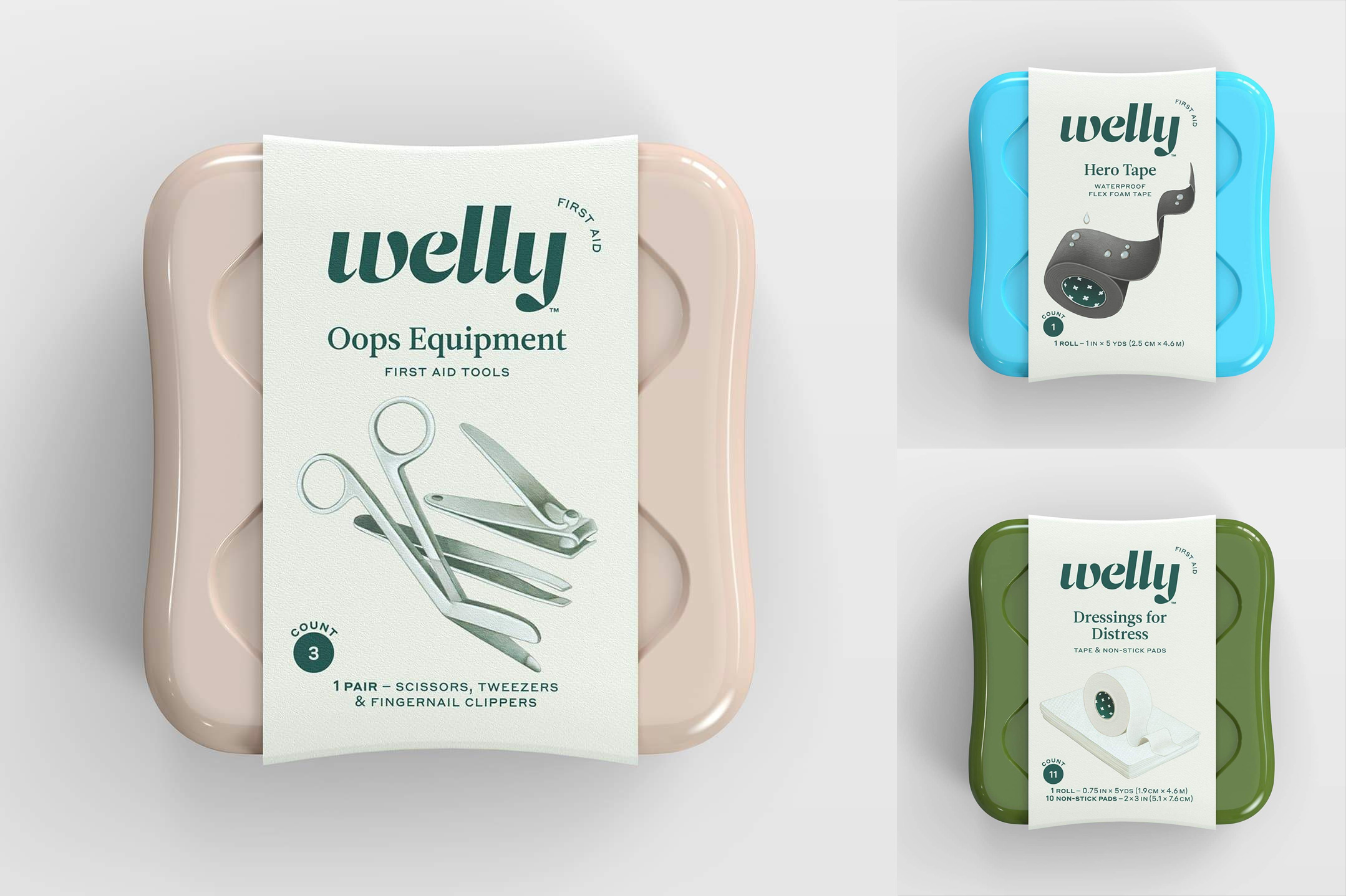
Partners&Spade's work for Welly is a stellar example of how ample white space and a clear type hierarchy can reinforce the ideas of wellness and balance.

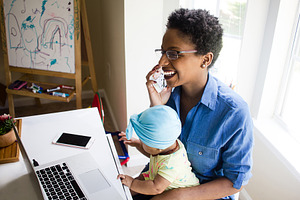
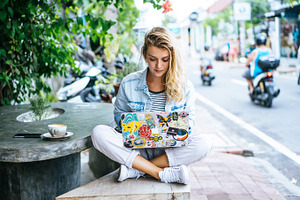
4. Digital Nomadism
As online communication and project management tools evolve, more and more companies will go remote. In doing so, they'll continue to enable the digital nomad lifestyle, a rising trend in the last few years that is going nowhere in 2020. Graphic designers are working from wherever inspiration strikes, reflecting the geographical, human, and aesthetic diversity that they're exposed to. Exotic locations, global flavors, rich historical references: expect to see interesting pieces infused with designers' experiences around the world. Here are some motifs and themes we'll see even more of in 2020:
- Botanical graphics
- Folk and artisanal elements
- Raw textures

Many Creative Market shop owners are successful digital nomads, running their businesses from amazing locations around the world.
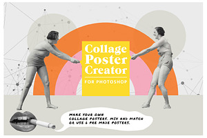
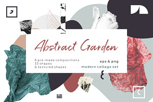
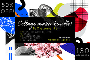
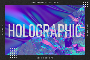
5. Mixed Media Compositions
Perhaps as a reaction to the ubiquitous flat design aesthetic, we've been seeing an outburst of layered compositions that play with texture, volume, and analog materials. There's a certain naiveté in this style: objects are laid out spontaneously, in collage-like fashion. Common elements include torn paper edges, fabrics, cutout text, paint strokes, and photos. In some cases, these are combined with digitally designed layers, resulting in compositions with interesting visual depth.
Andy J. Miller captures this style well with the illustrations he created for YouTube's Contributor Program. He brings together hand-drawn strokes, dry brush finishes, and solid shapes.
The explosion of Procreate has also made it easier to add layers of texture and various artistic brushes to otherwise flat compositions.
A clear example of this trend is the Tumblr aesthetic, a resurgence of 90s grunge motifs that are reminiscent of the internet's early days. Think simpler system fonts paired with vintage photography and pixelated graphics. If you're interested in seeing more examples, we've covered both the Eclectic Collage and Tumblr styles extensively on the blog.
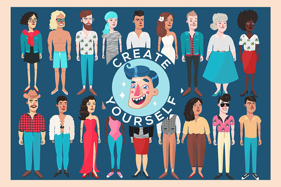
6. Capturing Diversity
Design can contribute to a more diverse sense of representation and help expand our understanding of the things that make us different. These possibilities are particularly interesting in fields like photography and illustration, which continuously shape the mirror with which we look at ourselves.
In this video, Airbnb's Jennifer Hom explains her inclusive approach to product illustrations at AIGA's 2019 Design Conference.
You can also read more about how she incorporates diversity of age, race, disability, religion, orientation, and gender in her work here. Like Jennifer, designers all around the world are recognizing their role in defeating visual paradigms and creating fresh symbols that better represent just how diverse we are. Creative Market shop owners have created entire illustration sets that portray this more inclusive take on character design:
7. Celebrating Authenticity
The last couple of years have been all about embracing imperfection as a natural consequence of being human. Unique flaws, physical differences, and even tech errors are all part of our experience. The desire for more realistic visuals is a reaction, at least in part, to the overwhelming amount of fakeness we've been exposed to in the last couple of years. Design elements like grit, grain, rough edges, and glitch effects can help convey the genuine, imperfect look that is resonating so strongly with consumers.
Rejecting unattainable levels of perfection and staying as close as possible to unedited realities are both strong characteristics of this trend. In social media and other marketing channels, brands are leaving behind excessive skin retouching and sticking, if any, to minimal presets/actions that highlight what is naturally present in the composition.
When it comes to stock photography, customers are looking for non-generic, unique scenes that convey authenticity.

8. Democratization of Type
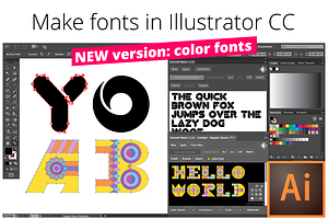
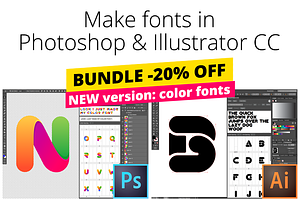
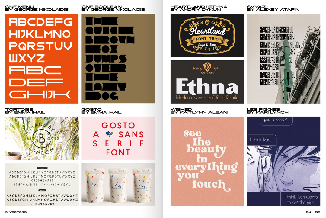
What happens when you launch a font design tool that makes the process accessible to virtually all? That's how tools like Fontself are changing the game for those that are eager to learn about type design, polish their craft, and create their own typefaces, but don't necessarily have hundreds of dollars to spare on software. By removing an important barrier to entry, players like Fontself are opening a world of possibilities for typography. Emerging foundries and independent designers are expressing their point of view like never before, and there's an explosion of new typefaces inspired by references that we hadn't necessarily seen. Because the plugin works directly within Illustrator and Photoshop, detailed display and color fonts are having a moment.
The Fontself team recently launched a book called Typocracy to celebrate some of the most creative fonts built using their tool. You can download it as a free PDF here.
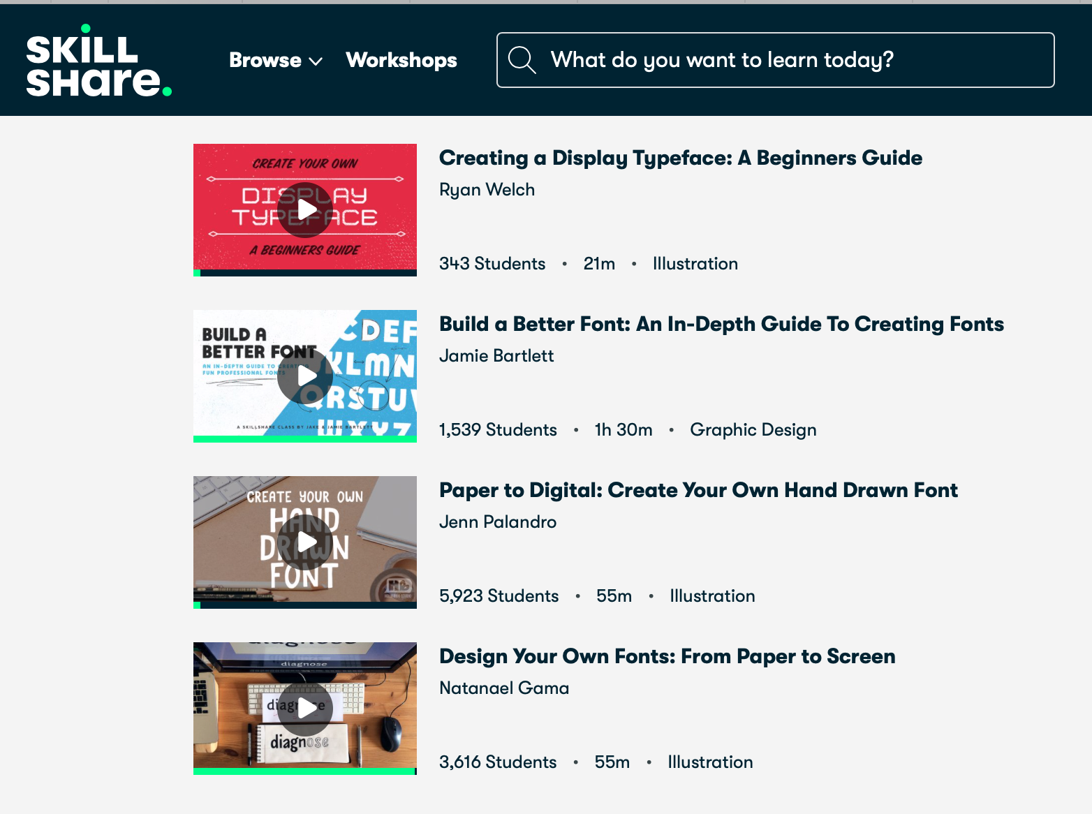
Aside from tools like these, aspiring type designers now have access to a growing library of online resources to learn about this fascinating art and science. Sites like Skillshare offer courses that walk you through a specific designer's method, lifting the veil on a process that hasn't always been this open.
9. Hello 70s
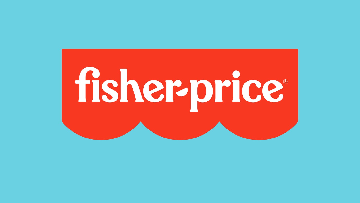
The 1970s are back with their curvy serifs and earthy, sunbaked color palettes. The decade was iconic for a number of reasons, but designers are specifically pulling from its free, casual spirit to add a touch of lightheartedness to their projects. Even typefaces like Windsor, traditionally seen as part of the "Ugly American" vernacular, are being revived in crisp, elegant versions that are perfect for branding projects. Pentagram did just that in their recent rebrand of Fisher-Price:
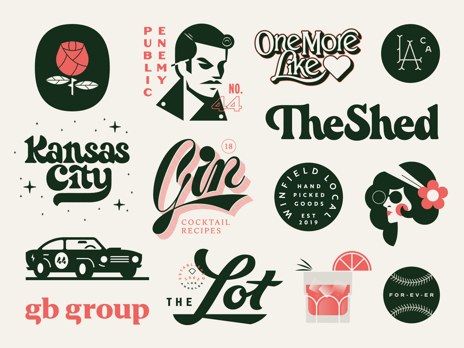
Designer Nathan Holthus displays some of his latest type work, which exudes a distinctively 70s style
There's a slightly different style within this trend that is more minimalistic and restrained in nature. Let's not forget that the 70s were also an interesting time for typography and editorial design. Back then, Letraset sheets were popular among professional and amateur graphic designers, architects and artists, enabling them to create layouts at a time when desktop publishing wasn't widely available yet. Therefore, the 1970s references we're seeing now carry an element of graphic design nostalgia. Sometimes, in the midst of so much digital saturation, we long for a time when certain things were more hands-on.
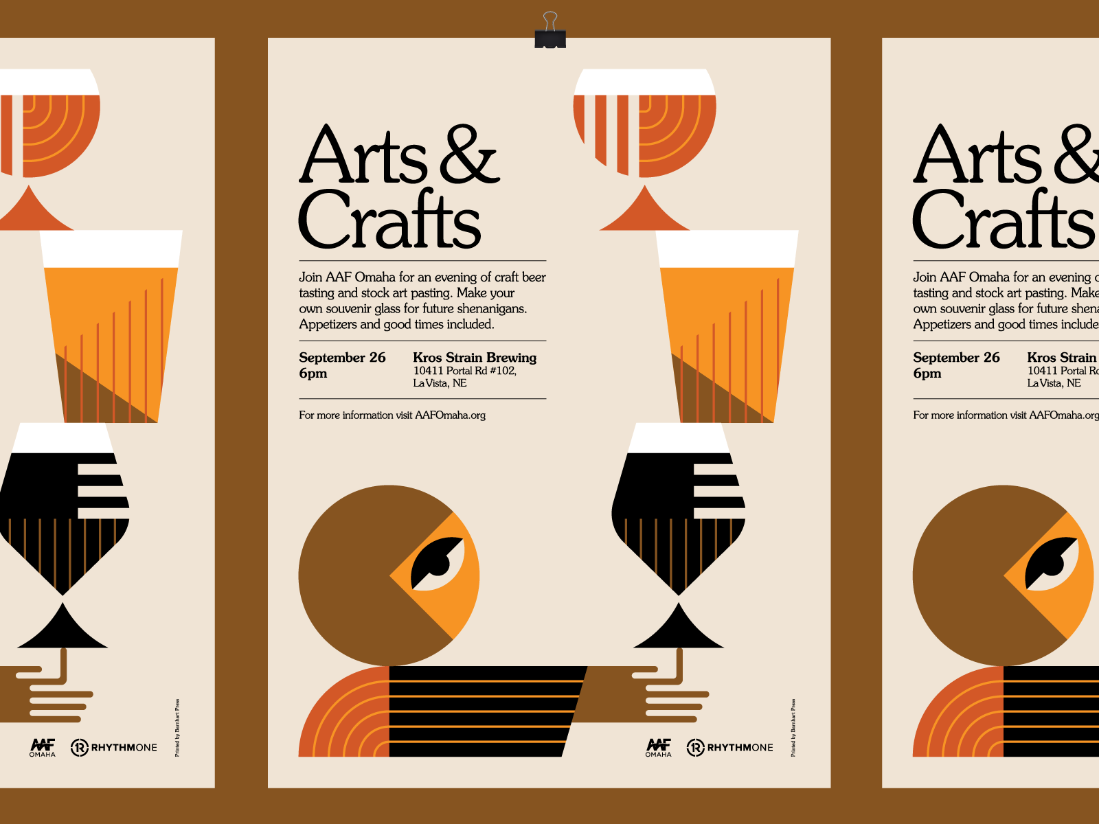
Designer Sean Heisler's work for AAF Omaha Arts & Crafts.
You'll find tightly gridded serif or extended sans serif typefaces against understated, monochrome backgrounds. Compositions are intentionally classic, pared-down, and type-centric. There's an air of retro sophistication that works incredibly well for industries like fashion, beauty, hospitality, and consulting. To define their own style within this trend, many designers are finding references in magazines, type catalogs, or stationery from the 70s.
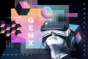
10. Cyberpunk Dystopia
Think ultralight geometric elements, moody color palettes, neon letters, 3D objects, mesh gradients, duotone compositions, futuristic typefaces, and street lights. Cyberpunk, a cultural movement originally popular in the 60s and 70s, has certainly made a comeback. You could call this trend a manifestation of the larger 1970s resurgence we just described, since Cyberpunk originated from the New Wave science fiction movement in the 1960s and 1970s. Authors back then wanted to portray a society that struggled to keep up with technological and cultural change, dreaming up dystopian plots in cyberspace settings.
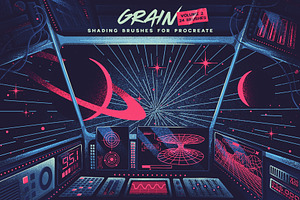
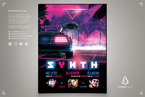
The challenges brought about by the Fourth Industrial Revolution we live in might have triggered Cyberpunk's comeback. Like many characters in New Wave science fiction, we face constant social turmoil in the midst of blended virtual/analog realities where everything is in constant flux. Expect to see more Cyberpunk elements in graphic design this year, since there's a distinctively dark, electronic feel to this style that works well for music, sports, art, and entertainment brands.
What do you expect to see more of in 2020?
As designers, our creative process doesn't happen in a vacuum. It is our responsibility to pay close attention to the cultural shifts and market signals impacting our work. Where and how much they shape it is up to us, but lack of awareness is not an option.