10 Beautiful Typography Trends to Try in 2016
Wowsers, here we are and 2016 is just over halfway done already. Whatever your design goals for the year are or were, we hope you’re well on the way to achieving them. If you’re a typography-loving designer, this article might help you out. We’ve collected 10 type and lettering trends for you to try over the coming months. Take a look, and let us know how you go in the comments below.
Watercolor
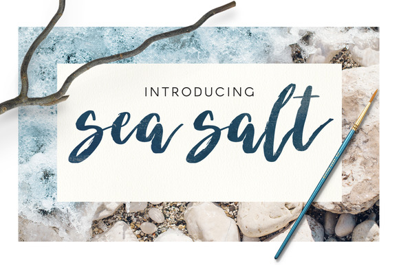
First and foremost, 2016 has been the year of beautiful watercolor type. You’ve seen it everywhere from Instagram posts to t-shirt slogans to wedding invitations. The theme here is laidback and luscious, with bits of color or just black and white.
Sea-Salt (below) is a great choice to get started with this on-trend type look:
Big and bold
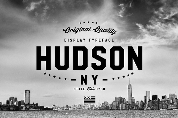
There was a day on the web when all typography had to be tiny. Not anymore. These days full-screen images and big, bold type are much more common. And when done well they can look splendid. Start with an uncompromising, proud typeface like Hudson (below):
Hand-drawn
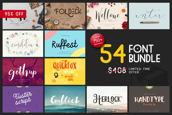
Authenticity is a big must for most brands these days. And one way to offer up a bit of that authentic vibe is to employ some hand-crafted type. The heartfelt nature of handmade lettering connects with most customers, so it’s worth a shot. Typefaces like Reusk, in the bundle below, are an excellent starting point:
Fluorishes
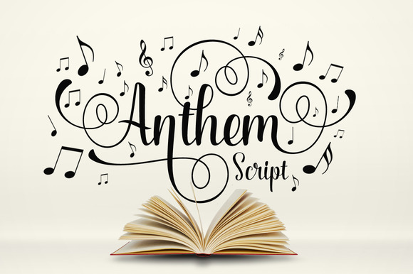
Sometimes it’s nice to be clean and minimal. In other occasions, it’s fun to go all out and craft some type with lots of embellishments and detail. When that ornate, swirl-filled style is what you’re going for, try Anthem, below:
Thin and Minimalist
On the opposite end of the spectrum, sometimes the job calls for a no-nonsense, straight up and down typeface that’s legible and likeable. Naive Line Sans (below) is a hand-drawn font that lets you get a good handle on this popular style:
80s
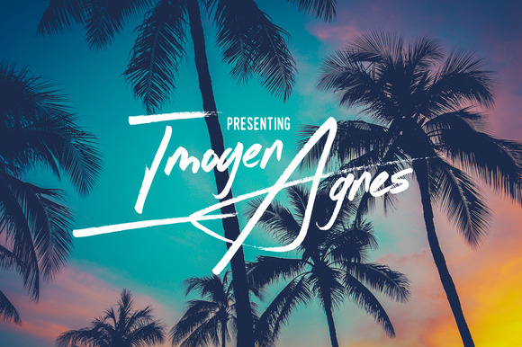
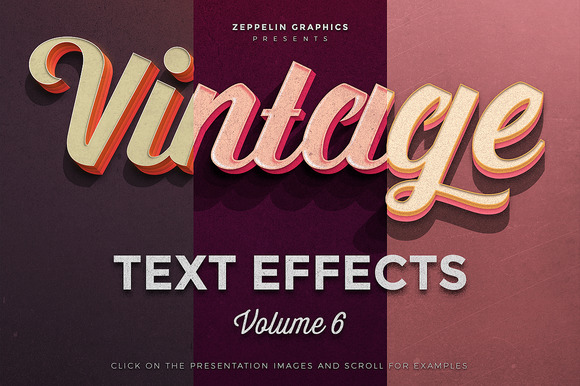
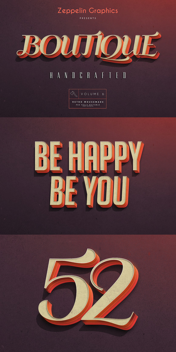
The 80s is one of those decades that seemingly never goes out of fashion. Its cool, carefree vibe is one that’s worth emulating type-wise, and a good place to start is Imogen Agnes (below):
All Caps
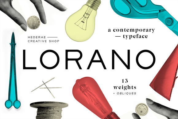
Strong, geometric, and essential is how the creator of Lorano (below) describes his typeface. And who could argue? All-caps typefaces in gigantic point sizes look beautiful when splashed across a full-screen responsive site.
Geometric
There’s something subtle and simplistic about a modernist, geometric font. The sharp, defined lines and consistent angles make for an intriguing headline display choice. Try out Suburbia (below):
Grunge
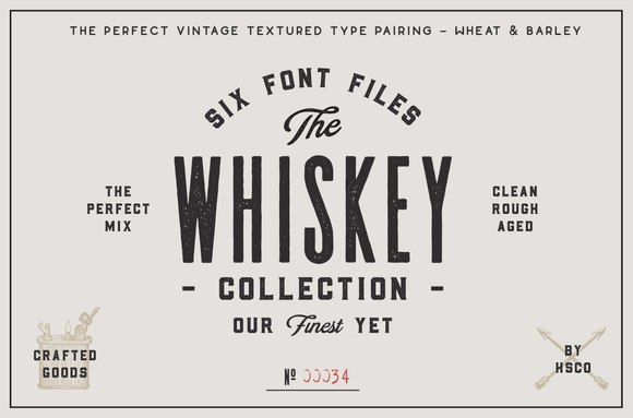
There’s always a place for clean and clear, but sometimes you’ve just got to dirty things up and go grungey. This look goes well with textures, rough edges, and distorted lettering. You can try creating it all by yourself from scratch, or you can save yourself some time with something like the Whiskey Font collection (below):
Script
Lastly, this wouldn’t be a list about 2016 type trends without including one script typeface on the list. Watercolor and flourishy fonts (above) sometimes go with a hand-drawn letterform style, but there’s no shortage of beautiful typefaces here at Creative Market to satiate your script needs. Crystal Sky (below) is light, airy and positive, and the perfect typeface to get your designs looking terrific:
It doesn’t stop there, though. Once you’ve tried a few of these trends out, you can take it to the next level by combining your lettering with some other design elements. We recommend utilising some of these typefaces with other techniques, like those laid out in our ‘20 Photoshop Text Effects That’ll Blow Your Mind’. Or you can get a bit of color inspiration by reading ‘How To Choose The Best Colors For Your Brand’.
Source: creativemarket blog

