Web design is a fast-paced industry and being able to predict top trends ahead of time will give your designs the extra edge that sets them apart. We’ve taken the time to gather up our predictions for the top web design trends of 2016 so let’s dive right in.
What Drives Change in Web Design?
Before we give our predictions, it's important to understand the powerful forces that can change in web design:
Technology: advancements in the available technology and tools, both to access and build websites, largely determines what designers and developers can do.
Users: the prevalent ways web visitors, designers and developers use the available technology, shape the web design landscape and push its boundaries in a forward-looking direction.
Other creative fields: what’s trending in other creative fields like graphic design and fashion, eventually finds its way into web design and vice versa. Creativity survives on mixing and matching ideas to convey emotions and propose solutions.
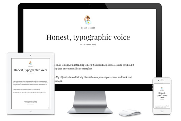
Most of us nowadays are multi-device users and expect a website to just work and look gorgeous, no matter the device we use.
Responsive Web Design (RWD), serving the same HTML code to all devices and using CSS to alter the appearance of the page on the device, is the prevalent technique and what Google recommends to build mobile-friendly websites. Therefore, some of the trends in my list illustrate approaches to web design that are most suited to RWD.
Taking the drivers above as guiding principles, here’s our list of 2016 web design trends.
Minimalism and Flat Design 2.0
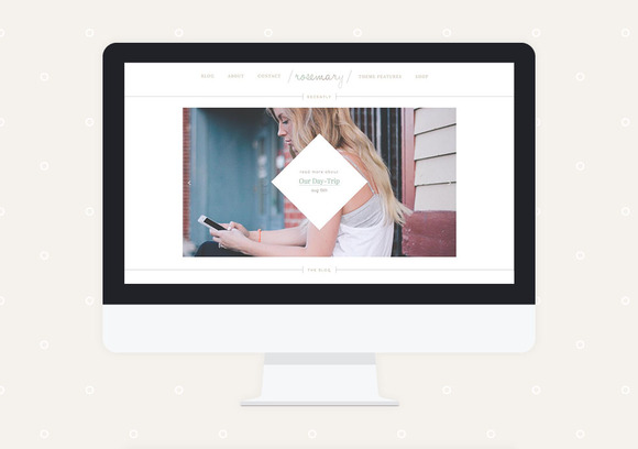
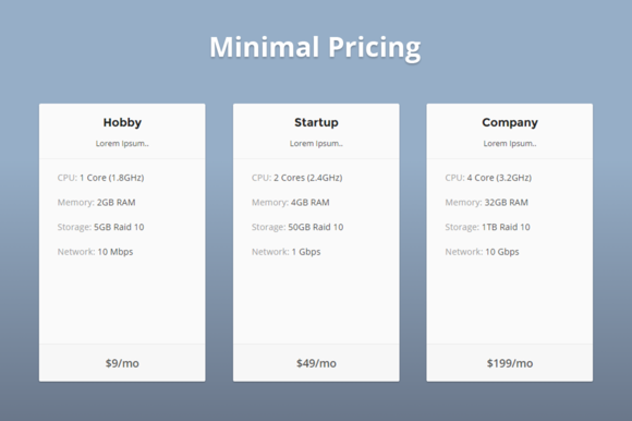
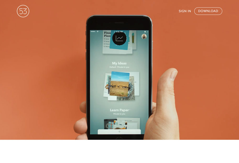
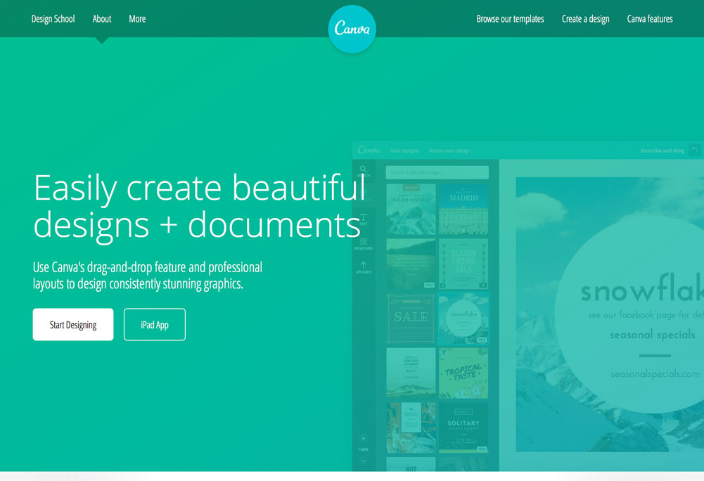
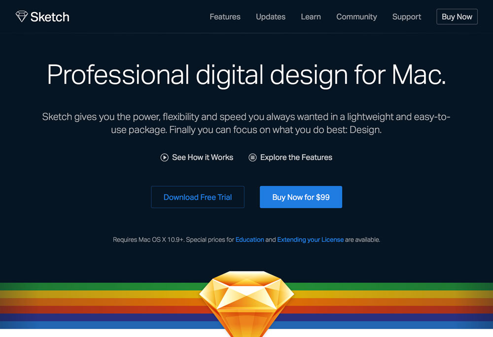
Minimalism has boomed in 2015 and will continue to go strong in 2016. It’s the perfect style for RWD: no clutter, focus on what’s important, clever use of generous white space. In other words: Less is more.
A popular web design approach that goes very well together with the minimalist philosophy is flat design, or its latest incarnation Flat 2.0.
Google Material Design well represents Flat 2.0 principles: the metaphor of the material world with the clever play of shadows, light and movement, gives users visual clues of their interaction with a website.
Fundamental components of print-based design like grids, negative space, bright,vibrant colors and stunning imagery, convey meaning and hierarchy while creating engaging experiences.
 While flat design has so far ruthlessly eliminated any hint of rounded corners, drop shadows or color gradients, Flat 2.0 will start experimenting with minimal texturesand subtle gradients.
Nerdy Vintage Style from the ‘80s
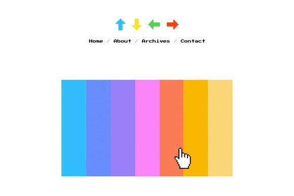
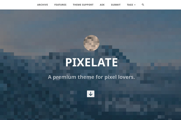
The colorful era of bulky computers and massive cell phones of the early ‘80s and ‘90s is the main source of inspiration for the latest flavor of the vintage trend on the web. Pixelated icons and text, galactic backgrounds and interactive moving stars and planets will be around a lot in 2016 web design.
Interactive Immersive Experiences
As humans, we’re storytellers and lovers of good stories by nature. Thanks to themagic of HTML5 canvas, CSS3 transitions and animations, state of the art JavaScript APIs like WebGL and Greensock, as well as the power of hardware acceleration, storytelling on the web will be even more immersive and interactive.
Browsing the web on mobile devices has made users more accustomed to long scrolls. Website designs that are capable of telling a great story keep users engaged with the content and entice them to keep scrolling to the bottom of the page.
Vibrant Custom Illustrations and Iconography
High pixel density monitors have revealed how standard image formats don't always work as expected on the modern web. Using .jpg and .png files can result in a pixelated look on retina displays, which spoils the aesthetics of a website.
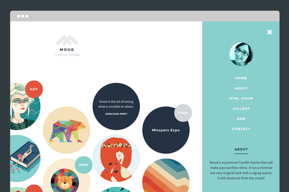
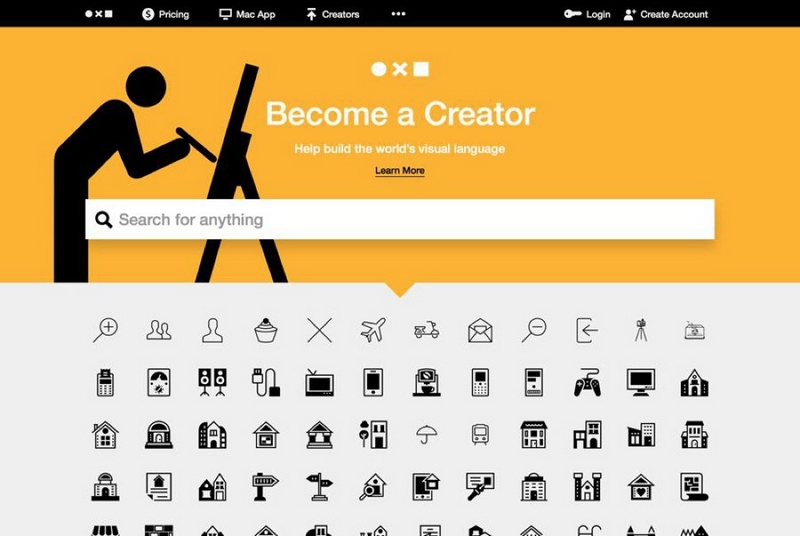
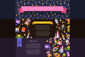
Today, wider browser support for Scalable Vector Graphics (SVG) and easily implemented icon fonts are a fantastic answer to this problem. As a consequence, we’ll see more web designs showcasing colorful custom illustrations, as well as stylish hand-drawn icon fonts and SVG icons that remain crisp and beautiful at any screen resolution.
Typography that Makes a Statement
Typography is a central component of great design and branding, the more so on the Internet, where consuming information is the main goal visitors have as they land on your page.
Thanks to services like Google Fonts and Typekit, which make custom fonts readily available and easy to use on the web, gone are the days when web designers were limited to a few system fonts.
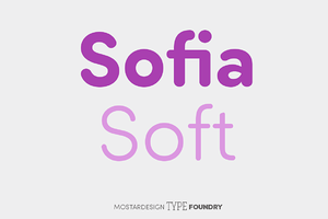
Flat design and minimalism already harness the power of big, dramatic typefaces to make a strong statement. The forthcoming year will see more adventurous use of artistic fonts and creative type treatments on websites.
HD Visual Assets
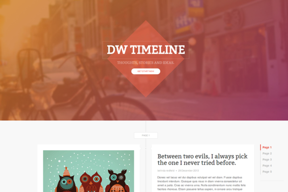
Increased bandwidth, wide browser support of HTML5 video, and ways to serve high resolution graphical assets selectively to devices with retina screens, all add to the popularity of gorgeous HD background images and videos on websites growing even stronger in 2016.

 Wider browser support for CSS3 background blending can very well lead to the application of dramatic artistic effects on images, which are created directly in the browser with a few lines of CSS code.
 Cinemagraphs are also enjoying widespread favor. These are still images with a selected animated portion, usually a subtle detail that aptly draws the attention of website visitors. They’re not new, but the success of “live photos” on the latest iPhones, which look quite close to cinemagraphs, and robust browser support for HTML5 canvas, play a key role in cinemagraphs being listed as a design trend of 2016.
Less Rigid Grids
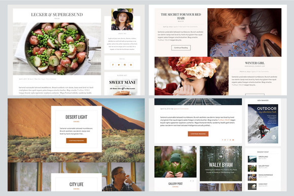
Grid-based layouts, especially Pinterest-like cards layouts, are still very popular today. Minimalism, flat design and popular frontend frameworks like Bootstrap, which make applying grids a breeze, have all contributed to the success of structured, grid-based web layouts.
2016 will see more playful web layouts that deviate from a rigid grid design. Certainly, storytelling and high interactivity encourage this kind of soft rebellion against the classic grid.

 With CSS3 Shapes gaining better support in the near future, it’s my strong wish that you’ll see more designs and web components breaking out of the standard rectangle box shape. Soft edges and rounded contours would enhance the composition of elements and their inter-relation on the web page. A great web design demo like Alice in Wonderland made by Adobe and the French agencyultranoir could become a real production website in 2016.
These web design trends are not self-contained, sealed compartments. Dramatic typography works great on top of HD photos and videos. Immersive storytelling goes beautifully well together with custom typographic elements and colorful illustrations.
As the latest web standards keep gaining browser support, variety and uniqueness in design will be more noticeable on the web and only your creativity is the limit to what you can do in the browser.
