Let's look at some of the trends that will become more important as the year progresses, never too late for read this :
1. Move Over Raymond, Everybody Loves Video
Let’s all agree on one thing first: car karaoke videos should go in 2017. Please? Okay, so karaoke aside, videos are literally flooding the content space. A recent report from Google predicts that 74% of all web traffic in 2017 will come from video. Yes, that’s right. Practically three-quarters of ALL web traffic will be generated through video content. Such an increase is reminiscent of the dot com surge. Back then, if companies weren’t online, they were scrambling to get online. Today, those companies that haven’t adopted video as a part of their ongoing marketing and branding efforts are scrambling to create shareable content. Websites will feature more full-screen glossy videos, as well as bite-sized pieces aimed at educating, sharing, and enticing.
2. A Deeper Understanding of “Mobile-First”
Entire agencies were made overnight under the banner of “mobile-first” design. Mobile traffic has increased so dramatically, though, that mobile-first is no longer a feature. It’s vital. Major brands have already adopted this, but smaller companies are still coming on board. However, what exactly mobile-first means is an area for further study. Simply designing a website with mobile accessibility in mind isn’t an automatic ticket to increasing conversions. Sure, NOT having a mobile ready site already leaves you missing all the action, but simply getting to the party doesn’t mean people will engage. With major dollars for large purchases still done via desktop, developing deeper mobile content and design strategies in order to increase customers will be phase two for mobile-first.
3. Magazine Worthy Typography
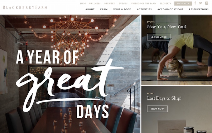 While typography has seen a much-needed renaissance lately, these trends have been most notable offline: think wedding invitations, packaging, window graphics, and magazine spreads. Recently, however, this focus on beautiful type has finally reached the mainstream online community. Pretty fonts really do make a difference, so why should they be confined to their offline counterparts? The lines between offline and online marketing are starting to blur as brands adopt a more holistic approach to their image. Websites featuring bold, custom text will continue to increase with dramatic headers and impactful content blocks. There’s also been much debate about font sizing in general. I think we’ll see a slight uptick in body copy size, but nothing outlandish...yet.
4. Increased Negative Space, A Positive?
The negative space around content blocks has been getting larger. Long, sweeping scrolls have been taking over the internet thanks in large part to our mobile browsing habits. We’re accustomed to giving a big sweep of the thumb in order to find our content. Though once reserved for fullscreen images, more sites are giving ample room to let beautiful typography breathe, as well. For the most part, this trend is great when browsing on any large screen. However, if not downsized appropriately, those long sweeps can seem a bit much on smaller laptops—almost like the information is hiding. I’m generally a fan of negative space, so it will be interesting to see how far designers push this boundary.
5. More GIFs, Please!
When my wife worked as a designer at an agency, it seemed like every other assignment was an animated GIF. Clients loved what could be accomplished through their simplicity. But advertisers aren’t the only ones cornering the market on these goldmines. Sure they make for great comebacks with friends in a text message, but they’re also extremely practical and expressive. More homepage GIFS from major brands? Sale banners with pizzazz instead of the standard slideshow? I’m expecting more of both in 2017.
6. Photocentric Menus
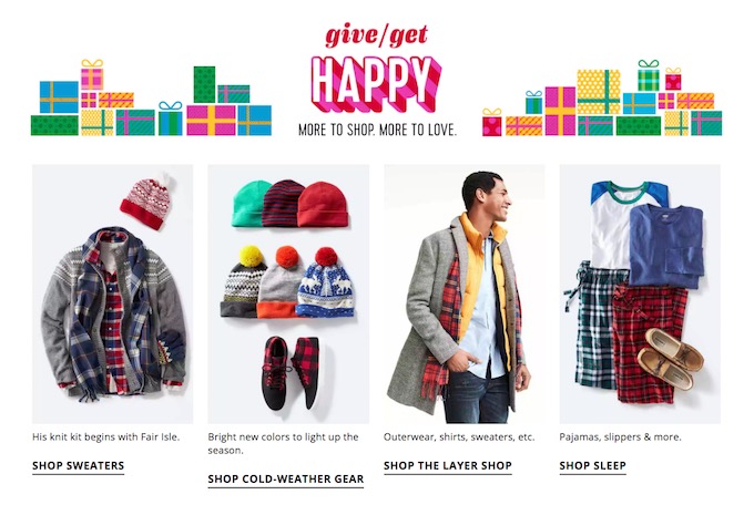 I’m sure we’ve all noticed the hamburger trend. No, not the bistro-cafe gourmet burger trend (though that is also a thing...and tasty.) But the hide your 526 options in a bite-sized hamburger menu so it doesn’t appear overwhelming trend. Once clicked, there’s so many plus signs and dropdowns, that the hamburger becomes not only useless, but frustrating. Instead, brands are moving away from collapsible options for everything, into a layout rooted in visual design and flow. Why are people visiting your site? What are they looking for? Who is the main person that visits your site? Answering these questions helps to organize content in a more logical way, as well as eliminate clutter. Target (sorry, I talk about them too much) and also Old Navy moved to a more photocentric grid layout a while ago, and while there’s much room for improvement, it’s a step in the right direction towards more visual menus.
7. Authentic Photography
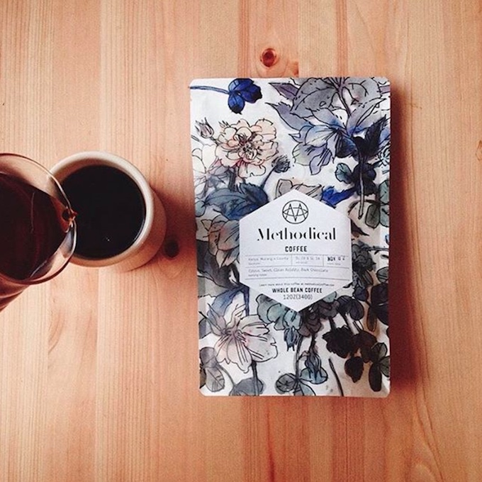 This post is not just about removing cheesy stock images. More companies—even small brands and brick and mortar stores—are opting for authenticity when it comes to product photos. White backgrounds are giving way to magazine worthy product shots with a focus on natural lighting and product integration. It’s not enough to show the product. We want to see it in action. Close up. Every detail. We want to imagine ourselves using the product. I’ve been so encouraged by clients who are automatically asking about photos in conjunction with a website redesign. If content is king, photos are its queen.
PS—is anyone else amazed that we’re still having discussions about bad stock photos? People, please use a good photo!
8. Vibrant Color Combos
Turquoise and gold? Yes. Purple and yellow? Sure thing. Subtle tones may make for great living rooms, but in the sea of websites, standing out is becoming a challenge. Websites, after all, are a visual media, and it’s exciting to see the color combinations that are hitting the stage. Together with big typography, bold colors are popping up and demanding attention. And it’s not all for show, either. If users can’t find what they need quickly, they’ll abandon your site. With all the information housed on websites, grabbing a user’s attention is necessary in order to guide their experience.
9. More Duotone
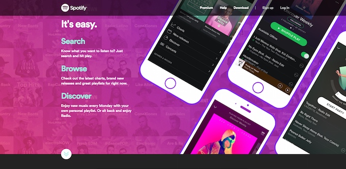 Ever since T-Mobile hit me with that duotone hot pink branding, I’ve been wondering how long they would keep it up. And the more they use it, the more I love it. There’s something so edgy, yet timeless (thanks to their black and white photos) that makes it feel continually fresh. While duotone everything may not be necessary—or even work for some brands—a little goes a long way. We’ll see more websites combining their authentic photos with punchy colors for visual impact.
10. Faster Load Times
This may seem like an odd one (especially after writing about more video and glossy photos) and a given (since load times are so important) and even more techy than design focused. But the reality is that many sites in all their glorious efforts, have become bloated with too much beautiful content. Yes, that’s right. You’re too beautiful, Internet. As internet speeds continue to increase, we’re pushing the bandwidth with more and more heavy content. If left unchecked, some sites end up with preloaders, multiple homepage background videos, parallax scrolling, and a barista waiting to hand you a latte through the screen. (I do love lattes.) These elements individually are wonderful, but when combined often lead to poor user experience. It can be tough to push back—especially when a CEO wants to see the latest and greatest—but I’m excited to hear more designers trumpet the mantra: just because we can, doesn’t mean we should.
Designers Are More Important Than Ever
They say necessity is the mother of invention. But I say we change that in 2017 to: necessity is the mother of design. All of these elements are reflective of a design culture increasingly in-tune with its audience. As you look ahead to your clients for 2017, what, if any, of these trends do you see yourself implementing? Are there other ideas you hope to see gain traction?
source: creativemarket blog
source: creativemarket blog


