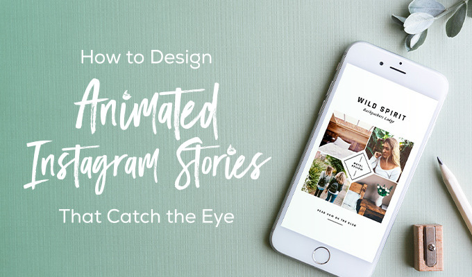
Instagram used to be the place where photographers went to show off their work, but today it's evolved into much more than that. In recent months, the Snapchat-esque Stories feature has taken over the scene and created a whole other type of feed for followers. I'll admit it myself: I look over the Stories a lot more than I do my regular feed.
But this does create a problem. Not everyone has the skillset to create a compelling video. In fact, it may seem like the bar to entry is even higher, because some of these stories are professionally created. How do you get into the mix?
Easy: templates. And I'm going to walk you through the process.
It started with an idea
Instagram Story templates are out there. Don't believe me? Well, a quick search will prove me right, as there are over 150 different templates at Creative Market that make the Story process that much simpler. The idea behind most of them is fairly straightforward: take the photos that you have and animated them in a way that's compelling to the viewer. And most of them not only have sample videos, but also walkthroughs and instructions so you can do it on your own.
With that in mind, I picked up Animated Instagram Stories by Silver Stag, downloaded the ZIP file and opened it up. Inside were 30 PSD files, an instruction guide, sample videos, free stories and even hand drawn stuff. It was a virtual grab bag of goodies, so I dove right in.
Start with the downloads
As it turns out though, I wasn't completely done. After going through the instructions, I realized that I needed to download a few fonts to get rolling. They were all free, and I already had two of them, so it wasn't a big deal to install them on my Mac.
My idea was to do something fun with a photo of my dog, and 05.psd in the kit seemed to work out pretty well for that. So with that in mind, I opened it up and here's what I got:
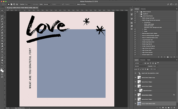
Each layer in the file is clearly labeled, so it's a straightforward process if I want to modify anything. For example, the text on the left-hand side says "WHAT ARE YOU GRATEFUL FOR?" That's not necessarily my jam, but putting the name of my dog would certainly work. So I did that.
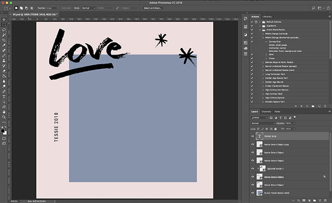
Every object in the file is either a Smart Object or text. And since I love me some Smart Objects, I know how they work. If you don't, the basic idea is that these objects can be changed or modified on their own, and then when they're updated, the overall graphic will change. The Smart Object for the main photo, in this case, was just a blue box. So I double-clicked on the Smart Object icon for that layer, opening up the Smart Object itself. I pasted and resized in the shot of my dog and ...
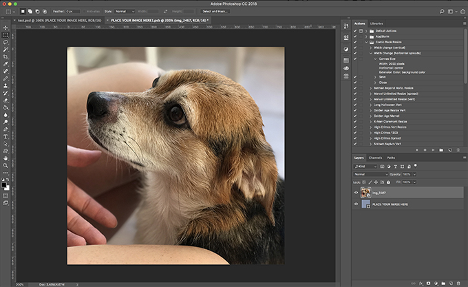
Just like that, I'm good. Here it is in the full photo:
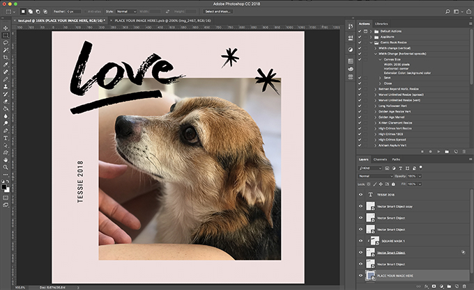
Now it's a cute shot as-is, but I wanted to do something else with the colors. It seemed like the background was off a bit, so again I went into the Smart Object for the background. All I had to do was pull a color from her fur with the eyedropper, and everything was good to go.
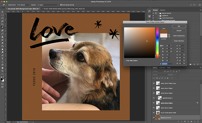
I was fairly satisfied at this point, but I did want to play around with a few ideas. Those asterisks in the corner were neat, but how would they look in white? Let's find out. I first opened up the Smart Object for one of the marks in Photoshop, and inside that was another Smart Object — this time, a vector-based one. Double-clicking on that allowed me to open it up in Adobe Illustrator.
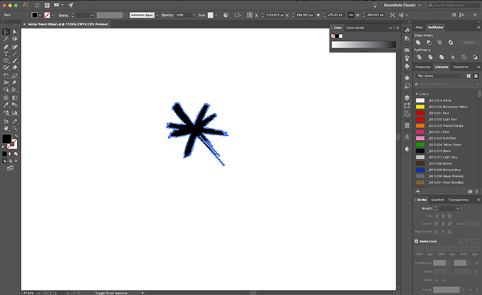
After changing the color to white, I saved the Illustrator file, then saved the Photoshop Smart Object. The results:
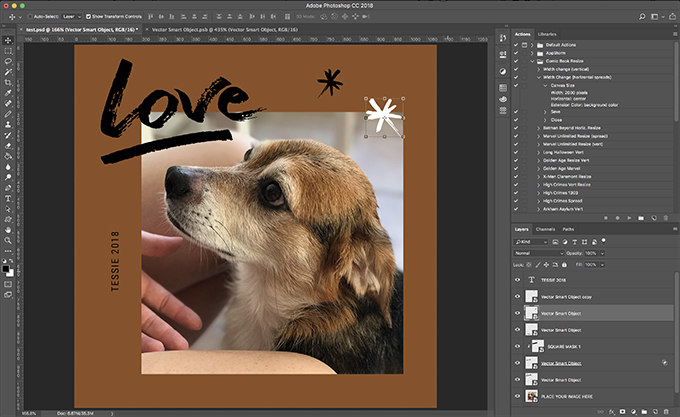
Well, I liked it, so I went ahead and did the same thing to the remaining asterisk.
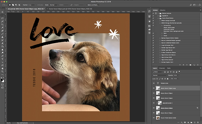
I did the same thing with the remaining Smart Objects, and to get the slash underneath "Love" the same color, I modified the "SQUARE MASK 1" block inside of Photoshop. Here's what I got:
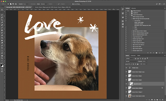
And with that, my design was done. For now.
Making the magic happen
At this point, I had two options. If I wanted to post it up as-is, I could. All I had to do was export it as a JPG or PNG file and I was done. But I did want it to animate — that's the whole point, after all. The instructions doc told me the basics: Go to File > Export > Render Video, then save it as 1080x1080px in the highest quality. Cool, let's do that.
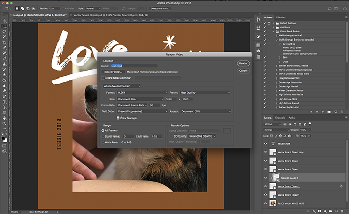
Now I had an mp4 file to work with, and I could even preview it on my Mac. To get it to my phone, I could either upload it to Photos, or send it via AirDrop. Once I did that, it was right on my phone and ready to go. All I had to do was post it via Instagram as a regular post, and I was done.
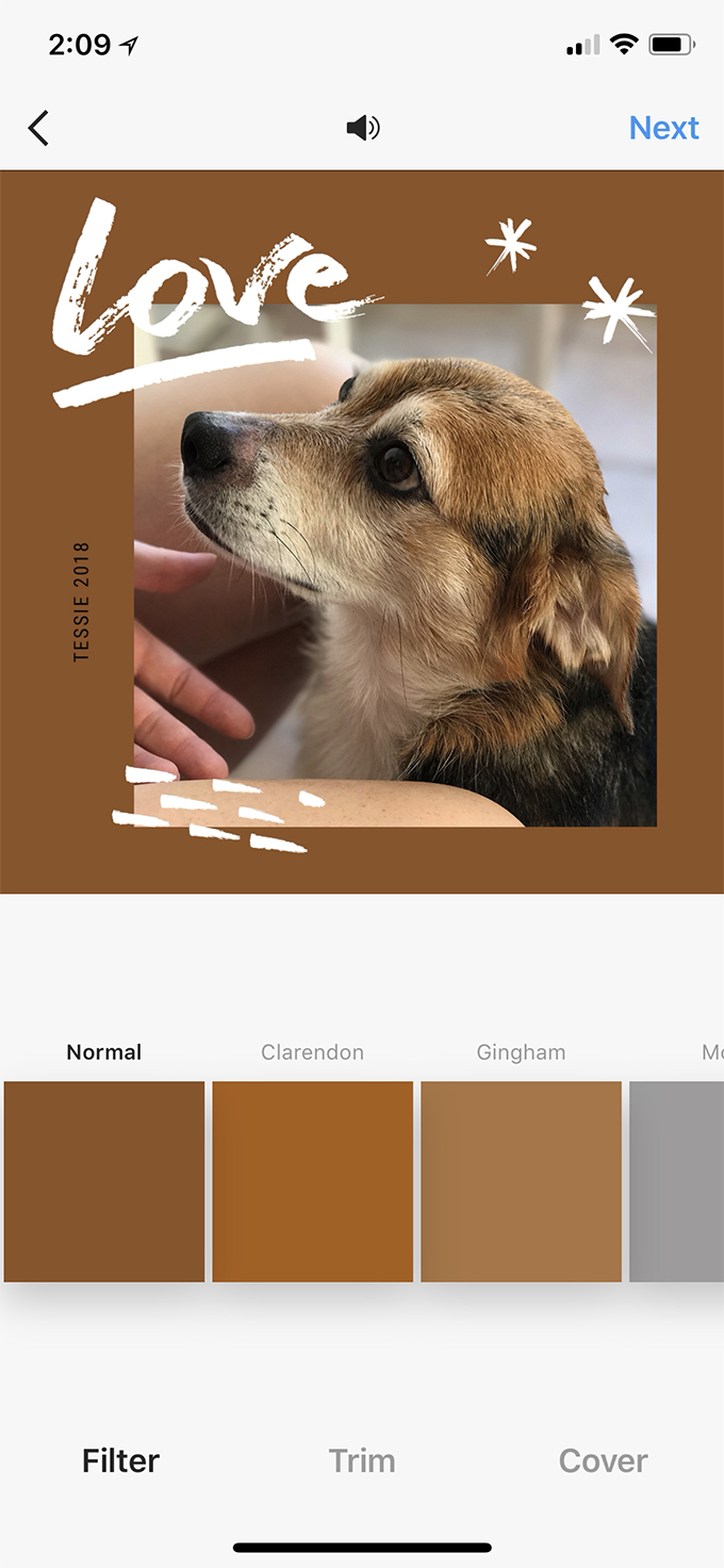
Or was I? I did want this as a story, after all. And since I picked a square-shaped design, I wasn't sure how that would work. Fortunately, Instagram is way smarter than me. I started the Story process, and just zoomed out on the animation. It filled in the background for me automatically, and just like that, I was good.
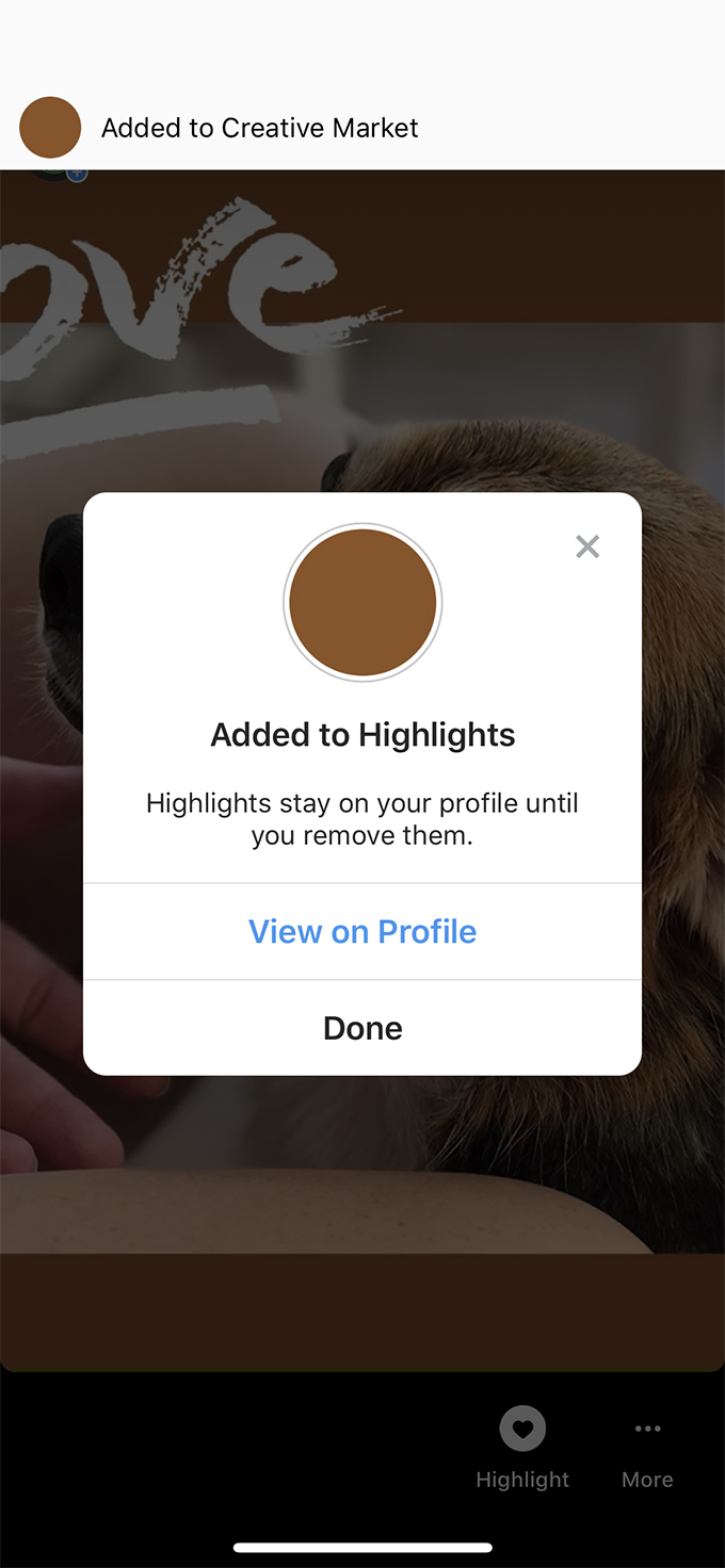
I saved it as one of the highlights on my profile as "Creative Market." If you want to check it out, I'm @Whippsindustries on Instagram, and it'll be on my bio page.
Final Thoughts
Well, I gotta say, that whole process was a ton easier than I initially expected. It took me less than 30 minutes to knock the whole thing out, and that was including the time it took for me to do screenshots for this post. Knowing that there are lots of other options out there for cool Story templates is also good info to have, and they're all pretty affordable, too.
If you've been putting off doing Instagram Stories for yourself or your business because it seems too difficult, don't. Now you have lots of choices to work with, and nothing is better than that.


you are welcome
ReplyDelete