Twitter Header Design: Templates & Tips
Your Twitter header is that huge, horizontal and eye-catching image that sits perched on top of your Twitter profile. This premium location means that it’s going to grab the most eyeballs of your followers, visitors, and just whoever happens to land on your Twitter page. With that in mind, it’s in your best interest to optimize your Twitter header design to make a great first impression.
If you’re using your profile as a social media channel to drive more traffic and leads to your business website, the header needs to be consistent with your brand and helpful to your marketing efforts. If your profile is meant to showcase your personality because you offer design services an are naturally advertising yourself (your voice, brand persona, etc.), then the header has to tie into that branding as well.
Make your Twitter header work for your business and branding by taking the time to design it to its maximum potential. Although it’s “just” an image, it’s a vital image that sets the tone for your profile and whether or not people will follow you on Twitter and all the way to your site, where you can sell to them in earnest.
Here’s how to get the most from your header image.
Abide by Twitter’s Requirements and Understand Its Subtleties
Before you even start thinking about the design proper of your header image, you have to follow Twitter’s exact specifications of what type of image to upload. Even when you do, there are unexpected surprises sometimes when your header is uploaded. It’s tricky, to say the least.
Officially, Twitter recommends header image dimensions of 1500X500 pixelsfor the best results. You’re only allowed to use JPG, PNG, and GIF (however, animated GIFs for headers aren’t supported). Unfortunately, that doesn’t always guarantee that your header will look just the way that you want.
In spite of your best efforts to follow this recommendation, Twitter will inevitably still cut off a part of your image, adding to your frustration. How can you get around this?
It helps to understand what Twitter means with its 1500X500 pixels recommendation: This accounts for the entire area of your Twitter header image. When you look at your profile, you’ll quickly realize that this entire area, however, is obscured by 1) your profile picture (which is approximately 400X400 pixels) and 2) the so-called invisible area (which is a thin band that runs horizontally across the top and bottom of your image area).
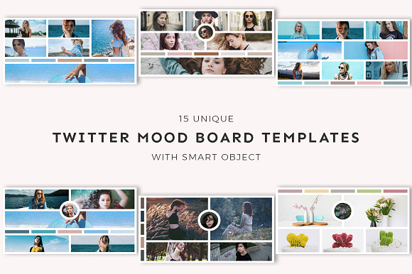
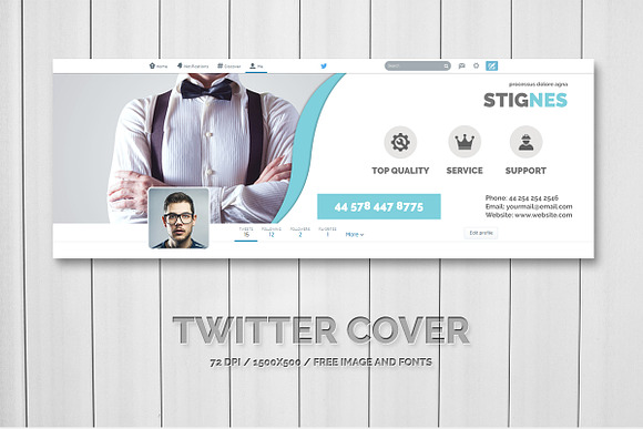
Template kits like the one above help you tailor content to Twitter's exact specifications
Your profile picture’s position relative to the header image will change based on the screen resolution. For instance, when your header gets displayed at full-width, it moves closer to the middle of the header, but if the header shows up on smaller screens with smaller resolutions, your picture shifts to the left, relative to the header.
To deal with this so that all the elements you want to appear actually show up in your Twitter header, just make sure you have a bit of empty space in the bottom-left corner of the header image.
As for the invisible area, this refers to the narrow strip at the top and bottom of your header that Twitter will cut off when you upload your image—even if you have the perfect size of 1500X500 pixels.
Deal with this by simply leaving sufficient space at the top and bottom of your header image or otherwise ensuring that your image doesn’t have any essential elements in this invisible area that’ll be cut off after you upload it.
With this technicality out of the way, let’s dive deeply right into the actual design of your Twitter header!
Use Only High-Quality Images
For your header, you can upload your own image, select a template, or use a header maker that’ll let you add filters, illustrations, and other specific design elements like typefaces and various colors to a template or image. On the web, high-quality images are proven to do better, so make sure whatever image you’re going with is sharp and aesthetic.
Practical Ecommerce published a classic report on this reality 10 years ago, and it still holds true today: higher-quality images were found to boost sales. On another front, Visual Website Optimizer conducted a case study that found that spending more time to pick a more relevant image on a landing page sharply increased conversions by more than 40%.

While your header may not exactly represent a product that you’re selling, it represents a brand that you are selling. It represents you and the design services that you’re advertising, so this reality of more attractive images helping ecommerce conversions translates to Twitter as well.
Advertise on Your Twitter Header
Let’s be frank: your header image is essentially a big, virtual billboard that spans the entire width of your Twitter profile. That’s how some enterprising creatives are using this piece of social-media real estate, and with good effect.
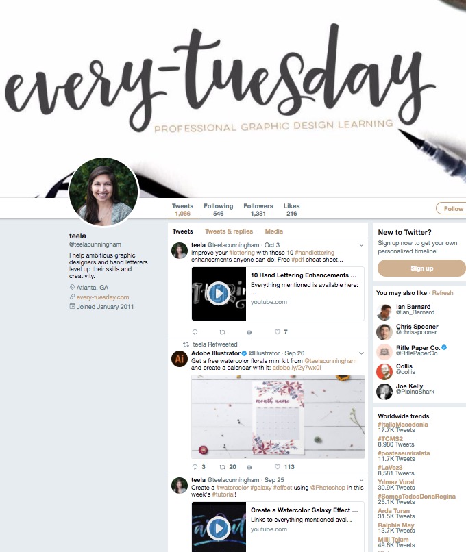
Shop owner Teela Cunningham runs a website called Every-Tuesday, where she releases a new design-tutorial video…wait for it…every Tuesday. To help raise awareness about her site and tutorials, she’s neatly designed the header to promote her brand and tutorials. With only a minimal mention of her site and its value proposition written in script font and sans serifs, her header turns into an effective billboard that sends people looking at her Twitter account straight to her site.
If you like Teela's style and would like to replicate it in your own header, she manages a Creative Market shop full of fonts, graphics, and templates you can grab:
Incorporate Flatlay
Flatlay photography has gotten more popular thanks to social media, where lots of users are fond of taking pictures from above. Hence, the term, “flatlay.” Flatlay is a reference to the technique of shooting items directly from above when they’ve been laid out and arranged on a flat surface.
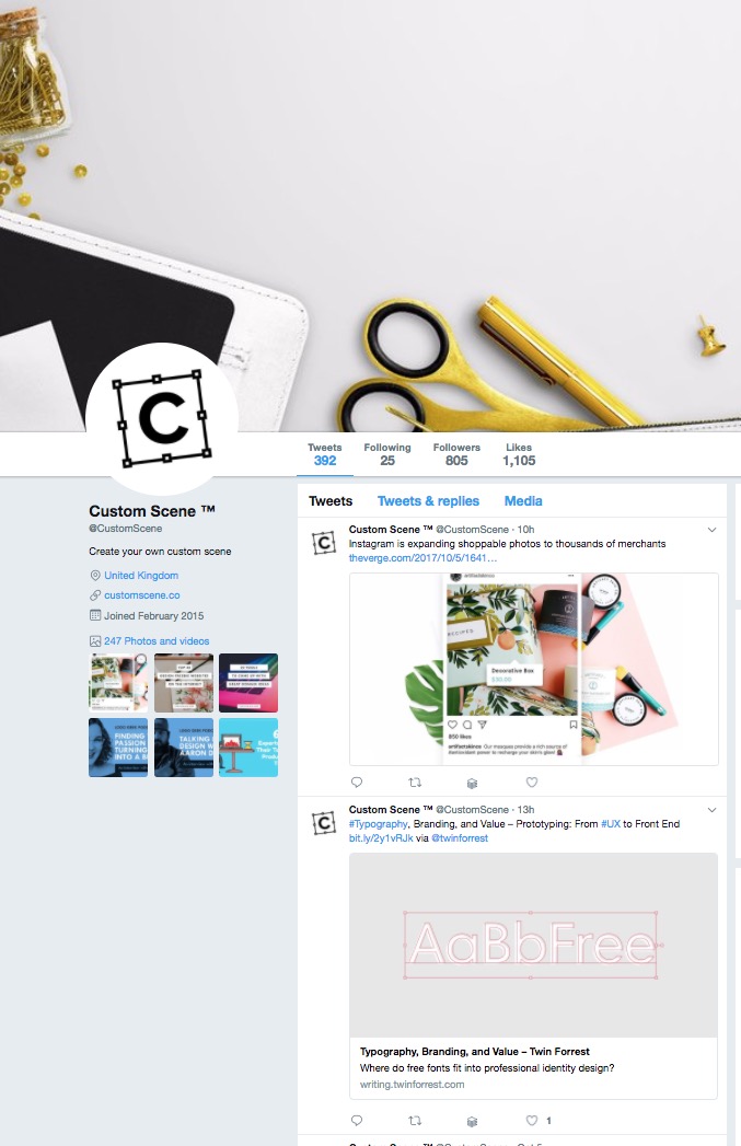
The goal of your header image is to capture attention, so using a flatlay image accomplishes that in an interesting way.
Shop owner Roman Jusdado’s header image reflects his love of the flatlay by showing a high-quality picture that essentially a shot of a designer’s workspace, right from above. You see thumbtacks strewn about, scissors and pens scattered, and binders laying open.
The flatlay image used in this post's header comes from Roman Jusdado's Creative Market shop, where you'll find dozens of resources to design your own social graphics:
Go Out of Focus
For something truly unique as your header, violate one of the most basic rules of good composition when you’re taking pictures. Blurriness, which usually results from an unsteady hand, is usually something that people don’t want to have in their images. On the other hand, it can definitely shake things up and provide a contrarian approach to your header image.
Case in point: shop owner Riccardo Anelli. This Italian web and graphic designer with a focus on the user interface opts to go completely out of focus on his header image. The result is a Twitter profile that makes you stop and stare—because you’re normally used to having something to look at in the header.
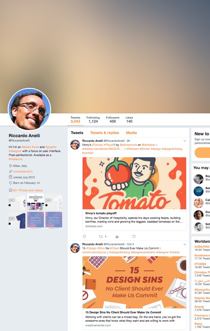
Sometimes, all it takes to send that lead straight to your Creative Market shop page or your own site is a design element like this, which is so unusual that it’s bound to compel people to spend a bit longer on you profile, which can be all the time they need to decide they want to find out more about your business.
Riccardo also offers ready-to-use blurred backgrounds like the ones below in his Creative Market shop.
Use Vibrant Colors to Grab Attention
If there’s one thing that never fails to grab anyone’s attention in a remarkable way, it’s the use of striking colors from which you just can’t look away. This stands to reason, as colors have been proven to psychologically and emotionally affect us in a myriad number of ways. Perhaps the reason we can’t look away from bold displays of color is that we’re wired to simply take them in.
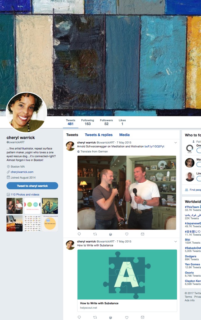
In any case, it’s a solid way to approach your Twitter header design, especially when you’re a creative. Enter shop owner Cheryl Warrick, whose header image is just bursting with mostly cooler though vibrant colors. Not only do you therefore just feel like stopping and gazing at her header — almost like someone stopping on the street to gawk at a mural — but you also become curious about the designer behind this interesting header image choice.
Check out Cheryl's Creative Market shop for colorful graphics to build your own header:
Show Just One Focal Point
A mistake that quite a few people make with their Twitter header images is to overload them with design elements. The end result is a mishmash of sometimes conflicting and definitely excessive things to look at that overwhelm viewers.
That’s why it can be refreshing when a header displays only one focal point. Instead of attacking the viewer with a bunch of competing elements in the same shot, having only one focal point calmly invites the viewer into your composition and encourages them to stay a bit longer to enjoy it.
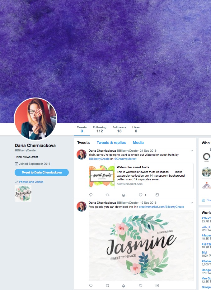
In shop owner Daria Bilberry’s header, we can see only one, giant focal point: a purplish mist or haze that occupies much of the header, with only bits of white poking out on either side. The result is a design whose elements don’t force viewers to compete for attention. Instead, they simply contemplate the simple elegance of this focal point.
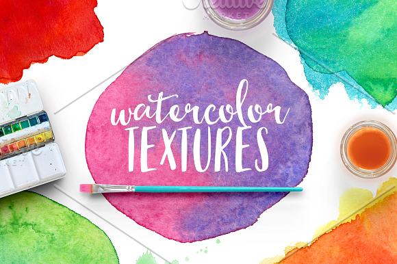
Daria offers similar textures in her Creative Market shop:
Project Your Personality
When you’re a designer, showcasing your personality is instrumental because it’ll show up in the products you create or the creative services you provide. In fact, you can’t really hide it because it’ll be apparent in your designs. One way to tackle header design is to flaunt your personality, as shop owner Ian Barnard does in his header image.
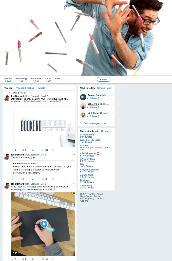
A humorous header (and fellow), Ian’s image shows him putting his hands up to try to deflect a barrage of markers and pens that mysteriously seem to have been thrown in his direction! In this minimalist approach to header design, we immediately understand two important things about Ian: 1) he’s a creative guy, thanks to the markers and pens and 2) he’s pretty easygoing and can laugh at himself.
Beyond that, this also fleshes out his branding as a designer.
Choose Awesome Templates
Templates are ideal for you if you don’t want to spend too much time designing your header. After all, you’ve got to create your products, provide your creative services to clients, and market your brand — all of which take up a good amount of your workweek. If that’s the case, don’t fret: templates have you covered.
They’re essentially premade layouts that already feature attractive designs, yet you can take it beyond this and add your own customizing touches to it. Templates usually allow you to personalize them by changing up the default colors, typeface, illustrations and other graphics, so that you can tweak them just how you like.
If you’re stuck with a creative block at the moment and aren’t exactly feeling inspired to design a Twitter header from scratch, then templates are a lifesaver.
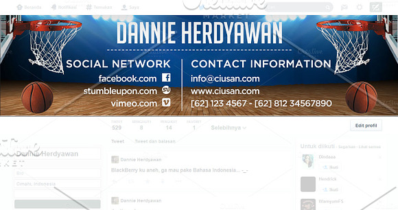
At Creative Market, we have various Twitter templates that you can use to build up your brand on your Twitter profile:
Explore a Twitter Header Maker
Another alternative you have for a great header design is a header maker. These are free web tools that allow you to design your own header without you having to be a design expert. These tools also let you create a high-quality and attractive header image in a short amount of time — sort of a hack when you want an image that looks like it’s been professionally designed.
There are many available tools on the web, but here are some of the most popular:
Design Hill
Design Hill offers a free tool allowing you to break down the header design process into a few, quick steps. First, choose a ready-made template from its collection. Then, after you upload the template into the editor, you can alter its typeface, colors, background and other graphics, making it your own. Finally, save the design, and then upload your creation onto your Twitter profile.
Crello
This pick-up-and-play tool lets you pick the automatically correct format that won’t run afoul of Twitter’s sizing guidelines. From there, just pick a premade layout from its collection, and then modify it to your desire in Crello’s maker. You can play around with the text, background, objects or icons, and any photos you upload to your template, thereby creating your unique header image. Just save it, and upload it as a JPG to your Twitter profile.
Photovisi
Photovisi’s free tool not only instantly adjusts your designs to perfectly fit into Twitter, but it also gives you a lot of control over your designs. Just pick a theme from its library, add a photo if you want, and tweak the theme with your own take on fonts, backgrounds and colors. When you’re done, just upload it to your Twitter profile without worrying about your header getting cut off.
Fotor
Fotor’s free header maker lets you design like a pro regardless of your design prowess. In only four steps, you can have a high-quality header image adorning your Twitter profile. First, open up Fotor’s design feature to pick your header layout. Next, pick your readymade template and drag-and-drop some elements of your choosing into the burgeoning design. When you’re finished editing the design to your customization, just preview and save it, selecting the size and format you want. Upload it to your Twitter profile, and you’re all set.
FotoJet
This free tool has almost 1000 templates from which to choose. Just pick the one you like and you’re off. Customize it to your heart’s content by adding clip art, backgrounds, colors and shapes to your header design. With just a few clicks, you’ll eventually have a professional-looking design that will go a long way toward boosting your Twitter branding.
Canva
Canva’s free tool prides itself on simplicity. You don’t have to be a sophisticated designer to use this tool to create a professional header. Once you open up the editor, choose the Twitter header design type and have your pick of hundreds of unique layouts. Add to your layout by using your own photos or using Canva’s many stock photos. Tweak your design by adding filters and changing the font to your liking. Finally, save and then upload to your Twitter profile.
Adobe Spark
We can’t forget Adobe Spark. This huge name in graphic design has its own free header maker. Just sign up to use this service. Without any technical or design know-how, you can turn out high-quality headers in only a matter of minutes. Start by selecting your header size, and then settle on your theme. Next, you choose a color for your header, along with a background. Finally, choose the right messaging with text and fonts that you can customize. Then, upload to Twitter, and presto.
A Boost to Your Twitter Profile
Yes, Twitter is a firehose of sorts where anyone on this micro-blogging platform can sound off about anything at any time of the day or night. If you’re a designer, creative or entrepreneur, Twitter also works as a very high-potential lead-generation/marketing channel that can drive more traffic and leads to your Creative Market shop or your own site.
Key to making this work for you is to have a beautiful and attention-grabbing header. Without one, not only does your profile look bare, but it also fails to capitalize on the opportunity to brand your Twitter stream right from the first thing people will see.
Don’t just include any old header, though. For it to work, it’s got to be high-quality and a sight to see. So whether you use a template, your own photo, or the services of a header generator, make it as impressive as you can.




No comments:
Post a Comment