6 Beautiful Color Trends of 2016
Keeping up with the latest design trends involves looking at how color is being used in advertising, print, art, fabrics, decor, fashion, and many other fascinating spaces. In this article, I'll look at six beautiful color trends inspired by creative movements spotted in various industries. Regardless of where the trend first emerged, these might spark just the right kind of vibrant ideas that your next project needs.
1. Pastels
Dreamy, milky and soft, pastels aren’t just for nursery rooms anymore. Pastels have grown up and become sophisticated. Pantone’s colors of the year, Rose Quartz and Serenity, have already made their way into advertising for banking, cosmetics and tech. Have you seen Spotify’s beautiful “Year in Music”? Ephemera is a pastel palette that expands into yellow, orchid, peach for a wider range of pastels.
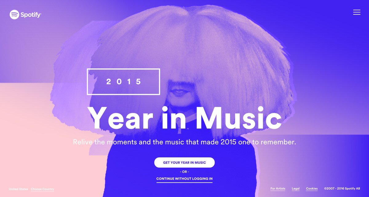 Spotify's color palette
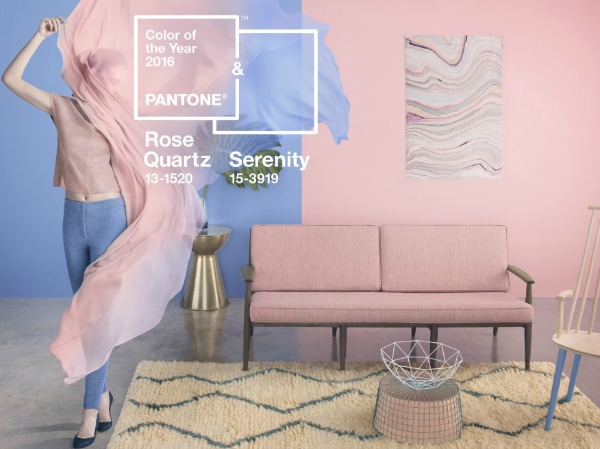
Pantone's colors of the year: Rose Quartz and Serenity
2. Vibrant, Bold Colors
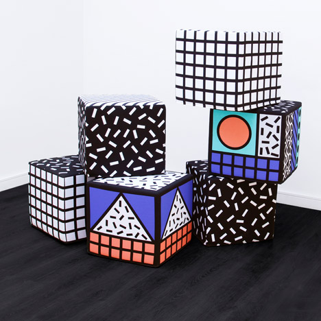
Bright, punchy and bold colors that fit in with the 80s/90s retro trend. Retro-inspired palettes with popping bright colors bring a lot of energy to your creative project. This fun palette draws inspiration from the Memphis Group, and their postmodern, rebellious, playful and asymmetrical designs. Retro is youthfully remixed with splashes of acid bright colors colliding with muddier colors and romantic pastels. Take a look at painter Sonia Delaunay’s work to find inspiration for fearless color combinations!
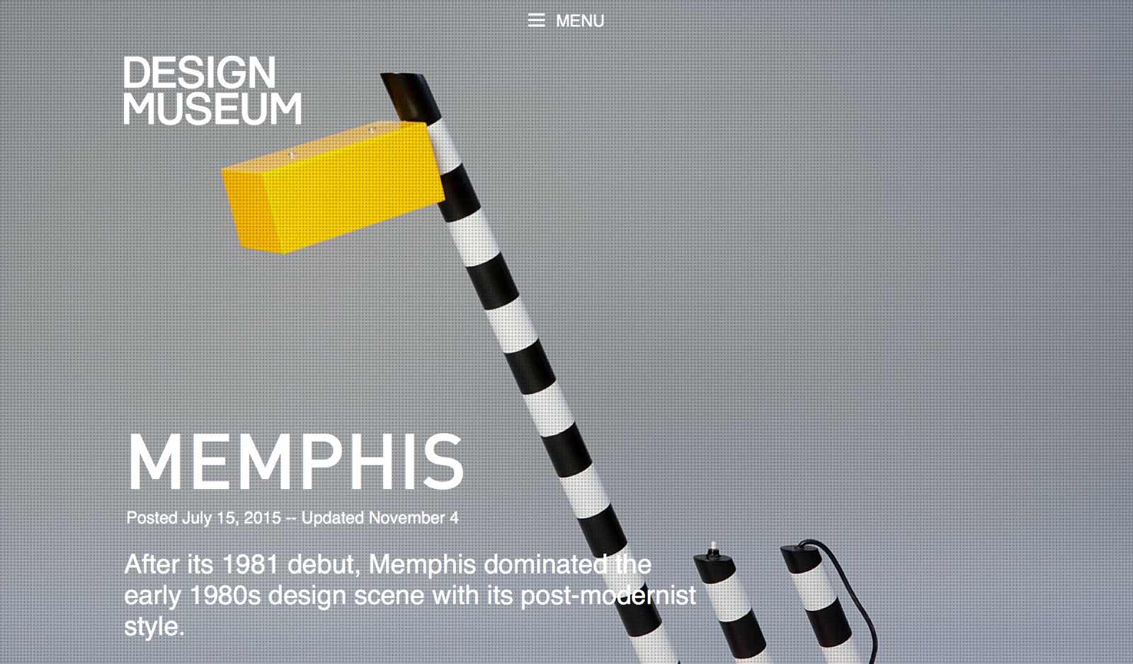 After its 1981 debut, Memphis dominated the early 1980s design scene with its post-modernist style. Image via Design Museum.
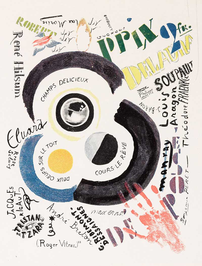 Sonia Delaunay or Robert Delaunay (or both), 1922. Public domain image.
3. Blue
Blue will continue to be a trending color in 2016. Ocean blues reflect a relaxing palette and our connection to nature. This year International Klein Blue is on the rise too. International Klein Blue (IKB) is a rich blue hue mixed by the French artist Yves Klein — it is perfect for intense accents. Underwater patterns and shadows come into play. Tiles, denim, and batik. Peacock blue. The richness of the color blue makes it easy to create a variety of palettes that give your projects a professional look. Create a palette that reflects the seaside, with shades of blue and a sandy neutral or a crisp white.
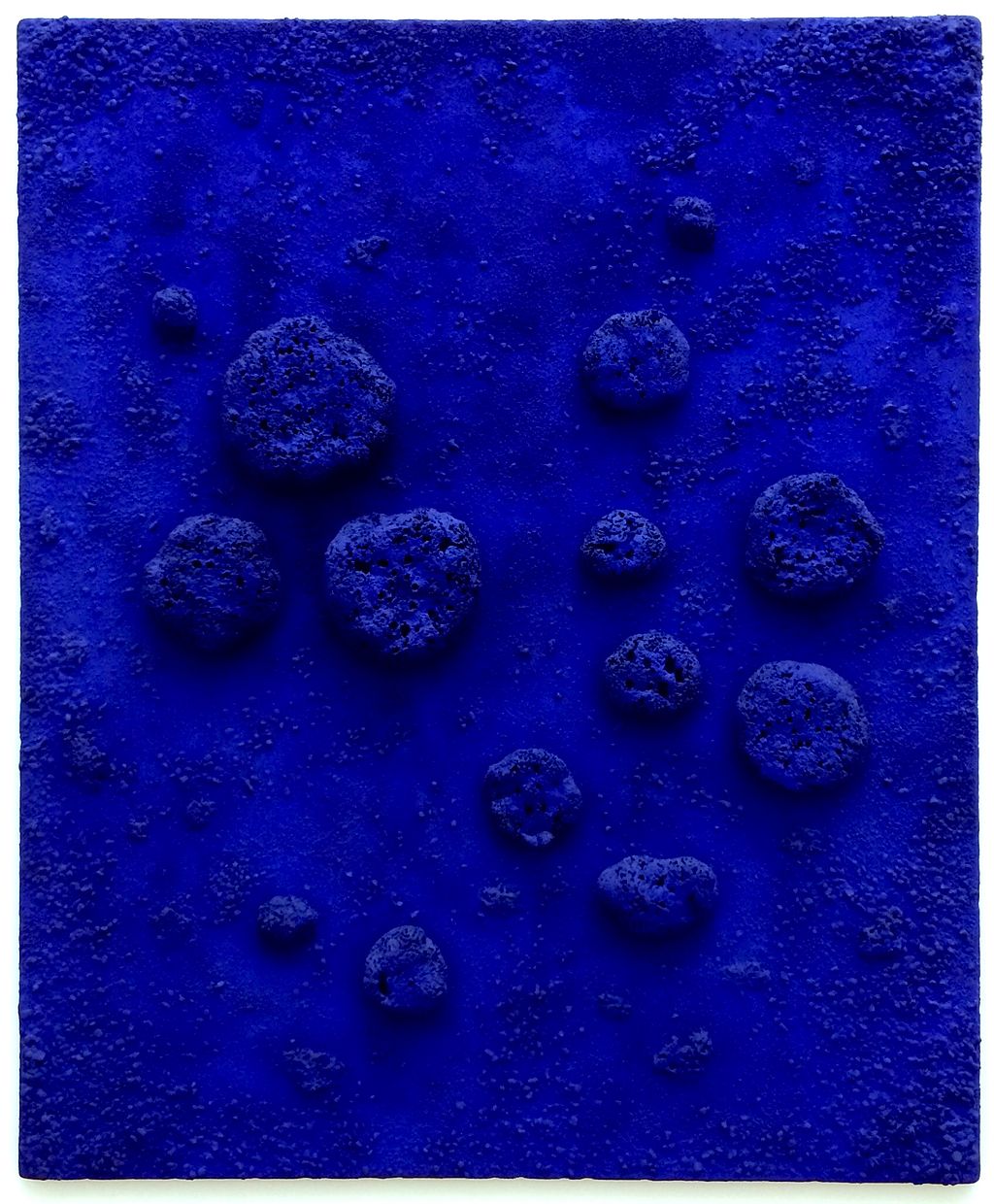
Mixed media painting titled L'accord Bleu, 1960 by Yves Klein. Via Wikimedia Commons.
4. Monochromatic or Limited
Limited color palettes stand the test of time. Simple, minimal and elegant color schemes where all the colors come from a single hue. Or combining black, white and grey. These color palettes are timeless and powerful because they help create focus in a visually oversaturated environment.
5. Opulent Indoors
In the home decor market we’ll find dark, deep walls contrasted with accents that glimmer with decadent metal. Think of heirlooms, intricate, and detailed craftsmanship. Think steampunk. Velvet, marble and pink copper. As we move fast into the future, we look for reassurance from our past. A contemporary twist on our heritage, this is maximalism. In graphic design we can see this trend in rich art deco and gold foil treatments, it’ll be interesting to see if this trend expands. It makes a huge contrast to the minimalist trends.
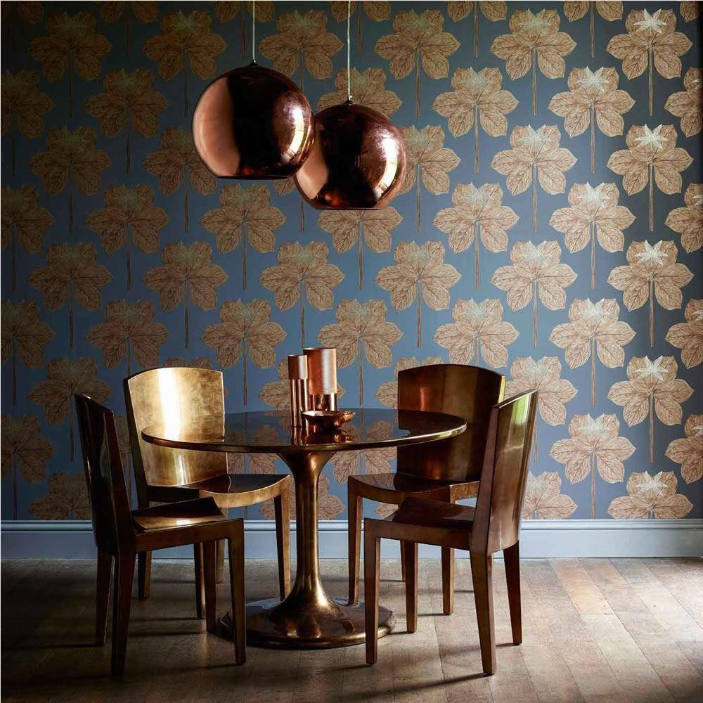
The Palmetto collection from Harlequin. Via Decor Supplies.
6. Outer Space
Dark blues and teals, juxtaposed with electric pink, coral, red, reflect our space explorations. Let yourself be inspired by space, sci-fi, and David Bowie. Nebulas. Let yourself be inspired by the 2015 Valentino couture collection, with constellations and planets in motion. Futuristic, celestial dreams with impressions of weightlessness. Pops of electric neon colors!
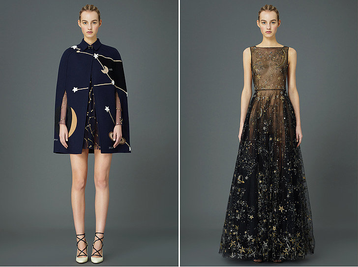
Valentino. Image via Popsugar.

No comments:
Post a Comment