Translate

Saturday, September 11, 2021

10 Creatives with Amazing Handwriting to Follow on Instagram

   INSPIRATION

10 Creatives with Amazing Handwriting to Follow on Instagram

Becky Bicks

Instagram is an incredible resource for design and artistic inspiration. Handwriting is one particularly cool niche on Instagram, where tons of amazing artists showcase their beautiful handwritten creations or handmade lettering, which they’ve turned into typefaces.

People who share their handwriting on Instagram sometimes just want to show off their ability to create beautiful letters. Others share the ways they use uniquely handwritten letters on their Instagram profiles—like in their class notes, in sketchnotes from meetings, or in stationery, letters, and notes they send in the mail.

The following artists with amazing handwriting are worth checking out. Each of these designers’ creations is fun to see—and they may also inspire you to work on your own class notes or come up with your next beautiful handmade project.

1. Mike Rohde / rohdesign

Mike Rohde has a significant following outside of Instagram. He is a designer, and he also wrote the books The Sketchnote HandbookSketchnote Workbook, and The Sketchnote Ideabook. Rohde also founded the Sketchnote Army, and he illustrated the book REWORK & REMOTE. However, beyond his published work and work advocating the power of sketch-noting, Rohde has made a name for himself on Instagram, where he both shows scenes from his everyday life and displays his latest handwriting creations (and sketch notes).

Save

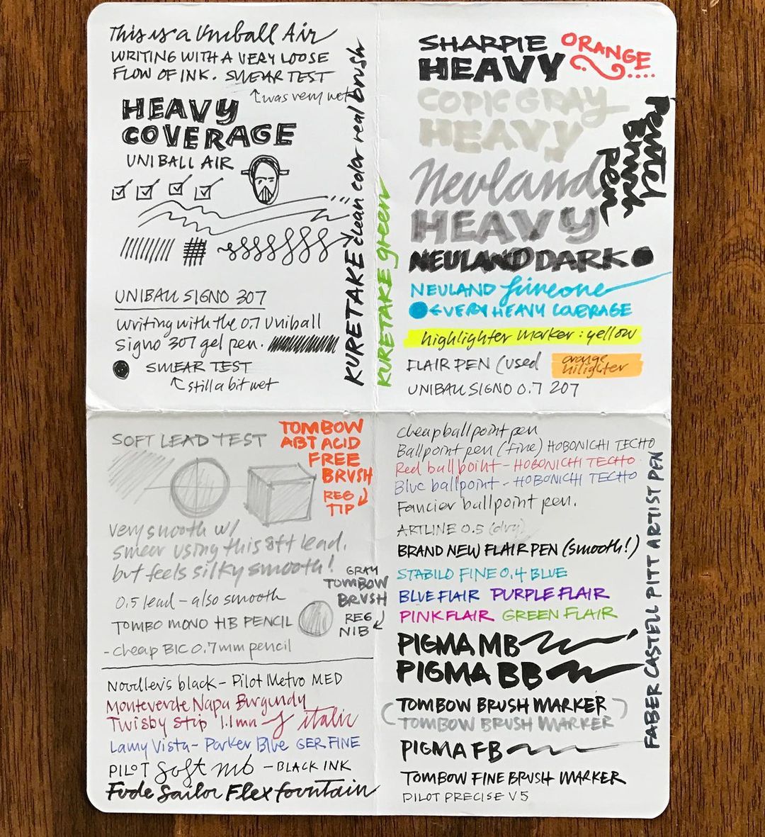
Rohde illustrates his notes, so alongside his stunning handwriting (which ranges from blocky to formal calligraphy to bubble letters), you can also find cute, funny, and informative drawings. Throughout his Instagram, Rohde showcases not only his beautiful letters, but he also explains how he comes up with those letters so followers can write similarly, too.

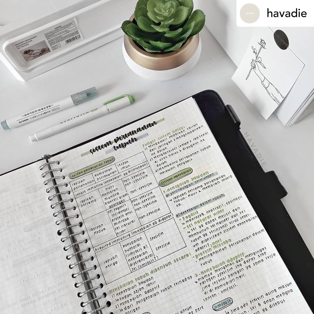
2. nora / shakesparians

On Shakesparians, creator Nora shares her aesthetic notes (and also notes of other creators, students, and designers who inspire her). Nora showcases a variety of note-takers and types of notes, so a wide range of people can get their inspiration on this page. She also shares different types of pens, markers, and paper people use to write their notes, so followers can get some ideas about which tools they’ll need to make beautiful handwritten creations. For curated amazing handwriting content on Instagram, this may just be the best page out there.

SaveShakesparians reposting from @havadie

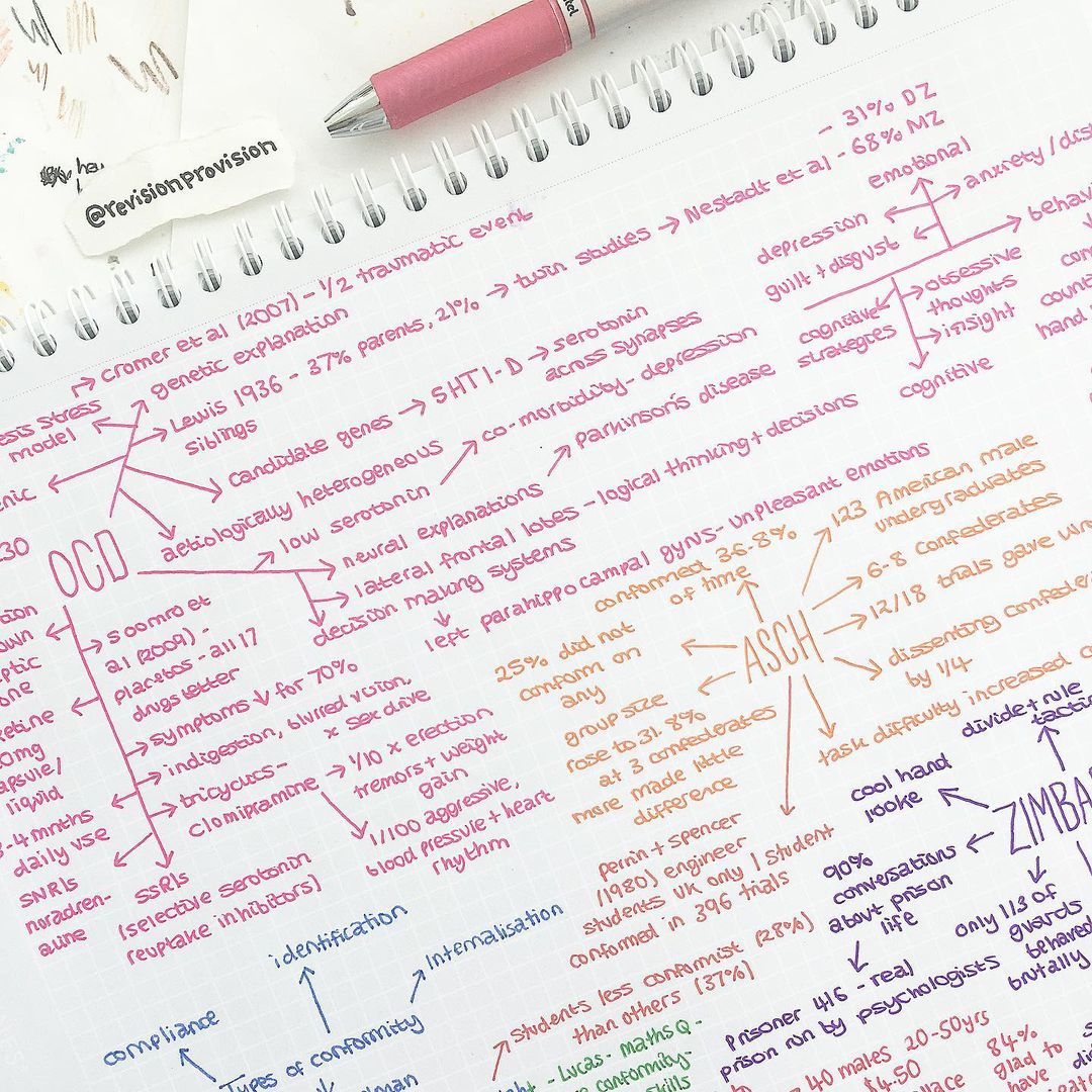
3. Revision Provision

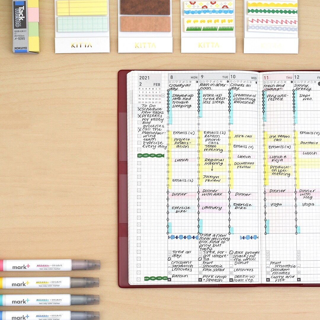
Revision Provision has over 40k followers and features a student’s handwritten notes in history and literature. The notes are beautiful, artistic, and colorful, and illustrated with small cartoons, graphs, and charts. The handwriting in Revision Provision is small and fastidious. It’s an amazing inspiration for anyone who wants to take handwritten notes that are as neat as typed notes. One fun feature that also appears from time to time on this page is color palette inspiration—so you can get some ideas for multiple pen, marker, and highlighter colors that go together to create beautiful and cohesive notes.

Save

4. Hans Sebastian / hansswriting

Indonesian Instagrammer Hans Sebastian shares his incredible handwriting and handwritten journals on hansswriting. Sebastien has a specific aesthetic, and his notes utilize a lot of brown, black, tan, and beige colors. While not as colorful as other handwriting Instagrammers, Sebastian’s page is incredibly beautiful. His notes are like illustrated books or works of art—and his handwriting is so uniform and unique, it could be its own font. Hans has nearly 12k followers. This is a can’t-miss for any creative handwriting aficionado.

Save

5. jolien / studyjolien

If you need to clean up your notes from class, there is no better inspiration than studyjolien. The creator behind the page, Jolien, showcases her notes from high school, which are incredibly neat and fastidious and so perfectly written they almost look like computer drawings. Jolien’s handwriting is mostly in black and white. However, she also draws diagrams in her notes to help her learn more concepts. Joilen uses highlighters to call attention to certain important pieces of information, and the highlighting isn’t only useful for helping her learn—it also makes her notes stunningly beautiful, even from afar. She currently has almost 70k followers, and it’s easy to see why.

Save

6. Emily / emily_studies

Emily, a 21-year-old blogger based in England, is a Y3 medical student. Her Instagram is not focused on medicine, though. Instead, Emily showcases her stunning notes, which she takes on a variety of surfaces, including notebooks, graph paper, bullet journals, and more. Emily’s handwriting often resembles calligraphy. She showcases the pens she uses to create her letters, and she reveals where her 224k followers can buy the same writing utensils. Emily’s Instagram shows how one’s handwriting can be as neat and legible as a typed and printed font—but that it can be fun, whimsical, and creative, too, with the use of a little color, unique lettering, and a variety of page layouts.

Save

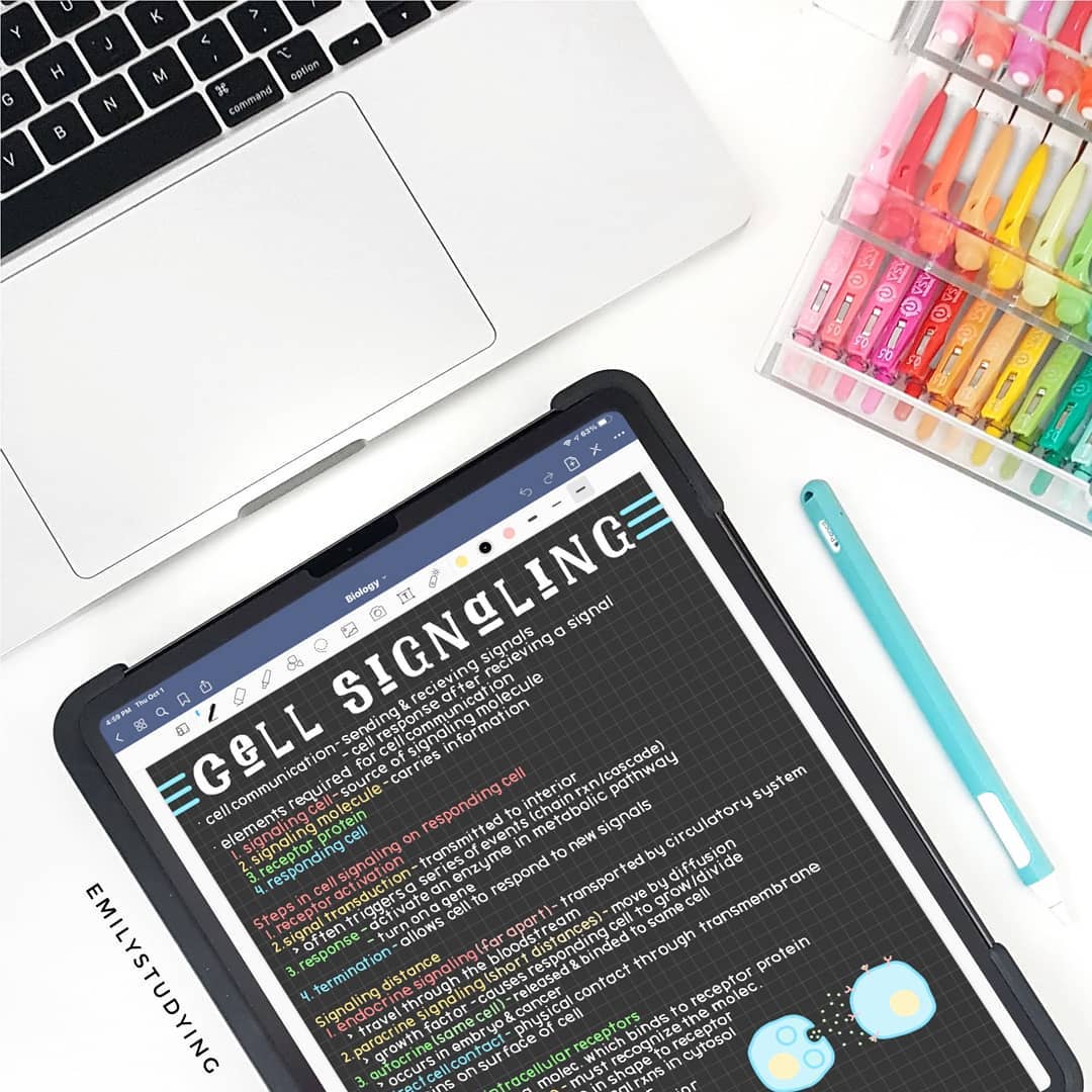
7. emily / emilystudying

Emily has created a studygram called emilystudying, and it currently has 39k followers. On emilystudying, Emily shows her notes from her college classes, and she also shares note-taking tips with her followers. Emily showcases which products she uses to write all of her beautiful handwritten notes, including tablets, pens, paper, stationery, and more. She also sells some of her products online, and she advertises these on her grid. Emily’s handwriting, in particular, is beautiful. She uses a variety of rainbow colors to make her notes eye-catching and also useful for studying. She has mastered a variety of block and bubble letters for headlines and titles within her notes—and these letters themselves are their own artwork.

Save

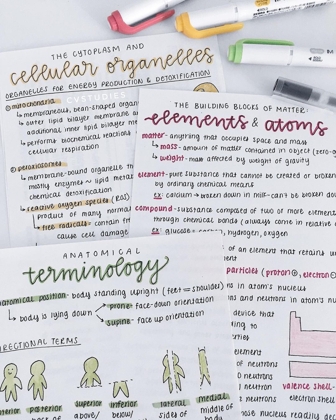
8. cathy / cvstudies

Cathy of cvstudies has created a note-taking studygram and currently has almost 8k followers. She showcases her class notes and how she organizes her notebooks in order to optimize her learning process. Her notes are beautiful, but they are especially eye-catching because her handwriting is neat and symmetrical. Cathy’s handwriting is so small and perfect that it almost looks like a typeface, but she infuses color and whimsy every once in a while. It’s a reminder that her work is hand-done and that note-taking by hand is often more fun and creative than typing study notes.

Save

9. JetPens

JetPens is a pen and stationery store based in Japan. Their Instagram showcases the product that they sell, and they have nearly 200k followers. But it also shows how you can use their pens for calligraphy and how you can use their notebooks and paper products to take notes. If you want to up your school supply game this year and make sure your notes are both beautiful and useful, JetPens is an Instagram you shouldn’t overlook.

Save

10. Amy / Studying Digital

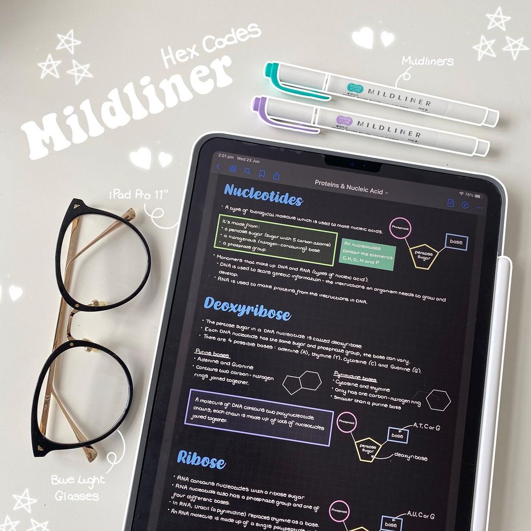
Amy is a Physiotherapy student in the U.K., and her Instagram is packed with examples of the notes she takes in class on her tablet. She currently has 121k followers. Amy shows how to create charts and images using pens on a tablet, and she showcases special effects using videos and step-by-step guides. Any student in a subject that requires note-taking, graph-making, or chart-making will find her how-to Instagram useful.

Save

Check Out More Creative Handwriting Ideas

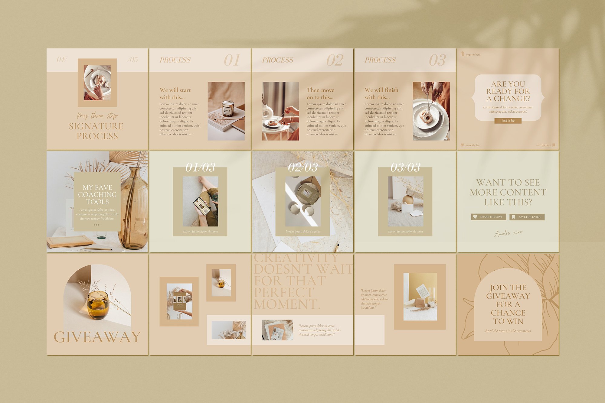
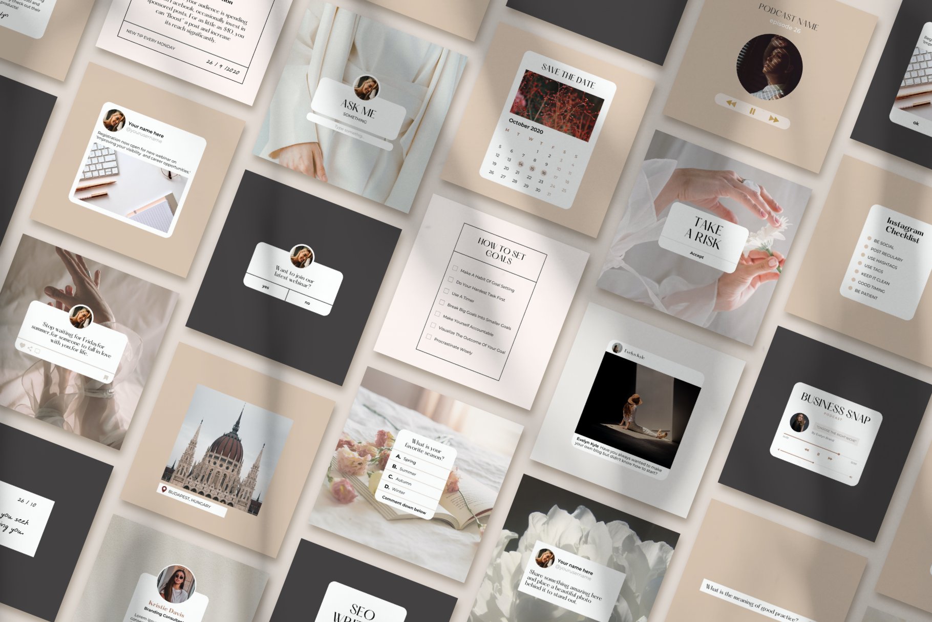
If you want to get inspired by some incredible creators on Instagram, follow these accounts that are chock full of amazing handwriting samples and other handwritten creations. You can also find more inspiring handwriting ideas on Creative Market. Designers across the globe have turned their own handwriting into typefaces—and these typefaces are now available for sale as design assets in our marketplace.

In addition to countless hand-created typefaces, you can find a slew of other design assets to you in your next projects—from logos to icons to templates and beyond. Check out all the design assets on Creative Market if you’re interested in starting a handwriting Instagram or turning your own handwriting into a typeface you can sell—or if you’re looking for a unique, eye-catching typeface that can take your design project to the next level.


I

Thursday, September 9, 2021

10 Types of Post Designs to Boost Your Social Media Engagement


10 Types of Post Designs to Boost Your Social Media Engagement 

By: Laura Busche

In the digital marketing world, the word engagement has become part of our everyday conversations. If you want to build a receptive audience for your brand’s message and cultivate a community, understanding what prompts them to action is an essential starting point. To get seen by the customers you’re seeking, you’ll need a basic notion of how algorithms work on social channels.

While they’re all different, there’s one factor these algorithms seem to weigh heavily: engagement. Put simply: just how much users are excited to interact with the message you’re sharing. Something else they have in common? Their dislike for engagement actions that are not authentic, such as automated responses. Depending on the platform, there are some specific actions that signal a high level of interest and can become ranking factors:

  • Expressing appreciation for your content (likes, favorites, or hearts)
  • Being so excited about it, you’re willing to share it (shares)
  • Perceiving it as something valuable enough to store and go back to (saves, bookmarks)
  • Feeling interested enough to add something to it (comments)

This is intuitive: as a social networking site, your goal is to keep users active, entertained, and invested in what they’re looking at. If you’re wondering what types of posts might have a better chance of achieving that, read on. Throughout this article, I’ll describe 10 types of social media designs that are prone to get interacted with, boosting your engagement. Though we’ll look at Instagram examples, remember these engagement principles apply to any other social platform with an algorithm that values relevance.

Question posts and stories

Curiosity is creative fuel. Ask questions and open up spaces for users to ask you questions. You’ll be surprised at the kinds of things others want to learn about you. Aside from boosting your engagement, these types of posts make for great audience research.


Carousels with step-by-step instructions

You don’t have to say everything at once. Walk your followers through an interesting sequence of steps they can swipe to uncover. Whether you’re presenting a list of resources, a tutorial, or general advice, these types of carousels are proven to increase interactions through the curiosity gap they create. SocialInsider studied 22 million Instagram posts and found them to be the most engaging post type.

Save

Notifications and reminders

Designs incorporating phone messages have been trending for some time, and with good reason. In general, the kinds of messages you’d insert in an alert are the kinds of messages followers may want to be reminded of in the future. That makes these kinds of posts particularly effective at getting saves and reshares.


Countdowns

Instagram Stories incorporate a handy countdown feature where followers can turn on a reminder when a specific day/time is near. Naturally, there’s a higher chance they’ll re-engage with you if they are alerted to do so at a given point in the future. Add these stickers to your stories and make sure your audience is notified of big launches and campaigns.


Quotes worth bookmarking and sharing

Sometimes a certain phrase is just the sign you’ve been waiting for. Sometimes it’s the sign you think your friend has been waiting for. That’s why quotes tend to do well in terms of saves and comment tags, both of which keep the content circulating far beyond its initial publication.


Polls and this/thats

When it comes to topics we care about, we like to voice our opinions. Especially, we also want to know how those opinions compare to others’. Quick social polls allow us to do both. The image-based this/that format, specifically, has become popular because it appeals to the visually-driven: you don’t really need to put in words what it is about something that strikes your preference. That je ne sais quoi is, more often than not, exactly that: a special something you can’t name.


Infographics and diagrams

In a world where we’re constantly bombarded with new information, simplifying complex topics is invaluable. That’s why you rush to save or bookmark the recaps that really help you remember the ideas that matter to you. This is also true in social media, where the right chart can continue to drive traffic to your account over time. If deemed valuable, they’ll get reshared, saved, and commented on for others to see. Here are some examples of information graphics you can share:

  • Cheatsheets
  • Challenges 
  • Checklists
  • Charts and diagrams

Giveaways and freebies

Nothing beats free. A giveaway can be the perfect magnet to place your brand in front of new eyes and refresh your audience. When they are organized so that followers need to tag friends/colleagues, these initiatives are strong engagement drivers.


Story templates followers can fill out

…and reshare, obviously. Like I mentioned earlier in this article, it is a very human desire to express one’s opinion freely. Templates like quizzes and fill-in-the-blanks give us that opportunity without structuring questions or designing the tool ourselves. When those new stories roam freely and link back to the original creator, a very natural form of engagement emerges: you’re being credited and remembered.


GIF and meme posts

Humor goes a long way. Reshare content that reflects your own brand of humor and let followers in on one of the most distinctive aspects of your personality. The World Wide Web is truly a meme-centric culture these days, and there’s a space for you within it — no matter what makes you laugh.

Save

Quick videos like Reels and IGTV

Gone are the days of 20-minute online videos. Platforms like Instagram, Snapchat, and TikTok have reshaped what we’ve come to expect of video content, both in terms of post-production (zero, apparently) and duration (tending towards zero?). In such an environment, you can add a personal touch by including some simple design elements like cover images and animated section title images that still allow you to publish videos on the go.


Your turn!

Engagement is not without its fair amount of controversy: some question how far content creators are willing to go to get seen and how much time users should wisely spend on these platforms. Exercise good judgment and always be mindful of your content’s impact on your audience. Are you testing out one or more of the post types above? 


Tuesday, September 7, 2021

Quick Fixes: 5 Tricks to Elevate Your Typography Work in Minutes


Quick Fixes: 5 Tricks to Elevate Your Typography Work in Minutes 

By Typejuice

These are some of my favorite quick tricks to really help your typography pop and give it that extra polish. Not everyone is an experienced typographer or has the time to design a custom typeface, but these tips can help speed up workflow and give your type a unique touch. Software and design tools are constantly evolving, so these tricks will focus more on techniques that can be applied across any software.

1. Contrast

One of the quickest ways to elevate a layout that’s looking a little flat and really make it pop is to use contrasting elements. Contrast doesn’t just refer to the varying difference in color or value like black type on a white background. It can also be used in scale, weight, and even in the style of typefaces or fonts you choose to use in a design.

Contrasting Fonts

Try using two contrasting typefaces in your design to create a more engaging experience. This refers to two very different typeface styles and could be as easy as pairing a geometric sans serif with a flowy script font or a strong serif font with a minimal sans serif. Possibilities are almost endless, and the fun is in experimenting with different combinations.

Modena | Duo with 6 Free Logos
Modena | Duo with 6 Free Logos by Jen Wagner Co


Greatly Font Duo + Logo Templates
Greatly Font Duo + Logo Templates by Letterhend Studio

There are also online resources that will help you find complementing font pairs if you’re in a hurry or stuck for ideas.


Contrasting Weight And Scale

Use contrasting font weights and sizes to build visual hierarchy and more engaging designs. The simplest form of this would be using a large bold font for a title or headline and then a smaller, lighter font for a body of text. Try taking this a step further and experiment with different ways to creatively incorporate scale and weight into your typography.

Presto
Presto by Type Juice

Alternatively, to really speed up this process, there are several online resources that generate complementary font sizes and weights based on mathematical ratios.

2. Custom Kerning

Most people working with type are familiar with letter spacing or tracking, both referring to the distance between glyphs in a word or body of text. This a fairly standard setting in design software, allowing you to add or remove spacing uniformly between all glyphs. These settings are commonly confused with kerning, which is the individual spacing between two glyphs. For example, an “A” sitting next to a “V” will have different kerning than an “O” next to a “C” even if they are all in the same word. Kerning is a way to balance negative space between glyphs making words more legible and pleasant to read.

Customizing kerning in logos, wordmarks, titles, etc., is one of the quickest and easiest ways to personalize short-form type. A little extra attention to the negative space between glyphs will give your type a unique polish standing out from type that is simply typed on with default settings.

Quick Kerning!

There are many ways to adjust kerning depending on the software you use. Adobe software like Photoshop and Illustrator has some of the quickest and easiest. Simply place your cursor between the two glyphs you wish to adjust, then hold Alt and use the left and right arrow keys to add or remove space until you have the desired spacing.

Sunbaked Mint Palettes
TRY OUR COLOR OF THE SEASON
Download color palettes using Sunbaked Mint

Download our set of color palettes in SVG and start using them in your favorite design app.

Download The Palettes

3. Custom Glyphs

Another quick and easy way to elevate your type and make it stand out is by customizing glyphs. When working on logos, wordmarks, titles, and other short-form typography, adding a unique glyph or glyphs to a word or phrase is a quick way to personalize your type. For example, this can be as quick as extending a letter, adding a unique serif, or removing part of a glyph.

To speed up workflow even further, you can use a font with built-in alternates or custom glyphs. This allows you to experiment and customize type without having to use image editing software such as Photoshop and Illustrator to create unique glyphs.

Joyride Extended Typeface
Joyride Extended Typeface by Type Juice
Save
 
Merchant
Merchant by Type Juice
Save

4. Grids

Understanding and using grids in your typography is a fast way to take some of the guesswork out of where elements should go and how they line up in a layout. This will help create implied lines and harmonies in your design.

What Exactly Is A Grid System?

In its simplest form, a grid is a series of columns and rows. A common example of this is the way newspapers are traditionally laid out. Grid systems will generally also include margins; this is the space around the edge of your artboard and gutters the space between columns.

Create Your Own Grid Presets

Creating your own grid presets or overlays that can quickly be applied to your design are a great way to save time. I like to have a set of my favorite grid layouts like a basic 6 column grid drawn out on a transparent .png in the formats I use most, like letter, tabloid, and 16×9. I can then drop the grids on separate layers and quickly jump straight into design.

Pre-made Grids

Speeding things up even further, you can purchase a variety of pre-made grid templates online.

5. Less is more

Everyone has heard this before but implementing it into your typography can be more difficult than just keeping it at the back of your mind. Probably the quickest way to polish a piece of typography is taking a step back, looking over your work, and making sure all the elements you’ve used serve a purpose. Here are a couple of quick points to check over.

Avoid Using Too Many Fonts
A general rule of thumb is to use only as many fonts as needed in a single design.

Make Use Of White Space
White space gives your type room to breathe and helps with legibility.

For The Love Of Type

There are plenty more tricks out there to speed up design workflows and elevate your type, but these 5 are the ones I use most in my day-to-day work. Please share any of your tips and tricks in the comments for others to take advantage of.


Info : 
🎉New Fresh font find ! 
Check out some of the fresh new fonts that are turning heads in our marketplace.