
90s Graphic Design: A Trip Back in Time to Millennial Land
Let’s go back in time to 90s graphic design for an aesthetic inspired by Nirvana, Beverly Hills, 90210, Britney Spears, and Saved by the Bell. This was a moment in time when the millennial generation was just starting out their young lives as children or teenagers. Baggy, comfortable, casual clothing was in, along with zany typography and vivid color palettes.
The grunge style was hot in the early to midpart of the decade, while the 90s eventually closed out with bubble gum pop music dominating the culture. TV shows like Full House, Mighty Morphin’ Power Rangers, and Friends exemplified the fun slab serifs that were used in so many title sequences.
90s style graphic design intrepidly moved toward the unknown of the new millennium with vibrant fun and optimism, which was seen throughout the pop culture of the day.
90s Graphic Design in Pop Culture
The best place to get your crash course in this design trend is in the TV shows, ads, music, and fashion of this last decade of the 20th century. This is the perfect time capsule to transport you back to the zeitgeist of what was popular in design.
If you thought 80s design was a loud aesthetic, then you’ll have to reconsider. The 90s were known for being in-your-face with colors and attitude popping right out of the medium at audiences everywhere. This ensured a memorable take on design that stayed in the audience’s mind long after interacting with it.
We’ll run down different design elements and how various mediums showcased each element.
Typography
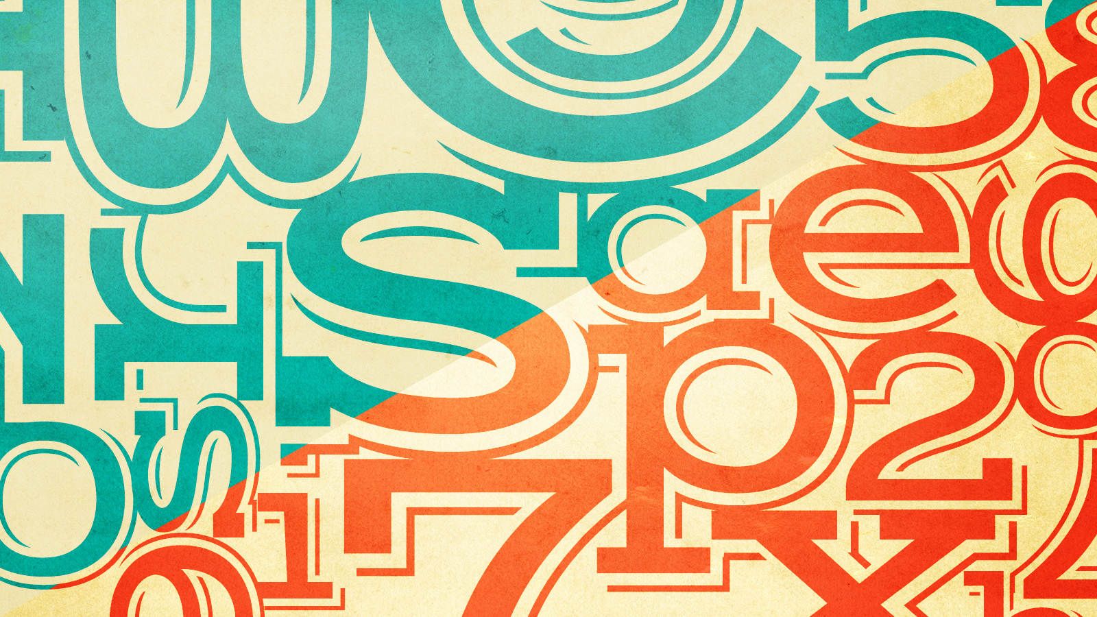
The typefaces in this decade were eye-catching, to say the least. They were characterized by a sense of not taking themselves too seriously. They were playful and shied away from the more serious approach of serif-style fonts. Perhaps this playful approach had something to do with the Comic Sans MS font, which debuted in October 1994. Its sans-serif script aesthetic captured the carefree approach of the decade.
TV Shows
There were many TV shows in the decade that capitalized on a casual style of typeface to appeal to their audiences.
Full House
Full House was one of them. The adventures of the Tanner clan in San Francisco came to us each week with a carefree, kid-friendly font in its opening sequence, as the Golden Gate Bridge swayed in the background.
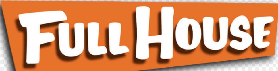
Image Credit: Wikimedia Commons
You’d be forgiven for likening this typeface to bubble letters since the characters are curvy. Note the drop shadows on the background, too, which give the typeface a 3D look.
If you try really hard, you can picture Michelle scribbling this font in her journal.
Friends
Friends was another long-running show that epitomized the 90s. Its title card had typography that was irreverent. About six New Yorkers who really enjoyed their coffee, the show carried on into the 21st century.
Noticeably stylized, this wordmark that appeared in the show’s title sequence features the same slab thickness as seen in the Full House example above. However, for this show, the characters are more slanted and closer to cursive. Each character is also separated by a dot of a different color to provide uniform tracking between the letters.
Its irreverent aesthetic matches the show’s theme of 20-something and 30-something rebellion.
Mighty Morphin’ Power Rangers
Then, there’s Mighty Morphin’ Power Rangers. A show that’s still going strong today in its umpteenth incarnation, the original show featured a font that was blocky, sans-serif, and 3D. It symbolized the colorful and vibrant approach to typefaces and design in general that abounded during the decade.
The vivid greens, reds, yellows, and purples are a feast for the eyes, perfect for the title sequence of a Saturday morning and weekday-afternoon kids’ show.
Ads
Ads during this time featured logos that were accessible to the public. They were inviting and friendly, urging people to engage with the brands behind them. Here’s a small sampling of some of our favorites during this era.
Burger King
 “2008 Old Burger King Logo, Myrtle Beach, SC” by scmikeburton is licensed under CC BY-ND 2.0
BK is an interesting brand. They attempted to modernize their logo in the 2000s, but eventually came back to their current logo, which is actually almost like their logo from 1994.
Note the presence of the curvilinear letters. Their rounded and smooth edges make the logo and, consequently, the brand more appealing to a wider audience, particularly younger people. The top and bottom of the bun enveloping the “Burger King” wordmark are equally rounded, with soft edges.
This corresponded to the overall design message in the 90s, which was fun, optimistic, and accessible.
Game Genie
Millennials will remember the Game Genie attachment that allowed gamers to cheat on Super Nintendo and Sega Genesis games. Designed by Codemasters and distributed by Galoob and Camerica, the Game Genie was popular and sold in the millions.
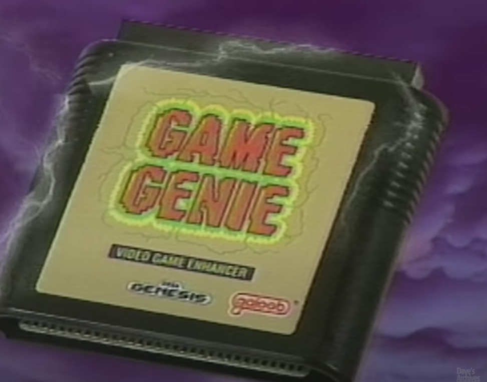
Image Credit: YouTube
In this still from an ad running on Nickelodeon, you’ll notice the funky graphics displayed in the electricity (or lightning?) coming off of the Game Genie cartridge (remember those?). The font used in the Game Genie sticker is also more of the same slab serif and comical style that was so popular during the decade.
Doctor Dreadful
Doctor Dreadful was a drink lab toy that was marketed by Tyco. It allowed kids to create their own “potions” with edible ingredients that they would mix together, which they could then drink.
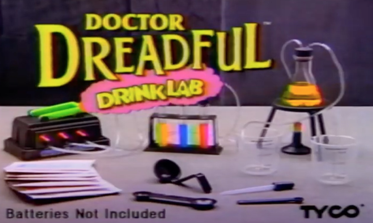
Image Credit: YouTube
In this ad from 1996, the use of comical and casual typography is again present. The presentation of the ad also emphasizes the use of bright colors, which makes sense for a kid’s toy.
Music
Dirt — Alice in Chains
The album cover of this epic grunge album by the Seattle metal band Alice in Chains is intensity personified. Showing a half-buried woman trying to rise out of the hard-baked earth, the record is a musical chronicle of the late singer Layne Staley’s experiences with drug addiction.
The design of the cover is evocative, to say the least. The warm hues of vivid orange serve as the backdrop to the interesting typeface choices. The band’s name is spelled out in a heavily stylized font that embodies both casual aspects and resembles blood splatter.
Nevermind — Nirvana
Nirvana’s breakout album is renowned for destroying hair metal and ushering in the grunge era in music. Its artwork features a naked baby swimming toward a dollar bill. The album has sold about 30 million copies worldwide. To say it’s influential would be an understatement.
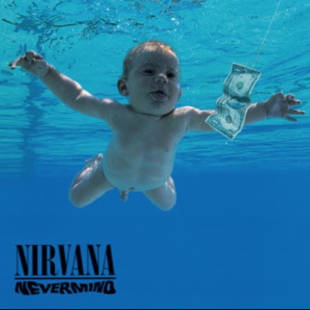
Image Credit: Wikipedia
Its typography is remarkable for the thin slabs and crossbars in the word “Nirvana.” The font used for the record’s title is distorted, mimicking the underwater feel of the artwork. The font is sans serif and playful.
…Baby One More Time — Britney Spears
…Baby One More Time is the debut album of Britney Spears. From a pop culture standpoint, it essentially closed out the decade with the excess and decadence that were the polar opposite of the grunge that had started the decade.
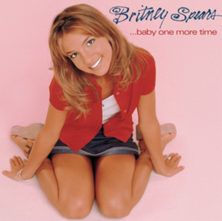
Image Credit: Wikipedia
The album’s font features a whimsical script that matches the bubble-gum innocence that the pop singer was associated with at the time. The handwritten typeface of her name stands in contrast to the album title’s more serious, lowercase, sans-serif font.
Here are some more graphic designs featuring 90s-inspired typography:


Patterns, Colors, and Textures
The 90s featured patterns, colors, and textures that can only be described as attention-grabbing. They were noisy, loud, vivid, and boasted a multitude of geometric shapes. Here’s a look at memorable patterns, colors, and textures that defined pop culture back then.
TV Shows
Numerous TV shows were enlivened by textures, either in their graphics or on the characters themselves.
Saved by the Bell
This popular teen sitcom of the day made household names of Zack Morris and AC Slater, among others. It was also a showcase of a certain fashion sense that relied on strong patterns in the clothing its cast wore.
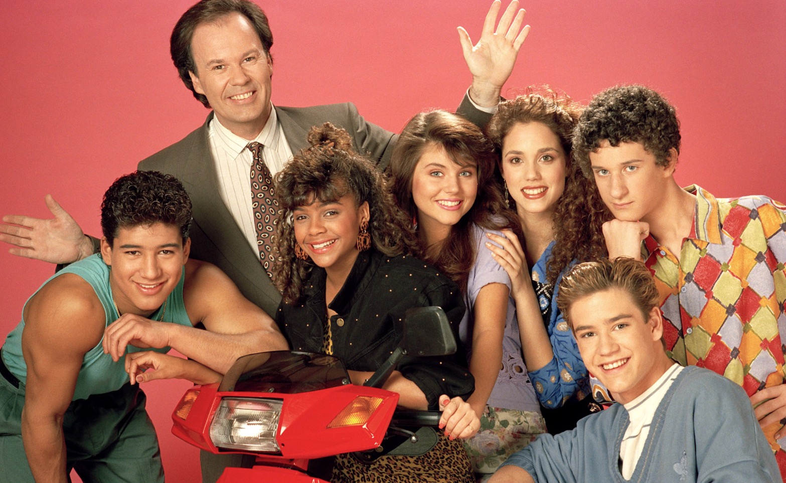
Image Credit: EW
In this promotional still, all the teens are sporting interesting lines and motifs in their shirts, sweaters, and skirts. From the leopard print on Lisa Turtle’s skirt to the diamond patterns on Screech’s shirt, the still is a study in visual texture.
Beverly Hills, 90210
This iconic series of rich teens set in Beverly Hills lasted the entire decade. Its approach to logo design gives us a candid look at graphic design in the 90s.
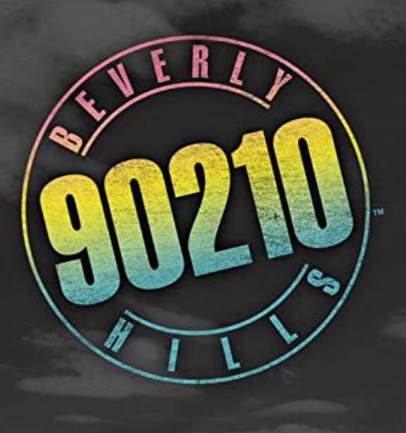
Image Credit: Amazon
There’s a lot of visual texture in the show’s logo, primarily in a decorative sense. With this take on the logo, you see gradients, as the colors subtly blend into one another and change. You also see a coarse, grainy quality that makes the presentation look faded and even grungy, to an extent.
My So-Called Life
Another teen soap opera from the decade, My So-Called Life, lasted just one season from 1994 to 1995. It’s since gained a cult following of sorts.
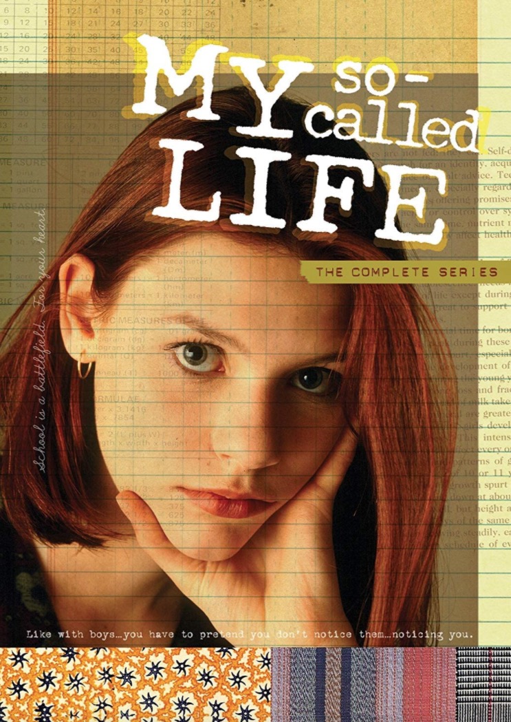
Image Credit: IMDB
The poster for this show displays a cornucopia of textures, everything from plaid and grunge to the presence of a grid pattern. The visual texture is also present in the title font, where techniques like blurring and drop shadows make an impact. Overall, this conveys the more angsty and grungy side of 90s TV.
Ads
The decade was replete with ads that we look back on now with nostalgia. At the time, they were an ode to various decorative patterns and textures that made viewing them a pleasure.
Bugle Boy
This brand is no longer a thing, having gone bankrupt in 2001. Founded by Chinese immigrant Dr. William Mow, Bugle Boy was hot in the 90s, popularizing the denim look and parachute pants for boys and men.
Key to its momentary success was the use of crazy patterns in its clothing. Graphic design in the 90s used many loud patterns, and this was no exception.
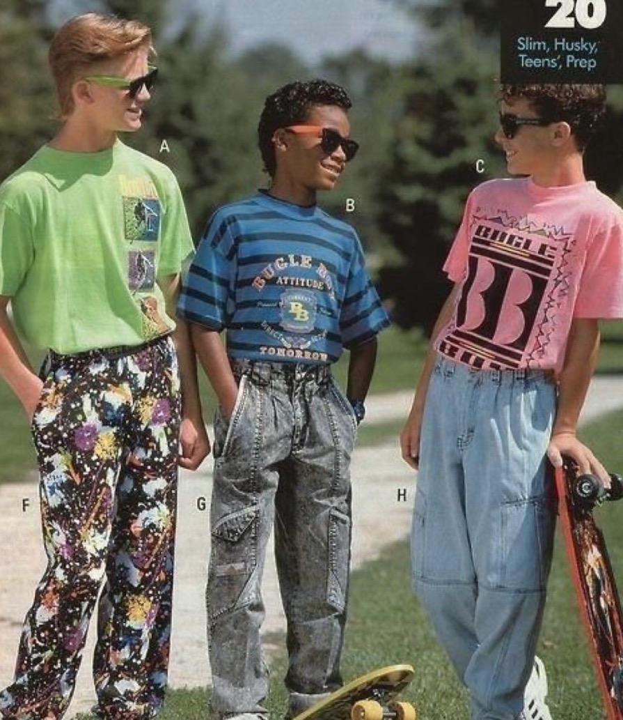
Image Credit: Reddit
In this ad from 1991, all the boys are sporting some eye-popping textures on their clothes. The boy on the left has pants with an explosion of multi-colored speckles on them, while the other two have shirts with bold zigzags, lines, and colors.
Guess Jeans
This company had some edgy and provocative ads throughout the decade. It’s a good example of how you can garner attention for your product when clever graphic designers are at work.
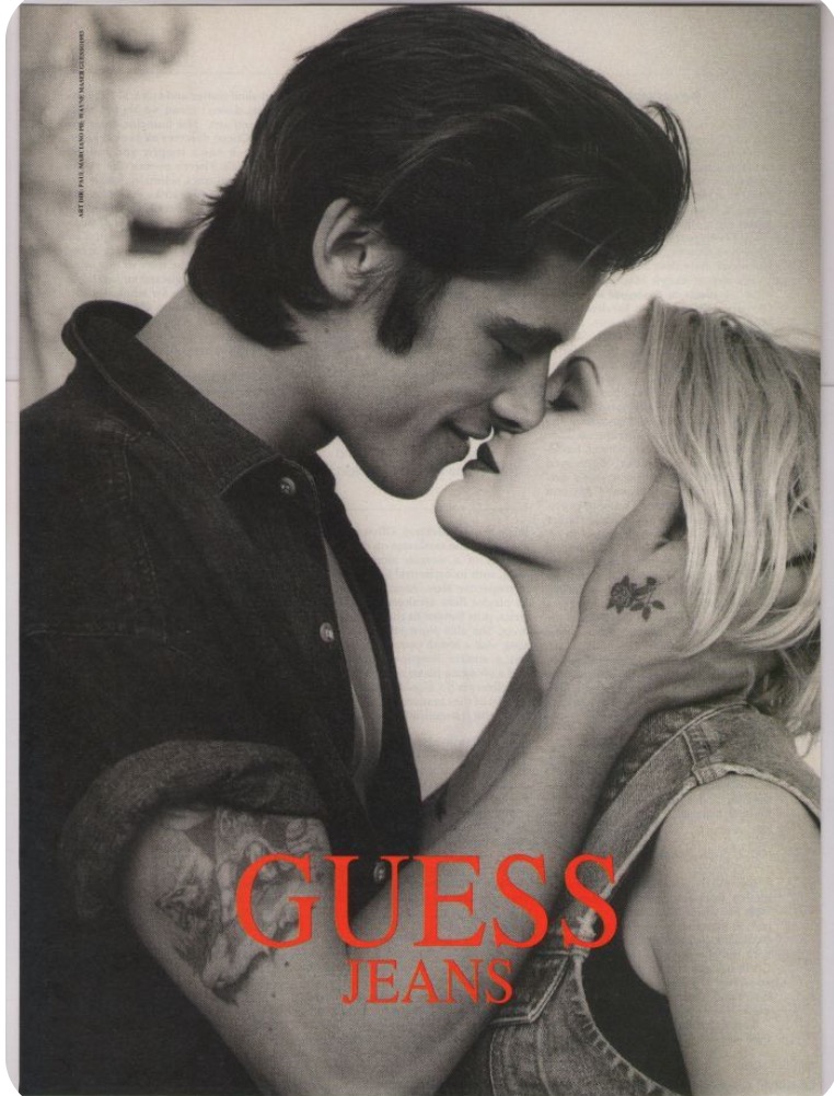
Image Credit: Pinterest
In this ad, the visual textures, as well as the suggestiveness, are explicit. From the tattoo on the man’s arm to the monochrome vibe and contrast, the ad evokes a certain timelessness, even now, some 30 years later.
McDonald’s Big Mac Ad
Remember when you could get McDonald’s Big Macs for just 59 cents? Great deal, right? You could get this deal back in 1996! This ad shows some of the layered textures the company was using in its ads, both in graphics and food photography.
You’ll notice that the 59-cent graphic has subtle color layers and features a numerical font with a shadow effect that gives it the appearance of a layer. The text to the right of the graphic has more shadow effects, adding to the layered look even further.
Music
Many 90s artists sported colorful textures in their personal appearance or right on their album covers. We take a look at some of them here.
Ænima — Tool
The progressive metal band is famous for putting out mind-blowing album covers. Their 1996 record didn’t disappoint.
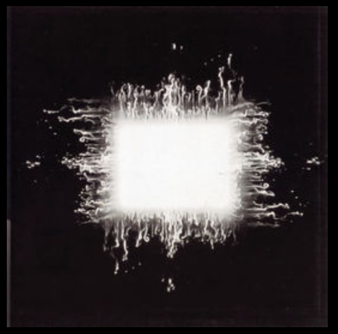
Image Credit: Wikipedia
Based on the painting called “Smoke Box,” from Cam de Leon, the cover artwork features animated smoke along with faint, small eyes peering through the smoke. Metaphysically, you can read this as the very fabric of space and time tearing open as you break through to the other side. Very trippy and mystical, indeed.
Homogenic — Björk
Iceland’s Björk has always attracted attention for her experimental music and her outfits. In 1997’s Homogenic, a rave-culture-inspired piece of electronica, the singer has an almost psychedelic presentation on the album artwork.
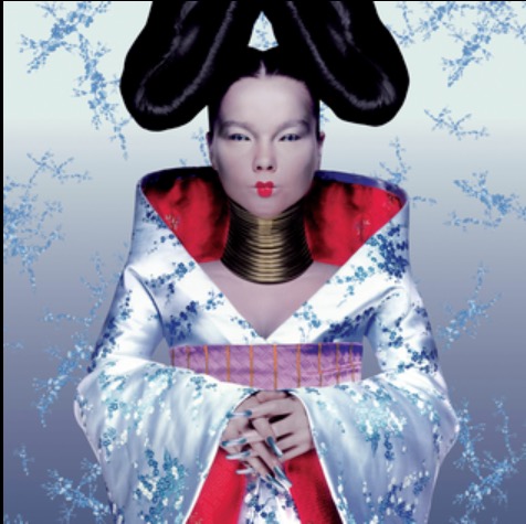
Image Credit: Wikipedia
The cover features her against a silver background with falling ornamentation. She’s dressed in a kimono, has big rings around her neck, long fingernails, and buns on each side of her head. The whole composition is a well-balanced study of decorative textures and geometric shapes.
Homework — Daft Punk
Another example of rave music during the decade, Daft Punk’s debut album, features stylized elements and popping colors, along with a myriad of interesting, subtle textures and patterns. The electronic music duo eschews the usual neon and futuristic colors of rave for more visual texture.
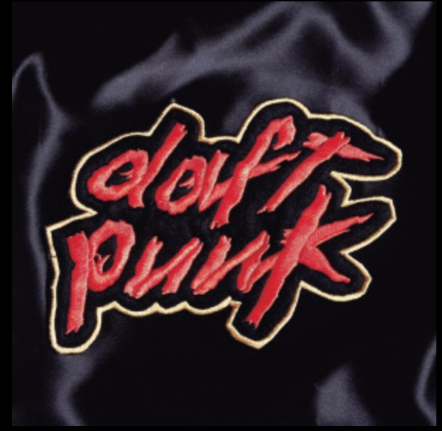
Image Credit: Wikipedia
Note the swirling smoke in the background that gives character to what would otherwise be just a neutral background. There’s quite a lot going on with the typography in the foreground. First, the lowercase script font for “Daft Punk” is heavily texturized, almost resembling a bloody, physical material. Second, you have an almost neon-yellow, thin outline around the font, giving the impression of additional layers and patterns around the band’s name.
Here are some more designs featuring patterns and colors straight out of this decade:


Anti-Design
We can’t close a write-up on 90s style graphic design without giving honorable mention to Anti-Design. This is a mind-bending concept, involving a good amount of irony, that you can almost call a contrarian or rebellious approach to what’s generally seen as good design.
True Anti-Design actually has its roots prior to the 90s. However, during the 90s, the Internet became increasingly available to ordinary people. This resulted in some of the earliest web designs that were, well, less than aesthetic.
Remember those Geocities websites? How about early AOL? Or maybe just some random forum that you happened upon in 1994?
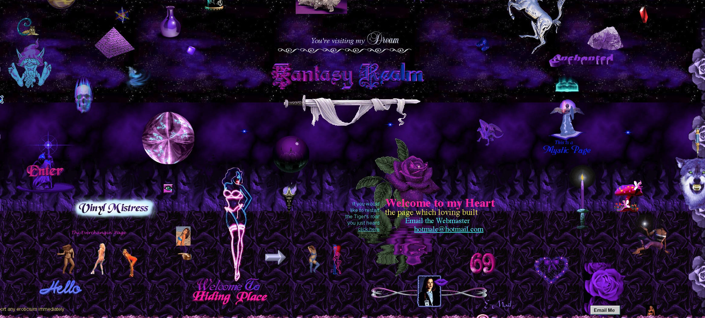
Image Credit: Cameron’s World
Anti-Design is characterized by:
- Bold colors
- A confusing, busy interface
- Off-grid typography
In fact, you could say that the Anti-Design of 90s websites was the precursor to what we more commonly know today as Brutalism. Brutalism is a design trend for websites emphasizing bare-bones design. Anti-Design tends to be an intentional attempt to make the worst web designs possible, in a tongue-in-cheek way.
Design for Today’s Millennials
At its core, 90s graphic design was what today’s millennials consumed in pop culture when they were in elementary, middle, and high school. The bright colors, spacey textures, and eye-popping typefaces were the perfect way to close out the 20th century and usher in the new millennium. Overall, design in this era focused on optimism and positivity, which is why you have casual and comical fonts, along with vivid colors and styles.
If you take a hard look at some of the interfaces of the websites, apps, and social media platforms you’re currently using, you’ll even see some of these influences embedded into today’s tech. That’s a good testament to the enduring nature of this style.
Source: Creativemarket-Category Trends


#/media/File:..._Baby_One_More_Time_(album).png)
#/media/File:Daftpunk-homework.jpg)