At the 80s. The era that gave us Ghostbusters, Back to the Future, Dirty
Dancing, Miami Vice, punk, new wave, cassette tapes, shoulder pads, and teased
hair. It was a decade not known for its subtlety, and maybe that’s why the
over-the-top aesthetic of the 80s is a favorite among artists and designers. The
neon lights, the tropical color palettes, the geometric patterns, and the other
hallmarks of the decade somehow manage to feel fresh and modern no matter how
many years go by. These 1980s fonts capture the best of the era: inspired,
vibrant, energetic designs that manage to be retro, modern, and futuristic all
at the same time. Blog Inspiration by : Creative market ✓Fresh and Fabulous 80s
Fonts for All Your Projects Are your creative juices flowing? Browse the
complete hand-picked collection of 80s fonts and inject some classic retro vibes
that also feel fresh and modern into your designs. Download The PDF
https://creativemarket.com/blog/80s-fonts# #handpicked #80s #font
Ancient Cosmos
By SunnyAfternoons
Ancient cosmos, full of celestial illustrations, planets, moon phases, suns, zodiac signs constellations, stars and clouds. All in vintage astronomy vibe. ✦
These graphics are super fun to create your own arrangements with, which you can use for your creative projects such as scrapbooking, monogram designs, wall art/posters, greeting cards, blogs/websites, digital projects, invitations and many more in magical, mystic vibe.
How to Design a YouTube Thumbnail to Get More Views
For years, YouTube has been a path toward fame and fortune for “ordinary people” with talent. It has become a colorful blend of all types of content, from grandmothers giving a tutorial on their holiday turkey techniques to school bands getting their music out there.
No matter what a channel’s content might be, though, one of the first challenges is convincing users to click and watch the video, and that all starts with the thumbnail. A well-designed thumbnail could be the deciding factor that catches a viewer’s eye and turns them into a lifelong subscriber.
How do you design a YouTube thumbnail that gets viewers to stop scrolling and start watching? Use these expert tips.
Be Authentic
First and foremost, don’t fall into the trap of publishing clickbait thumbnails. We’ve all seen videos in which the thumbnail image wasn’t representative of most of the video, or worse, it wasn’t in the video at all. This is a fast way to turn off viewers and lose loyal subscribers.
Use Consistent Branding
Branding is crucial in the overcrowded world of YouTube. You want users to see a thumbnail and automatically know whose video it is because it has the same tone and imagery.
An easy way to get started is with a professional YouTube branding kit. It comes with the colors and templates you need to produce thumbnail after thumbnail with on-brand images.
Thorough branding isn’t just about colors, fonts, and logos, though. You also want to be consistent in the types of photos or graphics you use. For instance, graphics should have a similar illustration style. Photos should have similar lighting styles or image effects.
All this combined will help viewers identify with the channel and become loyal viewers and subscribers. After all, the age-old Pareto Principle says that 80% of your engagement will come from 20% of your viewers, and those high engagement levels come from sustained loyalty.
YouTube Channel Art Template
by Social Media Pixie in Templates
Get a Face in the Frame
For introverts and extroverts alike, humans are automatically drawn to other humans, even if it’s just an image. Including a person’s face in your thumbnail is automatically more engaging and eye-catching.
Be sure that the person’s facial expression matches the tone you want to convey. They should be laughing if the video is comedic, or if it’s something down-home and comforting like a cozy cooking video, they could have a comforting smile.
Don’t Compromise Quality
Every designer knows the golden rules of image resolution: print images must be 300 dpi, while on-screen images only need to be 72 dpi. That may not be enough anymore.
Today, people watch YouTube on large monitors, huge TVs, and so on. They can zoom in and out as much as they want. Because of this, it’s now advisable to have high-res photography in your thumbnails so the image looks professional and put-together for every viewer.
Use Few Words with Great Impact
In general, the fewer words you write, the more people will read them. If you’re trying to squeeze a 20-word title onto your thumbnail, you can bet that nearly everyone will scroll by because it’s hard to read and it’s visually overwhelming.
The trick is to limit your thumbnails to a few words and make those words as compelling and enticing as possible. “Short and punchy” is your mantra. In your design, make sure those words also stand out enough to be readable at a glance.
Showcase the “After”
Most YouTube videos finish with something visually attractive. For instance, if the video is a makeup tutorial, the “after” is the finished look. A cooking video has a finished dish as the “after.” A reaction video’s “after” could be the reactor’s impressed or shocked reaction.
In these cases, feature the “after” in the video because it’s visually appealing and shows the viewer exactly why they should click. The exception is a situation in which this would create a spoiler. For instance, if your video’s title is bragging up a “secret celebrity guest,” don’t show the celebrity in the thumbnail.
Incorporate Diversity and Inclusion in the Big Picture
People are more likely to be attracted to a video or other type of media if it shows someone they can relate to. For this reason and to help to increase overall diversity and inclusion in the media, consider showing people of various races, genders, and ages in your thumbnails.
This is easy to do if there are multiple people in the video. If not, you could include illustrations that reflect the video’s content while incorporating diversity in the illustrations.
Know What Appeals to Your Audience
It’s the golden rule of marketing and design: know your audience. Fortunately, that’s easier on YouTube than in most other types of media.
Take a look at the channel’s audience analytics to see a snapshot of your channel’s viewers. You’ll see their geographic locations, ages, and other helpful data. This shows you the primary demographics of your fans and it also helps you find gaps in your audience.
Based on this, check out the top channels and videos for the viewers you want to target. Look over their thumbnails and look for patterns. Do they use bright colors or more muted tones? Do they include illustrations, photos, or both? What is the general visual style for their thumbnails?
Now that you’ve seen what thumbnails seem to be popular for your target audience, use them for inspiration. Don’t copy them too closely, but incorporate some of those elements into your own on-brand style.
Creating Click-Worthy YouTube Thumbnails
Design work that’s part of a marketing strategy is a tricky game. You’re walking the line between artwork and sales, trying to elicit a specific action while also being visually and artistically appealing. YouTube thumbnails require you to walk that same tightrope. The tips above can help you master thumbnails that get clicks but aren’t clickbaity, and those that are unique enough to catch the eye but similar enough to build a consistent brand.
ySense: $149 profit in 24 hours…
by ySensePosted onJuly 27, 2020
Today we’re sharing how one of our ySense members from the UK (MLivePro) who was able to earn $149 profit by completing this one ySense Offer!
If the offer is live in your country, follow his lead and you could find yourself $149 better off by tomorrow too!
The original post is over on the ySense blog and can be viewed via the link below. Note – you’ll need to first log in to the ySense blog, then copy and paste this link straight into your browser:
https://www.ysense.com/?rb=77212282
So let’s hear from MLivePro and how he earnt so much in such a short time on ySense…
MLivePro: “Last night I took a chance and tried the Bitcoin Trader offer. I was sceptical, but the fact the offer was on here reassured me a fair bit.
Then on signing up to the site the offer linked to, it was literally 2 minutes before I got a phone call from the company. They talked through the deposit process, and even told me not to trade until a manager called me, which happened today.
The offer here (in the UK) was to earn US$350 in my ySense account for depositing UK£200 into the Bitcoin Trading site. However I had to deposit US$250 which got converted into Russian Rubles during the payment process then converted back to US$ on the site. All the time I was thinking I’d have to raise a dispute with the bank in case it was a scam…
but no…
Within two hours, my ySense account was credited with the $350…. and as I had completed the daily checklist I got a $49 bonus!! $149 profit!!
Proof of Payment from MLivePro’s Transaction History
SetelanTypography is a key foundation of any design, and it’s also very hard to get right. Designers and brands of all kinds heavily rely on selecting good fonts and typefaces for every single project or system they work on. Understanding what makes a good typeface, and enhancing your overall knowledge of typography can have a huge impact on how effective your future work can be.
We’ve previously covered typography basics and outlined some useful readability tricks here on the Creative Market Blog in the past, but in this post we’re going to take it a step further and explore 5 fascinating online courses to dig deeper into the world of typography. So if you’re looking to level up your understanding of type or even dabble in creating some yourself, this collection of courses is perfect for you.
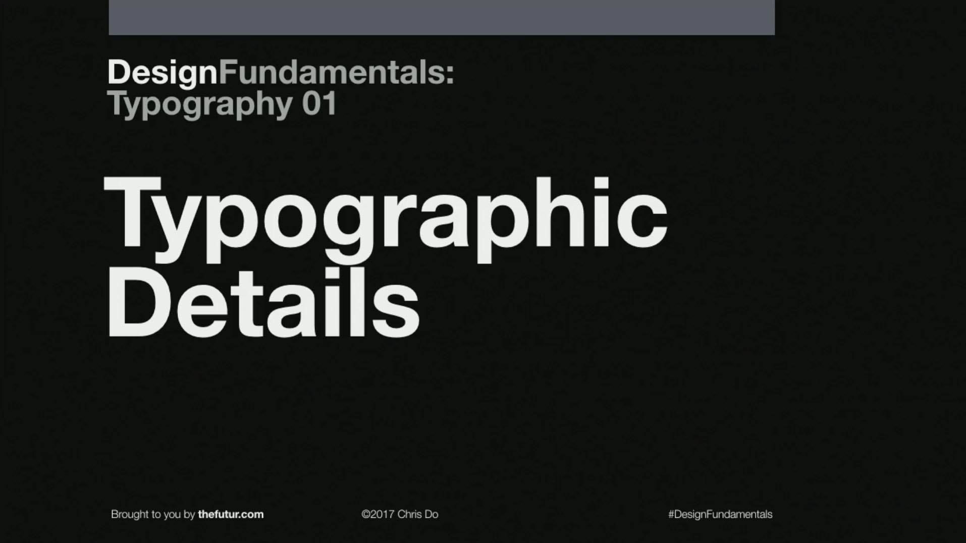
Typography 01 — The Futur
The Typography 01 Course by The Futur is a premium design course option, with a one-off purchase of $299 for access to the course — but don’t let this be a barrier, as the price is fully justifiable with the authors being well established and much loved design educators. Typography 01 is the most popular course from creators ‘The Futur” and it comes packed with more than 6 hours of comprehensive video content for your to absorb. The key goal of this course is to teach you how to control typography within your work so that you have a solid grasp of the impact your type has from the very start to the final stages of your projects.
The class will cover aspects such as repetition & contrast, grids, typographic details and applying type in a layout — all with the aim of teaching you to properly integrate type into your system so that everything can work together in harmony.
Trailer for Typography 01
Another welcome aspect of this particular course is that it is forever growing, meaning you’ll get access to lifetime updates and some bonus design critiques, where you can watch a visual breakdown of the type used in existing projects so you can learn from live examples and see what worked and what didn’t. So you get some real hands-on, real world experience along with some solid theory and fundamentals mixed in.
Typography Fundamentals by Ilene Strizver
Typography Fundamentals is a course available on CreativeLive, put together by Ilene Strizver who is the founder of The Type Studio. The course promises to teach you ‘how to take full advantage of the power of type. You’ll learn not only the fundamentals of typographic design, but also how to “see” type through new eyes - all to make more sophisticated type choices that will open doors and set your work apart.’ all of which comes at a cost of just $29 for a one-off fee the regular price, or it can also be purchased as part of a membership plan.
Aimed at creative professionals of any level, the focus of this class is to teach you to recognise and appreciate how important type is, and then to get you thinking like a type designer as a way to level up all aspects of your work, and to put type to better use, whatever your creative background might be.
The entire course is broken down in to 13 important lessons, covering topics such as ‘Type Hierarchy,’ ‘Selecting the Right Type for the Job’ and ‘Think Like a Type Designer’ as well as videos breaking down popular typefaces and outlining common typography misdemeanours so that you can avoid making simple mistakes when it comes to using type.
At the time of writing this, this course has a 100% satisfaction score from previous customers, so you can be confident that the course delivers on everything that it promises.
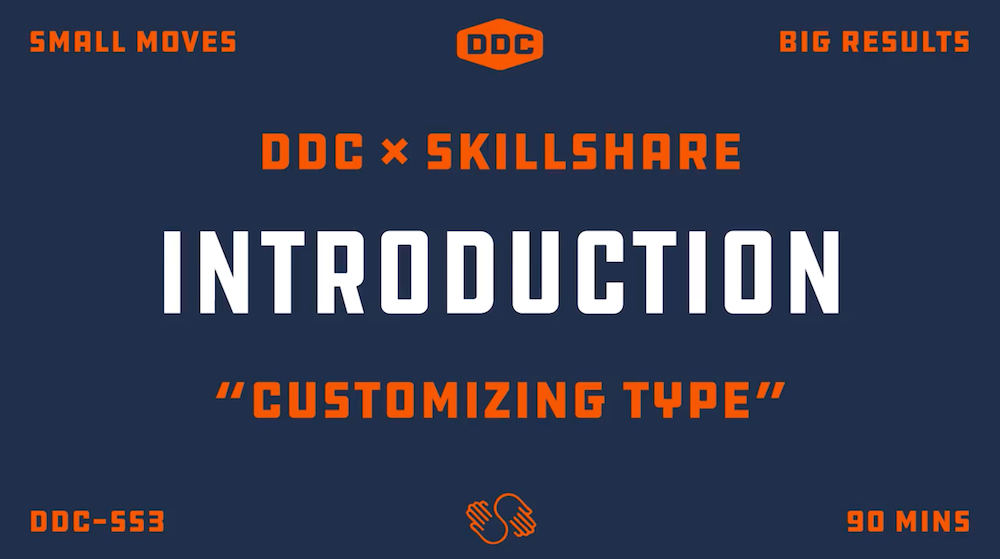
Customizing Type with Draplin
Much-loved designer and personality Aaron Draplin has a number of highly-recommended courses available online, but keeping our focus on typography, we can look to his popular Customizing Type with Draplin: Creating Wordmarks series for tips on taking existing typefaces a little further in your designs and making unique or more fit for purpose. Aaron Draplin has had a long career as a graphic designer, most notably for logo design, plus he is an author and a regular speaker (for the likes of TED and Google) and he even has some very popular Youtube videos which give an insight into his laid-back but engaging style of educating. Check out his Logo Design Challenge video for free on YouTube to get a taste for his content before picking up the full type class on Skillshare.
The reviews for this course say that it is best suited for ‘intermediate’ level designers and above, so this might not be one for beginners as it is a little more experimental and geared towards taking standard type in a different direction. Although Aaron is best known for his logo design skills, the lessons on display here do apply across a number of creative fields.
The vast majority of people that took the class say it ‘exceeded their expectations’ — so once again it gets the stamp of approval from the community. As this is available on Skillshare, you will need to sign up to access the content, which means paying for a membership of around $15 a month, but there is the option to take a free 2 month trial too and of course this gives you access to thousands of other classes on the popular Skillshare marketplace.
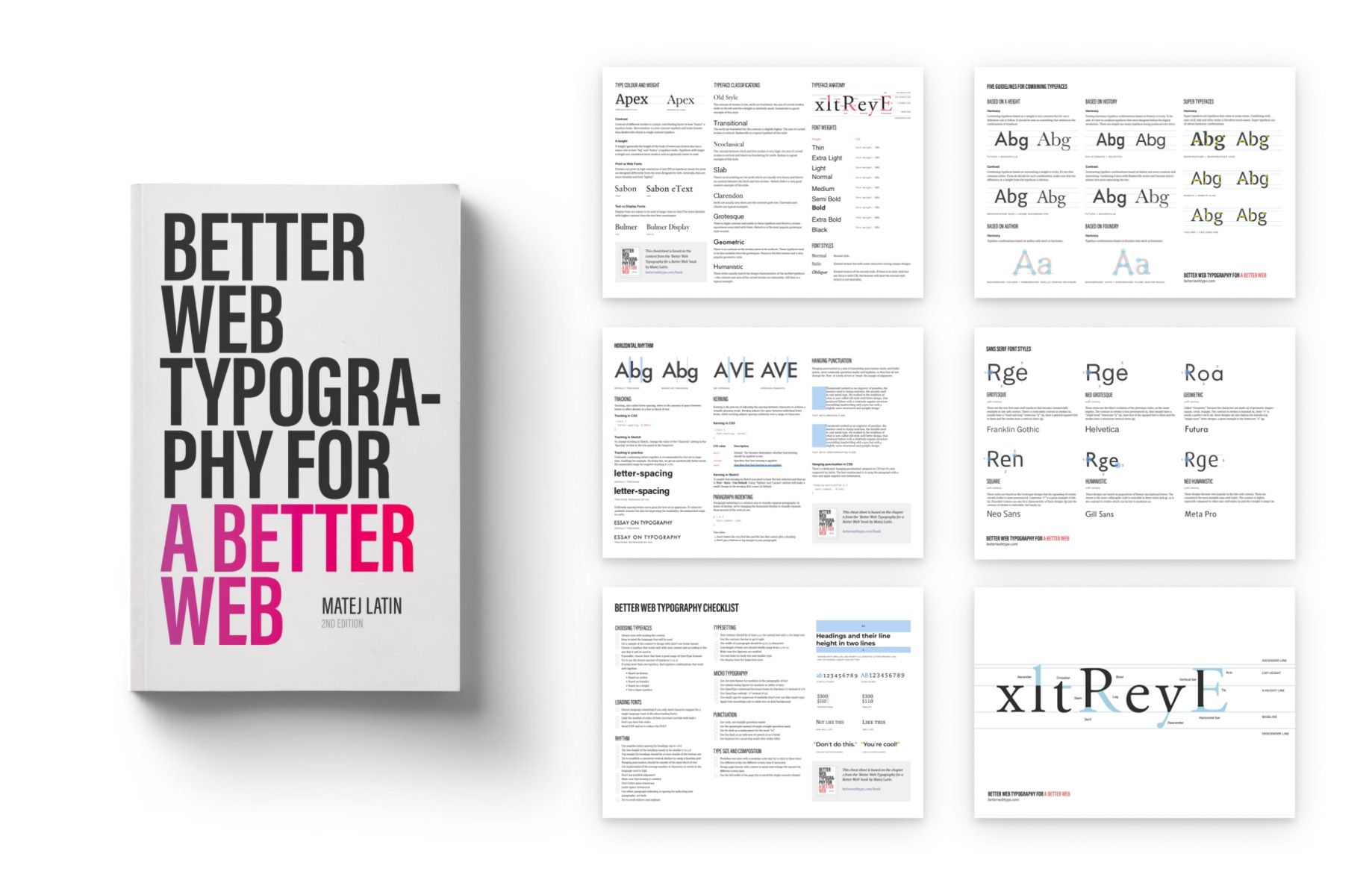
Better Web Typography — Matej Latin
It looks like a book, it reads like a book, but the author behind Better Web Typography, Matej Latin (Senior UX Designer at GitLab), proudly informs visitors that this is not just a book, instead it is an extensive course presented in book form. One great aspect when buying the full package for a flat fee of $29, is that it grants you access to a whole host of digital extras, example exercises, source code and Sketch/Figma files that go along with it. So we can certainly go along with the whole ‘this is not a book’ thing!
As the name of this course suggests, the focus here is on exploring and understanding the world of web typography. Once again this book will include advice on how to choose ideal typefaces for your projects, and it also takes a look at font combinations, teaching you how to pair fonts together in the most effective way. As this is geared towards web type, the book then starts to explore how to set paragraphs, modular scales, vertical rhythm and web page composition for type, with responsive web design in mind throughout.
As the Better Web Typography book is aimed at developers as well as designers this would be suitable for any level of experience of type, but perfect for those with an interest in the functional and aesthetic roles of type within a web project. With over 100 reviews scoring an average of 4.3 rating and over 29,000 sales you can be confident that this will be $29 well spent.
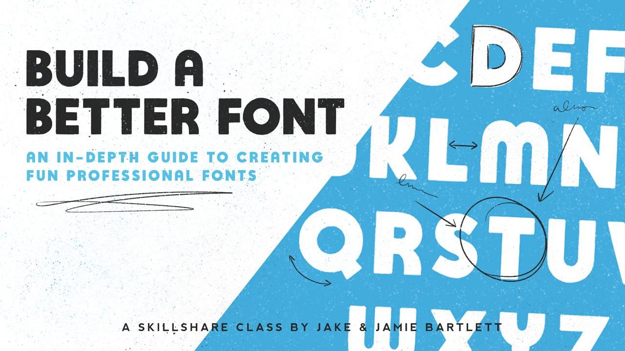
Build a Better Font — Jamie & Jake Bartlett
If you’ve made it this far, and you’re feeling particularly inspired and brave, there’s a chance you might actually be interested breaking into the world of creating typefaces. Nothing about the process is easy, so it’s always great to get some valuable insight from someone who truly knows what they are doing. The instructor for Build A Better Font just so happens to also be a member of the Creative Market community, with her own fonts and other goodies being available in her shop. So if you’re looking for a way to make a font that you hope one day you could be sold here on Creative Market, this course could be the one for you.
All aspects on the journey of making a font are explored in this 16 part class; ideas and sketching, refining, tracing, positioning, spacing, kerning and of-course the tools you’ll need along the way, as well as the super important testing phase.
Once again this class is available on Skillshare, so this will require a premium account, or you can make use of the free trial period to access the class for free, a reminder that memberships cost around $15 a month or less and you also get access to thousands of other classes across a wide range of topics.
The reviews at the time of writing are all positive, with no negative reviews at all. Community feedback suggests that the course itself is best for intermediate level designers, and lets be honest, making a font is not an easy process, so you really have to be committed to exploring this new skill before diving in to such a big undertaking, but fonts can be a fantastic creative outlet and source of income when done correctly, so if you are willing to invest the time and effort to educate and practise, courses like this can give you an edge.
More Typography Classes & Courses
If you’ve enjoyed this collection of courses and wish to explore more around the topic of typography, here’s a handy list of more resources that you may find useful. It’s a combination of more courses, tutorials and videos that you may find useful if you wish to continue to dig deeper into typography:
Intro to Typography — Flux on YouTube
Intro to Typography by Flux is part of a larger series on how to design for the web, but this free 18 minute video gives you a great primer for understanding the purpose of a font and how best to choose and use them.
Typography Handbook
The Typography Handbook is a quick reference guide / website that will help get you up to speed on a lot of the same ideas explored by the featured courses in this article.
Practical Typography
The goal of Practical Typography is to give you a primer on typography in ten minutes. Quickly covering composition, formatting, font recommendations and layouts in a neat little website.
Combining Typefaces: Free Guide
Combining Typefaces is a pocket guide by Tim Brown (who is Head of Typography for Adobe Typekit) that aims to get you comfortable with choosing more than one font to use within a system. It can be very easy to get this wrong, so having a free PDF to learn from is a great help.
Teela Cunningham is another fantastic seller here at Creative Market, but she also has a number of fantastic courses available on her own website, a number of which do cover lettering and type.
Rather than list a bunch of book recommendations, I’ll instead point you towards a more comprehensive and up-to date breakdown of the Best Typography Books for Designers for you to browse through.
Level-Up Your Script Lettering
Another Creative Market shop owner and popular hand lettering artist Ian Barnard has created his own script lettering course which is available on Skillshare.
Where Do You Learn Typography?
So that concludes my collection of recommended courses for exploring typography a little further, but now it’s over to you, please let me know what I’ve missed and what other resources you would suggest for learning typography. Which courses have you taken yourself or which books on the topic have you read that you highly recommend? Let us know in the comments.
This has truly been a throwback summer. A global health crisis has forced us to reimagine the spaces, events, and experiences that brought us the most joy. Regardless of where you live or how health mandates have reshaped your every day, it's been a season for deep reflection. Those of us in the Northern Hemisphere face a dilemma: what does Summer look like when the sun is out and so many are staying in? What does it feel to go through the season where we're used to coming together when you're supposed to stay apart?
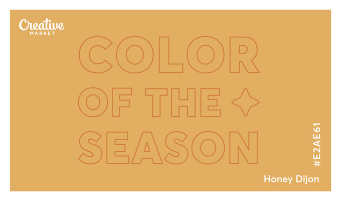
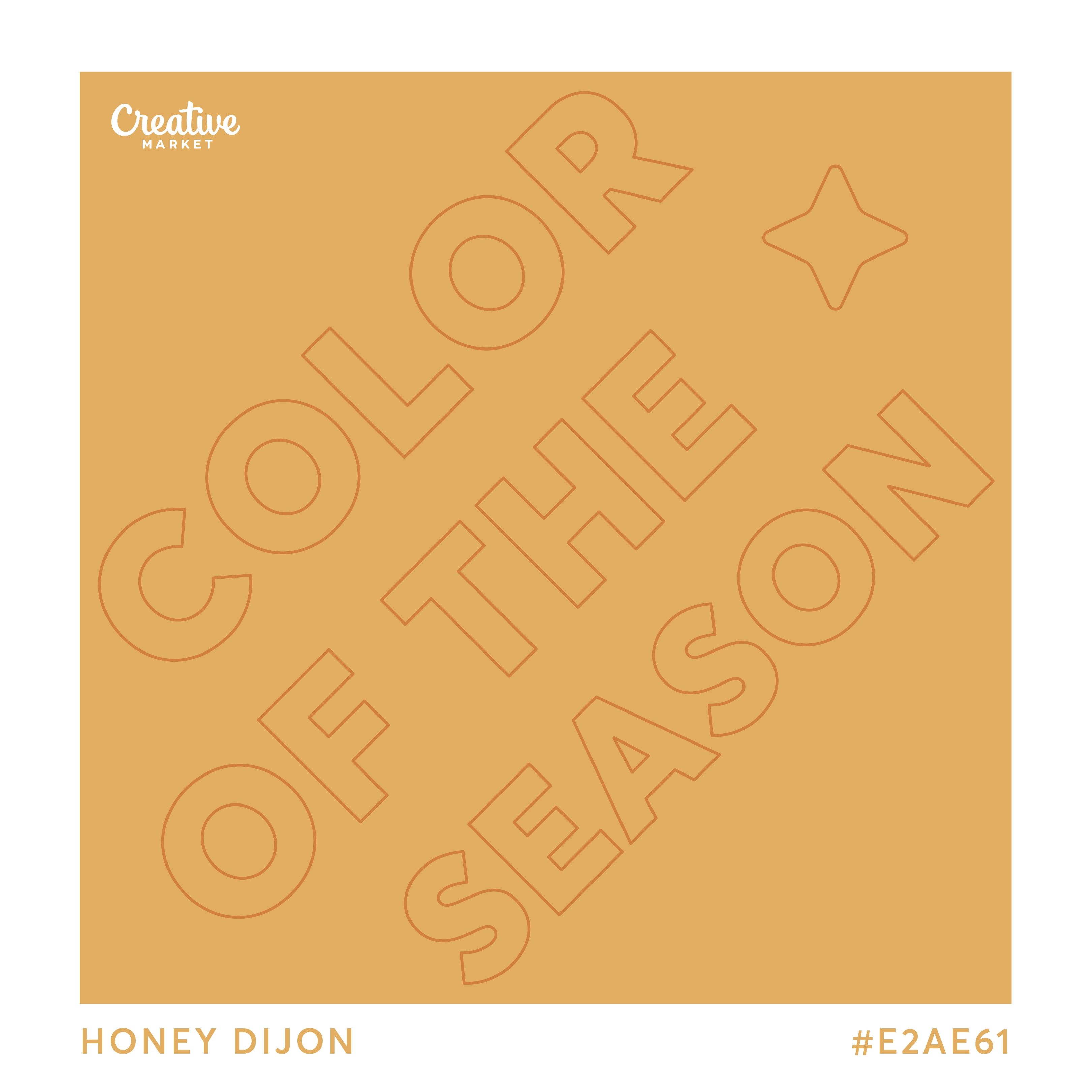
It feels like Honey Dijon. Atypically bittersweet. Just like mustard spiked with a bit of wine and a pinch of honey, this hue exudes mixed feelings. It captures a summer that is proving to be less energetic, more contemplative, and unlike anything we could have imagined.
Summer 2020 has been a period of reflection about what truly matters to us, marked by ebbs of hope and flows of uncertainty. It's also had a distinctively nostalgic spirit: many of us have taken comfort in remembering the moments of joy we've lived in summers past, which remind us of the possibilities in those to come. All in all, Honey Dijon is a Summer-to-Fall hue that feels transitional, much like everything else right now.
Looking for a refresher on the various color codes, what they mean, and their applications? Make sure to check out this article where we explore the differences and technical details you need to know.
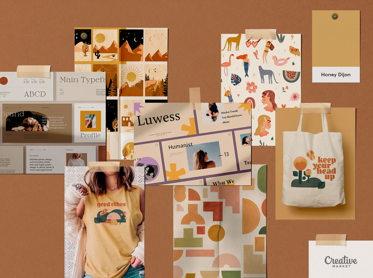
Start Using Honey Dijon
Here's a curated collection of Creative Market products that are already using Honey Dijon or slight variations of it. Try your hand at this hue with a template or graphic that is well-considered and ready to use: