Translate

Wednesday, March 27, 2019

Design Trend Report: Street Art Design


Commonly found in public places, this design trend has the ability to capture the imagination and show up where you least expect it. Street art design is a cousin of guerrilla art, thanks to its penchant for raising awareness about various political and social issues, and has gotten more popular in this new century.
While it’s still in a limbo of sorts when it comes public acceptance and official governmental approval in jurisdictions around the world, that hasn’t stopped this design trend from showing off its creativity and tendency to surprise. These days, you can see it on everything from the walls of buildings and trains to streets and any site that’s viewable by the public at large.
Here’s your in-depth walkthrough of street art design and its place in the world in the 21st century.

The History of Street Art Design

When it comes right down to it, graffiti of a political nature (social commentary, protest slogans, etc.) scrawled on public places like walls and buildings is the precursor of this design trend. If you want to broaden your definition of this genre, you could definitely include straightforward graffiti as a subset of it.
However, this is too much of an oversimplified way of looking at it.
Basic-though-memorable graphics and/or text doodled, painted or chalked onto public surfaces started to make the public take notice as early as the World War I and World War II periods of the 20th century. Perhaps nothing is as effective as making this point as the infamous Kilroy Was Heregraffiti that was ubiquitously found during World War II and associated with American GIs.
Uniquely American in nature, Kilroy Was Here showed a crudely drawn, bald man with a long nose, peering over a wall so that only his eyes and nose were visible, with his hands clutching the top edge of the wall.
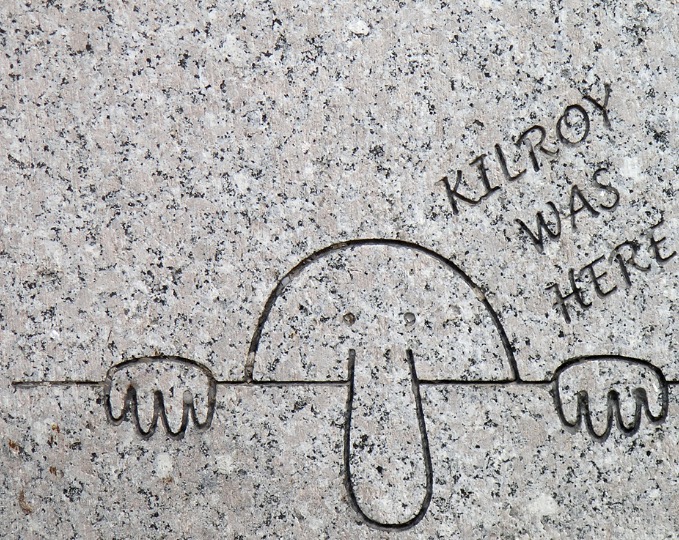
Image Credit: Luis Rubio
This graffiti was something of a tradition among GIs, who tended to find drawings of Kilroy Was Here in various places they served, whether that was an encampment, station or other location. This motivated GIs to continue this graffiti tradition in new places they’d visit.
The thing about Kilroy Was Here was that it was actually based on another form of early graffiti called Foo Was Here, which dated back to World War I and its popularity with Australians. Like KilroyFoo depicted a bald man (at times with a few strands of hair), crudely drawn, looking over a wall with only his eyes and nose visible, as his fingers clutched the top edge of said wall.
What got the public’s attention with Kilroyand Foo was not so much its appearance on public property—but that it appeared in surprising and unexpected locations. Certainly, this would come to be a defining feature of anything graffiti-related as the design trend wore on.
From here, we move to the 1960s, where New York City’s graffiti boom of the later parts of the decade gave this nascent design movement another shot in the arm. This continued throughout the 1970s and into the 1980s, where street art design culminated into large and defiant works on entire NYC subway cars.
You can look at the 1980s as the decade where this design trend matured and evolved. By the end of the decade, it wasn’t just about text-based designs; artists were painting actual illustrations on walls, like the late Richard Hambleton, known for his so-called “shadowman” paintings that he splashed on hundreds of buildings across NYC.
At the same time, other artists were experimenting with ways to make their street art pop and attract the attention of the unsuspecting public—almost in the same tactical mindset as the aforementioned GIs during World War II. SAMO (short for “same old”) began appearing on NYC walls, the work of Jean-Michel Basquiat while Keith Haring’s subway graffiti also created quite a splash during the 1980s.
Check out some of our street art design assets to further understand this trend’s knack for giving the viewer something out of the ordinary:

It was difficult to make a real career out of this design trend back then due to its lack of public acceptance and issues with the law. Still, it should be noted that the early street artists’ refusal to work within the confines of a gallery or museum may have been curiously rooted in another, much earlier design trend that you wouldn’t expect: Futurism, which was a short-lived Italian movement in the early 20th century that was obsessed with technology, machines, youth and speed. In the Manifesto of Futurism—written by its founder, Filippo Tommaso Marinetti—there’s a short quote that reads:
“We will destroy all the museums.”
In the last couple of decades or so, however, things have taken quite a favorable turn for street art design.
In North America alone, there are numerous, public sites or communities where street artists are invited to display their works:
  • New York City – The locale that started it all in many ways is still a prominent place of street art to this day, with areas like the Chelsea art district and Brooklyn’s Dumbo and Williamsburg neighborhoods recognized as street-art sites.
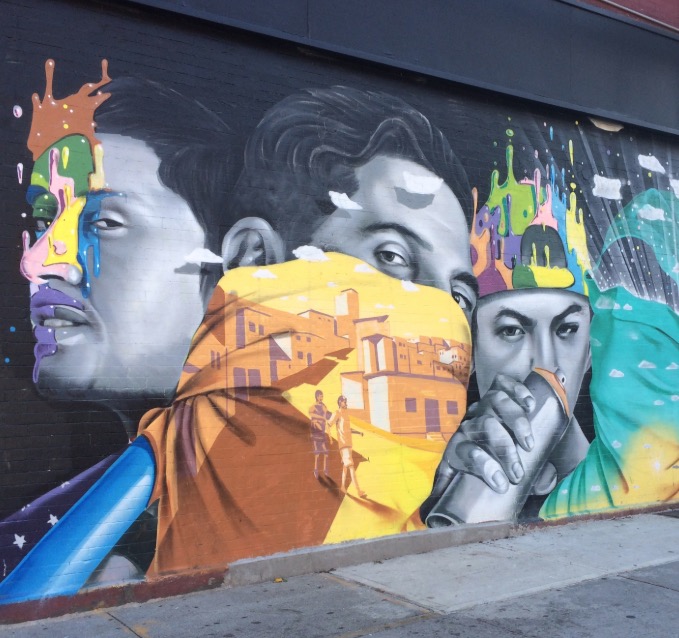
Image Credit: Gabby T231
  • Los Angeles – The Hollywood area and key streets such as Sunset Boulevard, Melrose Avenue, La Brea, and Beverly Boulevard are places you can find prominent street art in the present day. The LAB ART art gallery exists solely to display street art, using the almost 7000 square feet of its property to show off this design trend.
  • Buenos Aires – This capital of Argentina is home to many large-scale artworks and murals that both citizens and visitors can see on public spaces and subway stations.
  • London – London is an oxymoron of sorts: While the city’s population is quite accepting of street art, the local government disapproves of it. Nonetheless, street art here has a sizable following, with street artist Stik painting—you guessed it—literal stick figures on public spaces, and the Dulwich Outdoor Gallery hosting street-art exhibitions.
  • Melbourne – Australia’s second-biggest city is a hotbed of this design trend. Notable artists like Banksy and Blek le Rat have been known to exhibit their artworks in public places while street art is actively supported and maintained by local councils. Look for a lot of street art in sites like Melbourne’s city center, Northcote, Brunswick, Fitzroy and Carlton.

The Characteristics of Street Art Design

By now, it’s clear that this trend features designs and artworks that are outside the box, which is putting it lightly. If you want to see illustrations and paintings that will literally cause you to stop and stare, this is the style to behold.
Here are some telltale qualities of this style that are impossible to miss:
  • Loud and flashy
  • The use of silhouettes
  • Vibrant colors
  • Larger than life
  • Comic-based
  • Cartoony
  • Diverse typography (bubble letters, block letters, sans serifs, serifs, etc.)
  • Full of different shapes, patterns and forms
  • Politically and socially subversive
  • Straightforward illustrations
  • Minimalism (think stick figures)
  • Contrast
  • Strong focal points
For a more in-depth glance at the characteristics of this design trend, have a look at some more of our street art-inspired digital assets:

Famous Works and Contributors

To understand the genesis of this style of design from being seen as something of an underground movement to now being increasingly accepted—especially in bigger, urban centers—we have to appreciate its most famous works. From its early days of the 1970s and 1980s to the more mainstream designs of the 21st century, here’s a roundup of some of the more well-known contributions that street art design has offered the world.

The Bowery Mural

Not so much a famous work as a famous location that has facilitated a lot of famous street art, the Bowery Mural is situated at the corner of the Bowery and downtown Manhattan’s Houston Street. It was set up specifically to display the works of those working in street art design.
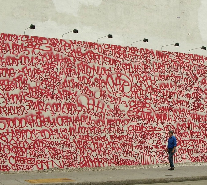
Image Credit: Sewperman
Since 2008, this outdoor exhibition space has hosted a series of murals by:
  • A retrospective of famed 1980s artist Keith Haring
  • OSGEMENOS (Brazilian street and graffiti artists)
  • Barry McGee (American street and graffiti artist)
  • John Matos or Crash (graffiti artist)
  • Martha Cooper (American photojournalist who’s chronicled street art in New York for decades)
  • Caledonia Dance Curry or Swoon (American street and graffiti artist)
  • Maya Hayuk (American artist)

Rene Moncada’s I AM THE BEST ARTIST Murals

Beginning in the late 1970s, Moncada’s I AM THE BEST ARTIST murals spontaneously appeared in various spots in Manhattan’s SoHo neighborhood. They continued on throughout the 1990s and were characterized by their large size, use of color contrast, and bold typography.
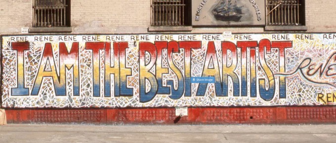
Image Credit: Penwatchdog
Moncada’s motivation was an act of provocation against the local art community he felt ignored him. These murals eventually became backdrops to many tourists’ photos, movies and even marketing-campaign layouts.

Banksy

No one knows exactly who Banksy is, but that hasn’t stopped him from being one of the most successful street artists in history. In fact, his hidden identity is likely one of the factors behind his runaway success. Based in England, his artworks have appeared in a hodgepodge of locales (bridges, streets and walls) all over the world.
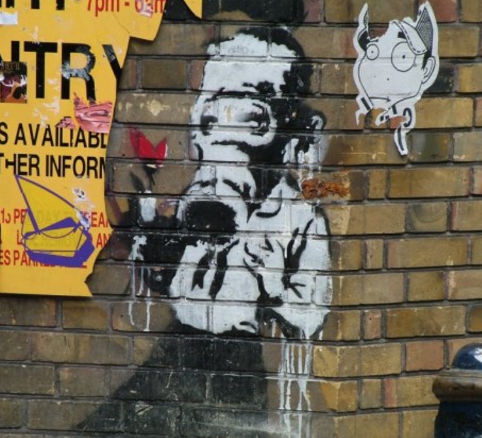
Image Credit: Matt Whitby
Primarily known for his social and political commentary, his designs also feature satire, subversive epigrams, black comedy, and interesting technique, as his graffiti is always applied in a distinctive stencilingmethod.

Street Art Design in Graphic Design

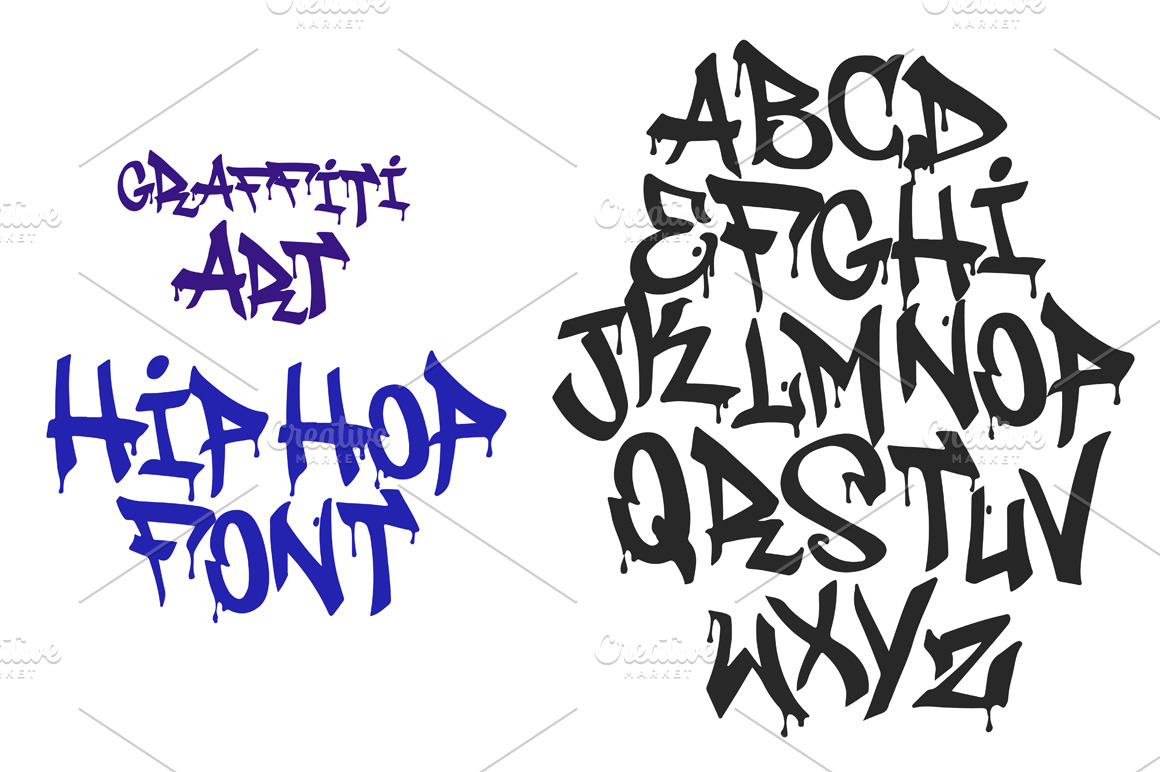
Graffiti Font | Street Tag Vol 1

For an embodiment of how unconventional and bold street art can be, check out this typeface that draws its inspiration from various graffiti tags in Jakarta’s urban locations. Note the highly stylized approach to font design here, with its combination of bold, fat strokes and cursive lettering.

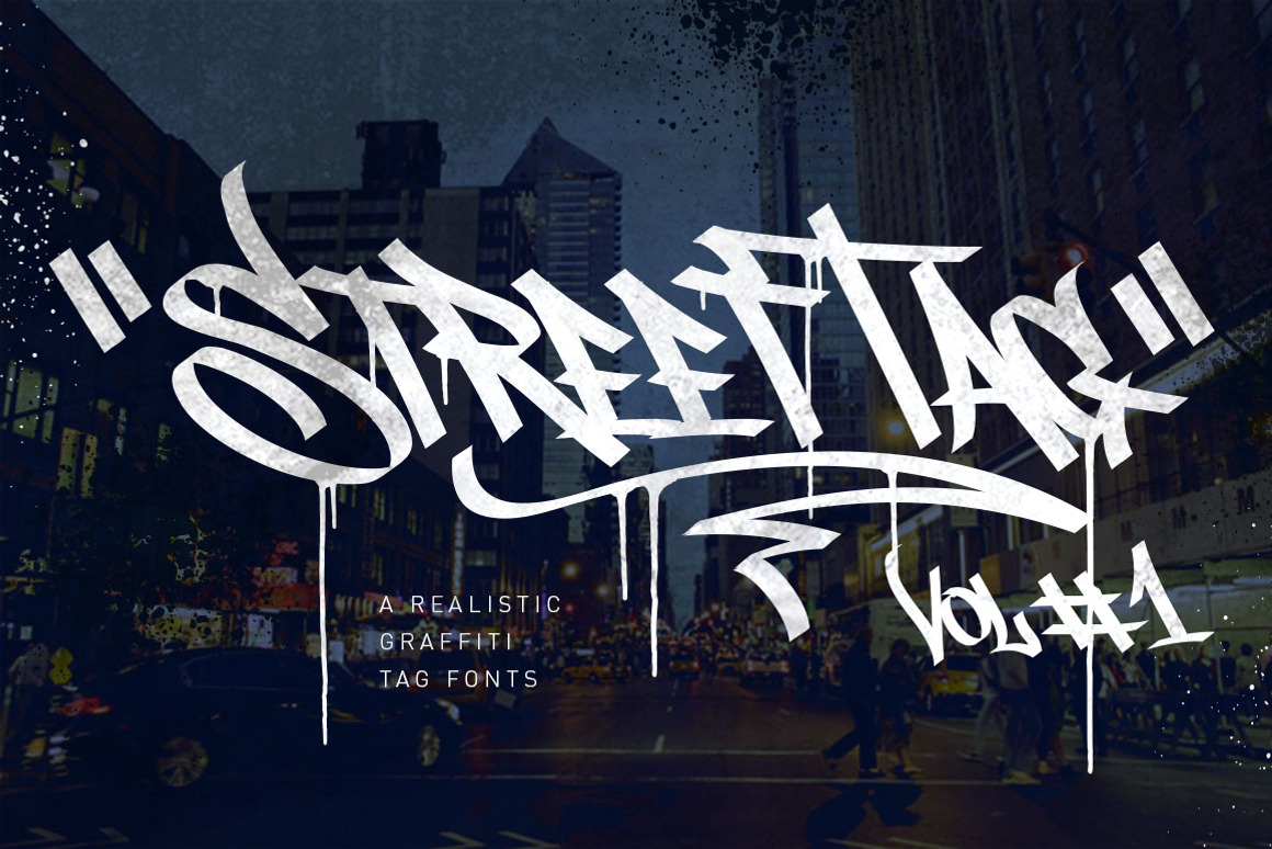
In this great typography set, you’ll receive various special character designs like drips, alternate tag symbols, and lines. The special characters are fully editable, so you can adjust their kerning to your specific preference.

Urban Poster Mock-up VOL. 9

What’s unique about this set of poster mockups is its emphasis on street art in a handy graphic. Easily infuse your next design project with an urban flavor—much like a street-art mural or illustration you’d see in a big, urban city—thanks to this design asset. Design your poster for an event, fundraiser or concert, and see if it really looks attractive and convincing in a real-life environment.

With 17 different mockups from which to choose, you’ll get a very reliable impression of your poster design’s appeal in the real world. That’s extremely helpful information to know since people will only spend a couple of seconds at most looking at your poster on a wall or other public location!

Street Art Logo

Icons, marks, brands and emblems given the street art design treatment are quite the sight to behold. A stellar example of that is this bundle of logo designs that uses street art culture as its inspiration. This digital asset, which will make a great addition to any design project, is an eclectic mix of hand-drawn typography and stencils. The end result is an aesthetic series of designs that’s great for a multitude of uses.

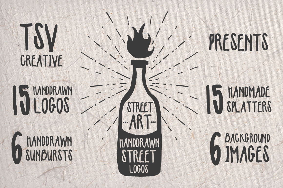
Use this set’s 15 hand-drawn logos, 15 handmade splatters, six hand-drawn sunbursts, and six background images for projects like:
  • T-shirts
  • Posters
  • Stickers
  • Business cards
  • Invitations
  • Brochures
  • Menus
All told, you’re getting a high-value bundle that shows off the aesthetic creativity of street art.

Street Art Photo Pack

As a designer working on a creative project, you know that it can always be optimized with the use of high-quality images. If you’re working on a project that’s urban-facing—or you’d just like to include something that’s outside the box and will grab people’s attention—look to this high-value bundle of street art photographs.

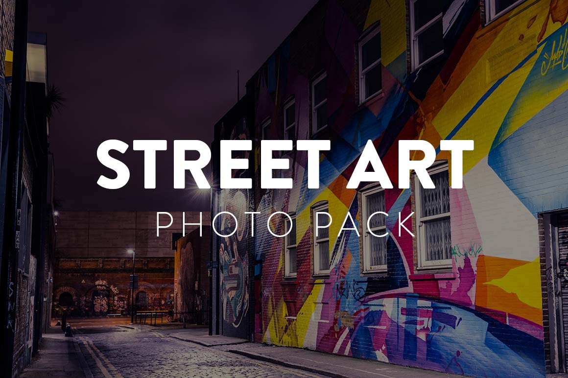
With 21 total eye-popping pictures in the set, street art design is captured in a way that only close-up photography can do justice. These stunning urban images have been taken in various neighborhoods in New York City and London, both locations being hubs of the street art culture.
All images are between 4000 and 6000 pixels wide and come in JPG.

Street Art Design in Web Design

Street Art Utopia

With a tagline like “We declare the world as our canvas,” you know that this website is dedicated to showcasing street art in all its unpolished glory. Street Art Utopia displays various examples of street art from all over the world, from Brooklyn, New York, to Vannes, France, to everything in between.
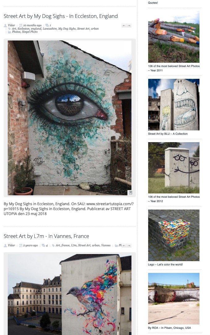
Image Credit: Street Art Utopia
Each entry identifies the street artist or artists responsible and provides a comment section where site visitors can give their feedback. There’s also a most-popular column in the sidebar to highlight the collections that have been getting the most attention in the last 24 hours.

Street Art Mankind

A perfect example of the political and social activism of this design trend, Street Art Mankind is an organization that uses street art to raise awareness and combat child trafficking. Its website, above the fold, offers a blunt glimpse into this philosophy. The hero image features a young girl taking spray cans to a wall to write the organization’s mission in a big, slab typeface.
Image Credit: Street Art Mankind
The homepage’s good use of white or negative space in the background frames the organization’s mission with great clarity and creates a stark impression for visitors. Overall, a great example of using minimalism in web design to ensure that there are very few elements on a page that don’t compete for user attention.

Street Art Cities

The website for an app committed to helping urban enthusiasts find the best street art sites in the world, Street Art Cities boasts an impressive, rotating carousel on its homepage, above the fold, that scrolls through some aesthetic street-artist murals. Of particular note is the use of vibrant colors in the mural selections of the carousel to draw the eye of site visitors.
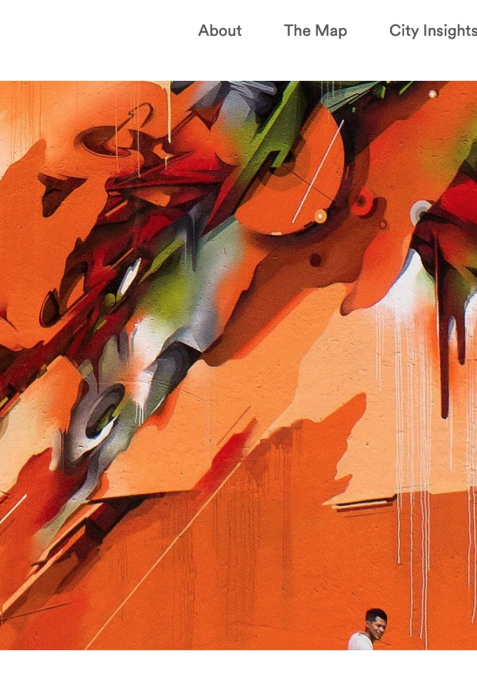
Image Credit: Street Art Cities
The positioning of this carousel establishes to visitors right off the bat what the purpose of the site is and sets up good information hierarchy in the clear-cut page flows.

Urban Flavor Meets Social Commentary

Street art design is a movement that you can’t miss because it’s in-your-face, literally. From illustrations on entire walls to long subway cars, this trend features artworks in the most unexpected places, but that doesn’t mean that this style is light on technique. From intricate stenciling and interesting typography to vivid colors and pop-art influences, street art is a visual treat.

From its humble beginnings as the “graffiti” of GIs during World War II, it’s come a long way. While the movement initially started out at odds with local governments and the law, today, the trend is widely accepted in public places, especially in urban centers, with specific neighborhoods, exhibitions and public spaces set aside just for street art.

Saturday, March 2, 2019

Design Trend Report: Vertical Video

Design Trend Report: Vertical Video

By on Mar 1, 2019 in Inspiration
Chances are that you’ve been told that vertical video is to be avoided at all costs and is a social media faux pas. After all, video looks so much better in the landscape (horizontal) orientation than vertical video. You don’t have those “ugly” black bars on either side of your video if you shoot horizontally rather than vertically.
At least that’s what the so-called conventional wisdom has told you!
Stop to think for a minute, and you’ll soon realize that vertical video is a bold, new content format that turns conventional wisdom on its head. This design trend is actually more popular than you may think, as research reveals that the majority of video content is shot vertically instead of in landscape orientation anyway. If so, then why is there all this pressure and expectation to continue shooting horizontally?
Free yourself from this restrictive belief system and embrace the tighter intimacy of vertical video, a new design movement on our smartphones.

Way More Popular Than You May Think

Many people believe that shooting video in landscape orientation is some sort of best practice when it comes to recording. Almost without thinking, when we finally remember to as we’re shooting video, we quickly rotate our smartphones horizontally to get a wider screen view. This, we tell ourselves, will get rid of those aggravating black bars on the sides of the video.
person using silver iPhone X
Image Credit: Alvaro Reyes
However, data suggests that most of us already shoot video standing on end, so why mess with the natural way we record things? According to ScientiaMobile’s MOVR Mobile Overview Report, “94% of the smartphone hits indicate a portrait orientation.” In other words, almost all of us are shooting video in the way that comes naturally to us—with our phones held vertically.
This makes sense when you think about how smartphones are designed in the first place. They’re designed vertically, with our thumbs meant to swipe, tap and interact with the screen as our remaining, four fingers provide support to the entire device. In short, from this natural way we already hold our hands, it extends to how we innately want to shoot video, which is upright.
So the next time you feel the overpowering urge to turn your phone horizontally, just ignore it, and instead try to experiment with this new approach.
To help you along with that, take a look at some great samples of our wide assortment of digital assets in this style:
     

The History of Vertical Video

The history of this new design trend is highly interesting but, to really understand its roots, we have to go back to the true history of film and aspect ratios. See, we’re used to watching movies, TV shows, and videos in a horizontal format due to this preference having been standardized from the earliest days of film.
The very first movie screenings took place all the way back in 1895, when the Lumiere brothers—Louis Jean and Auguste Marie Louis Nicholas—held their first screenings. When they did so, they initially standardized the format horizontally.
Image Credit: The Hollywood Reporter
Now let’s fast-forward a few decades to 1932, when the Academy of Motion Picture Arts and Sciences standardized the screen format to the so-called Academy ratio. This is the famous 1.375:1 aspect ratio that made images wider than they are tall, thereby creating the effect and popularity of horizontal video. When the world-famous organization known for putting on the Oscars each year standardizes this format, it’s no surprise that the tradition of horizontal video has carried through across the decades and influenced how we think we should shoot our moving images on our phones.
For a good, long while, vertical video had a really hard go of it, when it came to the web. Horizontal videos dominate YouTube, which led to the avoidance of upright videos as much as possible. In fact, professional video creators would actively refuse to work with this format due to the lack of platforms that supported it.
All that suddenly changed a few years back, starting in 2011. That’s the year that Snapchat was launched. Snapchat, of course, is the multimedia messaging app that allowed its users to send each other “snaps” (pictures or short videos) that would last for only a short time and then become inaccessible. Snapchat later on introduced dedicated support for video in 2012. Since its launch, the app had always prioritized a 9:16 aspect ratio, which meant a portrait orientation (the images are taller than they are wide). Just a year later, the app introduced Snapchat Stories to further capitalize on vertical video and popularize it to its audience of mainly younger people between the ages of 18 and 34.
Since Snapchat succeeded in courting this huge audience of millennials and Generation Z, the advertising departments of brands all over the world gradually took notice. Due to the app’s popularity with the hipper, younger crowd that also had dollars to spend, vertical video was instantly legitimized. We can all thank Snapchat for that.
From here on out, the sky was the limit for portrait orientation of video. In 2015, other platforms started to jump on board this upright craze. Grabyo, the live-video production platform that’s integrated with popular apps like Instagram, Twitter and Facebook—and which is also used by major sports leagues like the NHL and Spain’s La Liga—made it easier to publish vertical videos. It debuted a technology to assist those video publishers who were only used to publishing horizontally to start publishing in more mobile-friendly orientations like upright.

Get your free grid template

img

Design a cohesive Instagram grid

Download this kit to quickly export Instagram shots that match your brand's visual style. PSD and AI files are included, as well as a moodboard to display your brand's assets.
In the same year, Snapchat and two partners formed a video-marketing consortium aimed at producing video content specifically for vertical screens. Toward the end of 2015, upright video found itself in huge favor. Twitter and Facebook joined Snapchat as social-media websites that support vertical. Not to be outdone by the competition, YouTube, long the advocate of horizontal video viewing, finally made things easier for fans of videos that you watch on end. YouTube launched a vertical video viewing arrangement that was compatible with its Android phones. In 2017, YouTube rolled out its new format to all sorts of mobile devices.
Image Credit: Santeri Viinamaki
In 2018, Instagram finally joined the vertical party by debuting a vertical video app named IGTV. This standalone app allows its users to upload vertical videos that are up to one hour long! Talk about a huge acceptance of this once-shunned design trend.
YouTube released a new video ad format in 2018, one that supports upright video; it also finally allowed for vertical videos to be seen on its social-media embeds and desktop site without the trademark black bars on either side of the portrait orientation.
But there’s one more momentous moment in this trend’s history that ties things up in a very neat way. Even Netflix got in on this design movement’s trend. Also in 2018, it debuted 30-second, portrait-orientation movie and show previews on its platform. The reason for this move by the company? The increasing popularity of mobile, of course.

The Characteristics of Vertical Video

This trend is very obvious to spot. The antithesis of horizontal orientation, vertical is about more than just an aspect ratio characterized by more height than width. It’s about the way that you tell stories and interact with your followers, fans, customers or viewers at various touchpoints of your branding. While it may have seen restrictive to video publishers for a very long time, it’s clear this trend actually has opened a lot of doors for content creators.
Here are some of the unmistakable characteristics of this take on video:
  • A new spin on storytelling
  • More intimacy, immediacy, and interactivity
  • Better camera handling due to the need for a more refined take
  • Black bars on the left and right sides of the video (although some huge platforms like YouTube have now addressed this by allowing for upright videos to be published without the black bars)
  • Shorter duration (due to the general impression that many people aren’t comfortable with this take on video)
  • Mobile-friendly presentation
  • Attention-grabbing
  • Provocative animation
  • Interesting thumbnails
  • Eye-catching video copy
  • Option to add interactive polls, augmented reality, geofilters, and stickers to videos
Naturally, you’ll know when you’re watching a video in portrait orientation, but what may not be readily apparent are all the branding, content, and storytelling possibilities that this take on video unleashes—especially when you consider how we’ve been made to get used to the horizontal presentation side of things.
Take a look at some more design assets from our marketplace to help you understand how this design trend is shaking up traditional video:
     

Vertical Video in Graphic Design

Creative designers can take the gist of what’s behind this bold design trend and turn it into something memorable. Here are some great examples.

Instagram Mobile Mockups Pack

Perfect for the portrait-orientation designer, this pack of Instagram mobile mockups includes numerous templates that allow a designer to visualize their Instagram page across stories, photos, marketing campaigns, and profile pages. Each template was specifically designed for mobile sensibilities and comes with:
  • Wholly customizable copy
  • Editable images
  • Icons you can personalize
Containing high-res PDF files, this digital asset features functionality with:
  • Image guides
  • Post templates
  • Page templates
  • Instagram stories
This is the perfect pack for a creative working on a social-media project, whether for a large client, a small business, or even for their own promotional purposes.

ColorPop Xmas INSTAGRAM STORY Pack

A mobile-friendly template set that’s ideal for the Christmas season, the ColorPop Xmas INSTAGRAM STORY Pack is minimalist and exciting. This digital asset allows you to craft attractive social-media graphics that make a splash and should increase your clickthrough rate on any number of projects.
These Illustrator and Photoshop files come completely ready to be edited: They give you total control over every aspect of their vertical-video design, from the backgrounds and shapes to the typography. This easy customizability means that, in example, in only a few seconds, you’re able to come up with an Instagram story banner that complements your brand.
Make your upright videos look aesthetic with this template set!

Colorful Modern Opener Vertical

Made especially for the upright video enthusiast, the Colorful Modern Opener Vertical is a template that serves as an opener for your:
  • Shows
  • Commercials
  • Presentations
  • Events
  • Slideshows
  • Social-media platforms
Requiring no plugins, it features creative copy animations and aesthetic transitions that make watching your openers the highlight of any video, presentation or slideshow.
Overall, this set comes with:
  • 13 customizable copy layers
  • 1 logo placeholder
  • 13 video and/or image placeholders
Take advantage of the promising potential of vertical video with this template set that makes it a cinch to make a good impression on your audience from the very beginning.

Gingko Animated Instagram Stories

More Instagram story templates, this one can help you make a better impression that connects with your audience. Both modern and minimal, this digital asset boasts a soft as well as natural look that’s soothing to the eyes, while also creating good balance by using white space in the right places. Feel free to use the videos in this set for both static pictures and animated videos.
Here are some features of this asset:
  • 20 overall distinct animated Instagram story templates
  • Elements you can personalize to your liking
  • A multilingual font
  • Labeled and organized layers
  • A PDF tutorial
Note that you’ll have to use Photoshop in order to experiment with this fun line’s templates.

Vertical Video on the Web

Going straight to the various video-publishing platforms is the best way to see examples of this design trend on the web.

YouTube

On the desktop version of YouTube, when you type in “vertical video” as a search result, you’ll see a large number of results pop up. The term itself enjoys more than 8000 searches per month on the platform, indicating a healthy and growing interest in this new trend.
Image Credit: YouTube
As you can see, there’s the presence of the trademark black bars on both sides of these types of videos on the platform. That makes for a more intimate viewing experience because you have to a) pay closer attention to the smaller screen real estate, and b) the black bars actually act as an effective form of negative space, focusing attention to the moving images of the video itself.

Snapchat

Snapchat was especially made to host video that stands on end (remember the 9:16 aspect ratio mentioned earlier on?), so videos on this platform don’t suffer from those ugly black bars on the sides of its portrait orientation. As a result, videos on this platform closely fill the screen all the way to the edges, but you’re still looking at a much taller than wide video.
Image Credit: Tech Advisor
Of course, that doesn’t matter to the user base of this app, as they have gotten used to and like the handheld convenience of watching videos the way your hand naturally holds a phone.
Overall, Snapchat videos therefore are shorter, get right to the point, and focus on being gripping right away from the outset.

Instagram

Another large, video-friendly platform on the web is Instagram, which is also mobile-friendly due to the visual-centric focus of its culture. As such, it’s no surprise that this brand also got on the vertical video bandwagon, which fits seamlessly with the habits of its user base. After all, when you’re scrolling through Instagram following the image storytelling of your favorite brands and people, it’s very handy to watch your favorite videos in portrait orientation.
Image Credit: Instagram
You’ll note that the hashtag “vertical video” has several thousand posts on the app, meaning that it’s not yet super-popular, but, like on YouTube, this design trend is also growing on this platform.
While most upright videos here have no bars of any color on either side, you’ll sometimes see the occasional odd one out that does have bars, simply for stylistic reasons.

A Very New Trend, But One That Has Legs

Simply put, we can thank our smartphone obsession with the growing trend of these kinds of videos over the last few years. Although people are still used to seeing horizontal videos, that’s going to change more and more as the years go by and mobile continues to overtake desktop when it comes to how many people use it.
At least on the web, vertical video’s popularity will continue to expand and maybe even surpass the traditional aspect ratio videos. After all, no one believed just a few years ago that more people would end up accessing the Internet from their small smartphones, but the number of users on mobile has already surpassed those accessing the Internet from their desktops.
If that trend is any indication, we may someday live in a world where videos that you stand on end are the norm, and videos that are wider than tall are looked at as a sign of the past…almost like the landline phone.