Translate

Sunday, February 18, 2018

Trend Alert: Abstract Illustrations in Web Design
Trend Alert: Abstract Illustrations in Web Design

By on Feb 16, 2018 in Design Trends
Trend Alert: Abstract Illustrations in Web Design
Web design has certainly come a long way from the original limitations of HTML and browsers. With comprehensive frameworks like HTML5, CSS3, ultra-fast navigation speeds, and modern browser capabilities, designers are offered a truly powerful canvas to render brand experiences online. Web design has gone from a purely technical practice to a holistic craft. With shrinking limitations and ever-expanding potential, we've built ourselves an incredibly flexible medium to share ideas with the world.

The Abstract Illustration Trend in Web Design

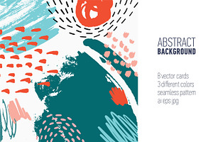
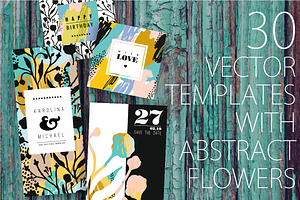
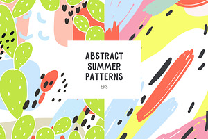
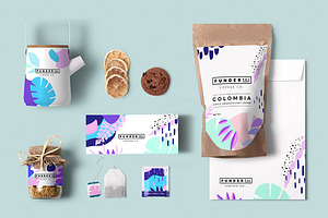
With simple shapes, eye-popping colors and flowing, airy lines, abstract illustration is one of the hottest trends in web design. Inspired by multiple art and design movements, this particular aesthetic direction can help capture ideas, express emotions, and invite site visitors to interact in engaging ways. Throughout this article, I'll share some of the movements that have inspired the trend, what it looks like in the real world, and how you can apply it to your own web design projects.
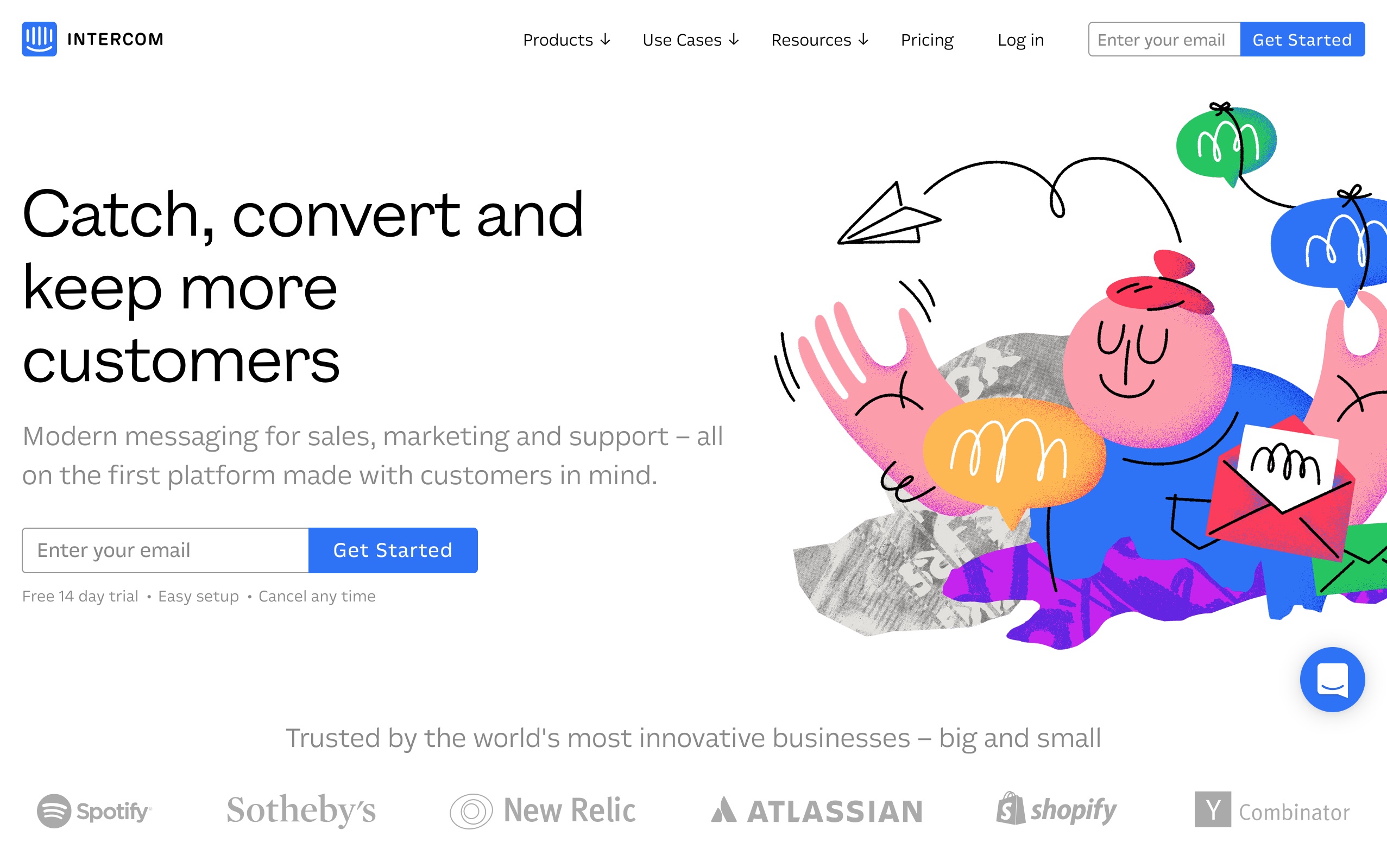
Abstract illustrations on Intercom's newly redesigned website
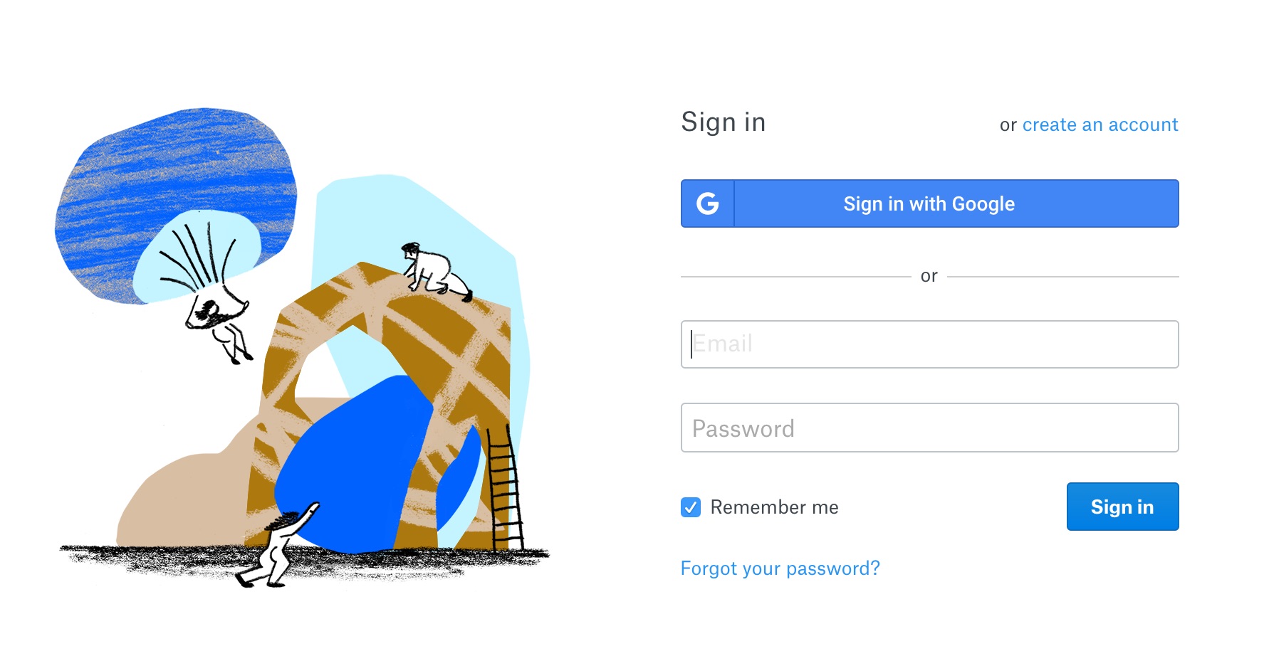
Abstract illustrations used by Dropbox as part of their recent rebrand

What Abstract Illustrations Look Like

What makes abstract images so intriguing - and powerful? The key lies in the way these images can express highly complex ideas and emotions in just a few lines or shapes. Abstract illustrations can also become a blank slate so that any viewer can project themselves into a scene. It's a radical departure from the concrete imagery of photographs and videos, which usually aim to represent the subject as accurately and specifically as possible.
Though there's no denying the power of a photograph to capture moments that evoke emotions ranging from joy to outrage, sometimes an abstract image can do the same, using color, shape, and form to suggest a particular mood. By combining multiple elements in the same image, a designer can use abstract illustration techniques more effectively than photography to tell visual stories and capture the essence of a brand's image.
A company's new website for hiking gear might feature a stunning photograph of a young man against the backdrop of a mountain sunset. The image captures the essentials of the company's brand, but the young man also becomes the "face" of that brand, so definite that people who don't look like him might not be able to identify with the company's products and the lifestyle they represent. Abstract images do just the opposite. A simple line drawing that represents everyone can make it easy for viewers to see themselves in the scene.

Inspiration Springs From Many Sources

The new trend toward abstraction and illustration in web design harkens back to the styles and design techniques of years past, mixing and matching them in new ways to create sites that are creative, expressive, and more interactive than ever before. Here's a look at some of the art movements and trends of yesterday that inspire today's most innovative web designers.

Cubism

In the early years of the 20th century, the world of art saw a seismic shift away from realistic, representational art that was often so detailed that it could rival today's photography. Led by Pablo Picasso, a small group of artists in Paris began to experiment with breaking subjects down into essential parts to reveal their essence from a completely new perspective.
The movement they pioneered, called Cubism, was a decisive step away from the almost photographic realism of old. In its most extreme form, Cubist art was completely non-representational, relying on arrangements of shape, line, and color to convey meaning. In today's world of web design, Cubism's influence is felt in combinations of shapes, forms, and colors that aim to convey moods and concepts, rather than accurate depictions of "real life."

Memphis Design

What do you get when a group of Italian designers looking for new ideas happens to listen to Bob Dylan's song "Stuck Inside of Mobile With the Memphis Blues Again?" Memphis Design, of course - a rebellious, exuberant blend of Art Deco, Pop Art and the kitsch of 1950s advertising campaigns.
Memphis Design began with furniture, inspiring playful, curvy, colorful designs that suggested grown-up versions of children's toys. But the style also made its way into the world of art and graphic design. Today, the Memphis aesthetic creates dynamic websites characterized by whimsical combinations of geometric shapes, pastels, and patterns.

1980s Color Palettes

Color can reflect the mood of a generation or an era. According to Pantone, the company behind the Pantone Matching System that standardizes colors across the printing industry, the 1980s were an upbeat, prosperous time that was reflected in that decade's popular palette of vibrant, saturated colors.
These 1980s colors play a leading role in today's abstract-inspired web design, combining with a variety of illustration styles, geometric shapes, and patterns to create eye-catching, interactive sites with a thoroughly modern feel.

Mid-Century Illustration Techniques

The bold, brushy illustration techniques used in commercial art and advertising of the 1950s and 1960s are also a hallmark of modern abstract illustration in web design. Mid-Century illustration for web design features strong lines, retro script fonts, and pen and ink shading effects along with abstract elements such as basic shapes and lines. Combined with the eye-popping color palettes of Memphis Design and the bright Pantone colors of years past, these "vintage" techniques can create visually stunning, interactive sites.

The Past Inspires the Future of Web Design

Abstract illustration is one of the top trends in web design for 2018 and beyond. Borrowing from influences as varied as turn-of-the-century Cubist art, Mid-Century advertising style, and the bright colors of a decade long past, this eclectic style opens up new ways of viewing and thinking that exist outside the limitations of representational art and photographs.
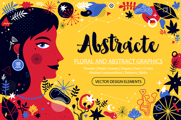
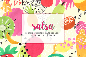
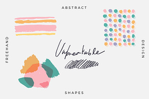
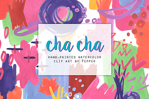
Versatile and flexible, today's abstract illustration trend draws inspiration from the past to create the future of web design. Check out some of the most representative abstract illustrations on Creative Market and give this trend a try.



Sunday, February 11, 2018

The Best Sports Fonts for Athletic, Gym & College Designs


The Best Sports Fonts for Athletic, Gym & College Designs


The Best Sports Fonts for Athletic, Gym & College Designs
Have you ever found yourself looking for that perfect font for just the right occasion? Like you, I've looked through my files a million times trying to dig out the best option, only to wonder if I need to dig around online. The other day, I was looking for a font that had the feel of the "College" sweatshirt that John Belushi wore in Animal House. I found a few in my collection, but ultimately I ended up buying something new because it fit the theme best. College, gym, and athletic-themed design projects can benefit from a font inspired by sports, movement, and dynamism. Throughout this article, I'll describe some of the best examples available in the marketplace.

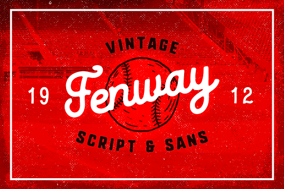
Fenway Script & Sans + Bonus

I'm going to start with Fenway for a few reasons. First and foremost, I'm from Framingham, Massachusetts, and that means I am a huge Red Sox fan. I live in the Phoenix area now, so getting out to see Fenway in person is kind of a big deal, and I did it for the first time since 2008 this past May. I love Fenway — which is part of the reason I own this font. But it's also because I like the casual and old-school script effect of it all. The way it looks just as at home in a ballpark as it would on the inside of a gym. It's versatile but works nicely for its intended usage.

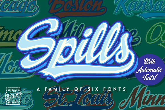
Spills

I'm a big fan of Comicraft — so much so that I talk about them here all the time. Spills is another font that I have in my personal collection. It's great because it comes with a ton of different options, plus tails. There are easy instructions on how to get it to work, and then you add your layers on top to give yourself a variety of different looks. I've used it in different sports-related designs (since it very clearly has a baseball-related feel), and I find myself returning to it for all sorts of crazy ideas.

TT Polls

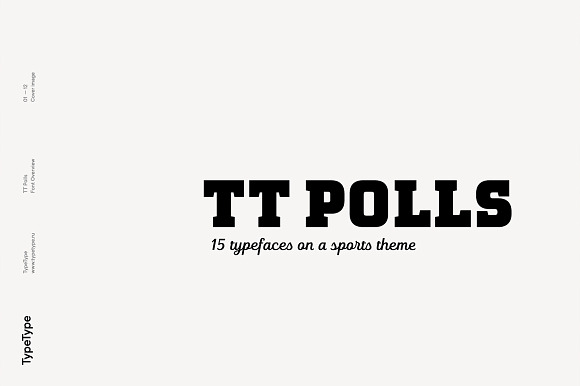
I love me a font with options, and that's TT Polls. They say it's "optimized for work with numbers," but it can do fractions, ligatures, and stylistic alternates. So what makes it sporty? The bold, hard angles of the letters and the clean serifs, both traits that remind us of that old college shirt. There's even a script version included too, just in case you want to get fancy.

Sports Font Bundle BTL.1

Sometimes your best option is a bundle, and that's my angle here. BoxTube Labs gives you a quintet of excellent sports-themed fonts, all of which fit into the same general area. Fanatix is nice and angular, just like you'd see on a football jersey, but Dahmer Slab takes the idea and narrows it up a bit, like what you might see at a gym. Throw in Areno for something more modern and Godou Grande for extra flair, and you've got a winning combo.

Varsity Scratch - Sports Jersey Font

You've got the traditional look of a college or athletic font, with just a touch more curves and stylistic options than usual. Then there's a stroke floating around it just to hammer the point home. Oh, and to top it all off, the whole thing looks like it's been washed and dried to the point that it's perfectly worn. This one's a winner.

Maritime Champion Stencil

When I first came across this one, I was a little bit on the fence. Is this sporty enough that I'd find it out on the street? Well, lots of fonts in this category do have that stenciled look, and this fits the bill, but the bottom of the letters are flourished out like a whale tail. It's a college-style font, but it's a bit less mainstream. Use it if you're looking for a style that hints at sports in a less literal sense.

Grizzly 0116 Display Typeface

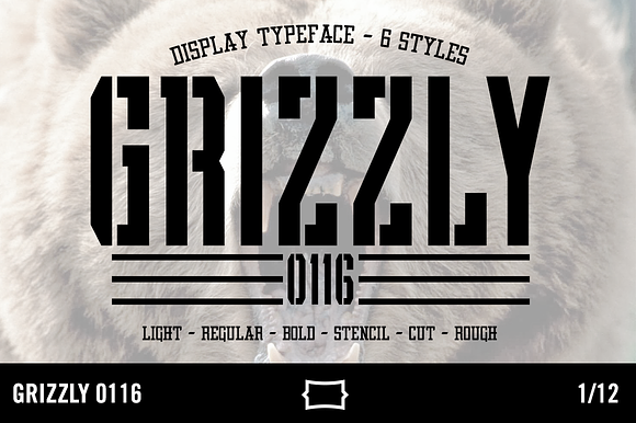
Going back to the stenciled look, Grizzly 0116 is all about athletics. It comes in a variety of different line weights, and a bunch of styles — including a version without the stencil effect. I love the rugged aesthetic of the whole family.

National Champion - Line Series

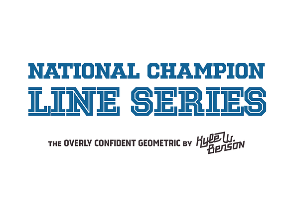
National Champion - Line Series is a pretty sweet product. It's got that geometric slab look that fits with this post's theme, but it also has a few different options and weights. It means that you can create a design that's got the simple line through it, or one that's made up entirely of lines. That gives you the look of an athletic font, but in the more extreme variations, the feel of one. Love it.

JKR - Radical

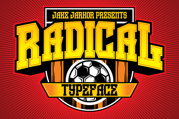
Let's try something just a little bit different. Radical, like many of the other fonts on this list, has a heavy focus on being a geometric slab. But this one works in a few different angles that aren't found in the rest. The Q, for example, has this great take on the letter itself that you don't see very often. The J is angled at the base just so, and that also makes it stand out. There's also a version with an extra stroke that puts the varsity stamp on the whole thing.

Redzone - The UFL Project

To end this list, let's go with one I dig: Redzone. First off, it looks perfect as-is, and would fit in perfectly at any sporting event. But it's the little flourishes and tweaks on a traditional geometric slab what I enjoy most. The tiny serifs on some of the letters, the shape of the G, the asterisk: they all just come together. This font's creator is also behind the UFL Project, an amazing branding experiment.

Saturday, January 13, 2018

7 New Social Media Trends for 2018

“Happy New Year!” And just like that, 2017 ended.
After ringing in the New Year 2018, savvy content marketers know that it’s never too early to start planning for the year ahead.
Here’s what to expect from social media in 2018 (and how to find success).

1) Generation Z on the rise

According to a Goldman, Sachs & Co. study, Generation Z is more valuable to most brands than even millennials! And in 2018, this generation is just beginning to make purchases and enter the workforce.
What’s interesting about GenZ-ers is they don’t stick with one social channel all the time. According to The Drum, “With students, mostly GenZ, using up to five different screens over the course of the day and evening, it should be no surprise that they are not married to just one platform.” However, Snapchat and Instagram are in the lead over channels like Facebook, when it comes to GenZ.

2) Social media + shopping becomes more popular

From Instagram to Pinterest, Twitter, and Facebook, social media continues to wade in the shopping waters. But, 2018 is when it will truly take off.
For example, Victoria’s Secret is ahead of the game—everything they share on Instagram is up for purchase from their Shopify integration. In fact, Instagram may soon reach 1 billion monthly active users.When teamed with Shopify (boasting more than 500,000 businesses), this channel is sure to impact brands hoping to sell on social.

3) Improved algorithms given priority

With the rise of “fake news” on social channels, Facebook and Twitter are finding ways to integrate human filters into their processes.
Until now, engagement was the main driver of success within algorithms, but this doesn’t help when combating false news. It’s predicted that 2018 will usher in a new wave of best practices and perhaps even changes to news feed algorithms because of this trend.

4) More video consumed and created

Content marketers focus more on video rather than static images—and that trend is expected to grow this year.
Brands discovered that effectively engaging with their audiences is much easier when using video. In fact, Mark Zuckerberg, the co-founder of Facebook, estimates that 90 percent of Facebook’s content will be video-based by 2018. However, brands be warned: Video should still have a purpose and be directed to your specific audience—not just making video for the sake of it.

5) Organic reach is still declining

It’s true that social media was equal and free for all—but now, when it comes to getting your hard-fought content actually seen, it’s going to take more investing.
According to Hootsuite, “Brands must accept that organic reach is steadily declining and stop relying on short-term tactics that used to work.” Applying more sustainable strategies is key when leveraging social for your business. One way to do it is to be more selective when choosing your content, and where you post it. Don’t stretch your brand over multiple channels if your team can’t support it!

6) Social influencers lead the pack

Chances are you have some favorite social media influencers you follow and take recommendations from. And it’s more than likely that your customers do, too.
In fact, 74 percent of people look to their social media networks for advice on buying decisions, and 40 percent of people purchased an item based on seeing it promoted by an influencer via Instagram or Twitter. Now’s the time to reach out to your industry’s influencers and collaborate on content.

7) Live stories will continue to engage

Whether it’s the original Snapchat or Instagram, the newcomer for live stories, these instant updates will continue to engage users this year.
Consider this: Inc. predicts that Snapchat will soon offer an incentivized video feature to their users, similar to what YouTube offers. And product marketers are likely to use Facebook Live in 2018to do more product demonstrations, plus showing videos of real people using their products. This year, your brand may try live video as a way to start engaging with your users in real time.
Certainly, there will be many changes in 2018 to the social media realm! But no matter what this year holds in store for your brand, by planning for these trends you can be confident your strategy will be successful.