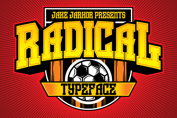
Art deco is one of those design styles that defies the passage of time. One of the first, major international styles of design, Art Deco appeared in France just before the outbreak of World War I and saw its demise as World War II began to sweep across Europe a couple of decades later.
In spite of its short-lived nature, monuments to its greatness remain in manmade creations all over the world. That’s the beauty of Art Deco: this design style covered virtually everything that could be legitimately touched by design, including graphic design (Art Deco fonts), interiors, buildings, cars, jewelry, pop culture, and even mundane objects like your radio and other household appliances.
It’s quite rare when a design trend has such a broad-based reach on much of what you encounter in the world. Even today, this style is alive and well in graphic design and numerous pop culture references and homages to its heyday.
Take a trip down memory lane with the glorious designs of the 1920s and 30s with this primer on everything Art Deco.
The History of Art Deco
To understand this design’s roots, we have to go back to France in the late 19th century. Around this time, France was a hotbed of burgeoning design-trend activity, with Art Nouveau also popping up in this exciting era of great creativity. Essentially, we have the then-growing influence of so-called decorative artists to thank for what would eventually and officially turn into Art Deco.
Decorative artists were those who worked as designers of textiles, furniture, and other ornamentation; until 1875, they were just regarded as ordinary artisans. However, that year, they gained status when they were awarded recognized status with the distinction of “arts decoratifs.”
When France’s Society of Decorative Arts was established in 1901, these former artisans were now given equal authorship rights that had previously only been enjoyed by sculptors and painters. Meanwhile, in Italy, something similar was happening, with the first-ever expo devoted to the decorative arts being held in Turin in 1902.
Throughout the 20th century’s first decade, more inroads were made by this nascent design style. New magazines devoted to this style were springing up all over Paris while art exhibits in the city started to feature more decorative arts sections.
Part of the reason for Art Deco’s growth was French nationalism: French designers were increasingly unhappy with the increasingly prosperous exports of more cost-affordable German furniture, so they decided to develop their own style to compete.
Not to be outdone, Parisian fashion houses, department stores, and clothing designers joined in the fray. French brands you’re no doubt familiar with today—like Louis Vuitton and Cartier—started to design their products in a more modern fashion, recruiting various decorative artists to work on projects in their design studios. By this time, luxurious and wealthy materials like silk, ivory, and ebony—along with very vibrant, stylized and colorful motifs—started to mold the trademark Art Deco style.
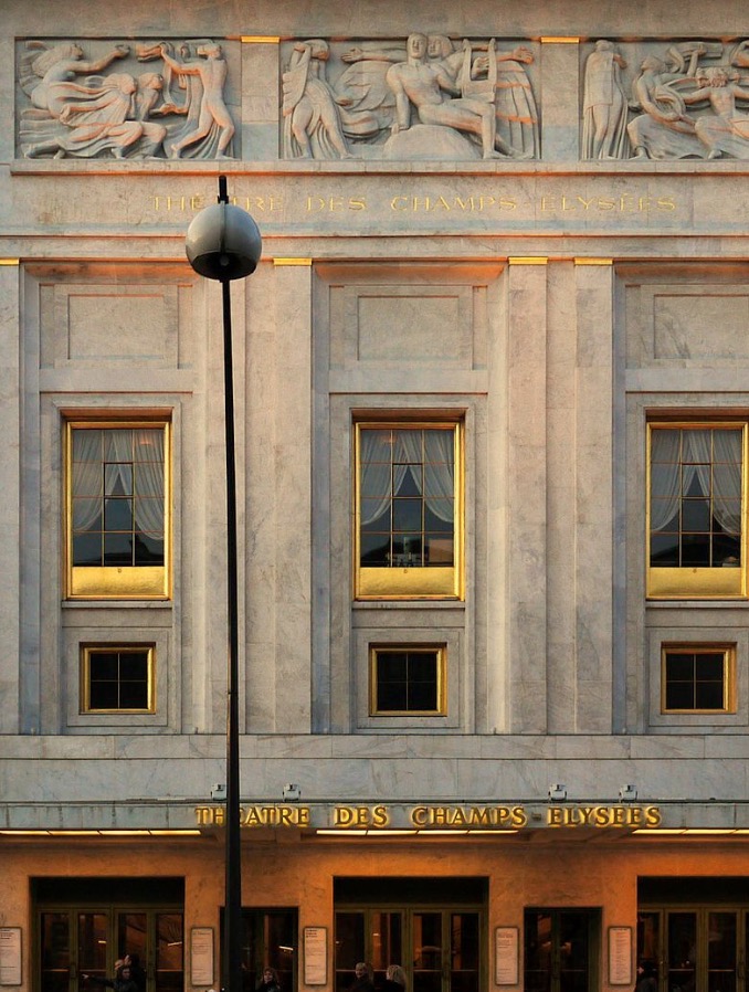
By the 1910s, Art Deco was leaving its mark on buildings in France, too. The first real landmark structure completed in this memorable style was Auguste Perret’s Theatre des Champs-Elysees. You can look at this theater as the classic epitome of what makes Art Deco…Art Deco, both inside and out.
Outside, it features Art-Deco hallmarks like:
- Straight lines
- Geometric patterns and shapes
- Clean, rectangular design
Inside, it featured Art Deco:
- Sculptures
- Curtains
- Paintings
- Dome
Now, this design technique was in full swing, especially in Paris. Furniture coming out of Paris was characterized by loud and sometimes discordant colors, with floral patterns being a favorite. Richer materials like silk and ebony would be fused with vibrant and bright colors for an unmistakable look.
What was also really interesting was the influence of Cubism, which left a mark in France by 1912, on Art Deco. Cubism, of course, is the art style where the single viewpoint of an object is replaced with a fragmented subject that’s shown from several points of view, together with an emphasis on minimalist forms.
In particular, it was 1912’s The Cubist House, an architectural display at the annual Paris art and design exhibition called Autumn Salon, that demonstrated not only the overlap between Cubism and Art Deco (note the strikingly geometric shapes and straight lines common to both), but also provided something of a basis to the inevitable explosion in popularity of Art Deco.
Interestingly, it was the famous Swiss-French designer and architect Charles-Edouard Jeanneret (AKA, Le Corbusier) who saw the Cubist House and later on, in 1925, designed the Esprit Nouveau pavilion for the International Exhibition of Modern Decorative and Industrial Arts, further showing the connection between the two design styles. It was at this 1925 exhibition that Art Deco also got its name.
By 1925, the curious design idiosyncrasy within Art Deco was its obsession with everything machine-related, such as planes, cars, and ocean liners, owing to the ability of this movement to adapt to what was happening around it, as technology was undergoing a rapid evolution in the 1920s and 30s. This design pivot in the movement, which was earlier based mainly on furniture, textile, clothing, and architecture, was key in solidifying its permanent association with science, technology and, therefore, progress. That’s why we also think of Art Deco as a modern approach to design.
This continued to the point that, by 1939, there were examples of this style all over the world, particularly in bigger cities and with architecture.
The Characteristics of Art Deco
What makes Art Deco capture the imagination with such ease is its broadness. It’s essentially not just a single style, but a mosaic of various and even contradictory styles joining forces to create something that was then very new and exciting.
Its major characteristics include:
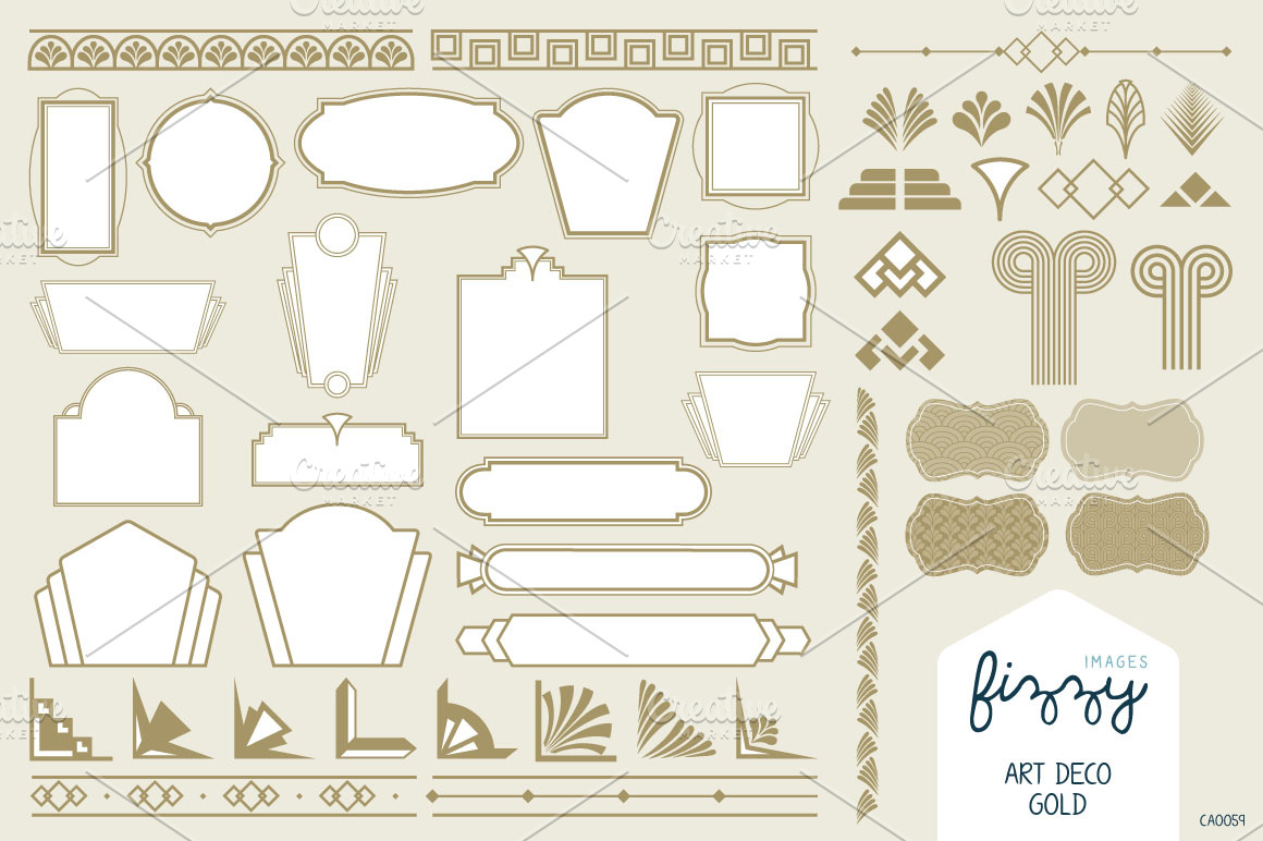
- Heavy geometric influences
- Triangular shapes
- Zigzags
- Trapezoidal shapes
- Straight and smooth lines
- Loud, vibrant, and even kitschy colors
- Streamlined and sleek forms
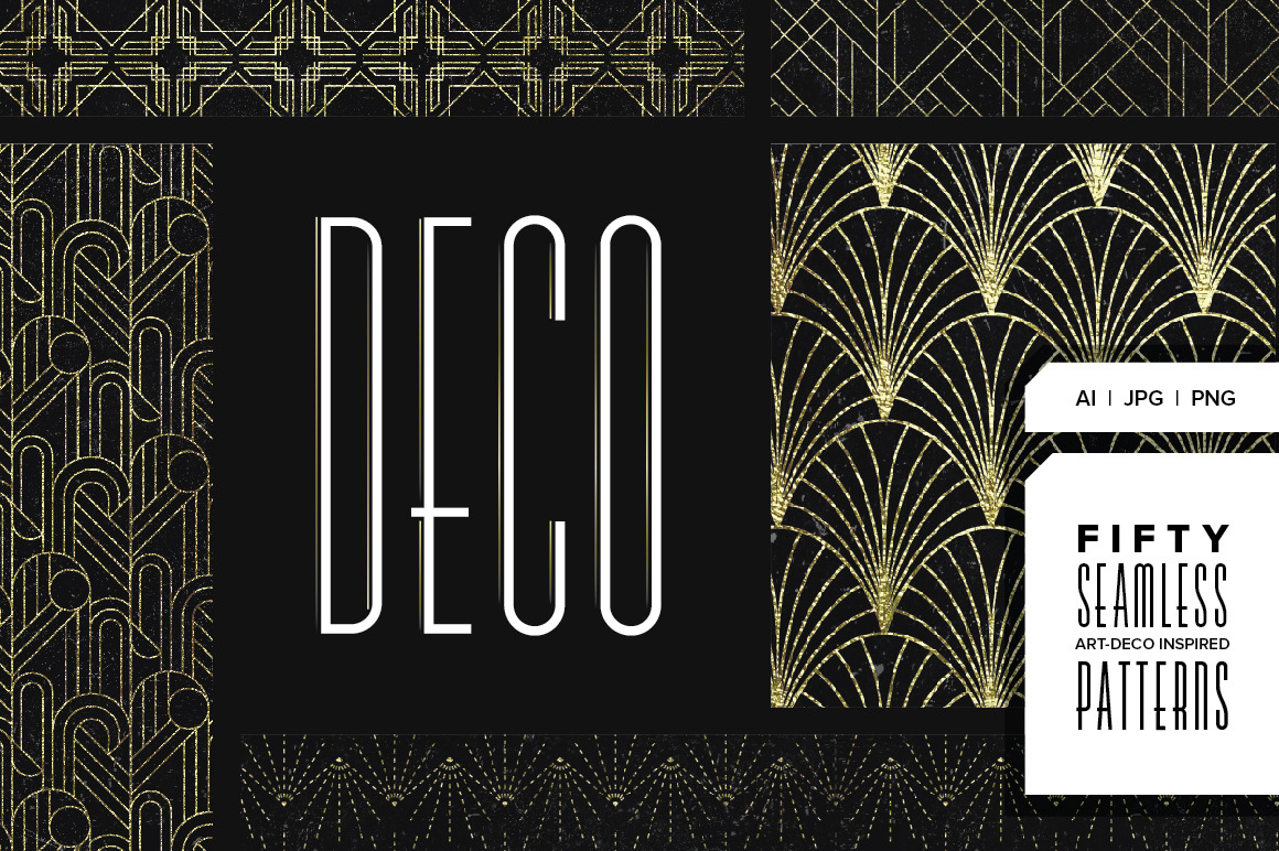
- Sunburst or sunrise motifs
- Exaggerated curves
- Hard edges
- Low reliefs
- Stepped forms
- Chevron (inverted, V-shaped mark) arrangements
- Ziggurat patterns
- Stylized, floral patterns
Compared to other schools of design, Art Deco’s characteristics make for a long bullet list! The fact that this style incorporates so many other influences is a big reason for this.
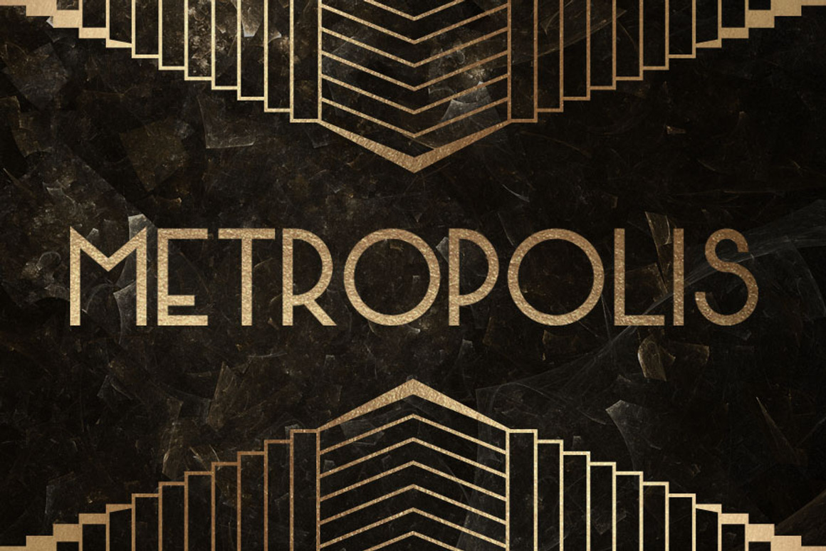
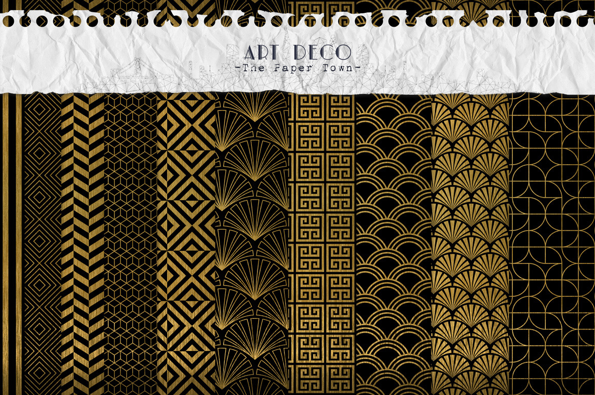
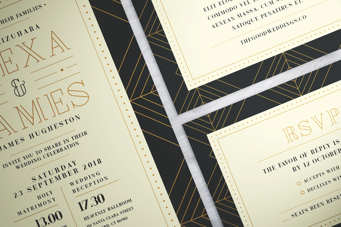
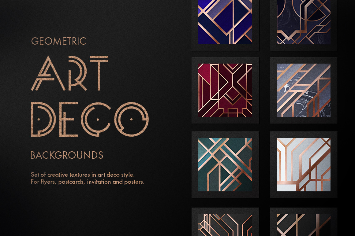
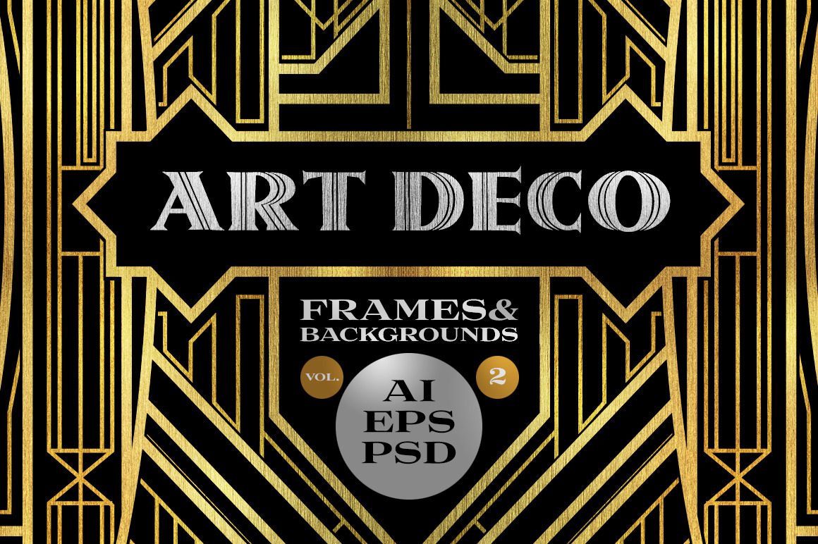
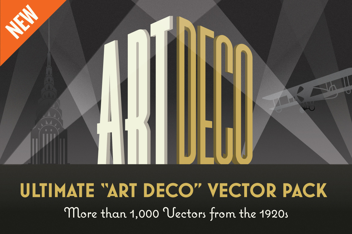
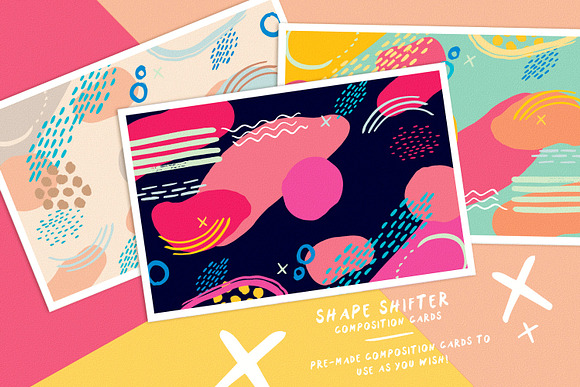
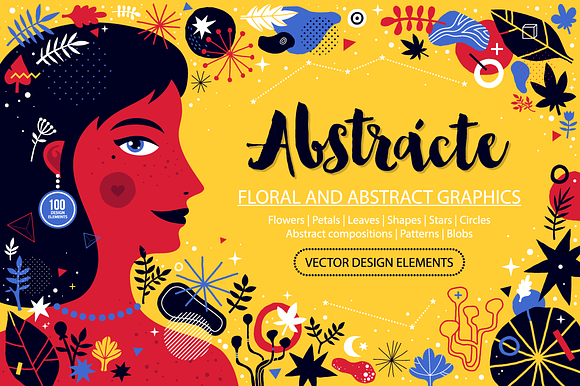
Take a look at some selections from our large collection of Art Deco graphic-design assets, and see if you can spot these beautiful design elements:
For starters, it was the immediate successor of Art Nouveau, which was a very popular, but short-lived, design style that became widespread in the late 19th century and was out of fashion already by 1910. Since Art Nouveau’s big theme was using the natural world in its designs—nature elements, the curvy lines of flowers, and women—Art Deco was pushback against this. That’s why Art Deco is flashier, louder, and uses more machine- and technology-based motifs in its designs.
Another feature that makes Art Deco stand out is its preoccupation with archaeology—which is represented in the forms and lines that pervade its designs. In the early 20thcentury, groundbreaking work was being done in archaeology, with excavations in Pompeii, Troy and, the biggest of all, the discovery of King Tut’s tomb in 1922. Art Deco designers noticed this and infused their designs with shapes that are distinctly archaeological in nature, like:
- Arches
- Ziggurats
- Buttresses
- Columns
Simultaneously, Art Deco was obsessed with everything Machine Age-related, particularly from approximately 1925 onwards. The Machine Age refers to the era from 1880 to 1945, where technology was advancing at such a rapid pace, punctuated by both the later stages of the Second Industrial Revolution and the start of the Atomic Age. Because of all the exciting progress in machine-related activity at the time—electric motors, skyscrapers, radio technology, the growing popularity of long-distance and safe travel in cars, planes, trains—designers took notice. Art Deco embraced this machine element to such an extent that, by the 1930s, a subset of the design called Streamline Moderne was actually developed.
That’s why Art Deco is one of those rare design styles that features elements and inspiration that seem oddly out of place. You’ll find nods to archaeology like arches and ziggurats in the same design that incorporates machine-related elements like streamlined forms and aerodynamic curves.
The end result is an approach to design that truly stands out and earns admiration and emulation still today, more than 100 years after its birth.
Art Deco in Graphic Design
Graphic design was one of the earliest areas where Art Deco left its mark, starting well before World War I. It was in the Paris costume designs and posters for the Ballets Russes and fashion catalogs of Paul Poiret where a French audience first gazed on Art Deco-influenced graphic design. From there, it spread like wildfire.
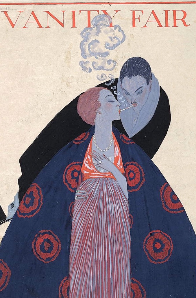
By the 1920s, its influence in graphic design has reached American shores, with world-famous fashion magazines like Vogue, Harper’s Bazaar, and Vanity Fair all featuring covers that feted this new, daring, and modern look.
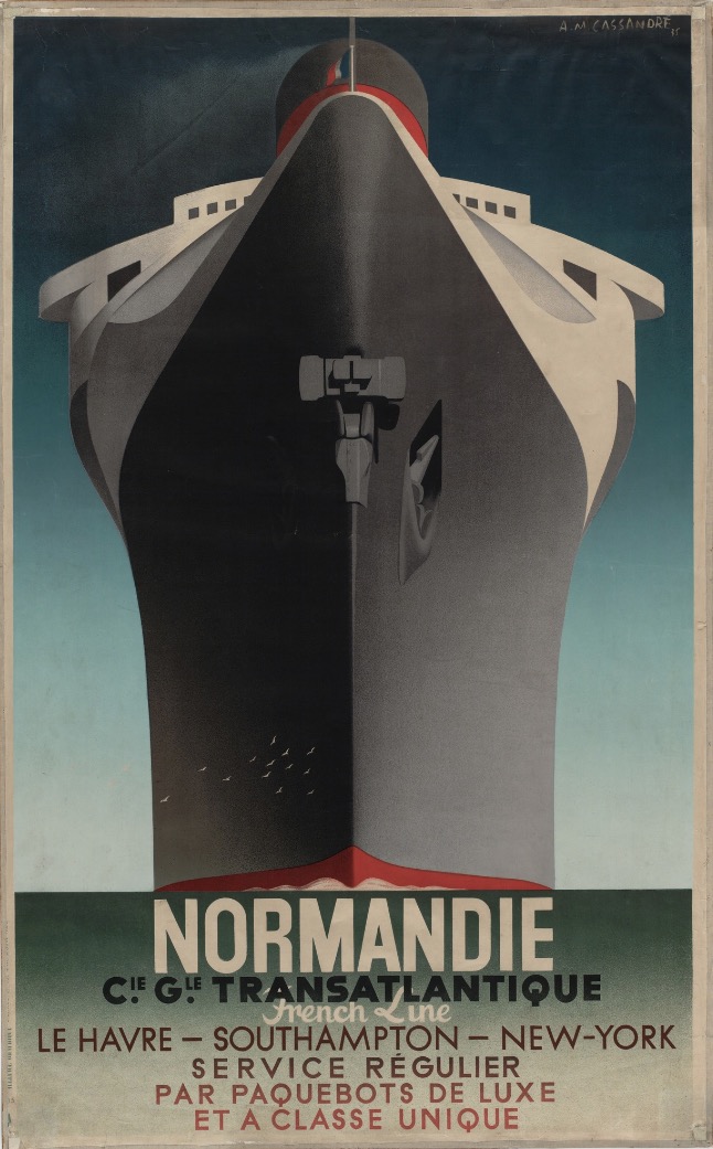
Even posters rapidly changed thanks to this new style. Whereas Art Nouveau posters had usually featured cabarets and theatrical actresses and productions, they now changed to more reflect the machine-influenced obsession of the day, specifically on travel posters. These increasingly featured airlines and steamship lines, illustrated with linear, dynamic, and more minimalistic forms, typically against a solid-colored background.
However, posters for entertainers were still popular. In the 1930s, Art Deco designers who worked on posters for famous entertainers of the time, such as Josephine Baker and Charlie Chaplin, shot to prominence themselves. Paul Colin developed a following after designing posters for Baker while Jean Carlu handled posters for Chaplin’s films. He immigrated to the U.S. right before World War II; while in the States, he helped the American war effort by designing propaganda posters to encourage war production in the U.S.
Other famous Art Deco poster designers included Charles Gesmar, who designed graphic art for Air France, and Adolphe Jean-Marie Mouron, also known as Cassandre, who designed the famous poster for the ocean liner SS Normandie by 1935.
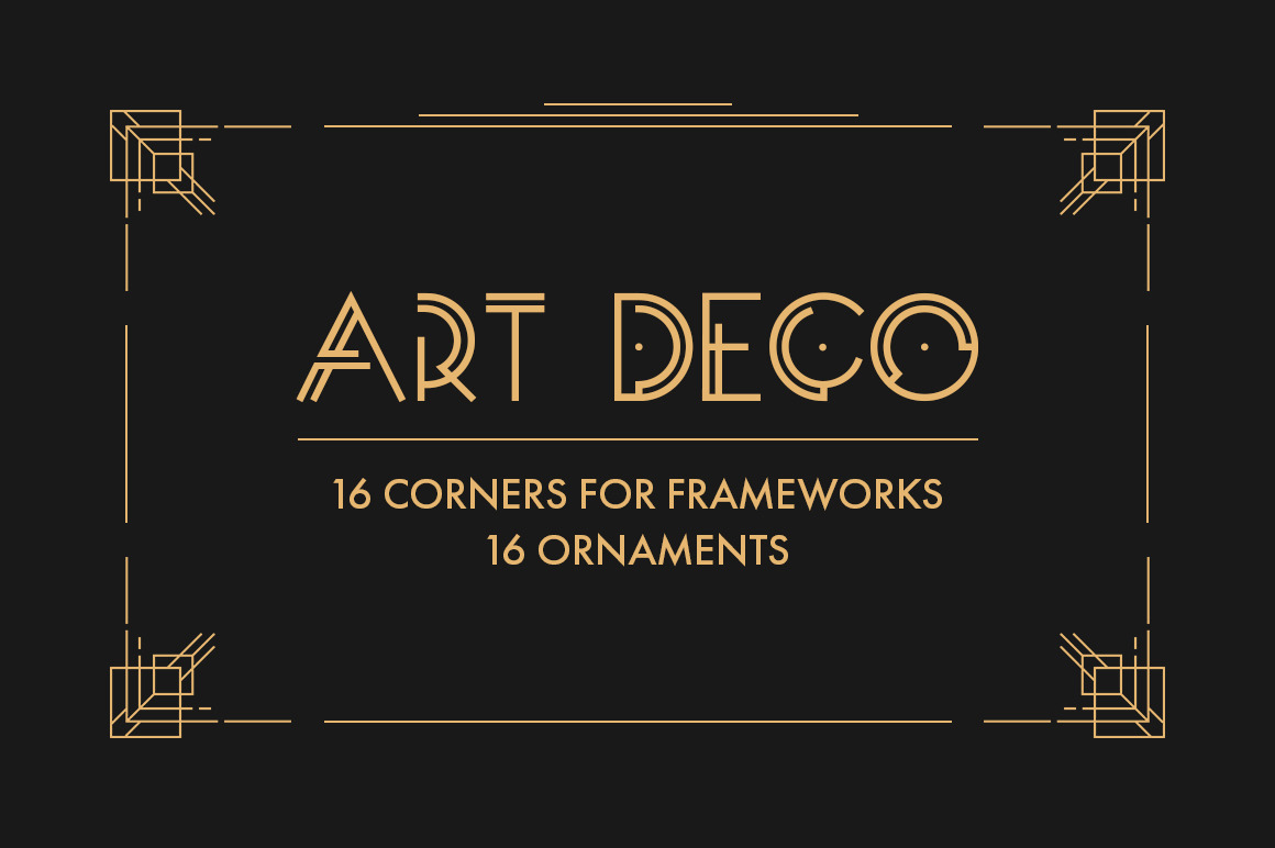
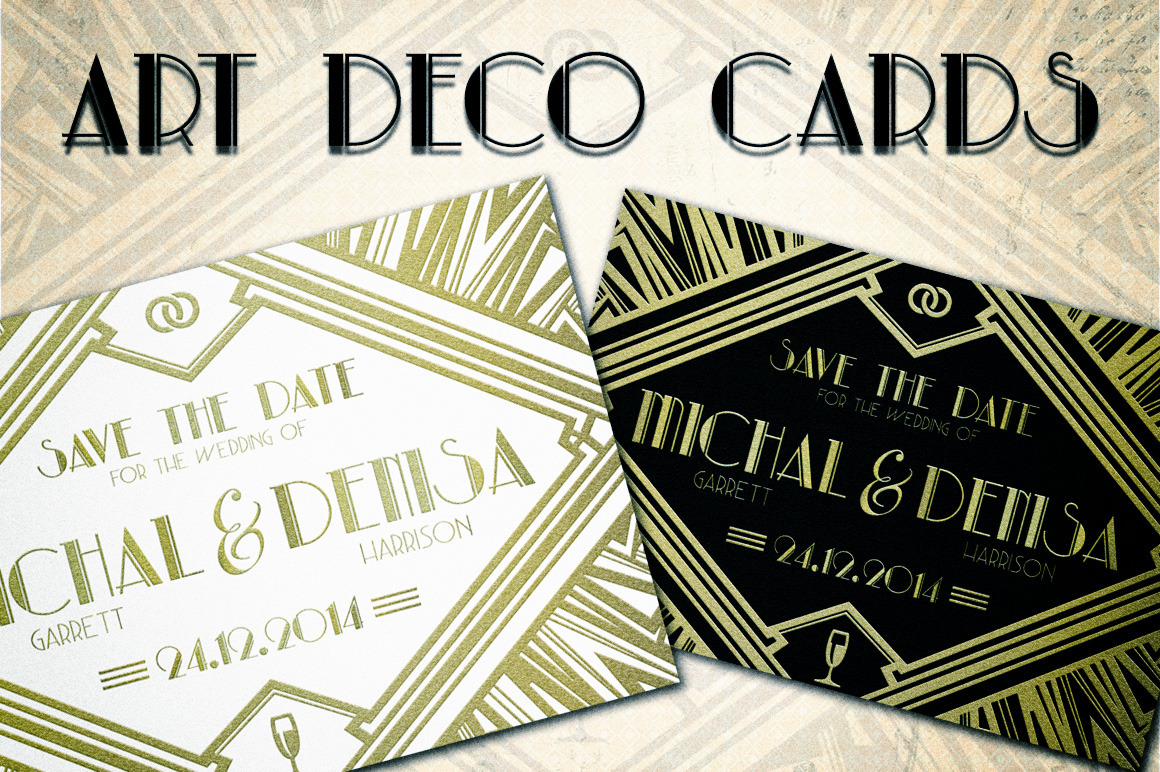
For more inspiration, take a look at these pieces from our Art Deco graphic-design collection:
Art Deco in Web Design
It seems a bit strange to even mention this design trend and web design in the same breath—after all, web design basically arrived 100 years after Art Deco made its mark! However, if you scour the Internet far and wide enough, you’ll be lucky enough to see some faithful examples of web design carried out in this decorative-art style.
New Zealand boat maker Dickey Boats pays tribute to Art Deco in its typography and logo, which are splashed across its website, in the header and footer, and on its Facebook page. The company’s logo features the streamlined look common of cars from the 1920s and 30s, together with that sleek, aerodynamic look that’s a throwback to the design of this era.
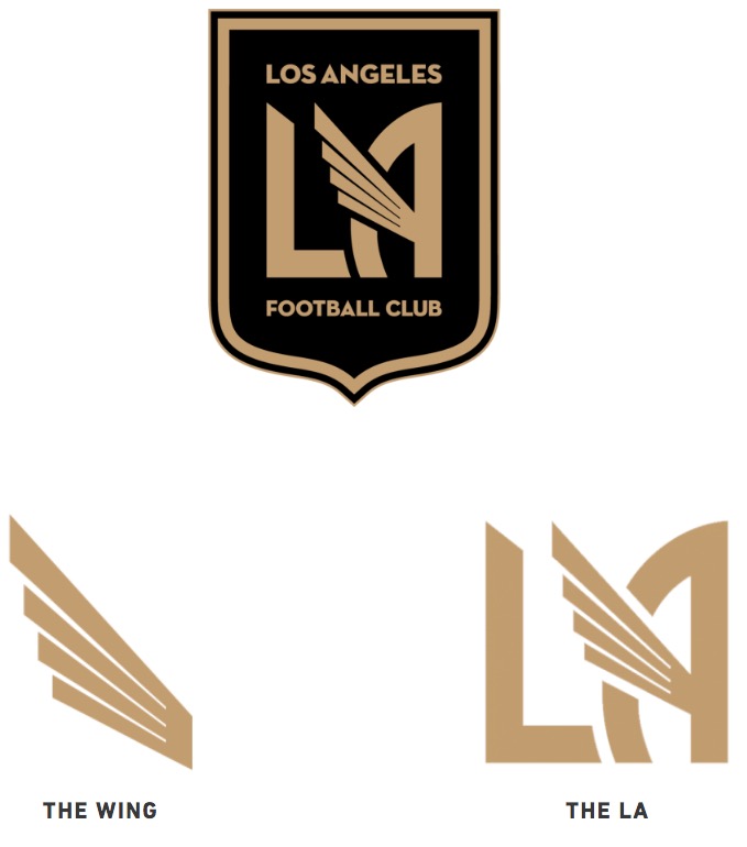
Next up is the site for the Los Angeles Football Club, a U.S. pro soccer franchise that’s based in the City of Angels. Its web design is infused with notable references to Art Deco, in part because of its crest and site logo and in part due to its colors.
The LAFC crest features a Neutraface font that screams Art Deco due to its:
- Simplicity
- Hard corners and edges
- Smooth, straight and sleek lines
- Geometric influences in individual characters (As look like triangles, Ts look like a horizontal and vertical rectangle)
The club’s colors, black, and gold, call to mind the glamorous, old-timey Hollywood movies during the 20s and 30s, when this design style was at its peak. The golden color also invokes visions of the sunburst or sunrise motifs that are so prevalent in various Art Deco designs.
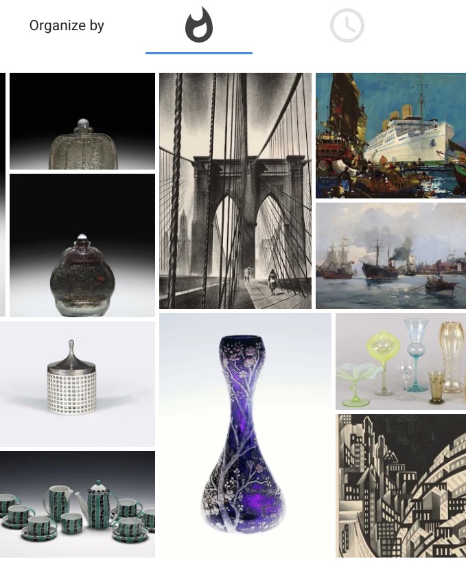
Finally, we have Google’s Arts and Culture Art Deco page. This powerful and pithy primer on the style does everything in its power to feature as much Art Deco design and images on a single page as possible. From the imposing hero image at the top of the page to the thorough gallery of Art Deco products and designs, this page demonstrates how you can create an Art Deco inspired page on the strength of imagery alone.
Art Deco in Interior Design
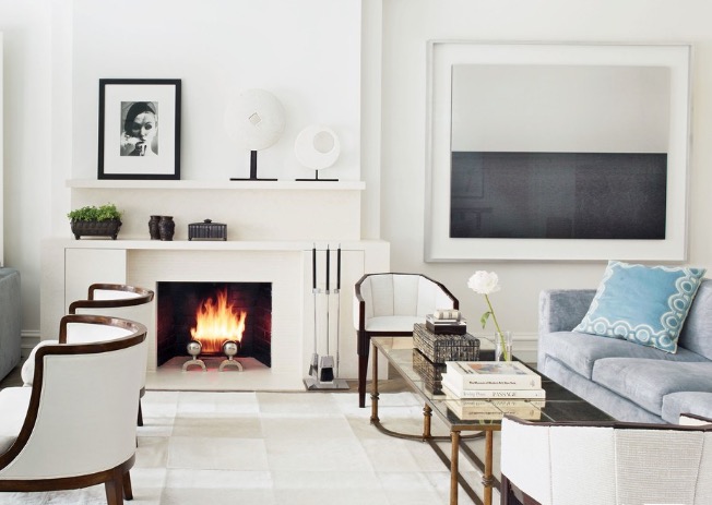
This design movement mainly started out with furniture and interiors in the late 19thcentury. Today, it’s still possible to deck out your interiors, so that they look like they came straight out of a Roaring Twenties scene.
Streamlined shapes and forms—usually found in vehicles from the era—can also be added into home touches. Look for angular armchairs and French-style coffee tableswith clean and hard edges. At the same time, you can’t go wrong with geometric shapes, so add rectangular or even oblong mirrors to your bedroom, together with Art Deco-inspired vases with contoured and curvy lines.
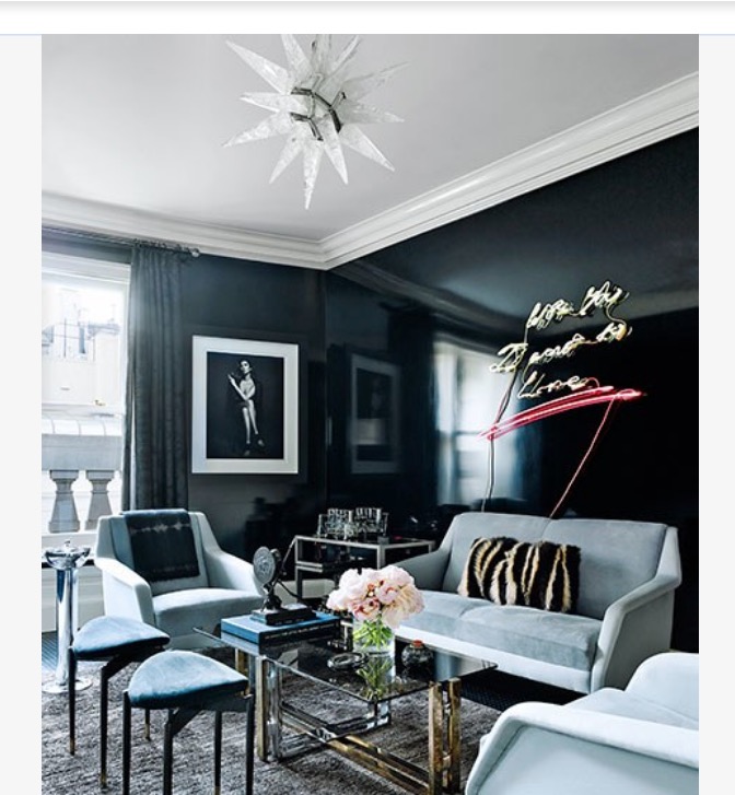
While you’re at it, do something memorable with the lighting. Art Deco chandeliers—themselves with various geometric patterns and designs—are a great source of light. Plus, they provide a certain glam effect that’s a throwback to the motion pictures of the era. Remember the aforementioned sunburst or sunrise motifs that are notable in designs of this style? Get yourself a sunburst-rock chandelier to put over your dining room table for the ultimate in Art-Deco homage.
If you just want to make one part of your home Art Deco instead of your whole digs, that’s a possibility, too. It may even be the smarter move since you can then simply escape to your Art Deco retreat when you want to immerse yourself in this radiant style.
Art Deco in Pop Culture
Pop culture is rife with homage after homage to this popular style. Whether it’s in the movies or even cartoons, the entertainment world has contributed to the development and spread of this design movement, too.
Perhaps the most famous movie that didn’t just exhibit this style, but actually immersed its entire plot and setting in Art Deco is 1991’s The Rocketeer. While not a blockbuster by any means, the movie nonetheless bursts with all things Art Deco. Its iconic poster, created in the last decade of the 20th century, looks like it came straight out of 1920s Hollywood. The production design of the movie—from the costumes, sets and everything in between—is basically a celebration of everything that made the design elements of Art Deco so timeless.
When you think of the decorative arts, cartoons are likely the last place you’d think of—but Art Deco managed to infiltrate even this medium.
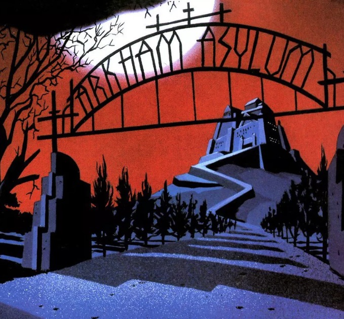
In particular, the 1990s Warner Bros. Animation cartoon series Batman: The Animated Series demonstrates how visually pleasing and striking Art Deco can be when a whole production team is invested in its faithful representation.
For any DC Comics or just animation fan who remembers this old cartoon, they can remember how sleek and cool Batman’s Gotham City was made to look thanks to Art Deco. Whether it was the Batmobile’s Machine Age and streamlined form, the geometric features of the Joker, or the beautifully drawn skyscrapers of Gotham’s skyline, Batman: The Animated Seriesturned a whole generation of kids on to the wonders of this impressive art style.
A Visually Striking Style
Few design movements do it quite like Art Deco. Its strength is arguably that it combines, borrows from, and takes inspiration from so many other design styles across the spectrum. With no other design movement do you see elements as harshly different from each other as machines and archaeology in the same technique. It’s almost like the perfect blend between the ancient and the modern, which makes for a visually memorable experience.
While its heyday may have only lasted a few decades in the early part of the 20th century, Art Deco still resonates today with designers who appreciate its sharp, sleek modernity, and sometimes gaudy excesses.


