| Here are some products just for you... | ||||||||||||||||||||||||||||||||||||||||||||||||||||||||||||||||||||||||||||||||||||||||||||||||||||||||||||||||||||||||||||||||||||||||||||||||||||||||||||||||||||||||||||||||||||||||||||||||||||||||||||||||||||||||||||||||||||||||||||||||||||||||||||||||||||||||||||||
| ||||||||||||||||||||||||||||||||||||||||||||||||||||||||||||||||||||||||||||||||||||||||||||||||||||||||||||||||||||||||||||||||||||||||||||||||||||||||||||||||||||||||||||||||||||||||||||||||||||||||||||||||||||||||||||||||||||||||||||||||||||||||||||||||||||||||||||||

One thing that’s always certain in the design world is that there’s never a dull moment. Trends are always being born and coming and going; sometimes, trying to keep up with all of the changes in design can literally make your head spin.
As we close out 2016 and look to the next year with anticipation of what awaits, I thought of focusing my sights on one, major area of design: the logo. Whether it’s for brand recognition, instant communicability, or simply visual appeal, logos impact our daily lives in numerous ways.
When browsing the grocery store for food and drink, your eyes naturally settle on the logos on the product packages of various brands. When you’re looking at magazine covers on a newsstand, deciding on which one to pick up and leaf through, each magazine’s logo is what stands out to you and helps you make a faster selection because it already communicates brand identity.
Keep your eyes peeled for these logo design trends in 2017.
Cleanliness
Logo design has already started to get a lot cleaner in presentation, and this trend is only going to continue with much haste in 2017. Don’t believe me? Just look at what Mastercard did with its much-vaunted, 20-year logo not too long ago.
For the past couple of decades, this brand used combination mark with the text, “Mastercard,” appearing inside of the red and yellow circles. Where the circles interlocked, there were red and yellows lines.
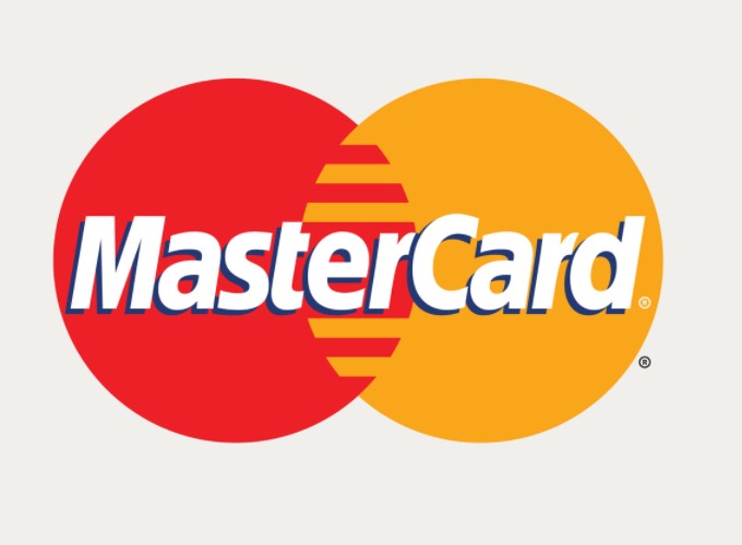
After the company’s rebrand last summer, the company’s logo still looked recognizable, yet markedly different. The company succeeded at this by moving to a much cleaner look that separated the wordmark from the symbolic aspect of the logo (the red and yellow circles).
Instead of having “Mastercard” sit inside the circles, the new logo now has the wordmark beneath the iconic treatment above. Further, the interlocking area of the two circles is now orange, which makes sense when you think about it because mixing red and yellow produces orange. Gone is the line effect in the interlocking area!
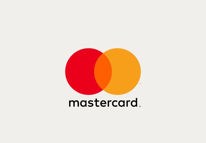
The new typeface also doesn’t cast any shadows, whereas the old typeface had a bit of a drop shadow.
The end result is a more concise, cleaner look that minimizes the brand’s identity going forward. Mastercard said that the redesign was inspired by a desire to brand itself consistently across all digital devices.
As we move into 2017, more and more brands will also realize that using a cleaner design will greatly help them in cross-channel and cross-device branding.
Anti-Serif or the Move Toward Sans Serif
When the world’s most powerful search engine and one of the most powerful and influential tech companies changes its wordmark by removing any hints of serifs—which its logo used to have for many years—then you can bet we’re in the middle of a sea change.
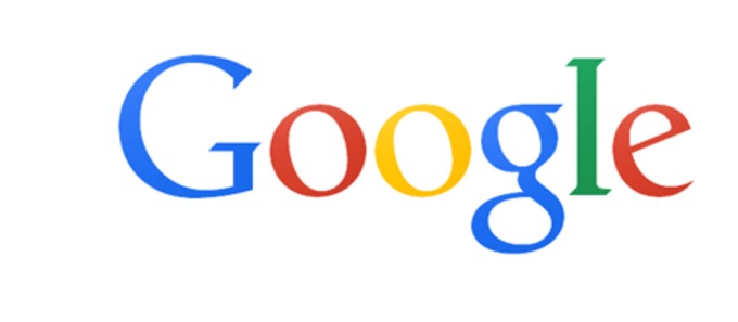
Late in 2015, Google changed its wordmark from a serif font to sans serif. The redesign is significant because it represents a change to a long-standing design that Google hadn’t messed with in almost forever. In fact, Google’s logo has pretty much had from the very beginning (the late 1990s) serif fonts. I can only take an educated guess that the company saw the writing on the wall for serif fonts…at least on the web!
This is backed up by real-world data on web fonts, too. For two years running, Typewolf, one of the most popular typography sites on the Internet, has revealed that nine out of 10 of the most popular fonts on the web are sans serif:
Google’s current wordmark is, as a result, sleeker and more modern, which should appeal to more people. It features:
- No serifs
- Fatter stems
- Better legibility
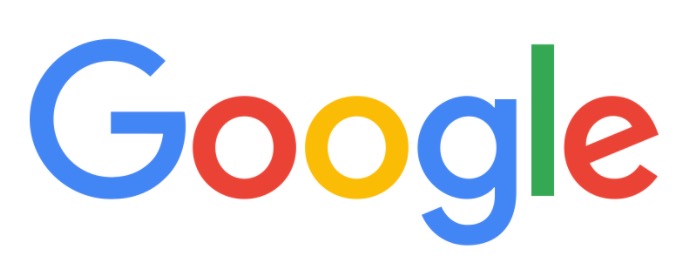
With such a big company recently abandoning serifs, I predict that more and more brands will follow suit in 2017.
Abstract Shapes to Form a Brand Identity
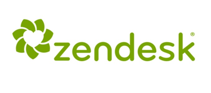
Almost everyone’s familiar with Zendesk, the customer-service software company. More people have probably seen its mascot, which was the smiling Buddha with a headset. Its old logo was a lotus flower with a heart inside of it, though some probably thought the Buddha mascot was the logo!
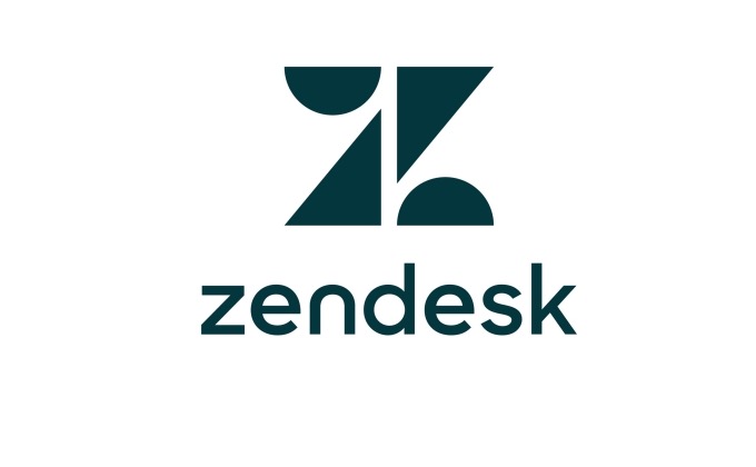
In any case, the company, just a couple of months ago, abandoned the lotus flower-heart logo in favor of something built upon simple shapes as components of its brand identity. Going back to basics, the company recently rebranded by choosing a big, capital “Z” as its new symbol logo, with the old “Zendesk” workmark retained in its combination logo.
However, the big “Z” isn’t what you’d expect: It’s actually a smart and unexpected approach to logo design, featuring “hidden” shapes that you won’t see at first. You see…the “Z” is composed of two triangles and half-circles, formed so carefully that you’ll swear you’re just looking at a stylized Z and nothing more.
But when you study the new logo a bit deeper, you’ll see that the two triangles really form the stroke of the Z, and the two half-circles make up the arms of the Z. The logo illustrates how using deceptively simple shapes can be the building blocks for creating a new brand identity that packs a punch and is memorable.
As 2017 gets started, I predict that more businesses will take their cue from Zendesk and try something as unique as this experiment.
Logos Based on One, Unifying Visual Identity
Try as they may, sometimes, when companies and organizations brand themselves, their brands are inconsistent. For instance, the logo design may change depending on the size of the product packaging or on the platform (mobile, etc.) in which people are experiencing it. One prominent company recently rebranded its appearance across all of its product lines in a way that’s going to powerfully resonate throughout 2017.
Coke is a global brand whose products are always associated with the color red—that’s instant brand recognition. As far as its logo goes, though, it’s essentially a wordmark on top of a red background. While memorable, that didn’t necessarily ensure brand unity, however, as the company features a line of different drinks (Coca-Cola Zero, Classic, etc.).
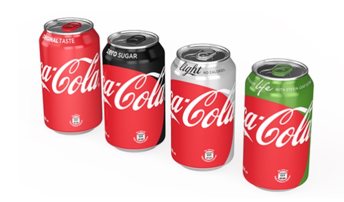
The company solved this dilemma of brand disunity, if you will, by using what it called the Red Disc. The Red Disc is essentially a big, red bottle cap with the wordmark “Coca Cola” spelled out on top of it. The company changed the logo for all of its products so that this Red Disc would always be prominently featured on the packaging—even if the specific Coke product (Coca-Cola Life, for example) had a different color. What resulted was a unifying logo design that told you right off the bat that all these different drinks are from the same brand.
Look for 2017 to feature more companies striving to create one, unifying design logo as well.
Category Consistency
Everyone remembers the big Instagram logo redesign a few months back. While the company said that it was a change from the well-known retro logo to a more modern design, observers criticized the logo as generic and somewhat indistinguishable from other logos or icons that users may see on their smartphones!
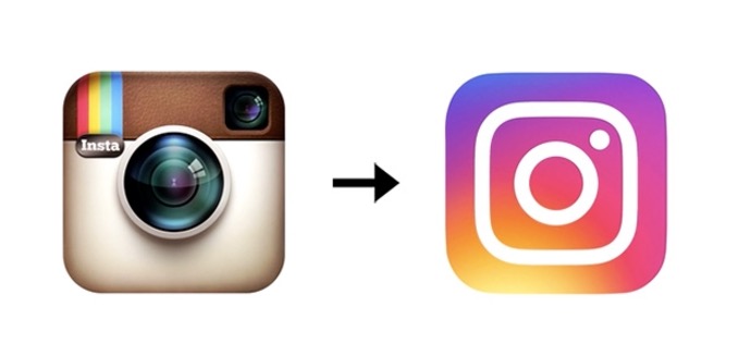
Indeed, the new Instagram logo has no immediately interesting characteristics as the old, retro one did. For all intents and purposes…it does look almost like a cookie-cutter approach to logo design.
Nonetheless, other companies are following suit in this trajectory, for better or worse.
Take Google’s redesign of its now-named Google Home logo, previously Chromecast. The new logo is a very literal interpretation of Google Home, as it’s in the shape of a house and features Google’s trademark colors. However, such a logo, just like the new Instagram one, is also pretty easy to lose amidst the slew of icons on one’s digital device.
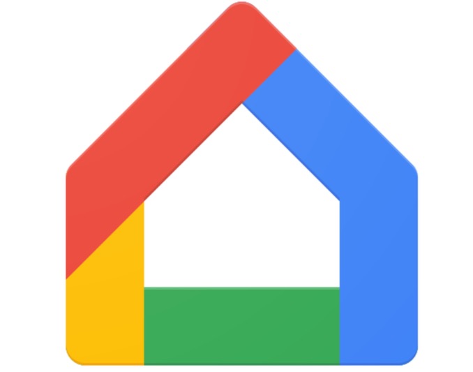
As logo design becomes an ever increasingly saturated field, I expect that 2017 will continue this trend of companies redesigning their logos…and running out of unique ideas.
It’s Going to Be an Exciting Year for Logo Trends
As you can see, companies of all shapes, sizes and industries always rebrand at some point. Some redesign their logos frequently while others don’t mess around with their logos in a significant way for many, many years (the more prominent examples above being Mastercard and Google). Of course, when these companies finally do make adjustments to their designs, it’s huge news because many are asking, why mess with a brand identity people have known for so long?
As we enter a new year, 2017 is looking like it’s going to be full of dynamic and exciting logo updates/redesigns/changes, on the back of these significant logo alterations of the past few months.
The big takeaways include:
- Cleaner logos
- More sans serif wordmarks
- Simple shapes
- Unified brand identities
- Generic oversaturation
As we proceed through 2017, more brands will incorporate more minimalism into their designs. We’ve already seen this with Mastercard, Google and Zendesk, and there’s no sign of stopping this trend. Unfortunately, some brands are also going to produce quite generic logo redesigns, but that’s all part and parcel of logo design!


