Translate

Tuesday, August 16, 2016

Top PowerPoint and Keynote Design Trends To Try in 2016

Top PowerPoint and Keynote Design Trends To Try in 2016
Eric Vadeboncoeur is the founder of both PresentationDeck.com and eVadeboncoeur Design. He creates effective, visually striking presentations for business. Eric makes PowerPoint sit up and bark. Eric holds a bachelor’s degree in graphic design, has been in the industry for over 12 years, and lives in Montreal, Canada.
_____
Meetings are not at the top of anybody’s “Fun Things To Do” list. We all get that. But, we also get that it’s up to us to change that. It’s our job, yours and mine.
The average worker spends 31 hours a month in meetings and presentations. And it gets even worse for executives: they can easily spend 40% of their week in meetings! According to research by Atlassian (the team behind Hipchat):
At presentations, on average, attendees…
  • Daydreamed (91%)
  • Made up an excuse to skip it (96%)
  • Felt overwhelmed (45%)
  • Did other work (73%)
  • Complained it was wasting their time (47%)
Some (39%) even admit they slept during a presentation! (source) Half of attendees consider the time wasted.

How to avoid becoming a statistic

There’s no law that says meetings must be boring. I checked.That said, there’s a lot you can do to make meetings less boring. You can make them different. You can make them interesting. You can grab and hold the audience’s attention.
Skillful use of tools and techniques make your visuals pop. They can help the presenter get the message across and assist your audience in enjoying the message. It’s what we all need to be doing, and we need to start right now. There's no doubt that presentations are a visual medium, and it all starts with design. That's why I decided to share what’s trending in the world of presentations: to give you insights and tips that can improve your designs dramatically.

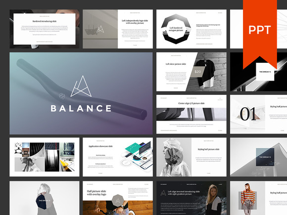
Minimalist design

Less is more. You’ve heard that often enough, right? That may not be a new idea, but it’s making a huge comeback. Maybe the economic climate is making people yearn for zen-like simplicity. Perhaps it’s just a shift in general tastes. Whatever is behind it, Minimalist Design is hot for 2016. Designers are removing distractions, focusing on key elements, and switching to outline icons. Fonts are going on diets and slimming down.
Just look at the bestsellers right here on Creative Market. People prefer clean and crisp over cluttered and noisy. The public now recognizes white space is a design element in its own right.
Now, designers have always known that. White space is not empty space: It has as much purpose as an image or the text. For the sake of minimalism, limit yourself to a single message per slide. A busy slide forces the audience to ignore the speaker. In effect, many of them shut down for the time it takes to read the slide.
Simple, but not simplistic, is the way to go.
 

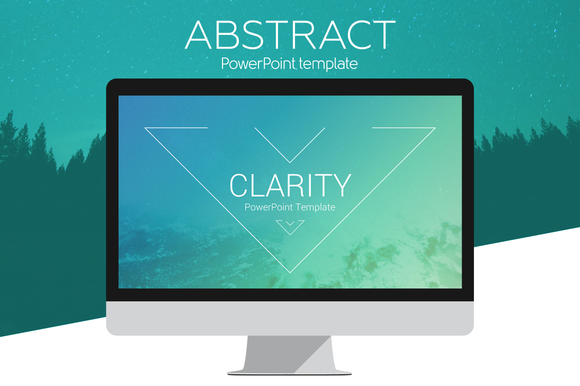
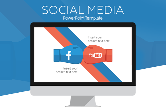
Flat Design

Flat design is light and friendly. It too, has been around for a while but shows no sign of slowing down. Combined with an overall minimalist approach it can still pack a wallop.
It's important to note that flat does not mean boring. This trend avoids unexpected gradients and textures. It also gives us a viable alternative to tired, over-used stock photography. Flat Design’s intention is to present information quickly, painlessly, and seamlessly. Isn’t that exactly what we need for a presentation?
 

Double Exposures Still Rock & Now They’re Easier

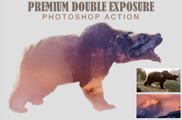
Combine two or more images into one and you create a new image. Double exposure is a nice side-step to stock-photo-fatigue syndrome. Fortunately, it’s now easier than ever to pull off. There are “double exposure” apps and Photoshop™ actions. You can buy them right here on Creative Market.
Forget reveal-all layer masks. Just let the apps and actions do their stuff. Easy as pie and just as delicious. Choose pictures that hit on an emotional level. You want to surprise viewers, delight, and enthrall them. It’s too easy to get carried away with this stuff. Don’t, remember minimalism and take it easy.
You want to leave them wanting more. You want them to feel each image viscerally, down deep in their guts. Be careful not to dilute that. Think of these effects like Jalapeno peppers. A little bit gives a nice kick of heat. Overdo it, and you trash the dish.

Bright gradients

People are used to soft pastel gradients. They are ethereal wisps. They are subtle. They whisper. They seduce.
Bright gradients are different: they are in-your-face, bold, and strong!
They shock! They scream! They’re an F-bomb in the Sunday sermon. They have all the subtlety of a slap upside the head. But sometimes, that’s exactly what we need to pay attention.
Some may question their appropriateness. No one doubts bright gradients command attention, or that their shock value can wake up your audience. You can shake them up, but you can’t always be shouting. Used with care, they provide tension that builds the drama. Check out Uigradients.com. There are plenty of examples there, as well as a handy tool to build them.

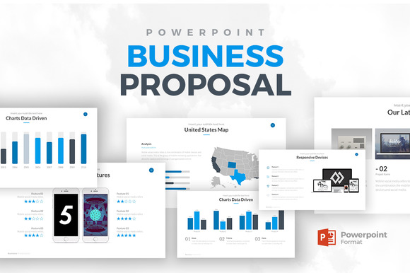
Templates

PowerPoint has a user base of over one billion people! However, many users think pasting a Word document in it is enough. O*M*G, NO! This isn’t only about PowerPoint. What about web sites? What about content marketing? What about blogs? White papers? Case studies?
   
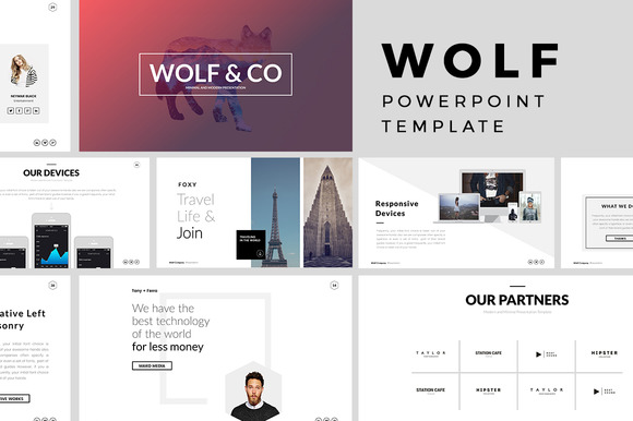
As people need to do more with less, design pros will fill the gap. And they'll do so with beautifully designed templates. Power presenters will use them as a shortcut to building one-off designs. In 2016, more and more people will have access to professional design skills. The best part? They will have it at an itsy-bitsy fraction of a one-off price. Look for templates to hit hard this year. They might be the single, most popular trend of 2016.
   

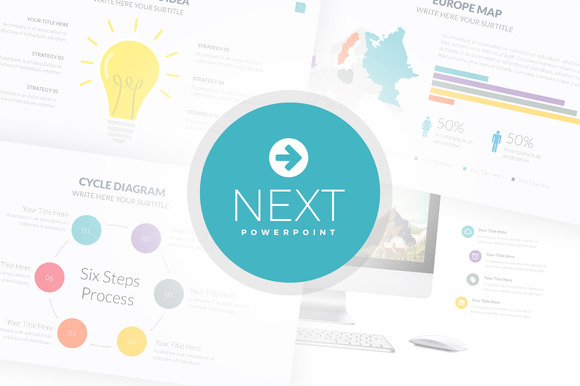
Next Powerpoint Template

Monday, August 15, 2016

Free Download this Week - August 15,2016

Free Download This Week


Download these 6 free goods before it's too late! 


Welcome to MiraElArt shop!
Clip art Watercolor Autumn Dreams set includes high resolution (300 DPI) PNG, JPG, PSD and EPS +BONUS Autumn lettering. This set will be ideal for design of greeting cards, wedding invitations, packaging, scrapbooking, wallpaper, textile design, websites, prints for t-shirts, DIY, etc. Create the design one minute and enjoy!
What’s included:
  • 4 watercolor elements in PNG (transparent background) and JPG
  • 9 watercolor seamless patterns in JPG (5000x5000 px) and PNG (transparent background, 5000x5000 px). Change a background for any color which you will wish!
  • 1 PSD with watercolor autumn leaves isolated on transparent background
  • FREE DOWNLOAD  

This Old Dock Photo Bundle + Bonus


The "This Old Dock" bundle includes 5 photos of wooden docks who may have seen better days, as well as 2 bonus photos that you can't find anywhere else. They will only be sold as part of this bundle.

All photos are:

Feminine Social Media Templates

by Hi and Hello co. in Graphics  Web Elements 
You are feminine, you are sweet. You consider yourself a chic and modest modern woman. You need graphics that tell that story. That fits your feminine side like a glove.
This set includes Pinterest and Instagram templates that are SO EASY to edit.
Don't have Photoshop or Illustrator? No problem! Simply add the transparent overlay on top of your image and top with text. Wa la!
Get noticed! Stand Out! Be Amazing!


LazyFox Hand Drawn Font

by pixelbypixel in Fonts 

Brand new hand drawn font with that imperfect look that you love!


NORD: Cinematic Text & Logo effects


Cinematic Text & Logo Effects - NORD


10 Colored Wall Textures


Grab a copy for only $5 of a fine selection of 10 high-res background textures of various photographed colored walls!
These will work great as background textures for type, lettering, websites and so on.
The textures are available in JPEG format, 300 dpi, resolution of minimum 16 megapixels and up to 24 megapixels.


Sunday, August 7, 2016

Hand Lettering for Beginners


Hand Lettering for Beginners
Hand lettering can appear to be a daunting task, but when you break it down to the fundamentals, it’s simpler than it seems. So let’s talk about how to define it, what materials to use, and all the steps involved. By the end, you’ll be able to create unique lettering for anything from greeting cards to comics, invitations, or even banners for special occasions.
Let’s start with the most basic: what is lettering? Despite what many think, it’s a very different art from calligraphy, which is essentially writing at its most graceful. Think of it like this…
Calligraphy is about perfecting the motions of your pen.
calligraphy-1
Lettering is essentially drawing. Or draftsmanship, depending on how precise you choose to be.
calligraphy-2
As such, you can use virtually any materials for it, but different ones will yield different results and take different skill levels to master. Let’s go over some of them.

Materials

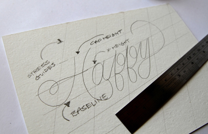
First, for all but the most freeform of projects, get a ruler. You’ll need it to plot the overall shape of your piece before sketching the letterforms, make grids, and block off your letters so they’re spaced appropriately.

Paper

You’ll also need something to draw on. There are three most common types:
Plain Printer Paper: For less formal projects, or in the planning stages, it’s perfectly fine to use this. It’s cheap, good for getting ideas down, and can be used for anything you won’t need a hard copy of after you scan it. And later, we’ll also explain a neat trick you can use with it that can cut down on time and effort if you feel like you’re struggling. However, it’s very acidic and will yellow with time, so don’t use it on anything you want to preserve for a while.
Bristol board: If you want to give your piece some weight and endurance, Bristol board is an excellent choice. It’s also perfect for framing. If you choose this, you’ll then be faced with the choice between vellum, with a softer matte finish, and plate, which is smooth and shiny. It’s generally said that vellum is better for pencilling, where plate is better for inking. Inks are more likely to bleed on vellum, but plate is known to smear pencil lines with the slightest touch.
Grid Paper: If you’re particular about making sure your lines are straight, or if you’re planning on finalizing your project via computer, grid paper can save you a lot of time on the blocking stage. It’s also fairly cheap and very easily available.

Pencils and Pens

It doesn’t matter what kind of pencil you use for the layout and sketch stages. Some of the world’s most talented letterers use #2’s or ordinary mechanical pencils for the layout stage. And similarly, ballpoint pens can be used for quick sketches, informal projects, or anything you want to have an intentionally messy feel.
The-Marmot
Image by “The Marmot
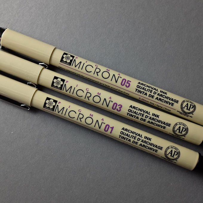
For intermediate inkers, archival markers, like Pigma Microns and Prismacolor Premiers, are a solid all-around choice, being easier to control than a dip pen but more professional than ballpoints. They do have a major drawback, though: each pen gives you just one line weight. In other words, it takes a pack of markers to do the job of one dip pen, and this can get expensive. However, it’s worth noting that some, like the chisel-tip and brush-tip, provide more variety than the fixed-width ones.
Chris-Lott
Image by Chris Lott
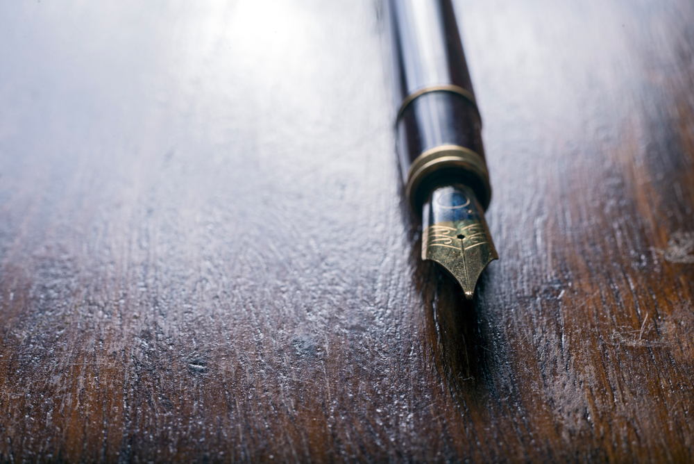
Let’s move on to dip pens. They’re high-maintenance, needing to be washed and cared for regularly, but the professional result they give is worth it. Drawing with them could be the focus of a whole separate article, but the basics are that you need to the right balance of ink—enough to ensure a good flow, but not so much that it leaks and splatters—and the right balance of pressure. it takes a light hand—if you press down too hard, you can bend the nib, which will ruin it—but you also need to move with confident strokes. Also, each side of the pen creates a different line weight and will move in different ways, so you’ll need to learn to use each one.
calligraphy-3
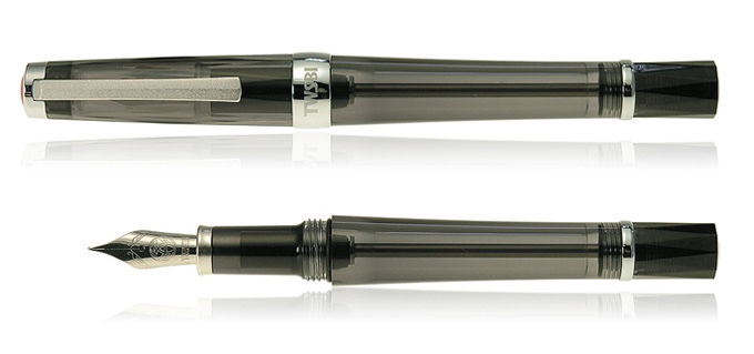
Technical pens are for truly dedicated and detail-oriented users. They’re not just expensive but high-maintenance, requiring you to change the ink cartridge, take care not to break the often tiny nibs, and clean them regularly to prevent clogs. However, in the right hand, they can create incredibly delicate and precise lines.

Steps in the Process

In short:
  1. You pick out the fonts you’d like to use (or sketching out your own beforehand)
  2. You measure and block out your piece so that your letters are all spaced as you like
  3. You hand-ink your piece or scan it, then finish in a vector program

Preplanning

First, a hand-lettered piece can serve many purposes, so what would you like yours to say? And what letter style would you like to use? If you already have in mind the words and character styles you plan to use, all the better. Now, the more complex the design you’ve plotted out, perhaps with some flourishes surrounding your lettering, the more you’ll need to plan ahead.
The first thing to determine is the theme and overall feel that you want to present in your piece. This will both help you find attractive and thematic fonts, but also the decorative elements that you might use to accentuate them.
img
Download now!

Getting started with hand lettering?

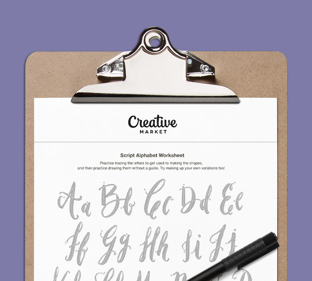
Download these worksheets and start practicing with simple instructions and tracing exercises.
There’s nothing wrong with imitating a font you’ve seen before, in fact, when you’re new, it’s probably a good idea to print some out to use as reference (this is also part of the trick we’ll explain later) at the size you want them to appear in your piece.

Measuring

First, decide on the overall shape of your piece. For your first few times, you might want to stick to a rectangle, but once you’ve got some more practice under your belt, you can start experimenting with a wide variety of different shapes.
Create the baseline you’ll draw your text on top of, then evenly space horizontal lines to block off where you would like your letters to go.
A-Pair-and-a-Spare
Image from A Pair and a Spare

The Pencil Sketch

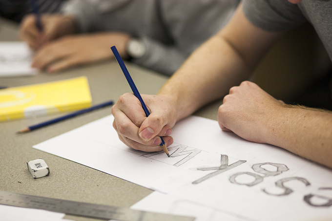
First, you start to lightly sketch a rough outline of each letter, just so you know how large each one is going to be. If you’ve done your blocking correctly, you should have a much easier time with this stage.
Workturn-2
Image by Workturn
Or, you can use that trick we mentioned earlier: a graphite transfer. Basically, you take a pencil or a graphite stick, rub it against the back of what you want to transfer, lay it down, then draw over what it is you want to copy, transferring a light image of it onto the page.
Once your initial rough is done, go over it again to solidify the letterforms’ final shapes. Remember that you only want to draw the outline of the letters. If there are portions of solid black, don’t fill those in. Too much graphite can show through your ink and clog your pen.

Inking

Sean-Wes
Image by Sean McCabe
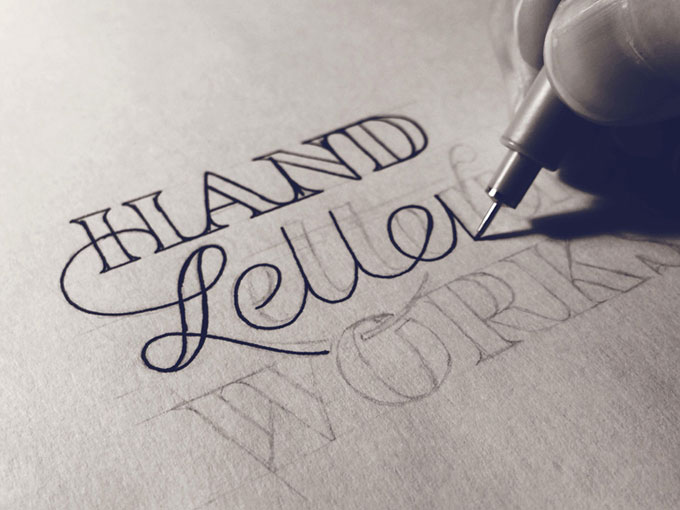
Trace over the lines and fill in the black areas with your pen. To avoid smudging your pencil lines, tape a piece of paper or plastic over the area that you’re not working on. This way, your hand will rest on the cover sheet instead of the drawing itself.
Once you’ve got everything filled in, let it completely dry before fixing anything. If you’re using Bristol board, don’t use correction fluid to fix mistakes: it isn’t quite white, so correction fluid will stand out against it. And even if you are using white paper, a a white gel pen that’ll dry flat is better than correction fluid that’ll often dry lumpy.

Scanning and Cleaning Up

If your paper is too large to be scanned in one fell swoop, Photoshop can take multiple scans of different parts of a piece and automatically composite them into one continuous image. If you don’t have Photoshop, Microsoft ICE can do the same thing for free.
Once it’s in, if you’re planning on using your lettering as an isolated graphic, there are plenty of ways to separate it from the background, especially if your design is fully inked, creating an even contrast and sharp lines you can pull out via the Color Select or Magic Wand tools.

How to Create Your Own Lettering Alphabet

Time to get some real lettering practice. We've prepared a series of short videos and a set of worksheets to help you get started.

Scripted Letter A

Follow these simple steps to learn how to draw a scripted letter 'A'. Start by drawing a swirled line stroke, and extending this up and slightly to the right in a diagonal line to make the point of the 'A'. Then, continue the diagonal line back down the other side, finishing in another swirl stroke to match the other side. Complete your design by drawing a slightly curved line across the middle of it, curling the ends slightly to finish your letter 'A'.

Scripted Letter B

Let's draw a beautiful scripted letter 'B'. Start your letter 'B' by drawing downwards with your pen in a straight vertical line. Next, draw a semicircle that joins the middle of the straight line, and in one stroke bring your pen around in a large arc, looping the tail once over itself to finish the design.

Scripted Letter E

Start your scripted 'E' by drawing a small curl, and without lifting your pen from the paper, bring your stroke around into a semicircle shape. Loop around again into another semicircle, and finish the 'E' shape with a final curl.
img
Download now!

Getting started with hand lettering?

Download these worksheets and start practicing with simple instructions and tracing .
Source: creativemarketblog.

Wednesday, July 20, 2016

Free Goods of the week , july 18.3016


Creative Market
New Free Goods, Available This Week Only
Harrlems Font + Bonus!
by Harder Type Foundry in Fonts
**The Harrlems Font** was made using brush pen,Harlems also has a'messy'skin to get naturally handmade looks and beautiness.. this Font is really suit for your design project and to exposing…
   Get It Free   
Blog and Social Media Image Kit
by Elan Blog Studio in Graphics
Eye-catching blog post images will attract people to your blog and even convince them to return. The easiest way to create them is by using blog image templates. These matching image templat…
   Get It Free   
Tropical Bouquets Clipart Set
by LarysaZabrotskaya in Graphics
This collection of Watercolor Tropical bouquets included 10 ready for use floral compositions and 2 hawaiian frames. All elements are high resolution (300dpi) png files with transparent back…
   Get It Free   
Textures of London
Textures of London
by Jackson Fish Market in Graphics
WHAT’S INCLUDED IN THE COLLECTION: 16 high resolution PNGs (approx 9" x 13” @ 300 dpi) 1 layered Photoshop file with each texture image on its own layer Feel free to contact us with any que…
   Get It Free   
Photography WordPress Theme - GEO
by GT3 Themes in WordPress
Hi, I am Tommy Lum. A creative photographer and traveler making emotional photography communicate a story. That’s it. And this is my new website. Welcome! Discover the power of GT3themes pro…
   Get It Free   
Tank Shirt On 5 Stages Mock-up
by mesmeriseme.pro in Graphics
ALL products 'ON STAGES' below: - 'Men's T-shirt On 5 Stages Mock-up' here:https://creativemarket.com/mesmeriseme.pro/748057-Mens-T-shirt-On-5-Stages-Mock-up - 'Women's T-shirt on 5 Stages …
   Get It Free    https://crmrkt.com/By9wA