Design Trend Report: Vertical Video
Chances are that you’ve been told that vertical video is to be avoided at all costs and is a social media faux pas. After all, video looks so much better in the landscape (horizontal) orientation than vertical video. You don’t have those “ugly” black bars on either side of your video if you shoot horizontally rather than vertically.
At least that’s what the so-called conventional wisdom has told you!
Stop to think for a minute, and you’ll soon realize that vertical video is a bold, new content format that turns conventional wisdom on its head. This design trend is actually more popular than you may think, as research reveals that the majority of video content is shot vertically instead of in landscape orientation anyway. If so, then why is there all this pressure and expectation to continue shooting horizontally?
Free yourself from this restrictive belief system and embrace the tighter intimacy of vertical video, a new design movement on our smartphones.
Way More Popular Than You May Think
Many people believe that shooting video in landscape orientation is some sort of best practice when it comes to recording. Almost without thinking, when we finally remember to as we’re shooting video, we quickly rotate our smartphones horizontally to get a wider screen view. This, we tell ourselves, will get rid of those aggravating black bars on the sides of the video.
Image Credit: Alvaro Reyes
However, data suggests that most of us already shoot video standing on end, so why mess with the natural way we record things? According to ScientiaMobile’s MOVR Mobile Overview Report, “94% of the smartphone hits indicate a portrait orientation.” In other words, almost all of us are shooting video in the way that comes naturally to us—with our phones held vertically.
This makes sense when you think about how smartphones are designed in the first place. They’re designed vertically, with our thumbs meant to swipe, tap and interact with the screen as our remaining, four fingers provide support to the entire device. In short, from this natural way we already hold our hands, it extends to how we innately want to shoot video, which is upright.
So the next time you feel the overpowering urge to turn your phone horizontally, just ignore it, and instead try to experiment with this new approach.
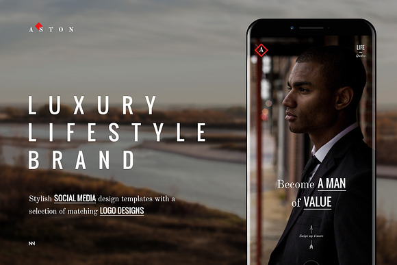
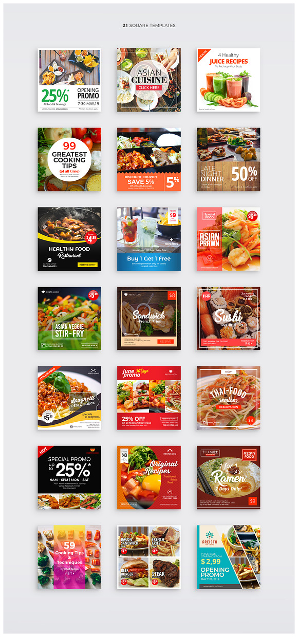
To help you along with that, take a look at some great samples of our wide assortment of digital assets in this style:
The History of Vertical Video
The history of this new design trend is highly interesting but, to really understand its roots, we have to go back to the true history of film and aspect ratios. See, we’re used to watching movies, TV shows, and videos in a horizontal format due to this preference having been standardized from the earliest days of film.
The very first movie screenings took place all the way back in 1895, when the Lumiere brothers—Louis Jean and Auguste Marie Louis Nicholas—held their first screenings. When they did so, they initially standardized the format horizontally.

Image Credit: The Hollywood Reporter
Now let’s fast-forward a few decades to 1932, when the Academy of Motion Picture Arts and Sciences standardized the screen format to the so-called Academy ratio. This is the famous 1.375:1 aspect ratio that made images wider than they are tall, thereby creating the effect and popularity of horizontal video. When the world-famous organization known for putting on the Oscars each year standardizes this format, it’s no surprise that the tradition of horizontal video has carried through across the decades and influenced how we think we should shoot our moving images on our phones.
For a good, long while, vertical video had a really hard go of it, when it came to the web. Horizontal videos dominate YouTube, which led to the avoidance of upright videos as much as possible. In fact, professional video creators would actively refuse to work with this format due to the lack of platforms that supported it.
All that suddenly changed a few years back, starting in 2011. That’s the year that Snapchat was launched. Snapchat, of course, is the multimedia messaging app that allowed its users to send each other “snaps” (pictures or short videos) that would last for only a short time and then become inaccessible. Snapchat later on introduced dedicated support for video in 2012. Since its launch, the app had always prioritized a 9:16 aspect ratio, which meant a portrait orientation (the images are taller than they are wide). Just a year later, the app introduced Snapchat Stories to further capitalize on vertical video and popularize it to its audience of mainly younger people between the ages of 18 and 34.
Since Snapchat succeeded in courting this huge audience of millennials and Generation Z, the advertising departments of brands all over the world gradually took notice. Due to the app’s popularity with the hipper, younger crowd that also had dollars to spend, vertical video was instantly legitimized. We can all thank Snapchat for that.
From here on out, the sky was the limit for portrait orientation of video. In 2015, other platforms started to jump on board this upright craze. Grabyo, the live-video production platform that’s integrated with popular apps like Instagram, Twitter and Facebook—and which is also used by major sports leagues like the NHL and Spain’s La Liga—made it easier to publish vertical videos. It debuted a technology to assist those video publishers who were only used to publishing horizontally to start publishing in more mobile-friendly orientations like upright.
Design a cohesive Instagram grid
Download this kit to quickly export Instagram shots that match your brand's visual style. PSD and AI files are included, as well as a moodboard to display your brand's assets.
In the same year, Snapchat and two partners formed a video-marketing consortium aimed at producing video content specifically for vertical screens. Toward the end of 2015, upright video found itself in huge favor. Twitter and Facebook joined Snapchat as social-media websites that support vertical. Not to be outdone by the competition, YouTube, long the advocate of horizontal video viewing, finally made things easier for fans of videos that you watch on end. YouTube launched a vertical video viewing arrangement that was compatible with its Android phones. In 2017, YouTube rolled out its new format to all sorts of mobile devices.
Image Credit: Santeri Viinamaki
In 2018, Instagram finally joined the vertical party by debuting a vertical video app named IGTV. This standalone app allows its users to upload vertical videos that are up to one hour long! Talk about a huge acceptance of this once-shunned design trend.
YouTube released a new video ad format in 2018, one that supports upright video; it also finally allowed for vertical videos to be seen on its social-media embeds and desktop site without the trademark black bars on either side of the portrait orientation.
But there’s one more momentous moment in this trend’s history that ties things up in a very neat way. Even Netflix got in on this design movement’s trend. Also in 2018, it debuted 30-second, portrait-orientation movie and show previews on its platform. The reason for this move by the company? The increasing popularity of mobile, of course.
The Characteristics of Vertical Video
This trend is very obvious to spot. The antithesis of horizontal orientation, vertical is about more than just an aspect ratio characterized by more height than width. It’s about the way that you tell stories and interact with your followers, fans, customers or viewers at various touchpoints of your branding. While it may have seen restrictive to video publishers for a very long time, it’s clear this trend actually has opened a lot of doors for content creators.
Here are some of the unmistakable characteristics of this take on video:
- A new spin on storytelling
- More intimacy, immediacy, and interactivity
- Better camera handling due to the need for a more refined take
- Black bars on the left and right sides of the video (although some huge platforms like YouTube have now addressed this by allowing for upright videos to be published without the black bars)
- Shorter duration (due to the general impression that many people aren’t comfortable with this take on video)
- Mobile-friendly presentation
- Attention-grabbing
- Provocative animation
- Interesting thumbnails
- Eye-catching video copy
- Option to add interactive polls, augmented reality, geofilters, and stickers to videos
Naturally, you’ll know when you’re watching a video in portrait orientation, but what may not be readily apparent are all the branding, content, and storytelling possibilities that this take on video unleashes—especially when you consider how we’ve been made to get used to the horizontal presentation side of things.
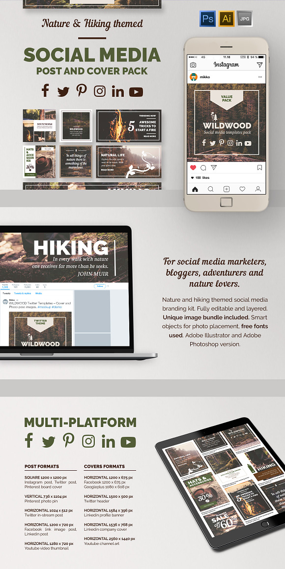
Take a look at some more design assets from our marketplace to help you understand how this design trend is shaking up traditional video:
Vertical Video in Graphic Design
Creative designers can take the gist of what’s behind this bold design trend and turn it into something memorable. Here are some great examples.
Instagram Mobile Mockups Pack
Perfect for the portrait-orientation designer, this pack of Instagram mobile mockups includes numerous templates that allow a designer to visualize their Instagram page across stories, photos, marketing campaigns, and profile pages. Each template was specifically designed for mobile sensibilities and comes with:
- Wholly customizable copy
- Editable images
- Icons you can personalize
Containing high-res PDF files, this digital asset features functionality with:
- Image guides
- Post templates
- Page templates
- Instagram stories
This is the perfect pack for a creative working on a social-media project, whether for a large client, a small business, or even for their own promotional purposes.
ColorPop Xmas INSTAGRAM STORY Pack
A mobile-friendly template set that’s ideal for the Christmas season, the ColorPop Xmas INSTAGRAM STORY Pack is minimalist and exciting. This digital asset allows you to craft attractive social-media graphics that make a splash and should increase your clickthrough rate on any number of projects.
These Illustrator and Photoshop files come completely ready to be edited: They give you total control over every aspect of their vertical-video design, from the backgrounds and shapes to the typography. This easy customizability means that, in example, in only a few seconds, you’re able to come up with an Instagram story banner that complements your brand.
Make your upright videos look aesthetic with this template set!
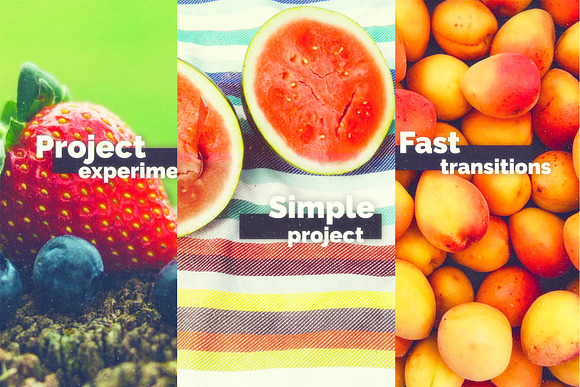
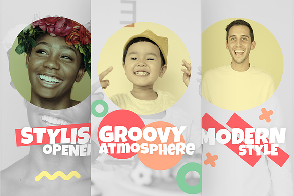
Colorful Modern Opener Vertical
Made especially for the upright video enthusiast, the Colorful Modern Opener Vertical is a template that serves as an opener for your:
- Shows
- Commercials
- Presentations
- Events
- Slideshows
- Social-media platforms
Requiring no plugins, it features creative copy animations and aesthetic transitions that make watching your openers the highlight of any video, presentation or slideshow.
Overall, this set comes with:
- 13 customizable copy layers
- 1 logo placeholder
- 13 video and/or image placeholders
Take advantage of the promising potential of vertical video with this template set that makes it a cinch to make a good impression on your audience from the very beginning.
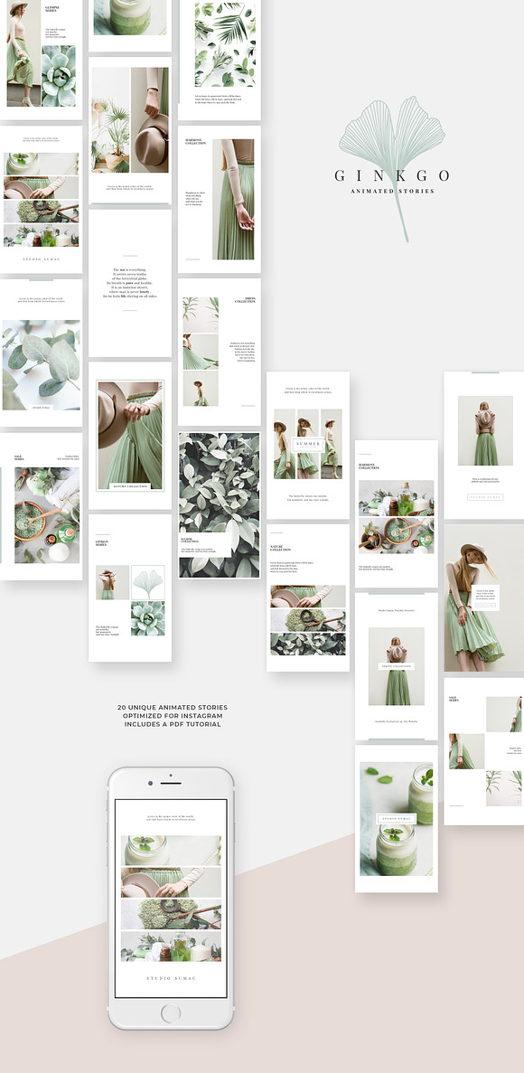
Gingko Animated Instagram Stories
More Instagram story templates, this one can help you make a better impression that connects with your audience. Both modern and minimal, this digital asset boasts a soft as well as natural look that’s soothing to the eyes, while also creating good balance by using white space in the right places. Feel free to use the videos in this set for both static pictures and animated videos.
Here are some features of this asset:
- 20 overall distinct animated Instagram story templates
- Elements you can personalize to your liking
- A multilingual font
- Labeled and organized layers
- A PDF tutorial
Note that you’ll have to use Photoshop in order to experiment with this fun line’s templates.
Vertical Video on the Web
Going straight to the various video-publishing platforms is the best way to see examples of this design trend on the web.
YouTube
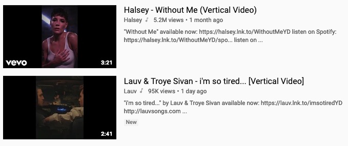
On the desktop version of YouTube, when you type in “vertical video” as a search result, you’ll see a large number of results pop up. The term itself enjoys more than 8000 searches per month on the platform, indicating a healthy and growing interest in this new trend.
Image Credit: YouTube
As you can see, there’s the presence of the trademark black bars on both sides of these types of videos on the platform. That makes for a more intimate viewing experience because you have to a) pay closer attention to the smaller screen real estate, and b) the black bars actually act as an effective form of negative space, focusing attention to the moving images of the video itself.
Snapchat
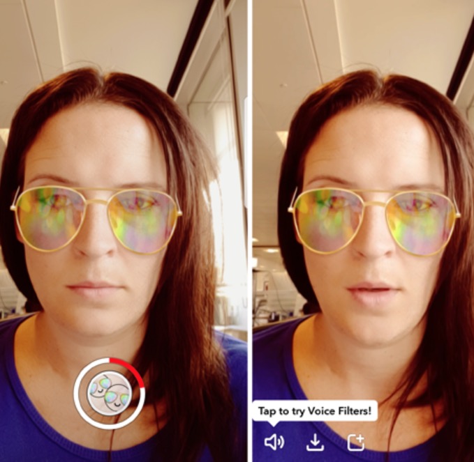
Snapchat was especially made to host video that stands on end (remember the 9:16 aspect ratio mentioned earlier on?), so videos on this platform don’t suffer from those ugly black bars on the sides of its portrait orientation. As a result, videos on this platform closely fill the screen all the way to the edges, but you’re still looking at a much taller than wide video.
Image Credit: Tech Advisor
Of course, that doesn’t matter to the user base of this app, as they have gotten used to and like the handheld convenience of watching videos the way your hand naturally holds a phone.
Overall, Snapchat videos therefore are shorter, get right to the point, and focus on being gripping right away from the outset.
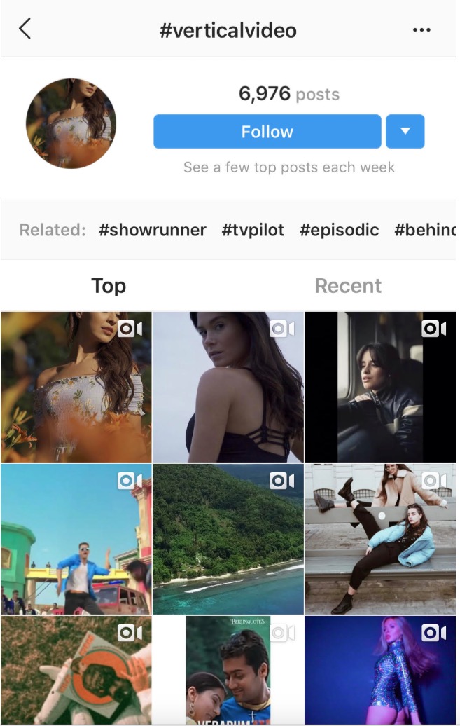
Another large, video-friendly platform on the web is Instagram, which is also mobile-friendly due to the visual-centric focus of its culture. As such, it’s no surprise that this brand also got on the vertical video bandwagon, which fits seamlessly with the habits of its user base. After all, when you’re scrolling through Instagram following the image storytelling of your favorite brands and people, it’s very handy to watch your favorite videos in portrait orientation.
Image Credit: Instagram
You’ll note that the hashtag “vertical video” has several thousand posts on the app, meaning that it’s not yet super-popular, but, like on YouTube, this design trend is also growing on this platform.
While most upright videos here have no bars of any color on either side, you’ll sometimes see the occasional odd one out that does have bars, simply for stylistic reasons.
A Very New Trend, But One That Has Legs
Simply put, we can thank our smartphone obsession with the growing trend of these kinds of videos over the last few years. Although people are still used to seeing horizontal videos, that’s going to change more and more as the years go by and mobile continues to overtake desktop when it comes to how many people use it.
At least on the web, vertical video’s popularity will continue to expand and maybe even surpass the traditional aspect ratio videos. After all, no one believed just a few years ago that more people would end up accessing the Internet from their small smartphones, but the number of users on mobile has already surpassed those accessing the Internet from their desktops.
If that trend is any indication, we may someday live in a world where videos that you stand on end are the norm, and videos that are wider than tall are looked at as a sign of the past…almost like the landline phone.

