Typography is one of the most underappreciated parts of design, which is ironic. I mean designers need to understand the ins and outs of good typography to choose the correct fonts for brochures, flyers, business cards…and especially web fonts.
You need to consider factors like readability, legibility, contrast, serif or sans serif—and the list goes on and on. The font you choose has to complement your overall design in an aesthetically pleasing way, whether that’s on the web or in print.
The best way, for my money, to get familiar with what typeface works and what doesn’t is to simply study great examples of web typography.
Kickstarter
This well-known crowd-funding website sports bubble letters! Its wordmark is spelled out in glorious bubble letters in the header of the homepage. That takes us right back to childhood.
Upwork
Find-me-a-freelancer site Upwork uses gorgeus sans serif typeface in its value proposition. The simple cleanliness of this typeface and the fat stems of the individual fonts make it pop.
Ask.fm
This social network built on the premise of Q&As features a combination of bubble letters and slanted typography that’s instantly memorable. The white-on-blue contrast is perfect to help it stand out.
The Wall Street Journal
This highly regarded publication goes the serif route with its all-uppercase title/header. Creating a classic and old-school feel, this typeface makes sense for a traditional newspaper.
Scribol
This listicle and strange-news site uses a combination of Stag Web and Helvetica Neue fonts for a look that’s clean and super-readable. Note the beautiful spacing the words for extra legibility.
The Telegraph
This highly trafficked British news site sports a very ornate and almost medieval-inspired typeface, but it’s really Austin News Text Semibold. It gives the homepage a touch of grandeur.
Autopilot Technology
Noto Sans JP is the star of the show on the Japanese tech company’s site. Its strong, bold and determined sans serif fonts contrast well with the futuristic-looking background.
League of Legends
This computer game’s site features imposing, bold typeface for its logo. Plus, the fonts for the headline and description provide a sense of balance due to their minimalism.
Zendesk
This customer-service software company’s homepage features magnificent, ultra-simple and understated fonts—that clearly communicate the unique value proposition of this business.
Fiverr
Fiverr’s site displays fatter serif typeface that’s highly stylized as well. This mix of blatancy and readability creates a memorable visual that makes an impression.
Falter Inferno
With bolded strokes, stems, stresses and bowls, the typeface for Falter Inferno is aesthetically appealing and memorable. Its neutral colors also make it evocative.
Spiegel Online
This famous German publication boasts its own Spiegel Sans Web font that features alternating fatter and thinner stems and strokes in the individual characters. The result is one that commands attention.
Kohl’s
The handwritten font on Kohl’s homepage—for a banner declaring there’s still time for last-minute Christmas gifts—is a superb example of a stylized and festive typeface.
GSMArena
GSMArena’s wordmark features very stylized and unique typography. Note the use of both uppercase and lowercase characters, as well as the stylized “A.”
Possession Begins
The typography for this horror site is doubly effective: Blood-red/dripping font in the headline and then a stylized effect in the subheadline.
The Boat
Note the very striking and dramatic typeface of “The Boat.” The choice of font is perfect for the stormy-seas motive of this storytelling site, as it really pulls site visitors in immediately.
Wix
Wix, the free site-building platform, uses simple-though-effective sans serif font. Against a light-blue background, the contrast makes this typeface pop all the more effectively.
Battle.net
An online gaming community, Battle.net features header typeface that’s sleek, sharp and nicely stylized. The logo next to the typeface adds to its effectiveness.
Le Dernier Gaulois
This French site features extremely memorable and evocative Playfair Display font that ties together the whole design and appearance of the site.
Clouds Over Cuba
A retrospective about the Cuban Missile Crisis, this site features elegant serif fonts that capture the drama of this highly intense moment in American history.
Make Me Pulse 2016
Talk about a highly stylized typeface. The font for Make Me Pulse 2016’s font is absolutely imaginative, to say the least. Its minimalist colors further elevate its presentation.
Life Buzz
Inspiring-stories site Life Buzz features an interesting take on its wordmark logo. Its all-uppercase design with parentheses thrown in for good measure is eye-catching.
Macy’s
Macy’s festive “Merry Christmas” font stands out with its classic and handwritten approach to typography. The slanted cursive conveys a sense of personal touch.
USPS
The U.S. Postal Service’s homepage shows off a unique font in the wordmark logo. Slanted and sans serif, its all-uppercase design communicates authority.
MIT
The Massachusetts Institute of Technology’s site displays an almost stencil-like typeface that’s really just a bunch of rectangles joined together to form the MIT acronym.
Peugeot Catch the Dragon
Peugeot’s Catch the Dragon site showcases bold, striking and unafraid typography that’s all at once confrontational and exciting.
The Happy Forecast
This site’s typography is so unreal that it’s basically “out there.” With trippy font that’s made out of different geometric shapes, it invites visitors to study it like some art exhibition.
The Law of the Jungle
This site for last year’s “The Jungle Book” remake shows what you can do when you use evocative typeface. The font perfectly captures the wildness and mystique of the movie.
Samsung
Samsung’s site features simple, bold and thick sans serif typography to alert visitors to the urgency of getting that great gift—before Christmas is over.
Asos
Asos features ultra-basic font that’s so simple that it’s almost unassuming, but this creates a perfectly readable contrast with the background.
Poptm
Creativity rules in the typeface of this popover and popunder site: The alternating black-and-white backgrounds make the simplicity of the sans serif font more striking.
Dictionary.com
The use of Verdana for its defined words provides Dictionary.com with a font that’s well-suited for readers trying to learn spelling and pronunciation.
Utorrent
This downloading client’s homepage makes use of elegant and airy fonts that are just as elegant as its downloading prowess.
Freepik
What makes the typeface of this site so interesting is the subtle nod to 3D in the form of drop shadows, which you can see (if you look closely enough) under each letter.
Taboola
Note the highly unique, stylized wordmark logo of this company, in the header of the site. What makes this content-delivery network’s logo so memorable is the resemblance to a pair of smiling eyes.
UPS
With its very basic, sans serif typography, the UPS wordmark is dedicated to pure minimalism. The all-lowercase characters are a further, neat touch.
Instructure
This software company’s homepage displays some exceptionally neat fonts: Pencil-thin sans serifs as part of a bigger formula that ties into its value proposition.
House of Borel
House of Borel’s typography is very mysterious and minimalist: Just a white-on-black presentation to make a noticeable impact.
Train Robber
Train Robber’s typeface makes us long for a western. With stylized protrusions on the sides of the individual fonts, Train Robber’s typeface is evocative.
Future Living
Almost childlike typography is the star on Future Living’s site. Its relaxed, elementary and all-uppercase design reminds us of grade school all over again.
Bolden
Almost too hard to read for entirely artistic reasons, this design and development firm’s homepage typography is literally comprised of layered fonts on top of each other.
Breitbart
This political site’s rough and raw font creates a thought-provoking, weathered look that complements the wooden-themed background nicely.
McWhopper
When you want a font that grabs visitors’ attention, go with something rare, like Block Berthold Condensed. McWhopper uses this font to great effect on its homepage.
Vangarde Music
This small music label’s site features notably stylized typography and flat fonts that also help in branding this company. Overall, a neat and professional representation.
Melanie F
Melanie F’s lookbook site gives visitors an opportunity to admire the beautiful, slanted font that easily draws the eye with its color contrast and fanciness.
The New Yorker
This long standing publication’s site demonstrates what elegant and timeless typography can be if it’s done excellently. This font combines serifs and sans serifs in a memorable medley.
Quanta Group
Handsome serif fonts make a strong case here for the power of ornamentation in typography. The Quanta Group’s site offers a very readable value proposition.
Shutterstock
Shutterstock uses typeface that displays a minimalist, sans serif look, thus making it super-easy for visitors to read the info at a glance.
Fox News
This news site’s typography is reminiscent of the searchlights in 20th Century Fox, with its very fat and thick stems, strokes and stresses.
Scribd
Notice right away the refined and gorgeous typeface that offers more than adequate spacing between each character for super-easy reading, a luxury in today’s slew of different typefaces.
The Anonymous Hamburger
With its powerfully bold and serif typeface, The Anonymous Hamburger epitomizes stunning typography. The simplicity of using a black-on-white color scheme only adds to the drama.
Calendas Plus
This font site showcases gorgeous, cursive type that is as classic as it is modern. With its serifs and elaborate ornamentation, this type makes quite the impression.
Standard Films
This typeface puts the drama into dramatic. Its faded, golden-to-rusty color and the dark, black background are the perfect combo for a memorable font.
Gestrandete Wale
A German site with a conservationist message, Gestrandete Wale features fat, bold and minimalist fonts along with some serif ones, which excel at getting the message across clearly.
Panache
The use of very thin and fine characters creates a very refined look for this font. Together with a few stylized elements, Panache exudes charm.
B & O Play
This ecommerce site for audio gear uses extremely thin sans serifs that speak to the high quality of the headphones that are available.
Cappen
Wide stems and stresses unite with striking sans serif characters to create a very minimalist but effective typeface. It’s short and to the point.
Liputan 6
This foreign news site’s workmark logo melds letters with number for a distinctive look.
Wed’ze
Perhaps matching the rugged, outdoorsy vibe of the site, Wed’ze’s typography screams on-the-edge and wild, which indicates smart branding choices.
Naver
This Japanese retailer features deceptively elementary typography that seems almost childlike in its simplicity, but is actually very readable and so helpful.
SourceForge
SourceForge’s font is best described as utilitarian meets stylized. The hard and sharp edges are refreshing in today’s aesthetic-obsessed design world.
Rester Avec Toi
This site features fonts with aesthetic color contrast that works to create an outline for every character. The end result is something basic, but attractive.
Sirin Labs
Simplicity rules the day at Sirin Labs, with the bold, sans serif typeface that’s used for extreme readability, clarity and overall legibility.
Slack
The world-famous messaging app for great team communication relies on minimalist, sans serif fonts with spacious tracking for extra clarity and readability.
Locus Solus
Words like sleek, elegant and sublime are all words that come to mind when you gaze at this font. That’s because its all-uppercase font and roomy tracking give off a luxurious quality.
Five Minutes
This site’s homepage features typography that’s part of a logo design, which always makes fonts so much more interesting.
Protest
This outdoor outfitter site’s fonts double down on accessible and open, showcasing fonts that are easy to read and inviting, which is perfect from an ecommerce standpoint.
Forbes
With its close tracking, but wide stresses, stems and bowls, Forbes demonstrates some very readable and aesthetically pleasing typography in its navigation menu.
Trello
Trello’s wordmark logo is a great study in typography: Note its cursive, slanted style that still makes for easy reading, mainly due to its intelligent tracking.
Weebly
Weebly’s homepage tagline is written in a font that almost resembles having been applied with a paint brush; this stylistic nuance makes it very aesthetic.
Weather.com
Weather.coms’ typography is very interesting because of its clean, almost understated presentation. This is obvious in both the letters and the degree numbers.
Camden Town Brewery
Camden Town Brewery’s typeface is strikingly bold: Clean, clear-cut and very neat. Fat characters and generous tracking add to the appeal of the typeface.
Cantina Dei Colli Ripani
This wine-selling ecommerce shop relies on GaramondPro font to create an attractive, visual presentation that shows the potential of serif fonts.
Christmas Express
A festive site, this celebration of Christmas uses some exceptionally aesthetic fonts that are heavily stylized with Christmas symbols and themes.
Siemen’s Santa’s Factory
Siemen’s Santa’s Factory site boasts some amazing typography that’s perfect for Christmas. Note the whimsical, wispy font and the old-school motif.
Big Youth
With its vibrant, bold, blue colors, the typography for Big Youth is truly unique: It looks like bubble letters and cursive, but it’s really not either…
Cuberto
This digital agency’s choice of font is a good indicator of its creativity: Serif typeface that’s at once readable and visually pleasing.
Perturbator
Perturbator’s typography is definitely 80s-inspired, retro gloriousness…all wrapped up in a neat, handwritten font that’s not that readable, but definitely memorable.
Studio Details
This Japanese company features utterly minimalist typography that gets the job done: Sans serif fonts with a bit of stylization for maximum effect.
Up to Tab
This site’s typography is the epitome of cartoony and non-serious, but when you look a bit closer, you’ll see solid typography techniques like clarity, tracking, colors and legibility.
Cienne New York
With easily readable, clean font design, Cienne New York’s typography is pleasing to the eye and attractive. It’s excellent for an ecommerce store that needs to persuade to sell.
Audiko
This free-ringtones site uses slanted serif typeface to create a 404 error page that’s very memorable for anyone who should stumble upon it.
Roblox
Game site Roblox makes a unique contribution to typography by showcasing a font that’s very childish, but ultimately consistent with the fun vibe of the site.
Blue Egg
Digital branding agency Blue Egg draws positive attention by using an all-lowercase font that’s entirely handwritten and features no tracking at all.
Mozilla
Mozilla’s value proposition is written on a slant without being cursive, with sans serif typeface and bold characters for a readable and appealing look.
The Washington Post
This old newspaper’s site features, unsurprisingly, very old-school typography that works very nicely for its publishing/newsy vibe.
Lucy Hardcastle – The Fifth Sense
Almost dreamlike in its typography, this site showcases what fonts would look like if we could see and experience them…underwater. An ultra-interesting effect is offered.
Converse “Diamonds”
Shoeseller Converse tries something different with this site and displays a remarkable typeface that’s graffiti font-inspired and showcases a lot of personality.
Nissan Kicks View
Nissan’s homage to the Rio Olympics, this site features all-caps typeface with some very interesting characters. The hefty space between the letters adds to readability.
Pomerleau
This building-experts site uses bold and heavyset typography to make the point that its construction and design are strong, sturdy and reliable.
Sequence
Sequence utilizes a sans serif font that’s extremely legible, clear and smart. What better way to make the point that it’s a creative agency that gets design and branding?
Xavier Bourdil
Graphic designer Xavier Bourdil’s About section uses Freight big typeface, which is characterized by elegant and thin serifs, tall cap heights, and great tracking for clarity.
Outbrain
Outbrain’s wordmark logo is an interesting take on a stylized typeface. Note the use of the person with glasses in the “O” of the wordmark.
India Times
A site of few characters, its homepage features India Times’ sparse wordmark, which is really just the acronym “IT.” However, its lowercase slanting action is more than enough to be memorable.
Adam Underwear
Kudos to this site for using sans serif fonts that are bolded and normal on the same product page. The juxtaposition creates a visually appealing typeface design.
Frederique Constant
This watchmaker’s site uses serif fonts that have an almost classical feel—you could picture this typeface on an old Greek or Roman building.
Tio Luchin
With a smart and spiffy handwritten typeface, Tio Luchin’s site typography gives off personality and character in droves.
Indian Type Foundry
Unsurprisingly, this design shop for fonts sports amazing-looking typeface right on its homepage. Its neutral color scheme helps the refined and dignified serifs stand out with purpose.
Indeed
Lowercase bubble letters and a slightly stylized design over the “i” make for an eye-catching wordmark. Each character is extremely legible in spite of the design.
Daily Mail
This British newspaper’s site features a stimulating typeface combination: Very old-school fonts and very modern, slimline sans serif fonts for a commanding wordmark.

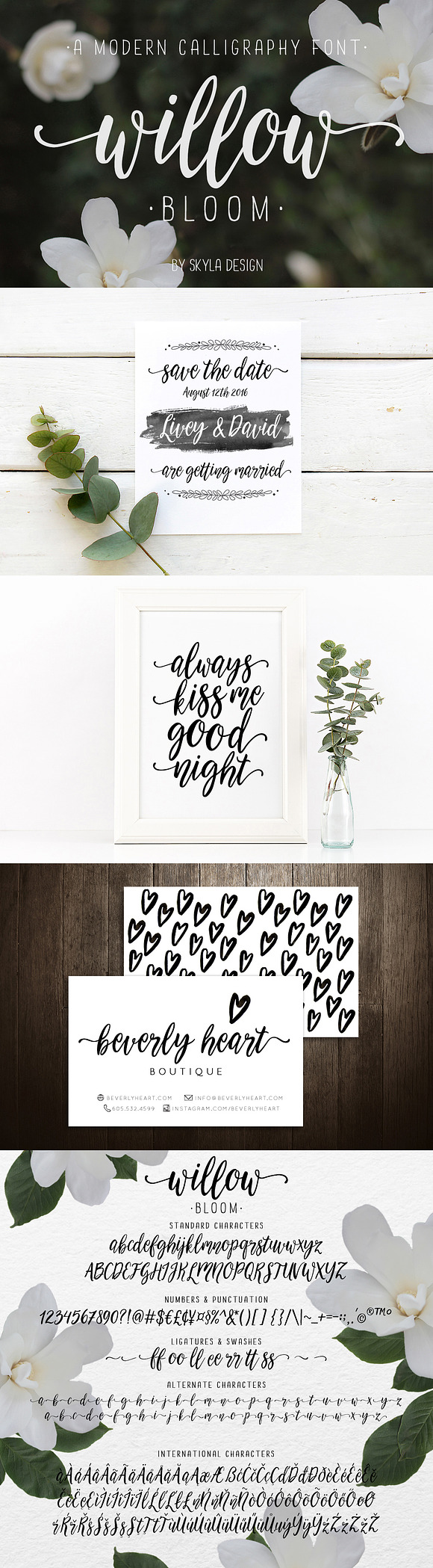
 by WornOutMedia Co. in Fonts Script